摘自:https://www.cnblogs.com/mengqd/p/12380204.html
Flutter Widgets 之 BottomNavigationBar 和 BottomNavigationBarItem

注意:无特殊说明,Flutter版本及Dart版本如下:
- Flutter版本: 1.12.13+hotfix.5
- Dart版本: 2.7.0
BottomNavigationBar 和 BottomNavigationBarItem配合Scaffold控件使用可以实现底部导航效果,类似于微信底部的导航效果,下面是一个简单的底部导航案例:
Scaffold(
bottomNavigationBar: BottomNavigationBar(
items: <BottomNavigationBarItem>[
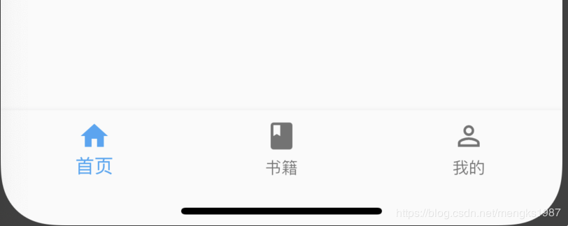
BottomNavigationBarItem(title: Text('首页'),icon: Icon(Icons.home)), BottomNavigationBarItem(title: Text('书籍'),icon: Icon(Icons.book)), BottomNavigationBarItem(title: Text('我的'),icon: Icon(Icons.perm_identity)), ], ), );效果:
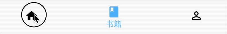
点击其他2个item时没有反应,添加切换效果:
int _currentIndex = 0;
BottomNavigationBar(
    onTap: (int index) {
        setState(() {
_currentIndex = index; }); }, currentIndex: _currentIndex, ...currentIndex代表当前显示导航的索引,当前切换时调用onTap,在onTap回调中调用setState方法改变_currentIndex的值达到切换的效果。
效果如下:

BottomNavigationBar有2种显示模式,其中一种是fixed效果,前面的展示就是fixed效果,这也是默认值,另一种是shifting效果,
BottomNavigationBar(
    type:BottomNavigationBarType.shifting,
selectedItemColor: Theme.of(context).primaryColor, unselectedItemColor: Colors.black, ... }设置shifting时需要设置selectedItemColor和 unselectedItemColor,效果如下:
我们还可以设置其背景颜色(backgroundColor)、图标大小(iconSize)、选中和未选中图标、字体的颜色,大小等。
如果导航的图标是自己设计的图标,这时仅仅通过BottomNavigationBar是无法实现我们想要的效果的,比如微信的导航的效果,虽然选中和未选中也是颜色的区别,但图标不是Icons自带的图标,想要实现切换2个图标需要BottomNavigationBarItem控件的支持,其中的icon和activeIcon分别代表未选中和选中。
通过切换导航而改变页面是App中最常用的方式,开始构建页面的切换:
int _currentIndex = 0;

Widget _currBody = HomePage();

_onTap(int index) {
    switch (index) {
case 0: _currBody = HomePage();; break; case 1: _currBody = BookPage(); break; case 2: _currBody = MyPage(); break; } setState(() { _currentIndex = index; }); } Scaffold( body: _currBody, bottomNavigationBar: BottomNavigationBar( onTap: _onTap, type: BottomNavigationBarType.shifting, selectedItemColor: Theme.of(context).primaryColor, unselectedItemColor: Colors.black, currentIndex: _currentIndex, items: <BottomNavigationBarItem>[ BottomNavigationBarItem(title: Text('首页'), icon: Icon(Icons.home)), BottomNavigationBarItem(title: Text('书籍'), icon: Icon(Icons.book)), BottomNavigationBarItem( title: Text('我的'), icon: Icon(Icons.perm_identity)), ], ), ); Scaffold控件的body表示导航上面,AppBar下面的页面,HomePage,BookPage,MyPage对应3个导航的页面,背景分别是红、蓝、黄色,效果如下:

推荐几款Github上带动画效果的底部导航
更多相关阅读:
- Flutter系列文章总览
- Flutter Widgets 之 Expanded和Flexible
- Flutter Widgets 之 AnimatedList
- Flutter Widgets 之 SliverAppBar
如果这篇文章有帮助到您,希望您来个“赞”并关注我的公众号,非常谢谢。


注意:无特殊说明,Flutter版本及Dart版本如下:
- Flutter版本: 1.12.13+hotfix.5
- Dart版本: 2.7.0
BottomNavigationBar 和 BottomNavigationBarItem配合Scaffold控件使用可以实现底部导航效果,类似于微信底部的导航效果,下面是一个简单的底部导航案例:
Scaffold(
      bottomNavigationBar: BottomNavigationBar(
        items: <BottomNavigationBarItem>[
          BottomNavigationBarItem(title: Text('首页'),icon: Icon(Icons.home)), BottomNavigationBarItem(title: Text('书籍'),icon: Icon(Icons.book)), BottomNavigationBarItem(title: Text('我的'),icon: Icon(Icons.perm_identity)), ], ), );
效果:
点击其他2个item时没有反应,添加切换效果:
int _currentIndex = 0;
BottomNavigationBar(
    onTap: (int index) {
        setState(() {
_currentIndex = index; }); }, currentIndex: _currentIndex, ...currentIndex代表当前显示导航的索引,当前切换时调用onTap,在onTap回调中调用setState方法改变_currentIndex的值达到切换的效果。
效果如下:
BottomNavigationBar有2种显示模式,其中一种是fixed效果,前面的展示就是fixed效果,这也是默认值,另一种是shifting效果,
BottomNavigationBar(
    type:BottomNavigationBarType.shifting,
selectedItemColor: Theme.of(context).primaryColor, unselectedItemColor: Colors.black, ... }设置shifting时需要设置selectedItemColor和 unselectedItemColor,效果如下:
我们还可以设置其背景颜色(backgroundColor)、图标大小(iconSize)、选中和未选中图标、字体的颜色,大小等。
如果导航的图标是自己设计的图标,这时仅仅通过BottomNavigationBar是无法实现我们想要的效果的,比如微信的导航的效果,虽然选中和未选中也是颜色的区别,但图标不是Icons自带的图标,想要实现切换2个图标需要BottomNavigationBarItem控件的支持,其中的icon和activeIcon分别代表未选中和选中。
通过切换导航而改变页面是App中最常用的方式,开始构建页面的切换:
int _currentIndex = 0;

Widget _currBody = HomePage();

_onTap(int index) {
    switch (index) {
case 0: _currBody = HomePage();; break; case 1: _currBody = BookPage(); break; case 2: _currBody = MyPage(); break; } setState(() { _currentIndex = index; }); } Scaffold( body: _currBody, bottomNavigationBar: BottomNavigationBar( onTap: _onTap, type: BottomNavigationBarType.shifting, selectedItemColor: Theme.of(context).primaryColor, unselectedItemColor: Colors.black, currentIndex: _currentIndex, items: <BottomNavigationBarItem>[ BottomNavigationBarItem(title: Text('首页'), icon: Icon(Icons.home)), BottomNavigationBarItem(title: Text('书籍'), icon: Icon(Icons.book)), BottomNavigationBarItem( title: Text('我的'), icon: Icon(Icons.perm_identity)), ], ), ); Scaffold控件的body表示导航上面,AppBar下面的页面,HomePage,BookPage,MyPage对应3个导航的页面,背景分别是红、蓝、黄色,效果如下:
推荐几款Github上带动画效果的底部导航
更多相关阅读:
- Flutter系列文章总览
- Flutter Widgets 之 Expanded和Flexible
- Flutter Widgets 之 AnimatedList
- Flutter Widgets 之 SliverAppBar
如果这篇文章有帮助到您,希望您来个“赞”并关注我的公众号,非常谢谢。