vue、Dropdown 下拉菜单、Dropdown属性事件、vue Dropdown 全部下拉菜单、vue Dropdown 全部属性事件
设计规则
向下弹出的列表。
何时使用
当页面上的操作命令过多时,用此组件可以收纳操作元素。点击或移入触点,会出现一个下拉菜单。可在列表中进行选择,并执行相应的命令。
代码演示
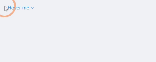
1.基本

最简单的下拉菜单。
<template>
  <a-dropdown>
    <a class="ant-dropdown-link" href="#"> Hover me <a-icon type="down" /> </a>
    <a-menu slot="overlay">
      <a-menu-item>
        <a href="javascript:;">1st menu item</a>
      </a-menu-item>
      <a-menu-item>
        <a href="javascript:;">2nd menu item</a>
      </a-menu-item>
      <a-menu-item>
        <a href="javascript:;">3rd menu item</a>
      </a-menu-item>
    </a-menu>
  </a-dropdown>
</template>
2.右键菜单
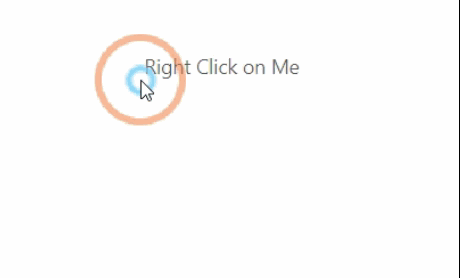
默认是移入触发菜单,可以点击鼠标右键触发。
<template>
  <a-dropdown :trigger="['contextmenu']">
    <span style="user-select: none">Right Click on Me</span>
    <a-menu slot="overlay">
      <a-menu-item key="1">1st menu item</a-menu-item>
      <a-menu-item key="2">2nd menu item</a-menu-item>
      <a-menu-item key="3">3rd menu item</a-menu-item>
    </a-menu>
  </a-dropdown>
</template>
3.带下拉框的按钮
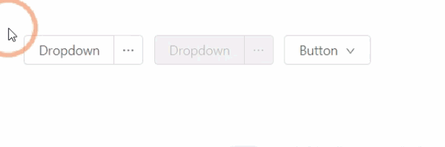
左边是按钮,右边是额外的相关功能菜单。
<template>
  <div>
    <a-dropdown-button @click="handleButtonClick">
      Dropdown
      <a-menu slot="overlay" @click="handleMenuClick">
        <a-menu-item key="1"><a-icon type="user" />1st menu item</a-menu-item>
        <a-menu-item key="2"><a-icon type="user" />2nd menu item</a-menu-item>
        <a-menu-item key="3"><a-icon type="user" />3rd item</a-menu-item>
      </a-menu>
    </a-dropdown-button>
    <a-dropdown-button @click="handleButtonClick" disabled style="margin-left: 8px">
      Dropdown
      <a-menu slot="overlay" @click="handleMenuClick">
        <a-menu-item key="1"><a-icon type="user" />1st menu item</a-menu-item>
        <a-menu-item key="2"><a-icon type="user" />2nd menu item</a-menu-item>
        <a-menu-item key="3"><a-icon type="user" />3rd item</a-menu-item>
      </a-menu>
    </a-dropdown-button>
    <a-dropdown>
      <a-menu slot="overlay" @click="handleMenuClick">
        <a-menu-item key="1"><a-icon type="user" />1st menu item</a-menu-item>
        <a-menu-item key="2"><a-icon type="user" />2nd menu item</a-menu-item>
        <a-menu-item key="3"><a-icon type="user" />3rd item</a-menu-item>
      </a-menu>
      <a-button style="margin-left: 8px"> Button <a-icon type="down" /> </a-button>
    </a-dropdown>
  </div>
</template>

<script>
  export default {
    methods: {
      handleButtonClick(e) {
        console.log('click left button', e);
      },
      handleMenuClick(e) {
        console.log('click', e);
      },
    },
  };
</script>
4.触发事件
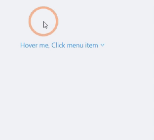
点击菜单项后会触发事件,用户可以通过相应的菜单项 key 进行不同的操作。
<template>
    <a-dropdown>
        <a class="ant-dropdown-link" @click="onClickTwo"> Hover me, Click menu item <a-icon type="down" /> </a>
        <a-menu slot="overlay" @click="onClick">
            <a-menu-item key="1">1st menu item</a-menu-item>
            <a-menu-item key="2">2nd menu item</a-menu-item>
            <a-menu-item key="3">3rd menu item</a-menu-item>
        </a-menu>
    </a-dropdown>
</template>
<script>
    export default {
        methods: {
            onClick({ key }) {
                this.$message.success(`点击了第 ${key} 个下拉菜单`)
            },
            onClickTwo() {
                this.$message.success("点击了一下链接")
            }
        }
    };
</script>
5.其他元素
分割线和不可用菜单项。
<template>
  <a-dropdown>
    <a class="ant-dropdown-link" href="#"> Hover me <a-icon type="down" /> </a>
    <a-menu slot="overlay">
      <a-menu-item key="0">
        <a target="_blank" rel="noopener noreferrer" href="http://www.alipay.com/">1st menu item</a>
      </a-menu-item>
      <a-menu-item key="1">
        <a target="_blank" rel="noopener noreferrer" href="http://www.taobao.com/">2nd menu item</a>
      </a-menu-item>
      <a-menu-divider />
      <a-menu-item key="3" disabled>3rd menu item(disabled)</a-menu-item>
    </a-menu>
  </a-dropdown>
</template>
6.菜单隐藏方式
默认是点击关闭菜单,可以关闭此功能。
<template>
    <a-dropdown v-model="visible">
        <a class="ant-dropdown-link" href="#"> Hover me <a-icon type="down" /> </a>
        <a-menu slot="overlay" @click="handleMenuClick">
            <a-menu-item key="1">Clicking me will not close the menu.</a-menu-item>
            <a-menu-item key="2">Clicking me will not close the menu also.</a-menu-item>
            <a-menu-item key="3">Clicking me will close the menu</a-menu-item>
        </a-menu>
    </a-dropdown>
</template>

<script>
    export default {
        data() {
            return {
                visible: false,
            };
        },
        methods: {
            handleMenuClick(e) {
                if (e.key === '3') {
                    this.visible = false;
                }
            },
        },
    };
</script>
7.弹出位置
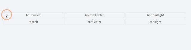
支持 6 个弹出位置。
<template>
    <div id="components-dropdown-demo-placement" style="padding-top: 100px;">
        <template v-for="(placement, index) in placements">
            <a-dropdown :placement="placement">
                <a-button style="width: 350px">{{placement}}</a-button>
                <a-menu slot="overlay">
                    <a-menu-item>
                        <a target="_blank" rel="noopener noreferrer" href="http://www.alipay.com/"
                        >1st menu item</a
                        >
                    </a-menu-item>
                    <a-menu-item>
                        <a target="_blank" rel="noopener noreferrer" href="http://www.taobao.com/"
                        >2nd menu item</a
                        >
                    </a-menu-item>
                    <a-menu-item>
                        <a target="_blank" rel="noopener noreferrer" href="http://www.tmall.com/"
                        >3rd menu item</a
                        >
                    </a-menu-item>
                </a-menu>
            </a-dropdown>
            <br v-if="index === 2" />
        </template>
    </div>
</template>

<script>
    export default {
        data() {
            return {
                placements: [
                    'bottomLeft',
                    'bottomCenter',
                    'bottomRight',
                    'topLeft',
                    'topCenter',
                    'topRight',
                ],
            };
        },
    };
</script>
<style>
    #components-dropdown-demo-placement .ant-btn {
        margin-right: 8px;
        margin-bottom: 8px;
    }
</style>
8.多级菜单
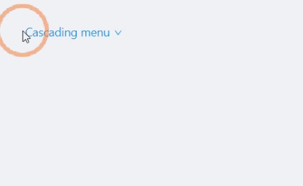
传入的菜单里有多个层级。
<template>
  <a-dropdown>
    <a class="ant-dropdown-link" href="#"> Cascading menu <a-icon type="down" /> </a>
    <a-menu slot="overlay">
      <a-menu-item>1st menu item</a-menu-item>
      <a-menu-item>2nd menu item</a-menu-item>
      <a-sub-menu title="sub menu" key="test">
        <a-menu-item>3rd menu item</a-menu-item>
        <a-menu-item>4th menu item</a-menu-item>
      </a-sub-menu>
      <a-sub-menu title="disabled sub menu" disabled>
        <a-menu-item>5d menu item</a-menu-item>
        <a-menu-item>6th menu item</a-menu-item>
      </a-sub-menu>
    </a-menu>
  </a-dropdown>
</template>
9.触发方式
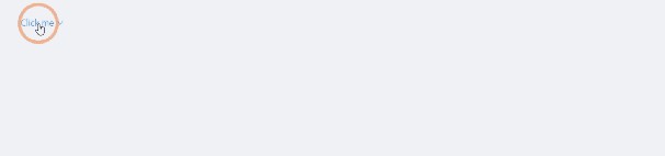
默认是移入触发菜单,可以点击触发。
<template>
    <a-dropdown :trigger="['click']">
        <a class="ant-dropdown-link" href="#"> Click me <a-icon type="down" /> </a>
        <a-menu slot="overlay">
            <a-menu-item key="0">
                <a href="http://www.alipay.com/">1st menu item</a>
            </a-menu-item>
            <a-menu-item key="1">
                <a href="http://www.taobao.com/">2nd menu item</a>
            </a-menu-item>
            <a-menu-divider />
            <a-menu-item key="3">3rd menu item</a-menu-item>
        </a-menu>
    </a-dropdown>
</template>
API
属性
| 参数 | 说明 | 类型 | 默认值 |
|---|---|---|---|
disabled |
菜单是否禁用 | boolean |
- |
getPopupContainer |
菜单渲染父节点。默认渲染到 body 上,如果你遇到菜单滚动定位问题,试试修改为滚动的区域,并相对其定位。 | Function(triggerNode) |
() => document.body |
overlay(slot-scope) |
菜单 | boolean |
- |
disabled |
菜单 | Menu | - |
overlayClassName |
下拉根元素的类名称 | string |
- |
overlayStyle |
下拉根元素的样式 | object |
- |
placement |
菜单弹出位置: bottomLeft bottomCenter bottomRight topLeft topCenter topRight |
String |
bottomLeft |
trigger |
触发下拉的行为, 移动端不支持 hover | Array< click hover contextmenu> |
['hover'] |
visible(v-model) |
菜单是否显示 | boolean |
- |
overlay 菜单使用 Menu,还包括菜单项 Menu.Item,分割线 Menu.Divider。
注意: Menu.Item 必须设置唯一的 key 属性。
Dropdown 下的 Menu 默认不可选中。如果需要菜单可选中,可以指定<Menu selectable>.
事件
| 事件名称 | 说明 | 回调参数 |
|---|---|---|
visibleChange |
菜单显示状态改变时调用,参数为 visible | function(visible) |
Dropdown.Button
| 参数 | 说明 | 类型 | 默认值 |
|---|---|---|---|
disabled |
菜单是否禁用 | boolean |
- |
overlay(slot-scope) |
菜单 | Menu | - |
placement |
菜单弹出位置: bottomLeft bottomCenter bottomRight topLeft topCenter topRight |
String |
bottomLeft |
size |
按钮大小,和 Button 一致 | string |
'default' |
trigger |
触发下拉的行为 | Array<click hover contextmenu> |
['hover'] |
type |
按钮类型,和 Button 一致 | string |
'default' |
visible(v-model) |
菜单是否显示 | boolean |
- |
Dropdown.Button 事件
| 事件名称 | 说明 | 回调参数 |
|---|---|---|
visibleChange |
菜单显示状态改变时调用,参数为 visible | function(visible) |
click |
点击左侧按钮的回调,和 Button 一致 | Function |
