vue、Pagination 分页、Pagination 属性事件、vue Pagination 分页全部样式、vue Pagination 分页全部属性事件
设计规则
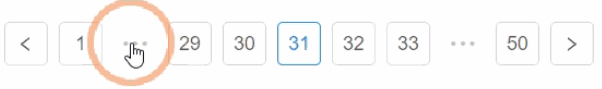
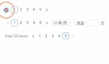
采用分页的形式分隔长列表,每次只加载一个页面。
何时使用
- 当加载/渲染所有数据将花费很多时间时;
- 可切换页码浏览数据。
代码演示
1.基本

基础分页。
<template>
  <a-pagination v-model="current" :total="50" />
</template>
<script>
  export default {
    data() {
      return {
        current: 2,
      };
    },
  };
</script>
2.更多
更多分页。
<template>
  <a-pagination :defaultCurrent="6" :total="500" />
</template>
3.改变
改变每页显示条目数。
<template>
  <div>
    <a-pagination
      showSizeChanger
      @showSizeChange="onShowSizeChange"
      :defaultCurrent="3"
      :total="500"
    />
    <br />
    <a-pagination
      showSizeChanger
      :pageSize.sync="pageSize"
      @showSizeChange="onShowSizeChange"
      :total="500"
      v-model="current"
    />
  </div>
</template>
<script>
  export default {
    data() {
      return {
        pageSize: 20,
        current: 4,
      };
    },
    watch: {
      pageSize(val) {
        console.log('pageSize', val);
      },
      current(val) {
        console.log('current', val);
      },
    },
    methods: {
      onShowSizeChange(current, pageSize) {
        console.log(current, pageSize);
      },
    },
  };
</script>
4.自定义下拉选项
自定义下拉选项,例如添加全部选项
<template>
  <a-pagination
    :pageSizeOptions="pageSizeOptions"
    :total="total"
    showSizeChanger
    :pageSize="pageSize"
    v-model="current"
    @showSizeChange="onShowSizeChange"
  >
    <template slot="buildOptionText" slot-scope="props">
      <span v-if="props.value!=='50'">{{props.value}}条/页</span>
      <span v-if="props.value==='50'">全部</span>
    </template>
  </a-pagination>
</template>
<script>
  export default {
    data() {
      return {
        pageSizeOptions: ['10', '20', '30', '40', '50'],
        current: 1,
        pageSize: 10,
        total: 50,
      };
    },
    methods: {
      onShowSizeChange(current, pageSize) {
        this.pageSize = pageSize;
      },
    },
  };
</script>
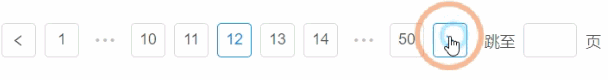
5.跳转
<template>
  <a-pagination showQuickJumper :defaultCurrent="2" :total="500" @change="onChange" />
</template>
<script>
  export default {
    methods: {
      onChange(pageNumber) {
        console.log('Page: ', pageNumber);
      },
    },
  };
</script>
6.迷你
迷你版本。
<template>
  <div id="components-pagination-demo-mini">
    <a-pagination size="small" :total="50" />
    <a-pagination size="small" :total="50" showSizeChanger showQuickJumper />
    <a-pagination size="small" :total="50" :showTotal="total => `Total ${total} items`" />
  </div>
</template>
<style scoped>
  #components-pagination-demo-mini .ant-pagination:not(:last-child) {
    margin-bottom: 24px;
  }
</style>
7.简洁

简单的翻页。
<template>
  <a-pagination simple :defaultCurrent="2" :total="50" />
</template>
8.受控
受控制的页码。
<template>
  <a-pagination @change="onChange" :current="current" :total="50" />
</template>
<script>
  export default {
    data() {
      return {
        current: 3,
      };
    },
    methods: {
      onChange(current) {
        this.current = current;
      },
    },
  };
</script>
9.总数
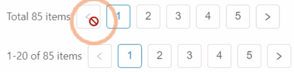
通过设置 showTotal 展示总共有多少数据。
<template>
  <div>
    <a-pagination
      :total="85"
      :showTotal="total => `Total ${total} items`"
      :pageSize="20"
      :defaultCurrent="1"
    />
    <br />
    <a-pagination
      :total="85"
      :showTotal="(total, range) => `${range[0]}-${range[1]} of ${total} items`"
      :pageSize="20"
      :defaultCurrent="1"
    />
  </div>
</template>
10.上一页和下一页
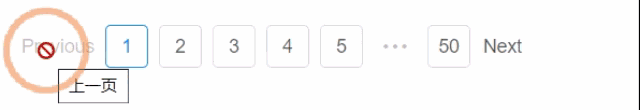
修改上一页和下一页为文字链接。
<template>
  <a-pagination :total="500" :itemRender="itemRender" />
</template>
<script>
  export default {
    methods: {
      itemRender(current, type, originalElement) {
        if (type === 'prev') {
          return <a>Previous</a>;
        } else if (type === 'next') {
          return <a>Next</a>;
        }
        return originalElement;
      },
    },
  };
</script>
API
属性
<a-pagination @change="onChange" :total="50" />
| 参数 | 说明 | 类型 | 默认值 |
|---|---|---|---|
current(v-model) |
当前页数 | number |
- |
defaultCurrent |
默认的当前页数 | number |
1 |
defaultPageSize |
默认的每页条数 | number |
10 |
hideOnSinglePage |
只有一页时是否隐藏分页器 | boolean |
false |
itemRender |
用于自定义页码的结构,可用于优化 SEO | (page, type: 'page' | 'prev' | 'next', originalElement) => vNode |
- |
pageSize(.sync) |
每页条数 | number |
- |
pageSizeOptions |
指定每页可以显示多少条 | string[] |
['10', '20', '30', '40'] |
showQuickJumper |
是否可以快速跳转至某页 | boolean |
false |
showSizeChanger |
是否可以改变 pageSize | boolean |
false |
showTotal |
用于显示数据总量和当前数据顺序 | Function(total, range) |
- |
simple |
当添加该属性时,显示为简单分页 | boolean |
- |
size |
当为「small」时,是小尺寸分页 | string |
"" |
total |
数据总数 | number |
0 |
事件
| 事件名称 | 说明 | 回调参数 |
|---|---|---|
change |
页码改变的回调,参数是改变后的页码及每页条数 | Function(page, pageSize) |
showSizeChange |
pageSize 变化的回调 | Function(current, size) |
