vue、AutoComplete 自动完成、AutoComplete 属性事件方法、vue AutoComplete 所有自动完成样式、vue AutoComplete 自动完成全部属性事件方法
AutoComplete 自动完成
输入框自动完成功能。
何时使用
需要自动完成时。
代码演示
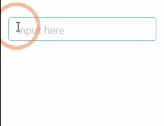
1.基本使用
基本使用。通过 dataSource 设置自动完成的数据源
<template>
  <a-auto-complete
    :dataSource="dataSource"
    style="width: 200px"
    @select="onSelect"
    @search="handleSearch"
    placeholder="input here"
  />
</template>
<script>
  export default {
    data() {
      return {
        dataSource: [],
      };
    },
    methods: {
      handleSearch(value) {
        this.dataSource = !value ? [] : [value, value + value, value + value + value];
      },
      onSelect(value) {
        console.log('onSelect', value);
      },
    },
  };
</script>
2.查询模式 - 确定类目
查询模式 - 确定类目
<template>
  <div class="certain-category-search-wrapper" style="width: 250px">
    <a-auto-complete
      class="certain-category-search"
      dropdownClassName="certain-category-search-dropdown"
      :dropdownMatchSelectWidth="false"
      :dropdownStyle="{width: '300px'}"
      size="large"
      style="width: 100%"
      placeholder="input here"
      optionLabelProp="value"
    >
      <template slot="dataSource">
        <a-select-opt-group v-for="group in dataSource" :key="group.title">
          <span slot="label">
            {{group.title}}
            <a
              style="float: right"
              href="https://www.google.com/search?q=antd"
              target="_blank"
              rel="noopener noreferrer"
              >更多
            </a>
          </span>
          <a-select-option v-for="opt in group.children" :key="opt.title" :value="opt.title">
            {{opt.title}}
            <span class="certain-search-item-count">{{opt.count}} 人 关注</span>
          </a-select-option>
        </a-select-opt-group>
        <a-select-option disabled key="all" class="show-all">
          <a href="https://www.google.com/search?q=antd" target="_blank" rel="noopener noreferrer">
            查看所有结果
          </a>
        </a-select-option>
      </template>
      <a-input>
        <a-icon slot="suffix" type="search" class="certain-category-icon" />
      </a-input>
    </a-auto-complete>
  </div>
</template>
<script>
  const dataSource = [
    {
      title: '话题',
      children: [
        {
          title: 'AntDesign',
          count: 10000,
        },
        {
          title: 'AntDesign UI',
          count: 10600,
        },
      ],
    },
    {
      title: '问题',
      children: [
        {
          title: 'AntDesign UI 有多好',
          count: 60100,
        },
        {
          title: 'AntDesign 是啥',
          count: 30010,
        },
      ],
    },
    {
      title: '文章',
      children: [
        {
          title: 'AntDesign 是一个设计语言',
          count: 100000,
        },
      ],
    },
  ];
  export default {
    data() {
      return {
        dataSource,
      };
    },
  };
</script>
<style>
  .certain-category-search-dropdown .ant-select-dropdown-menu-item-group-title {
    color: #666;
    font-weight: bold;
  }

  .certain-category-search-dropdown .ant-select-dropdown-menu-item-group {
    border-bottom: 1px solid #f6f6f6;
  }

  .certain-category-search-dropdown .ant-select-dropdown-menu-item {
    padding-left: 16px;
  }

  .certain-category-search-dropdown .ant-select-dropdown-menu-item.show-all {
    text-align: center;
    cursor: default;
  }

  .certain-category-search-dropdown .ant-select-dropdown-menu {
    max-height: 300px;
  }
</style>
<style scoped>
  .certain-category-search-wrapper
    >>> .certain-category-search.ant-select-auto-complete
    .ant-input-affix-wrapper
    .ant-input-suffix {
    right: 12px;
  }
  .certain-category-search-wrapper >>> .certain-search-item-count {
    position: absolute;
    color: #999;
    right: 16px;
  }
  .certain-category-search-wrapper
    >>> .certain-category-search.ant-select-focused
    .certain-category-icon {
    color: #108ee9;
  }
  .certain-category-search-wrapper >>> .certain-category-icon {
    color: #6e6e6e;
    transition: all 0.3s cubic-bezier(0.645, 0.045, 0.355, 1);
    font-size: 16px;
  }
</style>
3.自定义输入组件
自定义输入组件。
<template>
  <a-auto-complete
    :dataSource="dataSource"
    style="width: 200px"
    @search="handleSearch"
    @select="onSelect"
  >
    <a-textarea
      placeholder="input here"
      class="custom"
      style="height: 50px"
      @keypress="handleKeyPress"
    />
  </a-auto-complete>
</template>
<script>
  export default {
    data() {
      return {
        dataSource: [],
      };
    },
    methods: {
      onSelect(value) {
        console.log('onSelect', value);
      },
      handleSearch(value) {
        this.dataSource = !value ? [] : [value, value + value, value + value + value];
      },
      handleKeyPress(ev) {
        console.log('handleKeyPress', ev);
      },
    },
  };
</script>
4.不区分大小写
不区分大小写的 AutoComplete
<template>
  <a-auto-complete
    :dataSource="dataSource"
    style="width: 200px"
    placeholder="input here"
    :filterOption="filterOption"
  />
</template>
<script>
  export default {
    data() {
      return {
        dataSource: ['Burns Bay Road', 'Downing Street', 'Wall Street'],
      };
    },
    methods: {
      filterOption(input, option) {
        return (
          option.componentOptions.children[0].text.toUpperCase().indexOf(input.toUpperCase()) >= 0
        );
      },
    },
  };
</script>
5.自定义选项
也可以直接传递slot="dataSource"的Option
<template>
  <a-auto-complete style="width: 200px" @search="handleSearch" placeholder="input here">
    <template slot="dataSource">
      <a-select-option v-for="email in result" :key="email">{{email}}</a-select-option>
    </template>
  </a-auto-complete>
</template>
<script>
  export default {
    data() {
      return {
        result: [],
      };
    },
    methods: {
      handleSearch(value) {
        let result;
        if (!value || value.indexOf('@') >= 0) {
          result = [];
        } else {
          result = ['gmail.com', '163.com', 'qq.com'].map(domain => `${value}@${domain}`);
        }
        this.result = result;
      },
    },
  };
</script>
6.查询模式 - 不确定类目
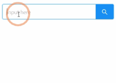
查询模式 - 不确定类目
<template>
  <div class="global-search-wrapper" style="width: 300px">
    <a-auto-complete
      class="global-search"
      size="large"
      style="width: 100%"
      @select="onSelect"
      @search="handleSearch"
      placeholder="input here"
      optionLabelProp="text"
    >
      <template slot="dataSource">
        <a-select-option v-for="item in dataSource" :key="item.category" :text="item.category">
          {{item.query}} 在
          <a
            :href="`https://s.taobao.com/search?q=${item.query}`"
            target="_blank"
            rel="noopener noreferrer"
          >
            {{item.category}}
          </a>
          区块中
          <span className="global-search-item-count">约 {{item.count}} 个结果</span>
        </a-select-option>
      </template>
      <a-input>
        <a-button slot="suffix" class="search-btn" size="large" type="primary">
          <a-icon type="search" />
        </a-button>
      </a-input>
    </a-auto-complete>
  </div>
</template>
<script>
  export default {
    data() {
      return {
        dataSource: [],
      };
    },
    methods: {
      onSelect(value) {
        console.log('onSelect', value);
      },

      handleSearch(value) {
        this.dataSource = value ? this.searchResult(value) : [];
      },

      getRandomInt(max, min = 0) {
        return Math.floor(Math.random() * (max - min + 1)) + min;
      },

      searchResult(query) {
        return new Array(this.getRandomInt(5))
          .join('.')
          .split('.')
          .map((item, idx) => ({
            query,
            category: `${query}${idx}`,
            count: this.getRandomInt(200, 100),
          }));
      },
    },
  };
</script>

<style>
  .global-search-wrapper {
    padding-right: 50px;
  }

  .global-search {
    width: 100%;
  }

  .global-search.ant-select-auto-complete .ant-select-selection--single {
    margin-right: -46px;
  }

  .global-search.ant-select-auto-complete .ant-input-affix-wrapper .ant-input:not(:last-child) {
    padding-right: 62px;
  }

  .global-search.ant-select-auto-complete .ant-input-affix-wrapper .ant-input-suffix {
    right: 0;
  }

  .global-search.ant-select-auto-complete .ant-input-affix-wrapper .ant-input-suffix button {
    border-top-left-radius: 0;
    border-bottom-left-radius: 0;
  }

  .global-search-item-count {
    position: absolute;
    right: 16px;
  }
</style>
API
<a-auto-complete :dataSource="dataSource" />
属性
| 参数 | 说明 | 类型 | 默认值 |
|---|---|---|---|
allowClear |
支持清除, 单选模式有效 | boolean |
false |
autoFocus |
自动获取焦点 | boolean |
false |
backfill |
使用键盘选择选项的时候把选中项回填到输入框中 | boolean |
false |
slot="default" (自定义输入框) |
自定义输入框 | HTMLInputElement / HTMLTextAreaElement |
<Input /> |
dataSource |
自动完成的数据源 | slot | DataSourceItemType[] |
|
defaultActiveFirstOption |
是否默认高亮第一个选项。 | boolean |
true |
defaultValue |
指定默认选中的条目 | string|string[]| 无 |
|
disabled |
是否禁用 | boolean |
false |
filterOption |
是否根据输入项进行筛选。当其为一个函数时,会接收 inputValue option 两个参数,当 option 符合筛选条件时,应返回 true,反之则返回 false。 |
boolean or function(inputValue, option) |
true |
optionLabelProp |
回填到选择框的 Option 的属性值,默认是 Option 的子元素。比如在子元素需要高亮效果时,此值可以设为 value。 |
string |
children |
placeholder |
输入框提示 | string | slot |
- |
value(v-model) |
指定当前选中的条目 | string|string[]|{ key: string, label: string|vNodes }|Array<{ key: string, label: string|vNodes }> |
无 |
defaultOpen |
是否默认展开下拉菜单 | boolean |
- |
open |
是否展开下拉菜单 | boolean |
- |
事件
| 事件名称 | 说明 | 回调参数 |
|---|---|---|
change |
选中 option,或 input 的 value 变化时,调用此函数 | function(value) |
blur |
失去焦点时的回调 | function() |
focus |
获得焦点时的回调 | function() |
search |
搜索补全项的时候调用 | function(value) |
select |
被选中时调用,参数为选中项的 value 值 | function(value, option) |
dropdownVisibleChange |
展开下拉菜单的回调 | function(open) |
方法
| 名称 | 描述 |
|---|---|
blur() |
移除焦点 |
focus() |
获取焦点 |
