学习唐宇迪老师的机器学习课程——基于随机森林做回归任务
这是一个天气最高温度预测任务。
通常想法是训练出随机森林,然后因为是做回归任务,那么取叶子节点中样本的平均值作为预测值
(如果是分类任务就是取众数)
读入数据,看数据情况,有无缺失值、异常值
import pandas as pd

# Read in data as pandas dataframe and display first 5 rows
features = pd.read_csv('data/temps.csv')
features.head(5)

print('The shape of our features is:', features.shape)

# Descriptive statistics for each column
features.describe()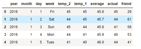
The shape of our features is: (348, 9)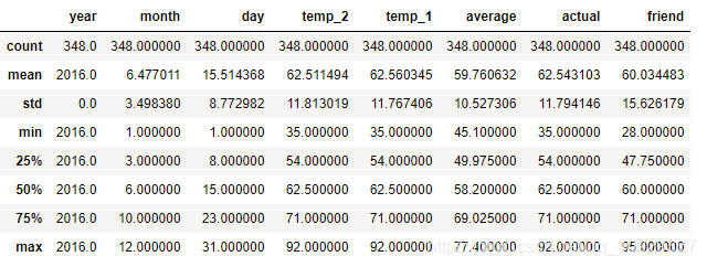
从上面可以看到,数据并没有问题
而发现数据,year-month-day 是可以组合的特征
import datetime

# Get years, months, and days
years = features['year']
months = features['month']
days = features['day']

# List and then convert to datetime object
dates = [str(int(year)) + '-' + str(int(month)) + '-' + str(int(day)) for year, month, day in zip(years, months, days)]
dates = [datetime.datetime.strptime(date, '%Y-%m-%d') for date in dates]

dates[:5]
数据没有异常和简单组合后,我们可以来看一下数据的分布情况,以可视化的形式
# Import matplotlib for plotting and use magic command for Jupyter Notebooks
import matplotlib.pyplot as plt

%matplotlib inline

# Set the style
plt.style.use('fivethirtyeight')

# Set up the plotting layout
fig, ((ax1, ax2), (ax3, ax4)) = plt.subplots(nrows=2, ncols=2, figsize = (10,10))
fig.autofmt_xdate(rotation = 45)

# Actual max temperature measurement
ax1.plot(dates, features['actual'])
ax1.set_xlabel(''); ax1.set_ylabel('Temperature'); ax1.set_title('Max Temp')

# Temperature from 1 day ago
ax2.plot(dates, features['temp_1'])
ax2.set_xlabel(''); ax2.set_ylabel('Temperature'); ax2.set_title('Previous Max Temp')

# Temperature from 2 days ago
ax3.plot(dates, features['temp_2'])
ax3.set_xlabel('Date'); ax3.set_ylabel('Temperature'); ax3.set_title('Two Days Prior Max Temp')

# Friend Estimate
ax4.plot(dates, features['friend'])
ax4.set_xlabel('Date'); ax4.set_ylabel('Temperature'); ax4.set_title('Friend Estimate')

plt.tight_layout(pad=2)
上面的代码相当于是选择某些特征进行画图展示(需要画类似图的时候就可以直接借鉴使用)

我们发现了Friend Estimate这个特征比前面三个“粗”太多了,也就可能不是那么准确的数值,重要性也就可能没有前面那三个重要
除此之外,在这个数据中之前有九个特征,其中就有星期week这个因素,里面的值都是Mon等,(先假设他们会有影响)
研究他们不能直接使用英文,需要转换为机器看得懂的表示,因此需要进行一定的预处理
这里需要用到One-Hot Encoding,其作用如下:

转变成数据的特征,是某个星期的就是为1,其他为0
代码:
# One-hot encode categorical features
features = pd.get_dummies(features)
features.head(5)

print('Shape of features after one-hot encoding:', features.shape)
(特征中只有week的数值不是数字)

Shape of features after one-hot encoding: (348, 15)大致的数据预处理之后我们需要进行提取label(即actual)(回归任务!)
# Use numpy to convert to arrays
import numpy as np

# Labels are the values we want to predict
labels = np.array(features['actual'])

# Remove the labels from the features
# axis 1 refers to the columns
features= features.drop('actual', axis = 1)

# Saving feature names for later use
feature_list = list(features.columns)

# Convert to numpy array
features = np.array(features)
之后就是切分数据集——训练和测试集
# Using Skicit-learn to split data into training and testing sets
from sklearn.model_selection import train_test_split

# Split the data into training and testing sets
train_features, test_features, train_labels, test_labels =
train_test_split(features,labels, test_size = 0.25,random_state = 42)

print('Training Features Shape:', train_features.shape)
print('Training Labels Shape:', train_labels.shape)
print('Testing Features Shape:', test_features.shape)
print('Testing Labels Shape:', test_labels.shape)
Training Features Shape: (261, 14)
Training Labels Shape: (261,)
Testing Features Shape: (87, 14)
Testing Labels Shape: (87,)这里可以看到切分后训练集和测试集数据情况
那么这时候就可以训练随机森林了
# Import the model we are using
from sklearn.ensemble import RandomForestRegressor

# Instantiate model
rf = RandomForestRegressor(n_estimators= 1000, random_state=42)

# Train the model on training data
rf.fit(train_features, train_labels);
这里的随机森林用了1000棵树来寻找最合适的特征
进行测试:
# Use the forest's predict method on the test data
predictions = rf.predict(test_features)

# Calculate the absolute errors
errors = abs(predictions - test_labels)

# Print out the mean absolute error (mae)
print('Mean Absolute Error:', round(np.mean(errors), 2), 'degrees.')
Mean Absolute Error: 3.83 degrees.这里的测试后用预测值和实际值相差多少来评估 ,即MAPE指标(和实际平均相差多少)来看一下它的效果如何
# Calculate mean absolute percentage error (MAPE)
mape = 100 * (errors / test_labels)

# Calculate and display accuracy
accuracy = 100 - np.mean(mape)
print('Accuracy:', round(accuracy, 2), '%.')
Accuracy: 93.99 %.我们还可以可视化展示一下树(举一个可视化树的例子,使用的数据)
# Limit depth of tree to 2 levels
rf_small = RandomForestRegressor(n_estimators=10, max_depth = 3, random_state=42)
rf_small.fit(train_features, train_labels)

# Extract the small tree
tree_small = rf_small.estimators_[5]

# Save the tree as a png image
export_graphviz(tree_small, out_file =
'small_tree.dot', feature_names = feature_list, rounded = True, precision = 1)

(graph, ) = pydot.graph_from_dot_file('small_tree.dot')

graph.write_png('small_tree.png');

上面标注了对树的一些解释
我们知道,随机森林建立时会优先选择有价值的特征(重要性比较强的特征,例如上面的temp_1),而我们可以通过随机森林知道特征的重要性
# Get numerical feature importances
importances = list(rf.feature_importances_)

# List of tuples with variable and importance
feature_importances = [(feature, round(importance, 2)) for feature, importance in zip(feature_list, importances)]

# Sort the feature importances by most important first
feature_importances = sorted(feature_importances, key = lambda x: x[1], reverse = True)

# Print out the feature and importances
[print('Variable: {:20} Importance: {}'.format(*pair)) for pair in feature_importances];
# list of x locations for plotting
x_values = list(range(len(importances)))

# Make a bar chart
plt.bar(x_values, importances, orientation = 'vertical')

# Tick labels for x axis
plt.xticks(x_values, feature_list, rotation='vertical')

# Axis labels and title
plt.ylabel('Importance'); plt.xlabel('Variable'); plt.title('Variable Importances'); 
很明显显示了那些特征重要
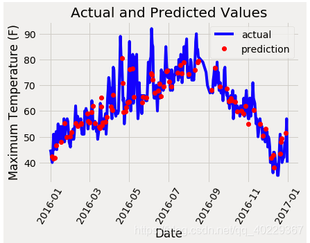
最后我们还可以以可视化的形式看一下我们的预测值和真实值之间的差异
# Dates of training values
months = features[:, feature_list.index('month')]
days = features[:, feature_list.index('day')]
years = features[:, feature_list.index('year')]

# List and then convert to datetime object
dates =
 [str(int(year)) + '-' + str(int(month)) + '-' + str(int(day)) for year, month, day in zip(years, months, days)]
dates = [datetime.datetime.strptime(date, '%Y-%m-%d') for date in dates]

# Dataframe with true values and dates
true_data = pd.DataFrame(data = {'date': dates, 'actual': labels})

# Dates of predictions
months = test_features[:, feature_list.index('month')]
days = test_features[:, feature_list.index('day')]
years = test_features[:, feature_list.index('year')]

# Column of dates
test_dates =
[str(int(year)) + '-' + str(int(month)) + '-' + str(int(day)) for year, month, day in zip(years, months, days)]

# Convert to datetime objects
test_dates = [datetime.datetime.strptime(date, '%Y-%m-%d') for date in test_dates]

# Dataframe with predictions and dates
predictions_data =
pd.DataFrame(data = {'date': test_dates, 'prediction': predictions})


# Plot the actual values
plt.plot(true_data['date'], true_data['actual'], 'b-', label = 'actual')

# Plot the predicted values
plt.plot(predictions_data['date'], predictions_data['prediction'], 'ro', label = 'prediction')
plt.xticks(rotation = '60');
plt.legend()

# Graph labels
plt.xlabel('Date'); plt.ylabel('Maximum Temperature (F)'); plt.title('Actual and Predicted Values');
同样的也是画图,这里是以时间为x轴看一下温度情况
之后我们还会以这个为例子,做一下对比,例如数据量和特征选择、还有随机森林参数对结果的影响
数据与特征对随机森林的影响(特征对比、特征降维、考虑性价比)
https://blog.csdn.net/qq_40229367/article/details/88528421
随机森林参数选择