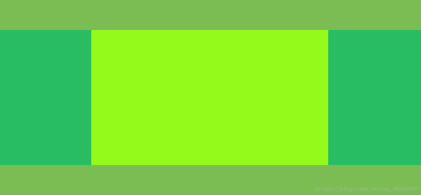
实现效果:
思路:
头部和底部采用绝对定位,中间部分采用绝对定位,其top、bottom值为头部和底部的高度,中间部分内容的左右采用相对定位(采用绝对定位,浮动失效),中间采用绝对定位,其right、left值为左右的宽度。
代码:
<!DOCTYPE html>
<html lang="en">
<head>
    <meta charset="UTF-8">
    <title>Title</title>
    <style type="text/css">
        html, body {
            height:100%;
            margin:0;
            padding:0
        }
        .head,.footer{
            position: absolute;
            height:100px;
            width:100%;
            background: #7bbd53;
        }
        .head{
            top:0;
        }
        .footer{
            bottom:0;
        }
        .left ,.right{
            position:relative;
            width:300px;
            height: 100%;
            background-color: #29bd63;
        }
        .left{
            float: left;
        }
        .right{
            float: right;
        }
        .center{
            position:absolute;
            left:300px;
            right:300px;
            height: 100%;
            background-color: #94fa1a;

        }
       .content{
           position:absolute;
           top:100px;
           bottom:100px;
           width: 100%;
       }
    </style>
</head>
<body>
    <div class="head"></div>
    <div class="content">
        <div class="left"></div>
        <div class="center"></div>
        <div class="right"></div>
    </div>
    <div class="footer"></div>

</body>
</html>