对clip的理解:
clip是对使用了该样式的元素进行裁剪显示。使用方法是rect (top, right, bottom, left) 其中参数top代表显示的区域上边界离该元素顶部border-top相对距离,依此分别是右边界离该元素左侧border-left相对距离。参数top和left取值auto时候代表是取值0,bottom和right取值auto时候代表取值100%;
注意:clip属性只能在元素设置了“position:absolute”或者“position:fixed”属性时候时起作用。样式在所有浏览器都支持,在ie4-ie7兼容性写法是去掉参数之间的逗号,如rect (top right bottom left)
clip的实践裁剪显示文本或图片demo
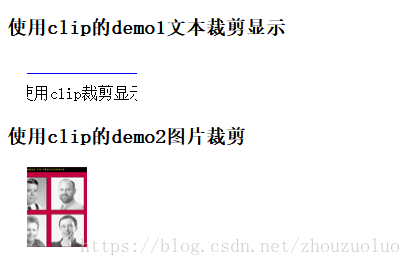
<h3>使用clip的demo1文本裁剪显示</h3>
<div style="height: 50px;">
<p class="textClip">使用clip裁剪显示指定区域范围内的文字内容</p>
</div>
<h3>使用clip的demo2图片裁剪</h3>
<p style="height: 100px;">
<img class="imgClip" src="http://www.w3school.com.cn/i/eg_bookasp.gif" alt="w3school图片加载失败" title="你好" width="120" height="150">
</p>
.textClip {
clip:rect(0px,130px,30px,20px);
position: absolute;
border:1px solid blue;
padding:10px;
}
.imgClip {
clip:rect(auto,80px,80px,20px);
position: absolute;
}
效果图
绘制圆形和半圆形
利用border-radius或clip样式绘制圆形或者半圆形demo3,如下
<
p
>
<
h3
>
绘制圆形
</
h3
>
<
div
style
=
"width:100px;height:100px;border-radius: 50px;background-color: red;"
></
div
>
<
h3
>
绘制半圆形
</
h3
>
<
div
style
=
"width:100px;height:50px;border-radius: 100px 100px 0px 0px ;background-color: red;"
></
div
>
<
p
>
使用clip样式在圆形基础上遮盖显示绘制半圆形
</
p
>
<
div
style
=
"height:60px;position: relative;"
>
<
div
style
=
"width:100px;height:100px;border-radius: 50px;background-color: red;position: absolute;clip: rect(0px,100px,50px,0px);"
></
div
>
</
div
>
</
p
>
效果图

border-radius绘制圆形的原理是当border-radius大小是等宽高的大小的一半时候,每个边角都会形成一个90度的圆角,再将高变成原来的一半就绘制出了半圆,同理当单个边角的border-radius和等宽高的大小一致时,会形成一个更大的90度扇形(如下代码);
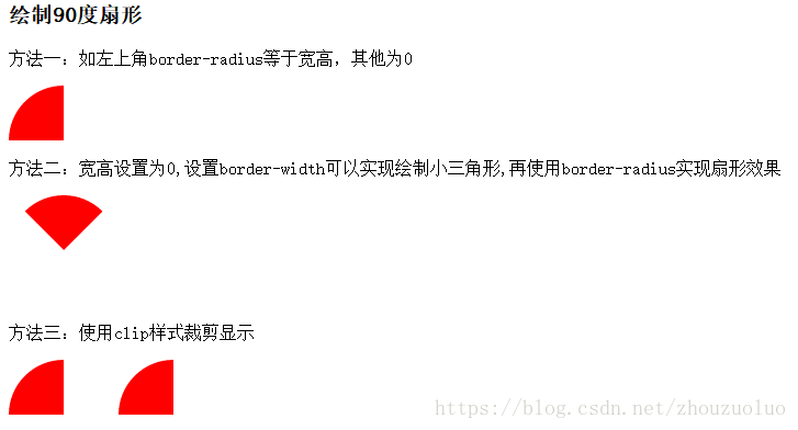
绘制90度扇形
还可以宽高设置为0利用border-width绘制小三角形进而绘制扇形或者clip裁剪显示,如demo
<
p
>
<
p
>
方法一:如左上角border-radius等于宽高,其他为0
</
p
>
<
div
style
=
"width:50px;height:50px;background-color: red;border-radius: 50px 0 0;margin-bottom:10px;"
></
div
>
<
p
>
方法二:宽高设置为0,设置border-width绘制小三角形,再使用border-radius实现扇形效果
</
p
>
<
div
style
=
"width:0;height:0;border:red 50px solid;border-color:red transparent transparent transparent;border-radius: 50px;"
></
div
>
<
p
>
方法三:使用clip样式裁剪显示
</
p
>
<
div
style
=
"width:100px;height:50px;border-radius: 100px 100px 0px 0px ;background-color: red;position: absolute;clip: rect(0px,50px,50px,0px)"
></
div
>
<
div
style
=
"padding-left:100px;position: absolute;clip: rect(0px,150px,50px,0px)"
><
div
style
=
"width:100px;height:100px;border-radius: 50px;background-color: red;position: absolute;clip: rect(0px,100px,50px,0px);"
></
div
></
div
>
</
p
>
效果图
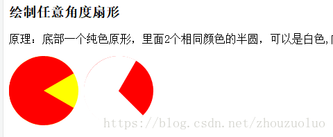
绘制任意角度扇形
原理是利用了clip样式多个半圆裁剪显示被覆盖的底图,或使用canvas绘制
<
p
>
<
p
>
详细原理:底部一个纯色原形,里面2个相同颜色的半圆,可以是白色,内部半圆按一定角度变化,就可以产生出扇形效果
</
p
>
<
div
style
=
"width:100px;height:100px;border-radius: 50px;background-color: yellow;display: inline-block"
>
<
div
style
=
"width:100px;height:100px;border-radius: 50px;background-color: red;position: absolute;clip: rect(0,50px,100px,0);transform: rotate(-60deg)"
></
div
>
<
div
style
=
"width:100px;height:100px;border-radius: 50px;background-color: red;position: absolute;clip: rect(0,50px,100px,0);transform: rotate(60deg)"
></
div
>
</
div
>
<
div
style
=
"width:100px;height:100px;border-radius: 50px;background-color: red;display: inline-block;border:transparent;"
>
<
div
style
=
"width:101px;height:101px;border-radius: 51px;background-color: white;position: absolute;clip: rect(0,50px,100px,0);transform: rotate(-45deg)"
></
div
>
<
div
style
=
"width:101px;height:101px;border-radius: 51px;background-color: white;position: absolute;clip: rect(0,50px,100px,0);transform: rotate(30deg)"
></
div
>
</
div
>
</
p
>
效果图
使用canvas绘制任意角度扇形
<
canvas
id
=
"acanvas"
width
=
"500"
height
=
"500"
>
您的浏览器不支持html5的canvas元素
</
canvas
>
var
canvas
=
document
.
getElementById
(
'acanvas'
);
var
p
=
canvas
.
getContext
(
'2d'
);
p
.
lineWidth
=
2
;
p
.
strokeStyle
=
"red"
;
p
.
fillStyle
=
"red"
;
//所有的变换都是基于原点的
p
.
translate
(
100
,
100
);
//设置原点,则旋转圆心等中心点是再100,100的位置,不设置原点会默认中心是0,0
p
.
save
();
//保存当前绘图stroke、fill样式、原点、旋转角度等
p
.
arc
(
0
,
0
,
100
,
1
/
6
*
Math
.PI,
1
/
3
*
Math
.PI);
//水平x轴方向为0度,顺时针为正
p
.
rotate
(
1
/
6
*
Math
.PI);
//坐标轴顺时针旋转30度
p
.
moveTo
(
100
,
0
);
p
.
lineTo
(
0
,
0
);
p
.
restore
();
//回到p.save()时候的绘图状态值
p
.
save
();
p
.
rotate
(
1
/
3
*
Math
.PI);
// p.moveTo(0,0); //这里如果添加一个线条起始点会导致fill()无法填充整个扇形
p
.
lineTo
(
100
,
0
);
p
.
stroke
();
p
.
fill
();
p
.
restore
();
对上述代码进行简化,直接将弧线的终点连接到原点都不用save和restore(),如下demo:
<
canvas
id
=
"bcanvas"
width
=
"500"
height
=
"500"
>
您的浏览器不支持html5的canvas元素
</
canvas
>
var
bcanvas
=
document
.
getElementById
(
'bcanvas'
);
var
ctx
=
bcanvas
.
getContext
(
'2d'
);
ctx
.
translate
(
100
,
100
);
ctx
.
strokeStyle
=
"red"
;
ctx
.
arc
(
0
,
0
,
100
,
1
/
6
*
Math
.PI,
1
/
3
*
Math
.PI);
ctx
.
lineTo
(
0
,
0
);
ctx
.
rotate
(
1
/
6
*
Math
.PI);
//旋转到起始角度大小
ctx
.
lineTo
(
100
,
0
);
ctx
.
stroke
();
对上述代码进行封装:
CanvasRenderingContext2D
.
prototype
.
sector
=
function
(
x
,
y
,
r
,
sDeg
,
eDeg
){
this
.
save
();
this
.
translate
(
x
,
y
);
this
.
arc
(
0
,
0
,
r
,
sDeg
*
Math
.PI/
180
,
eDeg
*
Math
.PI/
180
);
this
.
lineTo
(
0
,
0
);
this
.
rotate
(
sDeg
*
Math
.PI/
180
);
this
.
lineTo
(
r
,
0
);
this
.
restore
();
return
this
;
}
ctx
.
sector
(
0
,
0
,
100
,
45
,
90
).
stroke
();
进一步简化,能利用closePath()方法进一步封装
//使用beginPath和closePath对上面的封装方法进行简化,closePath是封闭路径
CanvasRenderingContext2D
.
prototype
.
sector2
=
function
(
x
,
y
,
r
,
sDeg
,
eDeg
){
this
.
save
();
this
.
beginPath
();
this
.
moveTo
(
x
,
y
);
//定义一个起点和一条弧线,再封闭路径
this
.
arc
(
x
,
y
,
r
,
sDeg
*
Math
.PI/
180
,
eDeg
*
Math
.PI/
180
);
this
.
closePath
();
this
.
restore
();
return
this
;
}
//利用上述方法绘制饼图
ctx
.
fillStyle
=
"green"
;
ctx
.
sector2
(
200
,
200
,
50
,
0
,
60
).
fill
();
ctx
.
fillStyle
=
"purple"
;
ctx
.
sector2
(
200
,
200
,
50
,
60
,
230
).
fill
();
ctx
.
fillStyle
=
"lightblue"
;
ctx
.
sector2
(
200
,
200
,
50
,
230
,
360
).
fill
();
一个扇形倒计时的demo以及绘制双弧线扇形的demo,如下
//一个扇形倒计时的demo
var
angle
=
270
;
var
timer
=
null
;
setInterval
(
function
(){
func
()},
200
);
function
func
(){
ctx
.
fillStyle
=
"green"
;
angle
-=
10
;
ctx
.
sector2
(
100
,
100
,
60
,
angle
,
270
).
fill
();
// ctx.fillStyle="#fff"; //添加该代码后会扇形变成进度条动画效果
// ctx.sector2(100,100,40,0,360).fill();
if
(
angle
==-
90
){
ctx
.
fillStyle
=
"#fff"
;
ctx
.
clearRect
(
0
,
0
,
500
,
500
);
angle
=
270
;
clearInterval
(
timer
);
//clearInterval的参数比必须是定时器返回的id值
}
}
//绘制双弧形的扇形
var
bbcanvas
=
document
.
getElementById
(
'bbcanvas'
);
var
ctxb
=
bbcanvas
.
getContext
(
'2d'
);
ctxb
.
lineWidth
=
0
;
ctxb
.
translate
(
100
,
100
);
ctxb
.
save
();
ctxb
.
fillStyle
=
"red"
;
ctxb
.
beginPath
();
ctxb
.
moveTo
(
0
,
0
);
ctxb
.
arc
(
0
,
0
,
80
,-
120
*
Math
.PI/
180
,-
60
*
Math
.PI/
180
);
ctxb
.
fill
();
ctxb
.
closePath
();
ctxb
.
restore
();
ctxb
.
fillStyle
=
"#fff"
;
ctxb
.
beginPath
();
ctxb
.
moveTo
(
0
,
0
);
ctxb
.
arc
(
0
,
0
,
40
,-
120
*
Math
.PI/
180
,-
60
*
Math
.PI/
180
);
ctxb
.
fill
();
ctxb
.
closePath
();
更多封装可以参考:https://www.cnblogs.com/jarson-7426/p/6231767.html