BFC机制
BFC(Block Formatting Context):块格式化上下文
BFC是 W3C CSS 2.1 规范中的一个概念,它决定了元素如何对其内容进行定位,以及与其余元素的关系和相互做用。当涉及到可视化布局的时候,Block Formatting Context提供了一个环境,HTML元素在这个环境中按照必定规则进行布局。一个环境中的元素不会影响到其它环境中的布局。好比浮动元素会造成BFC,浮动元素内部子元素的主要受该浮动元素影响,两个浮动元素之间是互不影响的。这里有点相似一个BFC就是一个独立的行政单位的意思。也能够说BFC就是一个做用范围。能够把它理解成是一个独立的容器,而且这个容器的里box的布局,与这个容器外的绝不相干。
引自:http://www.javashuo.com/article/p-rytdiolz-w.html
简单来说,BFC提供了一个独立的布局环境,BFC中的元素布局不受外部元素的影响,也不会影响到外部元素。
※触发BFC的几种方式
1、给元素设置浮动 float: left | right
2、给元素设置脱离文档流的定位 position: absolute | fixed
3、给元素设置内容溢出 overflow: hidden | scroll |auto
4、给元素设置 display: flex | inline-block | table-cell
※几种常见问题
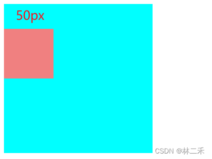
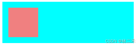
1、父级外边距折叠塌陷问题
嵌套的块级元素,父子元素紧贴的那一边会合并,作用在父元素上。所以给子元素设置margin-top时,父子元素会一起下移。
例:
嵌套的父子div块级元素,给子元素设置margin

父元素也受到了margin-top的影响

解决方案一、给父级1px的边框
.father{


    border: 1px solid transparent; /*transparent:设置边框透明*/
}
.son{


    margin-top: 50px;
}
解决方案二、给父级1px内边距
.father{


    padding-top:1px;
}
.son{


    margin-top: 50px;
}
解决方案三、不用margin-top,改用父级内边距padding
.father{


    padding-top: 50px;
    /*可能会撑大父元素,所以设置盒子宽高为算进边框的宽高,固定盒子大小*/
    box-sizing: boder-box;
}
解决方案四、给父元素设置overflow:hidden; (触发bfc)
父元素会变成独立的空间
.father{


    overflow: hidden;
}
.son{


    margin-top: 50px;
}
解决方案五、将子元素转换为行内块元素
.son{


    display: inline-block; /*嵌套的块级元素会塌陷,所以转化为行内块*/
    margin-top: 50px;
}
解决方案六、有浮动、固定、绝对定位的盒子不存在塌陷问题(触发bfc)
relative也会发生塌陷
/*加给父元素或子元素都可以*/
.father{


    float: left;  /*设置浮动*/
    margin-top: 50px;
}

.father{


    position: absolute;  /*绝对定位*/
    margin-top: 50px;
}

.father{


    position: fixed;  /*固定定位*/
    margin-top: 50px;
}
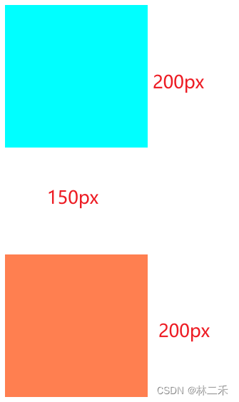
2、margin 纵向重叠及合并解决
两个盒子,上面的盒子margin-bottom: 50px; 下面的盒子margin-top: 100px; 则两个盒子纵向距离为100px。
例:
<style>
        .first{


            width: 200px;
            height: 200px;
            background-color: aqua;
            margin-bottom: 50px;
        }
        .second{


            width: 200px;
            height: 200px;
            background-color: coral;
            margin-top: 100px;
        }
</style>

<div class="first"></div>
<div class="second"></div>
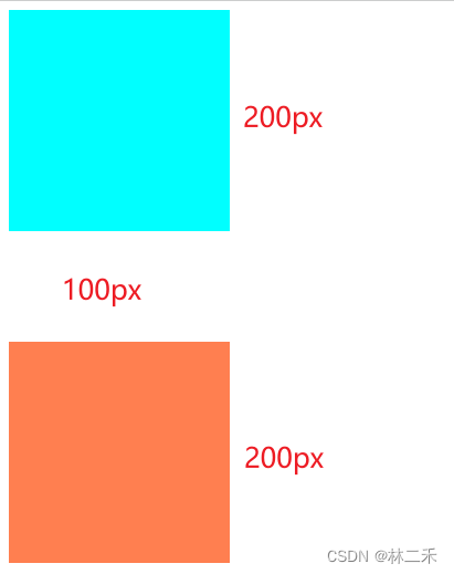
想要纵向边距为两者之和的方法:
解决方案一、直接给其中一个盒子的外边距设为两者之和
<style>
        .second{


            width: 200px;
            height: 200px;
            background-color: coral;
            margin-top: 150px;
        }
</style>
解决方案二、触发bfc,分别给两个盒子套一个父元素,为父元素设置overflow: hidden;
    <style>
        .father{


            overflow:hidden;
        }
        .first{


            width: 200px;
            height: 200px;
            background-color: aqua;
            margin-bottom: 50px;
        }
        .second{


            width: 200px;
            height: 200px;
            background-color: coral;
            margin-top: 100px;
        }
    </style>
    <div class="father">
        <div class="first"></div>
    </div>
    <div class="father">
        <div class="second"></div>
    </div>
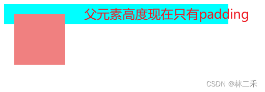
3、清除浮动带来的父元素塌陷
当设置子元素为浮动时,子元素脱标,不占有原位置,父元素会塌陷,不再具有原来的宽高,会改变布局。
例:
正常嵌套的父子元素:
<style>
        .father{


            width: 400px;
            /* 未设置高度,高度由子元素撑起来 */
            background-color: aqua;
            padding: 20px;
        }
        .son{


            width: 100px;
            height: 100px;
            background-color: lightcoral;
        }
    </style>
    <div class="father">
        <div class="son"></div>
    </div>
当设置子元素为float:left
解决方案一、父元素固定宽高
设置父元素的高度,就不必由子元素撑起来,不会受子元素脱标影响
优点:简单代码量少,没有兼容问题
缺点:内部元素高度不确定的情况下无法使用
解决方案二、添加新元素
clear:left:清除float:left对元素造成的影响
clear:right:清除float:right对元素造成的影响
clear:both:清除float:left和float:right对元素造成的影响
.clear_element{


    clear: both;
}
<div class="father">
    ...
    <div class="clear_element"></div>
</div>
添加一个新元素div,设置属性清除浮动clear: both;
缺点:添加了无语义的html元素,不便后期维护
解决方案三、添加伪元素(需设置为块级元素)
.father::after{


    content: "";   /*内容为空*/
    display:block; /*::after默认添加行内元素,需设置为块元素*/
    clear: both;   /*清除浮动*/
}
解决方案四、触发父元素bfc
.father{


    overflow: hidden; /*可以设置为 hidden  auto scroll*/
}
优点:仅用css实现,代码少,浏览器支持好;
缺点:可能会使超出的部分无法显示