

源码如下:

<!DOCTYPE html>
<html>
<head>
<meta charset="utf-8">
<title></title>
<style>
*{
/* 初始化 清除页面元素得内外边距 */
padding: 0;
margin: 0;
}
.container{
/* 弹性布局 让页面元素垂直 + 水平居中 */
display: flex;
justify-content: center;
align-items: center;
/* 让子元素垂直排列 */
flex-direction: column;
/* 高度占浏览器可视窗口总宽度 高度占浏览器可视区域总高度 */
width: 100vm;
height: 100vh;
background-color: #000;
}
.container a{
/* 相对定位 */
position: relative;
/* 将a这个行内元素转为块级元素不然无法设置宽和高 */
display: block;
width: 140px;
height: 60px;
/* 行高 */
line-height: 60px;
text-align: center;
margin: 40px;
color: aqua;
font-size: 20px;
/* 取消下划线 */
text-decoration: none;
/* 加一些过渡事件 */
transition: all 0. 3s ease-in-out;
/* 重头戏来了,改变各个元素的颜色,一句话搞定 */
/* hue-rotate是颜色滤镜 可以加不同的度数来改变颜色
这里用了calc自动计算的方法,还有var函数来调用外卖给每一个
设置的不同的属性值1-5,然后分别乘以60度,就能够分别得到
不同的度数*/
filter: hue-rotate(calc(var(--i)*60deg));
}
.container a::before,
.container a::after{
/* 将两个伪元素得相同部分写在一起 */
content: "";
position: absolute;
width: 20px;
height: 20px;
border: 2px solid aqua;
/* 最后的.3s是延迟时间 */
transition: all 0.3s ease-in-out 0.3s;
}
.container a::before{
top: 0;
left: 0;
/* 删除左边伪元素得右和下边框 */
border-right: 0;
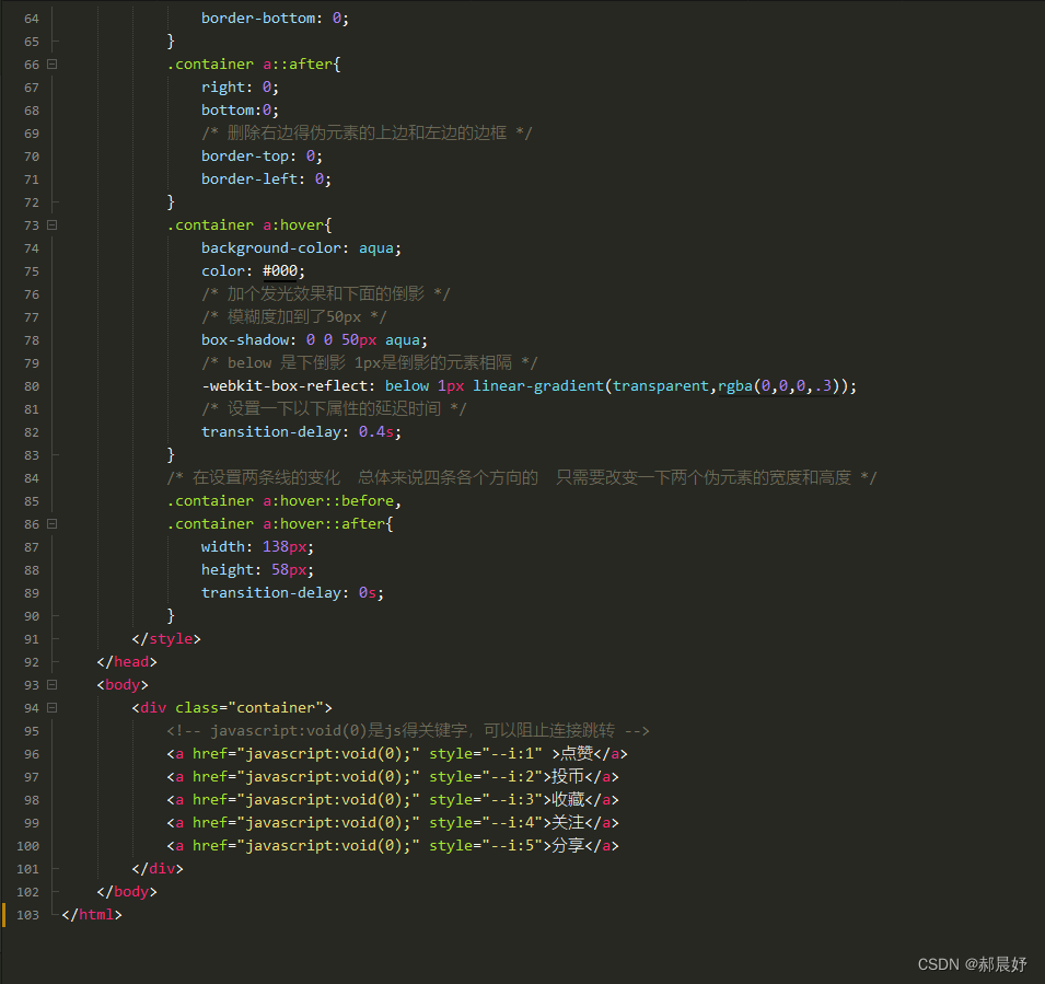
border-bottom: 0;
}
.container a::after{
right: 0;
bottom:0;
/* 删除右边得伪元素的上边和左边的边框 */
border-top: 0;
border-left: 0;
}
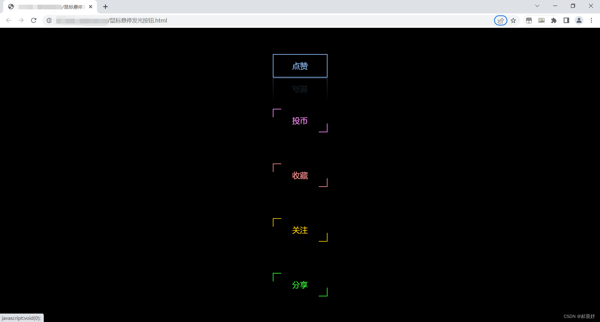
.container a:hover{
background-color: aqua;
color: #000;
/* 加个发光效果和下面的倒影 */
/* 模糊度加到了50px */
box-shadow: 0 0 50px aqua;
/* below 是下倒影 1px是倒影的元素相隔 */
-webkit-box-reflect: below 1px linear-gradient(transparent,rgba(0,0,0,.3));
/* 设置一下以下属性的延迟时间 */
transition-delay: 0.4s;
}
/* 在设置两条线的变化 总体来说四条各个方向的 只需要改变一下两个伪元素的宽度和高度 */
.container a:hover::before,
.container a:hover::after{
width: 138px;
height: 58px;
transition-delay: 0s;
}
</style>
</head>
<body>
<div class="container">
<!-- javascript:void(0)是js得关键字,可以阻止连接跳转 -->
<a href="javascript:void(0);" style="--i:1" >点赞</a>
<a href="javascript:void(0);" style="--i:2">投币</a>
<a href="javascript:void(0);" style="--i:3">收藏</a>
<a href="javascript:void(0);" style="--i:4">关注</a>
<a href="javascript:void(0);" style="--i:5">分享</a>
</div>
</body>
</html>