Paper:《Peeking Inside the Black Box: Visualizing Statistical Learning with Plots of Individual Conditional Expectation》翻译与解读
目录
2.1 Survey of Black Box Visualization
3.4 Visualizing a Second Feature
6.A Visual Test for Additivity
Paper:《Peeking Inside the Black Box: Visualizing Statistical Learning with Plots of Individual Conditional Expectation》翻译与解读
| 来源 |
|
| 作者 |
Alex Goldstein*、Adam Kapelnery、Justin Bleichz 和 Emil Pitkinx 宾夕法尼亚大学沃顿商学院 |
| 发布日期 |
2014年3月21日 |
Abstract
| This article presents Individual Conditional Expectation (ICE) plots, a tool for visualizing the model estimated by any supervised learning algorithm. Classical partial dependence plots (PDPs) help visualize the average partial relationship between the predicted response and one or more features. In the presence of substantial interaction effects, the partial response relationship can be heterogeneous. Thus, an average curve, such as the PDP, can obfuscate the complexity of the modeled relationship. Accordingly, ICE plots refine the partial dependence plot by graphing the functional relationship between the predicted response and the feature for individual observations. Specifically, ICE plots highlight the variation in the fitted values across the range of a covariate, suggesting where and to what extent heterogeneities might exist. In addition to providing a plotting suite for exploratory analysis, we include a visual test for additive structure in the data generating model. Through simulated examples and real data sets, we demonstrate how ICE plots can shed light on estimated models in ways PDPs cannot. Procedures outlined are available in the R package ICEbox. |
本文介绍了个体条件期望 (ICE) 图,这是一种可视化由任何监督学习算法估计的模型的工具。经典的局部依赖图 (PDP) 有助于可视化预测响应与一个或多个特征之间的平均部分关系。在存在大量实质性交互作用的情况下,局部响应关系可能是异质/异构的。因此,平均曲线(例如 PDP)可能会混淆建模关系的复杂性。因此,ICE 图通过绘制预测响应与单个观察的特征之间的函数关系来细化局部依赖图。具体来说,ICE 图突出了协变量范围内拟合值的变化,表明异质性/异构性可能存在的位置和程度。除了提供一个探索性分析的绘图套件外,我们还在数据生成模型中包含了对加性结构的可视化测试。通过模拟示例和真实数据集,我们展示了 ICE 图如何以 PDP 无法提供的方式阐明估计模型。 R 包 ICEbox 中提供了概述的程序。 |
1.Introduction
| The goal of this article is to present Individual Conditional Expectation (ICE) plots, a toolbox for visualizing models produced by “black box” algorithms. These algorithms use training data { xi, yi}N (where xi = (xi,1, . . . , xi,p) is a vector of predictors and yi is the response) to construct a model fˆ that maps the features x to fitted values fˆ(x). Though these algorithms can produce fitted values that enjoy low generalization error, it is often difficult to understand how the resultant fˆ uses x to generate predictions. The ICE toolbox helps visualize this mapping. |
本文的目的是展示个体条件期望 (ICE) 图,这是一个用于可视化由“黑盒”算法生成的模型的工具箱。这些算法使用训练数据 {xi, yi}N(其中 xi = (xi,1, ..., xi,p) 是预测变量的向量,yi 是响应)来构建将特征 x 映射到拟合值 f^(x)。尽管这些算法可以生成具有低泛化误差的拟合值,但通常很难理解结果 f^ 如何使用 x 生成预测。 ICE 工具箱有助于可视化此映射。 |
| ICE plots extend Friedman (2001)’s Partial Dependence Plot (PDP), which highlights the average partial relationship between a set of predictors and the predicted response. ICE plots disaggregate this average by displaying the estimated functional relationship for each observation. Plotting a curve for each observation helps identify interactions in fˆ as well as extrapolations in predictor space. The paper proceeds as follows. Section 2 gives background on visualization in machine learning and introduces PDPs more formally. Section 3 describes the procedure for generating ICE plots and its associated plots. In Section 4 simulated data examples illustrate that ICE plots can be used to identify features of fˆ that are not visible in PDPs, or where the PDPs may even be misleading. Each example is chosen to illustrate a particular principle. Section 5 provides examples of ICE plots on real data. In Section 6 we shift the focus from the fitted fˆ to a data generating process f and use ICE plots as part of a visual test for additivity in f . Section 7 concludes. |
ICE 图扩展了 Friedman (2001) 的局部依赖图 (PDP),它突出了一组预测变量与预测响应之间的平均部分关系。 ICE 图通过显示每个观察的估计函数关系来分解该平均值。为每个观察绘制曲线有助于识别 f^ 中的交互以及预测空间中的外推。 本文进行如下。第 2 节 给出了机器学习可视化的背景,并更正式地介绍了 PDP。第 3 节 描述了生成 ICE 图及其相关图的过程。在第 4 节中,模拟数据示例说明 ICE 图可用于识别在 PDP 中不可见的 f^ 特征,或者 PDP 甚至可能具有误导性的地方。选择每个例子来说明一个特定的原则。第 5 节 提供了真实数据上的 ICE 图的示例。在第 6 节中,我们将重点从拟合的 f^ 转移到数据生成过程 f,并使用 ICE 图作为 f 中可加性的视觉测试的一部分。第 7 节结束。 |
2.Background
2.1 Survey of Black Box Visualization
| There is an extensive literature that attests to the superiority of black box machine learning algorithms in minimizing predictive error, both from a theoretical and an applied perspective. Breiman (2001b), summarizing, states “accuracy generally requires more complex prediction methods ...[and] simple and interpretable functions do not make the most accurate predictors.” Problematically, black box models offer little in the way of interpretability, unless the data is of very low dimension. When we are willing to compromise interpretability for improved predictive accuracy, any window into black box’s internals can be beneficial. |
从理论和应用的角度来看,有大量文献证明了黑盒机器学习算法在最小化预测误差方面的优越性。 Breiman (2001b) 总结说,“准确性通常需要更复杂的预测方法……[并且] 简单且可解释的函数并不能做出最准确的预测。”有问题的是,黑盒模型几乎没有提供可解释性,除非数据的维度非常低。当我们愿意牺牲可解释性以提高预测准确性时,任何进入黑匣子内部的窗口都是有益的。 |
| Authors have devised a variety of algorithm-specific techniques targeted at improving the interpretability of a particular statistical learning procedure’s output. Rao and Potts (1997) offers a technique for visualizing the decision boundary produced by bagging decision trees. Although applicable to high dimensional settings, their work primarily focuses on the low dimensional case of two covariates. Tzeng (2005) develops visualization of the layers of neural networks to understand dependencies between the inputs and model outputs and yields insight into classification uncertainty. Jakulin et al. (2005) improves the interpretability of support vector machines by using a device called “nomograms” which provide graphical representation of the contribution of variables to the model fit. Pre-specified interaction effects of interest can be displayed in the nomograms as well. Breiman (2001a) uses randomization of out-of-bag observations to compute a variable importance metric for Random Forests (RF). Those variables for which predictive performance degrades the most vis-a-vis the original model are considered the strongest contributors to forecasting accuracy. This method is also applicable to stochastic gradient boosting (Friedman, 2002). Plate et al. (2000) plots neural network predictions in a scatterplot for each variable by sampling points from covariate space. Amongst the existing literature, this work is the most similar to ICE, but was only applied to neural networks and does not have a readily available implementation. Other visualization proposals are model agnostic and can be applied to a host of supervised learning procedures. For instance, Strumbelj and Kononenko (2011) consider a game-theoretic approach to assess the contributions of different features to predictions that relies on an efficient approximation of the Shapley value. Jiang and Owen (2002) use quasiregression estimation of black box functions. Here, the function is expanded into an orthonormal basis of coefficients which are approximated via Monte Carlo simulation. These estimated coefficients can then be used to determine which covariates influence the function and whether any interactions exist. |
作者设计了各种特定算法的技术(即与模型有关),旨在提高特定统计学习过程输出的可解释性。 Rao 和 Potts (1997) 提供了一种由 bagging 决策树产生的决策边界可视化的技术。虽然适用于高维环境,但他们的工作主要集中在低维情况下的两个协变量。 Tzeng (2005) 开发了神经网络层的可视化,以了解输入和模型输出之间的依赖关系,并深入了解分类不确定性。Jakulin等人(2005)通过使用一种名为“nomograms”的设备改进了支持向量机的可解释性,nomograms提供了变量对模型拟合贡献的图形表示。预先指定的感兴趣的交互效果也可以显示在nomogram中。 Breiman (2001a) 使用袋外观察的随机化来计算随机森林 (RF) 的可变重要性度量。那些预测性能相对于原始模型下降最大的变量被认为是预测精度的最大贡献者。该方法也适用于随机梯度提升 (Friedman, 2002)。(Friedman, 2002)。Plate等人(2000)通过协变量空间的采样点,在散点图中绘制每个变量的神经网络预测。在现有文献中,这项工作与 ICE 最相似,但仅应用于神经网络,并没有现成的实现。 其他可视化方案与模型无关,可以应用于许多监督学习程序。例如,Strumbelj 和 Kononenko (2011) 考虑了一种博弈论方法来评估不同特征对依赖于 Shapley 值的有效近似的预测的贡献。Jiang和Owen(2002)使用黑盒函数的拟回归估计。在这里,函数被扩展成一个正交的系数基,这些系数基是通过蒙特卡洛模拟近似的。这些估计的系数可以用来确定哪些协变量影响函数,以及是否存在任何相互作用。 |
2.2 Friedman’s PDP
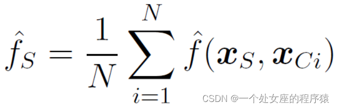
| Another particularly useful model agnostic tool is Friedman (2001)’s PDP, which this paper extends. The PDP plots the change in the average predicted value as specified feature(s) vary over their marginal distribution. Many supervised learning models applied across a number of disciplines have been better understood thanks to PDPs. Green and Kern (2010) use PDPs to understand the relationship between predictors and the conditional average treatment effect for a voter mobilization experiment, with the predictions being made by Bayesian Additive Regression Trees (BART, Chipman et al., 2010). Berk and Bleich (2013) demonstrate the advantage of using RF and the associated PDPs to accurately model predictor-response relationships under asymmetric classification costs that often arise in criminal justice settings. In the ecological literature, Elith et al. (2008), who rely on stochastic gradient boosting, use PDPs to understand how different environmental factors influence the distribution of a particular freshwater eel. To formally define the PDP, let S ⊂ {1, ..., p} and let C be the complement set of S. Here S and C index subsets of predictors; for example, if S = {1, 2, 3}, then xS refers to a 3 × 1 vector containing the values of the first three coordinates of x. Then the partial dependence function of f on xS is given by
|
另一个特别有用的与模型无关的工具是 Friedman (2001) 的 PDP,当指定的特征(s)在其边缘分布上变化时,PDP绘制平均预测值的变化。由于 PDP,许多跨学科应用的监督学习模型得到了更好的理解。 Green 和 Kern (2010) 使用 PDP 来了解预测变量与选民动员实验的条件平均处理效果之间的关系并通过贝叶斯加性回归树进行预测(BART, Chipman et al., 2010)。 Berk 和 Bleich(2013 年)证明了在刑事司法环境中经常出现的不对称分类成本下,使用 RF 和相关 PDP 来准确模拟预测因子-响应关系的优势。在生态文献中,Elith 等人。 (2008 年)依靠随机梯度提升,使用 PDP 来理解不同的环境因素如何影响特定淡水鳗鱼的分布。 为了正式定义 PDP,让 S ⊂ {1, ..., p} 并让 C 是 S 的补集。这里 S 和 C 索引预测变量的子集;例如,如果 S = {1, 2, 3},则 xS 指的是一个 3 × 1 向量,其中包含 x 的前三个坐标的值。那么 f 对 xS 的部分依赖函数由下式给出 |
| Each subset of predictors S has its own partial dependence function fS, which gives the average value of f when xS is xed and xC varies over its marginal distribution dP (xC). As neither the true f nor dP (xC) are known, we estimate Equation 1 by computing
where fxC1; :::; xCNg represent the different values of xC that are observed in the training data. Note that the approximation here is twofold: we estimate the true model with ^ f, the output of a statistical learning algorithm, and we estimate the integral over xC by averaging over the N xC values observed in the training set.
This is a visualization tool in the following sense: if ^ fS is evaluated at the xS observed in the data, a set of N ordered pairs will result: f(xS`; ^ fS`)gN `=1, where ^ fS` refers to the estimated partial dependence function evaluated at the `th coordinate of xS, denoted xS`. Then for one or two dimensional xS, Friedman (2001) proposes plotting the N xS`'s versus their associated ^ fS`'s, conventionally joined by lines. The resulting graphic, which is called a partial dependence plot, displays the average value of ^ f as a function of xS. For the remainder of the paper we consider a single predictor of interest at a time (jSj = 1) and write xS without boldface accordingly.As an extended example, consider the following data generating process with a simple interaction: |
预测变量 S 的每个子集都有自己的部分依赖函数 fS,它给出了当 xS 固定且 xC 在其边际分布 dP (xC) 上变化时 f 的平均值。由于既不知道真实的 f 也不知道 dP (xC),我们通过计算来估计等式 1 其中 fxC1; :::; xCNg 表示在训练数据中观察到的不同 xC 值。请注意,这里的近似是双重的:我们用 ^ f 估计真实模型,统计学习算法的输出,我们通过对训练集中观察到的 N 个 xC 值进行平均来估计 xC 上的积分。 这是以下意义上的可视化工具:如果在数据中观察到的 xS 处评估 ^fS,则将产生一组 N 个有序对:f(xS`; ^fS`)gN`=1,其中 ^fS`指在 xS 的第坐标处评估的估计部分依赖函数,表示为 xS。 然后对于一维或二维 xS,Friedman (2001) 建议绘制 N xS`'s 与它们相关联的 ^fS`'s,通常由线连接。生成的图形称为局部依赖图,将 ^ f 的平均值显示为 xS 的函数。对于本文的其余部分,我们一次考虑一个感兴趣的预测变量(jSj = 1),并相应地写出不带粗体的 xS。作为扩展示例,考虑以下具有简单交互的数据生成过程: |
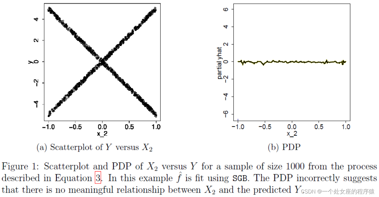
| We generate 1,000 observations from this model and fit a stochastic gradient boosting model (SGB) via the R package gbm (Ridgeway, 2013) where the number of trees is chosen via cross-validation and the interaction depth is set to 3. We now consider the association between predicted Y values and X2 (S = X2). In Figure 1a we plot X2 versus Y in our sample. Figure 1b displays the fitted model’s partial dependence plot for predictor X2. The PDP suggests that on average, X2 is not meaningfully associated with the predicted Y . In light of Figure 1a, this conclusion is plainly wrong. Clearly X2 is associated with Y ; it is simply that the averaging inherent in the PDP shields this discovery from view. |
我们从该模型中生成 1,000 个观察值,并通过 R 包 gbm (Ridgeway, 2013) 拟合随机梯度提升模型 (SGB),其中通过交叉验证选择树的数量并将交互深度设置为 3。我们现在考虑 预测 Y 值与 X2 (S = X2) 之间的关联。 在图 1a 中,我们绘制了样本中的 X2 与 Y。 图 1b 显示了预测变量 X2 的拟合模型的局部依赖图。 PDP 表明,平均而言,X2 与预测的 Y 没有有意义的关联。 根据图 1a,这个结论显然是错误的。 显然 X2 与 Y 相关联; 很简单,PDP 中固有的平均值将这一发现从视野中屏蔽了。 |
|
Figure 1: Scatterplot and PDP of X2 versus Y for a sample of size 1000 from the process described in Equation 3. In this example fˆ is fit using SGB. The PDP incorrectly suggests that there is no meaningful relationship between X2 and the predicted Y . |
图 1:来自公式 3 中描述的过程的大小为 1000 的样本的 X2 与 Y 的散点图和 PDP。在此示例中,使用 SGB 拟合 f^。 PDP 错误地表明 X2 和预测的 Y 之间没有有意义的关系。 |
| In fact, the original work introducing PDPs argues that the PDP can be a useful summary for the chosen subset of variables if their dependence on the remaining features is not too strong. When the dependence is strong, however – that is, when interactions are present – the PDP can be misleading. Nor is the PDP particularly effective at revealing extrapolations in X -space. ICE plots are intended to address these issues. |

3 The ICE Toolbox
3.1 The ICE Procedure
| Visually, ICE plots disaggregate the output of classical PDPs. Rather than plot the target covariates’ average partial effect on the predicted response, we instead plot the N estimated conditional expectation curves: each reflects the predicted response as a function of covariate xS , conditional on an observed xC . Consider the observations {(xSi, xCi)}i=1, and the estimated response function fˆ. For each of the N observed and fixed values of xC , a curve fˆ(i) is plotted against the observed values of xS . Therefore, at each x-coordinate, xS is fixed and the xC varies across N observations. Each curve defines the conditional relationship between xS and fˆ at fixed values of xC . Thus, the ICE algorithm gives the user insight into the several variants of conditional relationships estimated by the black box. |
从视觉上看,ICE 图分解了经典 PDP 的输出。我们没有绘制目标协变量对预测响应的平均部分影响,而是绘制了 N 个估计的条件期望曲线:每条曲线都将预测响应反映为协变量 xS 的函数,以观察到的 xC 为条件。 考虑观察 {(xSi, xCi)}i=1 和估计的响应函数 f^。对于 xC 的 N 个观测值和固定值中的每一个,针对 xS 的观测值绘制一条曲线 f^(i)。因此,在每个 x 坐标上,xS 是固定的,而 xC 在 N 个观测值中变化。每条曲线在 xC 的固定值下定义 xS 和 f^ 之间的条件关系。因此,ICE 算法让用户深入了解黑盒估计的条件关系的几种变体。 |
| The ICE algorithm is given in Algorithm 1 in Appendix A. Note that the PDP curve is the average of the N ICE curves and can thus be viewed as a form of post-processing. Although in this paper we focus on the case where |S| = 1, the pseudocode is general. All plots in this paper are produced using the R package ICEbox, available on CRAN. Returning to the simulated data described by Equation 3, Figure 2 shows the ICE plot for the SGB when S = X2. In contrast to the PDP in Figure 1b, the ICE plot makes it clear that the fitted values are related to X2. Specifically, the SGB’s predicted values are approximately linearly increasing or decreasing in X2 depending upon which region of X an observation is in.
Figure 2: SGB ICE plot for X2 from 1000 realizations of the data generating process described by Equation 3. We see that the SGB’s fitted values are either approximately linearly increasing or decreasing in X2. |
ICE 算法在附录 A 中的算法 1 中给出。请注意,PDP 曲线是 N ICE 曲线的平均值,因此可以看作是一种后处理形式。尽管在本文中我们关注 |S| 的情况= 1,伪代码一般。本文中的所有绘图均使用 CRAN 上提供的 R 包 ICEbox 生成。 回到公式 3 所描述的仿真数据,图 2 显示了 SGB 时 S = X2 时的 ICE 图。与图 1b 中的 PDP 相比,ICE 图清楚地表明拟合值与 X2 相关。具体来说,SGB 的预测值在 X2 中近似线性增加或减少,具体取决于观测值所在的 X 区域。 图 2:来自等式 3 描述的数据生成过程的 1000 次实现的 X2 的 SGB ICE 图。我们看到 SGB 的拟合值在 X2 中近似线性增加或减少。 |
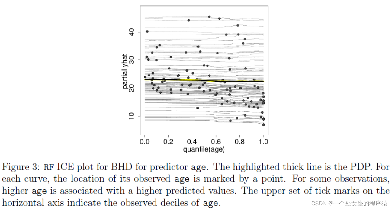
| Now consider the well known Boston Housing Data (BHD). The goal in this dataset is to predict a census tract’s median home price using features of the census tract itself. It is important to note that the median home prices for the tracts are truncated at 50, and hence one may observe potential ceiling effects when analyzing the data. We use Random Forests(RF) implemented in R (Liaw and Wiener, 2002) to fit fˆ. The ICE plot in Figure 3 examines the association between the average age of homes in a census tract and the corresponding median home value for that tract (S = age). The PDP is largely flat, perhaps displaying a slight decrease in predicted median home price as age increases. The ICE plot shows those observations for which increasing age is actually associated with higher predicted values, thereby describing how individual behavior departs from the average behavior. |
现在考虑众所周知的波士顿住房数据 (BHD)。该数据集中的目标是使用人口普查区本身的特征来预测人口普查区的房价中值。值得注意的是,这些地区的房价中位数被截断为 50,因此在分析数据时可能会观察到潜在的天花板效应。我们使用 R (Liaw and Wiener, 2002) 中实现的随机森林 (RF) 来拟合 f^。图 3 中的 ICE 图检查了人口普查区域中房屋的平均年龄与该区域相应的房屋价值中位数(S = 年龄)之间的关联。 PDP 基本持平,随着年龄的增长,预测中位房价可能略有下降。 ICE 图显示了年龄增长实际上与更高预测值相关的观察结果,从而描述了个体行为如何偏离平均行为。 |
|
|
图 3:用于预测年龄的 BHD 的 RF ICE 图。突出显示的粗线是 PDP。对于每条曲线,其观测年龄的位置由一个点标记。对于某些观察,较高的年龄与较高的预测值相关。水平轴上的一组刻度线表示观察到的年龄十分位数。 |

3.2 The Centered ICE Plot
| When the curves have a wide range of intercepts and are consequently “stacked” on each other, heterogeneity in the model can be difficult to discern. In Figure 3, for example, the variation in effects between curves and cumulative effects are veiled. In such cases the “centered ICE” plot (the “c-ICE”), which removes level effects, is useful. c-ICE works as follows. Choose a location x∗ in the range of xS and join or “pinch” all prediction lines at that point. We have found that choosing x∗ as the minimum or the maximum observed value results in the most interpretable plots. For each curve fˆ(i) in the ICE plot, the corresponding c-ICE curve is given by
|
当曲线具有广泛的截距并因此彼此“堆叠”时,模型中的异质性可能难以辨别。例如,在图 3 中,曲线和累积效应之间的效应变化被掩盖了。在这种情况下,消除水平效应的“居中 ICE”图(“c-ICE”)很有用。 c-ICE 的工作原理如下。在 xS 的范围内选择一个位置 x∗ 并在该点连接或“压缩”所有预测线。我们发现,选择 x* 作为最小或最大观察值会产生最可解释的图。对于 ICE 图中的每条曲线 f^(i),对应的 c-ICE 曲线由下式给出 |
| where the unadorned fˆ denotes the fitted model and 1 is a vector of 1’s of the appropriate dimension. Hence the point (x∗, fˆ(x∗, xCi)) acts as a “base case” for each curve. If x∗ is the minimum value of xS , for example, this ensures that all curves originate at 0, thus removing the differences in level due to the different xCi’s. At the maximum xS value, each centered curve’s level reflects the cumulative effect of xS on fˆ relative to the base case. The result is a plot that better isolates the combined effect of xS on fˆ, holding xC fixed. Figure 4 shows a c-ICE plot for the predictor age of the BHD for the same RF model as examined previously. From the c-ICE plot we can now see clearly that the cumulative effect of age on predicted median value increases for some cases, and decreases for others. Such divergences of the centered curves suggest the existence of interactions between xS and xC in the model. Also, the magnitude of the effect, as a fraction of the range of y, can be seen in the vertical axis displayed on the right of the graph. |
其中未修饰的 f^ 表示拟合模型,1 是适当维度的 1 的向量。因此,点 (x∗, f^(x∗, xCi)) 充当每条曲线的“基本情况”。例如,如果 x∗ 是 xS 的最小值,这可以确保所有曲线都起源于 0,从而消除由于不同 xCi 导致的水平差异。在最大 xS 值处,每条居中曲线的水平反映了 xS 对 f^ 相对于基本情况的累积影响。结果是一个图可以更好地分离 xS 对 f^ 的组合影响,保持 xC 固定。 图 4 显示了与之前检查的相同 RF 模型的 BHD 预测器年龄的 c-ICE 图。从 c-ICE 图我们现在可以清楚地看到,年龄对预测中值的累积影响在某些情况下会增加,而在其他情况下会降低。中心曲线的这种差异表明模型中 xS 和 xC 之间存在相互作用。此外,可以在图表右侧显示的垂直轴中看到效果的大小,作为 y 范围的一部分。 |
|
Figure 4: c-ICE plot for age with x∗ set to the minimum value of age. The right vertical axis displays changes in fˆ over the baseline as a fraction of y’s observed range. In this example, interactions between age and other predictors create cumulative differences in fitted values of up to about 14% of the range of y. |
图 4:年龄的 c-ICE 图,x∗ 设置为年龄的最小值。 右侧垂直轴显示 f^ 在基线上的变化,作为 y 观察范围的一部分。 在此示例中,年龄和其他预测变量之间的交互作用会在拟合值中产生高达 y 范围约 14% 的累积差异。 |

3.3 The Derivative ICE Plot
| To further explore the presence of interaction effects, we develop plots of the partial derivative of fˆ with respect to xS . To illustrate, consider the scenario in which xS does not interact with the other predictors in the fitted model. This implies fˆ can be written as
meaning the relationship between xS and fˆ does not depend on xC . Thus the ICE plot for xS would display a set of N curves that share a single common shape but differ by level shifts according to the values of xC . |
为了进一步探索交互效应的存在,我们绘制了 f^ 关于 xS 的偏导数图。为了说明,考虑 xS 不与拟合模型中的其他预测变量交互的场景。这意味着 f^ 可以写成 表示 xS 和 f^ 之间的关系不依赖于 xC。因此,xS 的 ICE 图将显示一组 N 曲线,这些曲线共享一个共同的形状,但根据 xC 的值在水平位移上有所不同。 |
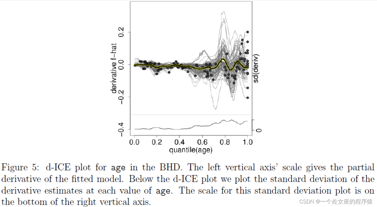
| As it can be difficult to visually assess derivatives from ICE plots, it is useful to plot an estimate of the partial derivative directly. The details of this procedure are given in Algorithm 2 in Appendix A. We call this a “derivative ICE” plot, or “d-ICE.” When no interactions are present in the fitted model, all curves in the d-ICE plot are equivalent, and the plot shows a single line. When interactions do exist, the derivative lines will be heterogeneous. As an example, consider the d-ICE plot for the RF model in Figure 5. The plot suggests that when age is below approximately 60, gl ≈ 0 for all observed values of xC . In contrast, when age is above 60 there are observations for which gl > 0 and others for which gl < 0, suggesting an interaction between age and the other predictors. Also, the standard deviation of the partial derivatives at each point, plotted in the lower panel, serves as a useful summary to highlight regions of heterogeneity in the estimated derivatives (i.e., potential evidence of interactions in the fitted model). |
由于很难从 ICE 图中直观地评估导数,因此直接绘制偏导数的估计值很有用。此过程的详细信息在附录 A 中的算法 2 中给出。我们称其为“导数 ICE”图或“d-ICE”。当拟合模型中不存在交互作用时,d-ICE 图中的所有曲线都是等效的,并且该图显示为一条线。当相互作用确实存在时,衍生线将是异构的。 例如,考虑图 5 中 RF 模型的 d-ICE 图。该图表明,当年龄低于大约 60 岁时,对于所有观察到的 xC 值,gl ≈ 0。相反,当年龄超过 60 岁时,观察到 gl > 0 和其他 gl < 0,这表明年龄和其他预测变量之间存在相互作用。此外,在下图中绘制的每个点的偏导数的标准差可作为有用的总结,以突出估计导数中的异质性区域(即拟合模型中相互作用的潜在证据)。 |
|
|
图 5:BHD 中年龄的 d-ICE 图。 左纵轴的刻度给出了拟合模型的偏导数。 在 d-ICE 图下方,我们绘制了每个年龄值的导数估计值的标准差。 此标准偏差图的比例位于右侧垂直轴的底部。 |
3.4 Visualizing a Second Feature
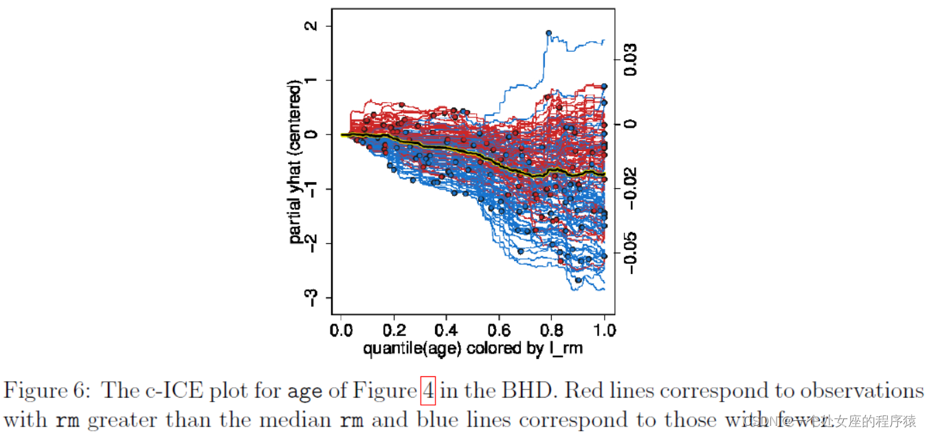
| Color allows overloading of ICE, c-ICE and d-ICE plots with information regarding a second predictor of interest xk . Specifically, one can assess how the second predictor influences the relationship between xS and fˆ. If xk is categorical, we assign colors to its levels and plot each prediction line fˆ(i) in the color of xik ’s level. If xk is continuous, we vary the color shade from light (low xk ) to dark (high xk ). We replot the c-ICE from Figure 4 with lines colored by a newly constructed predictor, x = 1(rm > median(rm)). Lines are colored red if the average number of rooms in a census tract is greater than the median number of rooms across all all census tracts and are colored blue otherwise. Figure 6 suggests that for census tracts with a larger number of average rooms, predicted median home price value is positively associated with age and for census tracts with a lesser number of average rooms, the association is negative. |
颜色允许 ICE、c-ICE 和 d-ICE 图重载,其中包含有关第二个感兴趣的预测变量 xk 的信息。具体来说,可以评估第二个预测变量如何影响 xS 和 f^ 之间的关系。如果 xk 是分类的,我们将颜色分配给它的级别,并以 xik 级别的颜色绘制每个预测线 f^(i)。如果 xk 是连续的,我们将色调从浅(低 xk)变为深(高 xk)。 我们重新绘制了图 4 中的 c-ICE,线条由新构建的预测器着色,x = 1(rm > 中值(rm))。如果人口普查区域的平均房间数大于所有人口普查区域的房间数中位数,则线条为红色,否则为蓝色。图 6 表明,对于平均房间数量较多的人口普查区域,预测的房价中值与年龄呈正相关,而对于平均房间数量较少的人口普查区域,该关联是负相关。 |
|
Figure 6: The c-ICE plot for age of Figure 4 in the BHD. Red lines correspond to observations with rm greater than the median rm and blue lines correspond to those with fewer. |
图 6:BHD 中图 4 年龄的 c-ICE 图。红线对应于 rm 大于中值 rm 的观测值,蓝线对应于较小的观测值。 |
4. Simulations
| Each of the following examples is designed to emphasize a particular model characteristic that the ICE toolbox can detect. To more clearly demonstrate given scenarios with minimal interference from issues that one typically encounters in actual data, such as noise and model misspecification, the examples are purposely stylized. |
以下每个示例都旨在强调 ICE 工具箱可以检测到的特定模型特征。 为了更清楚地展示给定场景,将实际数据中通常遇到的问题(例如噪声和模型错误指定)的干扰降至最低,特意对示例进行了程式化。 |
4.1 Additivity Assessment
| We begin by showing that ICE plots can be used as a diagnostic in evaluating the extent to which a fitted model fˆ fits an additive model. Consider again the prediction task in which fˆ(x) = g(xS ) + h(xC ). For arbitrary vectors |
我们首先展示了 ICE 图可以用作评估拟合模型 f^ 拟合加性模型的程度的诊断。 再次考虑 f^(x) = g(xS ) + h(xC ) 的预测任务。 对于任意向量 |
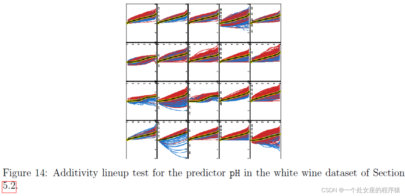
6.A Visual Test for Additivity
| Thus far we have used the ICE toolbox to explore the output of black box models. We have explored whether fˆ has additive structure or if interactions exist, and also examined fˆ’s extrapolations in X -space. To better visualize interactions, we plotted individual curves in colors according to the value of a second predictor xk . We have not asked whether these findings are reflective of phenomena in any underlying model. When heterogeneity in ICE plots is observed, the researcher can adopt two mindsets. When one considers fˆ to be the fitted model used for subsequent predictions, the heterogeneity is of interest because it determines future fitted values. This is the mindset we have considered thus far. Separately, it might be interesting to ascertain whether interactions between xS and xC exist in the data generating model, denoted f . This question exists for other discoveries made using ICE plots, but we focus here on interactions. |
到目前为止,我们已经使用 ICE 工具箱来探索黑盒模型的输出。我们已经探索了 f^ 是否具有加性结构或是否存在相互作用,并且还检查了 f^ 在 X 空间中的外推。为了更好地可视化交互,我们根据第二个预测变量 xk 的值用颜色绘制了单独的曲线。我们没有询问这些发现是否反映了任何基础模型中的现象。 当观察到 ICE 图中的异质性时,研究人员可以采用两种心态。当人们认为 f^ 是用于后续预测的拟合模型时,异质性是有意义的,因为它决定了未来的拟合值。这是我们迄今为止所考虑的心态。另外,确定数据生成模型中是否存在 xS 和 xC 之间的交互(表示为 f )可能会很有趣。这个问题存在于使用 ICE 图的其他发现中,但我们在这里关注交互。 |
| The problem of assessing the statistical validity of discoveries made by examining plots is addressed in Buja et al. (2009) and Wickham et al. (2010). The central idea in these papers is to insert the observed plot randomly into a lineup of null plots generated from data sampled under a null distribution. If the single real plot is correctly identified amongst 19 null plots, for example, then “the discovery can be assigned a p-value of 0.05” (Buja et al., 2009). A benefit of this approach is that the procedure is valid despite the fact that we have not specified the form of the alternative distribution — the simple instruction “find the plot that appears different” is sufficient. |
Buja 等人解决了通过检查图来评估发现的统计有效性的问题。 (2009) 和 Wickham 等人。 (2010)。这些论文的中心思想是将观察到的图随机插入到由在零分布下采样的数据生成的零图阵容中。例如,如果在 19 个空地块中正确识别出单个真实地块,则“可以为发现分配 0.05 的 p 值”(Buja 等人,2009 年)。这种方法的一个好处是尽管我们没有指定替代分布的形式,但该过程是有效的——简单的指令“找到看起来不同的图”就足够了。 |
6.1 Procedure
| We adapt this framework to the specific problem of using ICE plots to evaluate additivity in a statistically rigorous manner. For the exposition in this section, suppose that the response y is continuous, the covariates x are fixed, and y = f (x) + E . Further assume E [E ] = 0 and |
我们将此框架调整为使用 ICE 图以统计严格的方式评估可加性的具体问题。对于本节的说明,假设响应 y 是连续的,协变量 x 是固定的,并且 y = f (x) + E 。进一步假设 E [E ] = 0 并且 |
7. Discussion
|
Figure 14: Additivity lineup test for the predictor pH in the white wine dataset of Section 5.2. |
图 14:第 5.2 节白葡萄酒数据集中预测变量 pH 的可加性阵容测试。 |
| We developed a suite of tools for visualizing the fitted values generated by an arbitrary supervised learning procedure. Our work extends the classical partial dependence plot (PDP), which has rightfully become a very popular visualization tool for black-box machine learning output. The partial functional relationship, however, often varies conditionally on the values of the other variables. The PDP offers the average of these relationships and thus individual conditional relationships are consequently masked, unseen by the researcher. These individual conditional relationships can now be visualized, giving researchers additional insight into how a given black box learning algorithm makes use of covariates to generate predictions. The ICE plot, our primary innovation, plots an entire distribution of individual conditional expectation functions for a variable xS . Through simulations and real data examples,we illustrated much of what can be learned about the estimated model fˆ with the help of ICE. For instance, when the remaining features xC do not influence the association between xS and fˆ, all ICE curves lie on top of another. When fˆ is additive in functions of xC and xS , the curves lie parallel to each other. And when the partial effect of xS on fˆ is influenced by xC , the curves will differ from each other in shape. Additionally, by marking each curve at the xS value observed in the training data, one can better understand fˆ’s extrapolations.Sometimes these properties are more easily distinguished in the complementary “centered ICE” (c-ICE) and “derivative ICE” (d-ICE) plots. In sum, the suite of ICE plots provides a tool for visualizing an arbitrary fitted model’s map between predictors and predicted values. |
我们开发了一套工具,用于可视化由任意监督学习过程生成的拟合值。我们的工作扩展了经典的局部依赖图(PDP),它已经理所当然地成为黑盒机器学习输出的非常流行的可视化工具。然而,部分函数关系常常根据其他变量的值而有条件地变化。 PDP 提供了这些关系的平均值因此个体的条件关系因此被掩盖,被研究者看不到。这些单独的条件关系现在可以可视化,让研究人员进一步了解给定的黑盒学习算法如何利用协变量生成预测。 ICE 图是我们的主要创新,它绘制了变量 xS 的单个条件期望函数的整个分布。通过模拟和真实数据示例,我们说明了在 ICE 的帮助下可以了解的关于估计模型 f^ 的大部分内容。例如,当剩余特征 xC 不影响 xS 和 f^ 之间的关联时,所有 ICE 曲线都位于另一个之上。当 f^ 与 xC 和 xS 的函数相加时,曲线彼此平行。而当 xS 对 f^ 的部分影响受 xC 影响时,曲线的形状会有所不同。此外,通过在训练数据中观察到的 xS 值标记每条曲线,可以更好地理解 f^ 的外推。有时这些属性在互补的“居中 ICE”(c-ICE)和“导数 ICE”(d- ICE)地块。总之,ICE 图套件提供了一种工具,用于可视化预测变量和预测值之间的任意拟合模型的映射。 |
| The ICE suite has a number of possible uses that were not explored in this work. While we illustrate ICE plots using the same data as was used to fit fˆ, out-of-sample ICE plots could also be valuable. For instance, ICE plots generated from random vectors in Rp can be used to explore other parts of X space, an idea advocated by Plate et al. (2000). Further, for a single out-of-sample observation, plotting an ICE curve for each predictor can illustrate the sensitivity of the fitted value to changes in each predictor for this particular observation, which is the goal of the “contribution plots” of Strumbelj and Kononenko (2011). Addition- ally, investigating ICE plots from fˆ’s produced by multiple statistical learning algorithms can help the researcher compare models. Exploring other functionality offered by the ICEbox package, such as the ability to cluster ICE curves, is similarly left for subsequent research. The tools summarized thus far pertain to exploratory analysis. Many times the ICE toolbox provides evidence of interactions, but how does this evidence compare to what these plots would have looked like if no interactions existed? Section 6 proposed a testing methodology. By generating additive models from a null distribution and introducing the actual ICE plot into the lineup, interaction effects can be distinguished from noise, providing a test at a known level of significance. Future work will extend the testing methodology to other null hypotheses of interest. |
ICE 套件有许多可能的用途,但在这项工作中没有探讨。虽然我们使用与拟合 f^ 相同的数据来说明 ICE 图,但样本外的 ICE 图也可能很有价值。例如,从 Rp 中的随机向量生成的 ICE 图可用于探索 X 空间的其他部分,这是 Plate 等人提倡的想法。 (2000 年)。此外,对于单个样本外观察,为每个预测变量绘制 ICE 曲线可以说明拟合值对这个特定观察的每个预测变量变化的敏感性,这是 Strumbelj 的“贡献图”的目标和科诺年科(2011)。此外,调查由多种统计学习算法产生的 f^ 的 ICE 图可以帮助研究人员比较模型。探索 ICEbox 包提供的其他功能,例如聚类 ICE 曲线的能力,同样留待后续研究。 迄今为止总结的工具属于探索性分析。很多时候,ICE 工具箱提供了交互作用的证据,但与不存在交互作用时这些图的样子相比,这些证据又如何呢?第 6 节提出了一种测试方法。通过从零分布生成加性模型并将实际 ICE 图引入到阵容中,可以将交互效应与噪声区分开来,从而提供已知显着性水平的测试。未来的工作将把测试方法扩展到其他感兴趣的零假设。 |
Supplementary Materials
| The procedures outlined in Section 3 are implemented in the R package ICEbox available on CRAN. Simulated results, tables, and figures specific to this paper can be replicated via the script included in the supplementary materials. The depression data of Section 5.1 cannot be released due to privacy concerns. |
第 3 节中概述的程序在 CRAN 上可用的 R 包 ICEbox 中实现。本文特定的模拟结果、表格和图形可以通过补充材料中包含的脚本进行复制。出于隐私考虑,第 5.1 节的抑郁症数据无法发布。 |
Acknowledgements
| We thank Richard Berk for insightful comments on multiple drafts and suggesting color overloading. We thank Andreas Buja for helping conceive the testing methodology. We thank Abba Krieger for his helpful suggestions. We also wish to thank Zachary Cohen for the depression data of Section 5.1 and helpful comments. Alex Goldstein acknowledges support from the Simons Foundation Autism Research Initiative. Adam Kapelner acknowledges support from the National Science Foundation’s Graduate Research Fellowship Program. |
我们感谢 Richard Berk 对多个草稿的富有洞察力的评论并建议颜色重载。 我们感谢 Andreas Buja 帮助构思测试方法。 我们感谢 Abba Krieger 的有益建议。 我们还要感谢 Zachary Cohen 提供第 5.1 节的抑郁数据和有用的评论。 亚历克斯·戈德斯坦感谢西蒙斯基金会自闭症研究计划的支持。 Adam Kapelner 感谢美国国家科学基金会研究生研究奖学金计划的支持。 |
References
Bache, K. and Lichman, M. (2013). UCI machine learning repository.
Berk, R. and Bleich, J. (2013). Statistical procedures for forecasting criminal behavior: A comparative assessment. Criminology and Public Policy, 12:513–544.
Breiman, L. (2001a). Random Forests. Machine learning, pages 5–32.
Breiman, L. (2001b). Statistical Modeling: The Two Cultures. Statistical Science, 16(3):199– 231.
Breiman, L. and Friedman, J. (1985). Estimating Optimal Transformations for Multiple Regression and Correlation. Journal of the American Statistical Association, 80(391):580– 598.
Buja, A., Cook, D., Hofmann, H., Lawrence, M., Lee, E., Swayne, D., and Wickham,
H. (2009). Statistical inference for exploratory data analysis and model diagnostics. Philosophical transactions. Series A, Mathematical, physical, and engineering sciences, 367(1906):4361–83.
Chipman, H., George, E., and McCulloch, R. (2010). BART: Bayesian Additive Regressive Trees. The Annals of Applied Statistics, 4(1):266–298.
Elith, J., Leathwick, J., and Hastie, T. (2008). A working guide to boosted regression trees.
The Journal of Animal Ecology, 77(4):802–13.
Friedman, J. (2001). Greedy Function Approximation: A Gradient Boosting Machine. The Annals of Statistics, 29(5):1189–1232.
Friedman, J. (2002). Stochastic gradient boosting. Computational Statistics & Data Analysis, 38(4):367–378.
Green, D. and Kern, H. (2010). Modeling heterogeneous treatment effects in large-scale experiments using Bayesian Additive Regression Trees. In The annual summer meeting of the society of political methodology.
Hastie, T. (2013). GAM: Generalized Additive Models. R package version 1.09.
Hastie, T. and Tibshirani, R. (1986). Generalized additive models. Statistical Science, 1(3):297–310.
Hastie, T., Tibshirani, R., and Friedman, J. (2009). The Elements of Statistical Learning.
Springer Science, second edition.
Jakulin, A., Mozina, M., and Demsar, J. (2005). Nomograms for visualizing support vector machines. In KDD, pages 108–117.
Kapelner, A. and Bleich, J. (2014). bartMachine: Machine learning with bayesian additive regression trees. ArXiv e-prints.
Liaw, A. and Wiener, M. (2002). Classification and regression by randomforest. R News, 2(3):18–22.
Plate, T., Bert, J., Grace, J., and Band, P. (2000). Visualizing the function computed by a feedforward neural network. Neural computation, 12(6):1337–53.
Rao, J. and Potts, W. (1997). Visualizing Bagged Decision Trees. In KDD, pages 243–246. Ridgeway, G. (2013). GBM: Generalized Boosted Regression Models. R package version 2.0-8. Smith, J. and Everhart, J. (1988). Using the ADAP learning algorithm to forecast the onset
of diabetes mellitus. In Proceedings of the Symposium on Computer Applications and
Medical Care, pages 261–265. IEEE Computer Society Press.
Strumbelj, E. and Kononenko, I. (2011). A General Method for Visualizing and Explaining Black-Box Regression Models. In Dobnikar, A., Lotric, R., and Ster, B., editors, Adaptive and Natural Computing Algorithms, Part II, chapter 3, pages 21–30. Springer.
Tzeng, F. (2005). Opening the Black Box - Data Driven Visualization of Neural Networks.
In Visualization, pages 383–390. IEEE.
Venables, W. and Ripley, B. (2002). Modern Applied Statistics with S. Springer, New York, fourth edition.
Wickham, H., Cook, D., Hofmann, H., and Buja, A. (2010). Graphical Inference for Infovis.
IEEE Transactions on Visualization and Computer Graphics, 16(6):973–9.