四、浮动
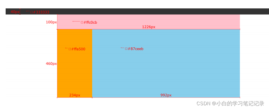
(案例)网页布局案例
➢ 需求:使用浮动,完成设计图中布局效果
<!DOCTYPE html>
<html lang="en">
<head>
    <meta charset="UTF-8">
    <meta http-equiv="X-UA-Compatible" content="IE=edge">
    <meta name="viewport" content="width=device-width, initial-scale=1.0">
    <title>Document</title>
    <style>
        * {


            margin: 0;
            padding: 0;
        }

        .top {


            /* 宽度高度背景色 */
            height: 40px;
            background-color: #333;
        }

        .header {


            width: 1226px;
            height: 100px;
            background-color: #ffc0cb;
            margin: 0 auto;
        }

        .content {


            width: 1226px;
            height: 460px;
            background-color: green;
            margin: 0 auto;
        }

        .left {


            float: left;

            width: 234px;
            height: 460px;
            background-color: #ffa500;


        }

        .right {


            float: left;

            width: 992px;
            height: 460px;
            background-color: #87ceeb;


        }

        /* CSS书写顺序: 浏览器执行效率更高
            1. 浮动 / display
            2. 盒子模型: margin border padding 宽度高度背景色
            3. 文字样式
        */
    </style>
</head>
<body>
    <!-- 通栏的盒子: 宽度和浏览器宽度一样大 -->
    <div class="top"></div>
    <div class="header">头部</div>
    <div class="content">
        <div class="left">left</div>
        <div class="right">right</div>
    </div>
</body>
</html>
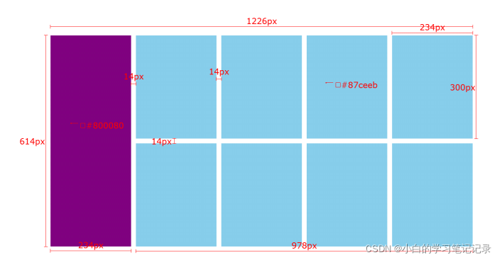
(案例)小米模块案例
➢ 需求:使用浮动,完成设计图中布局效果
<!DOCTYPE html>
<html lang="en">
<head>
    <meta charset="UTF-8">
    <meta http-equiv="X-UA-Compatible" content="IE=edge">
    <meta name="viewport" content="width=device-width, initial-scale=1.0">
    <title>Document</title>
    <style>
        * {


            margin: 0;
            padding: 0;
        }

        .box {


            margin: 0 auto;

            width: 1226px;
            height: 614px;
            /* background-color: pink; */
        }

        .left {


            float: left;

            width: 234px;
            height: 614px;
            background-color: #800080;
        }

        .right {


            float: right;

            width: 978px;
            height: 614px;
            /* background-color: green; */
        }

        ul {


            /* 去掉列表的符号 */
            list-style: none;
        }

        .right li {


            float: left;

            margin-right: 14px;
            margin-bottom: 14px;

            width: 234px;
            height: 300px;
            background-color: #87ceeb;
        }

        /* 如果父级的宽度不够, 子级会自动换行 */
        /* 第四个li和第八个li右侧间距清除 */
        .right li:nth-child(4n) {


            margin-right: 0;
        }
    </style>
</head>
<body>
    <div class="box">
        <div class="left"></div>
        <div class="right">
            <ul>
                <li></li>
                <li></li>
                <li></li>
                <li></li>
                <li></li>
                <li></li>
                <li></li>
                <li></li>
            </ul>
        </div>
    </div>
</body>
</html>
<!DOCTYPE html>
<html lang="en">
<head>
    <meta charset="UTF-8">
    <meta http-equiv="X-UA-Compatible" content="IE=edge">
    <meta name="viewport" content="width=device-width, initial-scale=1.0">
    <title>Document</title>
    <style>
        * {


            margin: 0;
            padding: 0;
        }

        .box {


            margin: 0 auto;

            width: 1226px;
            height: 614px;
            /* background-color: pink; */
        }

        .left {


            float: left;

            width: 234px;
            height: 614px;
            background-color: #800080;
        }

        .right {


            float: right;

            width: 978px;
            height: 614px;
            /* background-color: green; */
        }

        ul {


            /* 去掉列表的符号 */
            list-style: none;
        }

        .right li {


            float: left;

            margin-right: 14px;
            margin-bottom: 14px;

            width: 234px;
            height: 300px;
            background-color: #87ceeb;
        }

        /* 如果父级的宽度不够, 子级会自动换行 */
        /* 第四个li和第八个li右侧间距清除 */
        .right li:nth-child(4n) {


            margin-right: 0;
        }

    </style>
</head>
<body>
    <div class="box">
        <div class="left"></div>
        <div class="right">
            <ul>
                <li></li>
                <li></li>
                <li></li>
                <li></li>
                <li></li>
                <li></li>
                <li></li>
                <li></li>
            </ul>
        </div>
    </div>
</body>
</html>
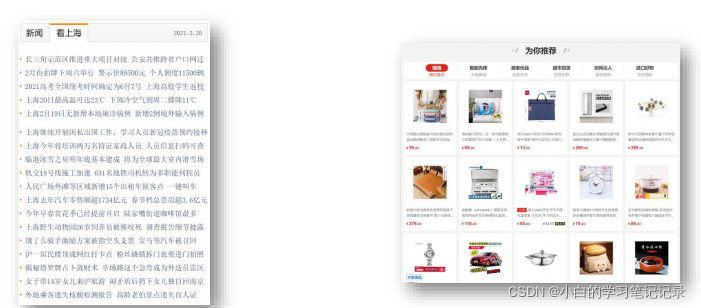
(案例)网页导航案例
➢ 需求:使用浮动,完成设计图中布局效果

<!DOCTYPE html>
<html lang="en">
<head>
    <meta charset="UTF-8">
    <meta http-equiv="X-UA-Compatible" content="IE=edge">
    <meta name="viewport" content="width=device-width, initial-scale=1.0">
    <title>Document</title>
    <style>
        * {


            margin: 0;
            padding: 0;
        }

        .nav {


            margin: 50px auto;
            width: 640px;
            height: 50px;
            background-color: #ffc0cb;
        }

        ul {


            list-style: none;
        }

        .nav li {


            float: left;
        }

        .nav li a {


            /* 1. 浮动 / display */
            /* display: inline-block; */
            display: block;

            /* 2. 盒子模型 */
            width: 80px;
            height: 50px;
            /* background-color: green; */

            /* 3. 文字样式 */
            text-align: center;
            line-height: 50px;
            color: #fff;
            text-decoration: none;
        }

        .nav li a:hover {


            background-color: green;
        }
    </style>
</head>
<body>
    <!-- 导航 -->
    <div class="nav">
        <ul>
            <li><a href="#">新闻</a></li>
            <li><a href="#">新闻</a></li>
            <li><a href="#">新闻</a></li>
            <li><a href="#">新闻</a></li>
            <li><a href="#">新闻</a></li>
            <li><a href="#">新闻</a></li>
            <li><a href="#">新闻</a></li>
            <li><a href="#">新闻</a></li>
        </ul>
    </div>
</body>
</html>
书写网页导航步骤:
- 清除默认的margin和padding
- 找到ul,去除小圆点
- 找到li标签,设置浮动让li一行中显示
- 找到a标签,设置宽高 → a标签默认是行内元素,默认不能设置宽高??
• 方法一:给a标签设置 display : inline-block
• 方法二:给a标签设置 display : block
• 方法三:给a设置 float : left
display:inline-block;
display:block;float:left;
五、清除浮动
目标:能够认识 清除浮动的目的,并且能够使用 清除浮动的方法
学习路径:
- 清除浮动的介绍
- 清除浮动的方法
1.1 清除浮动的介绍
➢ 含义:清除浮动带来的影响
• 影响:如果子元素浮动了,此时子元素不能撑开标准流的块级父元素
➢ 原因:
• 子元素浮动后脱标 → 不占位置
➢ 目的:
• 需要父元素有高度,从而不影响其他网页元素的布局
清楚浮动带来的影响,影响,如果子元素浮动了,这个时候子元素不能撑开标准流的块级父元素子元素浮动后脱标-》不占位置
需要父元素有高度,从而不影响其他网页元素的布局
小结
➢ 清除浮动的含义是什么?
• 清除浮动带来的影响
• 影响:如果子元素浮动了,此时子元素不能撑开父元素
➢ 清除浮动的目的是什么?
• 需要父元素有高度,从而不影响其他网页元素的布局
如果子元素浮动了,这个时候子元素不能撑开标准流的块级父元素
<!DOCTYPE html>
<html lang="en">
<head>
    <meta charset="UTF-8">
    <meta http-equiv="X-UA-Compatible" content="IE=edge">
    <meta name="viewport" content="width=device-width, initial-scale=1.0">
    <title>Document</title>
    <style>
        .top {


            margin: 0 auto;
            width: 1000px;
            /* height: 300px; */
            background-color: pink;
        }

        .bottom {


            height: 100px;
            background-color: green;
        }

        .left {


            float: left;
            width: 200px;
            height: 300px;
            background-color: #ccc;
        }

        .right {


            float: right;
            width: 790px;
            height: 300px;
            background-color: skyblue;
        }
    </style>
</head>
<body>
    <!-- 父子级标签, 子级浮动, 父级没有高度, 后面的标准流盒子会受影响, 显示到上面的位置 -->
    <div class="top">
        <div class="left"></div>
        <div class="right"></div>
    </div>
    <div class="bottom"></div>
</body>
</html>
2.1 清除浮动的方法 — ① 直接设置父元素高度
清楚浮动的方法直接设置父元素的高度
➢ 特点:
• 优点:简单粗暴,方便
• 缺点:有些布局中不能固定父元素高度。如:新闻列表、京东推荐模块
2.2 清除浮动的方法 — ② 额外标签法
➢ 操作:
- 在父元素内容的最后添加一个块级元素
- 给添加的块级元素设置 clear:both
➢ 特点:
• 缺点:会在页面中添加额外的标签,会让页面的HTML结构变得复杂
在父元素内容的最后添加一个块级元素,给添加的块级元素设置clear:both
会在页面当中添加额外的标签,会让页面的HTML结构变得复杂
2.3 清除浮动的方法 — ③ 单伪元素清除法
➢ 操作:用伪元素替代了额外标签
① :基本写法
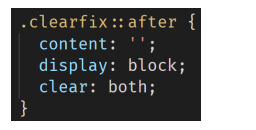
② :补充写法
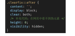
.clearfix::after{content:’’;display:block;clear:botn;height:0;visibility:hidden;
}{
➢ 特点:
• 优点:项目中使用,直接给标签加类即可清除浮动
<!DOCTYPE html>
<html lang="en">
<head>
    <meta charset="UTF-8">
    <meta http-equiv="X-UA-Compatible" content="IE=edge">
    <meta name="viewport" content="width=device-width, initial-scale=1.0">
    <title>Document</title>
    <style>
        .top {


            margin: 0 auto;
            width: 1000px;
            /* height: 300px; */
            background-color: pink;
        }

        .bottom {


            height: 100px;
            background-color: green;
        }

        .left {


            float: left;
            width: 200px;
            height: 300px;
            background-color: #ccc;
        }

        .right {


            float: right;
            width: 790px;
            height: 300px;
            background-color: skyblue;
        }

        .clearfix {


            /* 清除左右两侧浮动的影响 */
            clear: both;
        }
    </style>
</head>
<body>
    <!-- 父子级标签, 子级浮动, 父级没有高度, 后面的标准流盒子会受影响, 显示到上面的位置 -->
    <div class="top">
        <div class="left"></div>
        <div class="right"></div>
        <div class="clearfix"></div>
    </div>
    <div class="bottom"></div>
</body>
</html>
。clearfix{clear:both;}
.clearfix{clear:both;}
<!DOCTYPE html>
<html lang="en">
<head>
    <meta charset="UTF-8">
    <meta http-equiv="X-UA-Compatible" content="IE=edge">
    <meta name="viewport" content="width=device-width, initial-scale=1.0">
    <title>Document</title>
    <style>
        .top {


            margin: 0 auto;
            width: 1000px;
            /* height: 300px; */
            background-color: pink;
        }

        .bottom {


            height: 100px;
            background-color: green;
        }

        .left {


            float: left;
            width: 200px;
            height: 300px;
            background-color: #ccc;
        }

        .right {


            float: right;
            width: 790px;
            height: 300px;
            background-color: skyblue;
        }

        /* 单伪元素清除浮动 和 额外标签法原理是一样的 */
        .clearfix::after {


            content: '';

            /* 伪元素添加的标签是行内, 要求块 */
            display: block;
            clear: both;

            /* 为了兼容性 */
            height: 0;
            visibility: hidden;
        }
    </style>
</head>
<body>
    <!-- 父子级标签, 子级浮动, 父级没有高度, 后面的标准流盒子会受影响, 显示到上面的位置 -->
    <div class="top clearfix">
        <div class="left"></div>
        <div class="right"></div>
        <!-- 通过css 添加标签 -->
    </div>
    <div class="bottom"></div>
</body>
</html>
。clearfix::before作用解决外边距塌陷的问题
.clear
2.4 清除浮动的方法 — ④ 双伪元素清除法
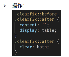
➢ 特点:
• 优点:项目中使用,直接给标签加类即可清除浮动
项目当中使用,直接给标签加类就可以清楚浮动
2.5 清除浮动的方法 — ⑤ 给父元素设置overflow : hidden
➢ 操作:
- 直接给父元素设置 overflow : hidden
➢ 特点:
• 优点:方便