Android深度定制化TabLayout:圆角,渐变色,背景边框,圆角渐变下划线,基于Android原生TabLayout
在附录1的基础上丰富自定义的TabLayout,这次增加两个内容:
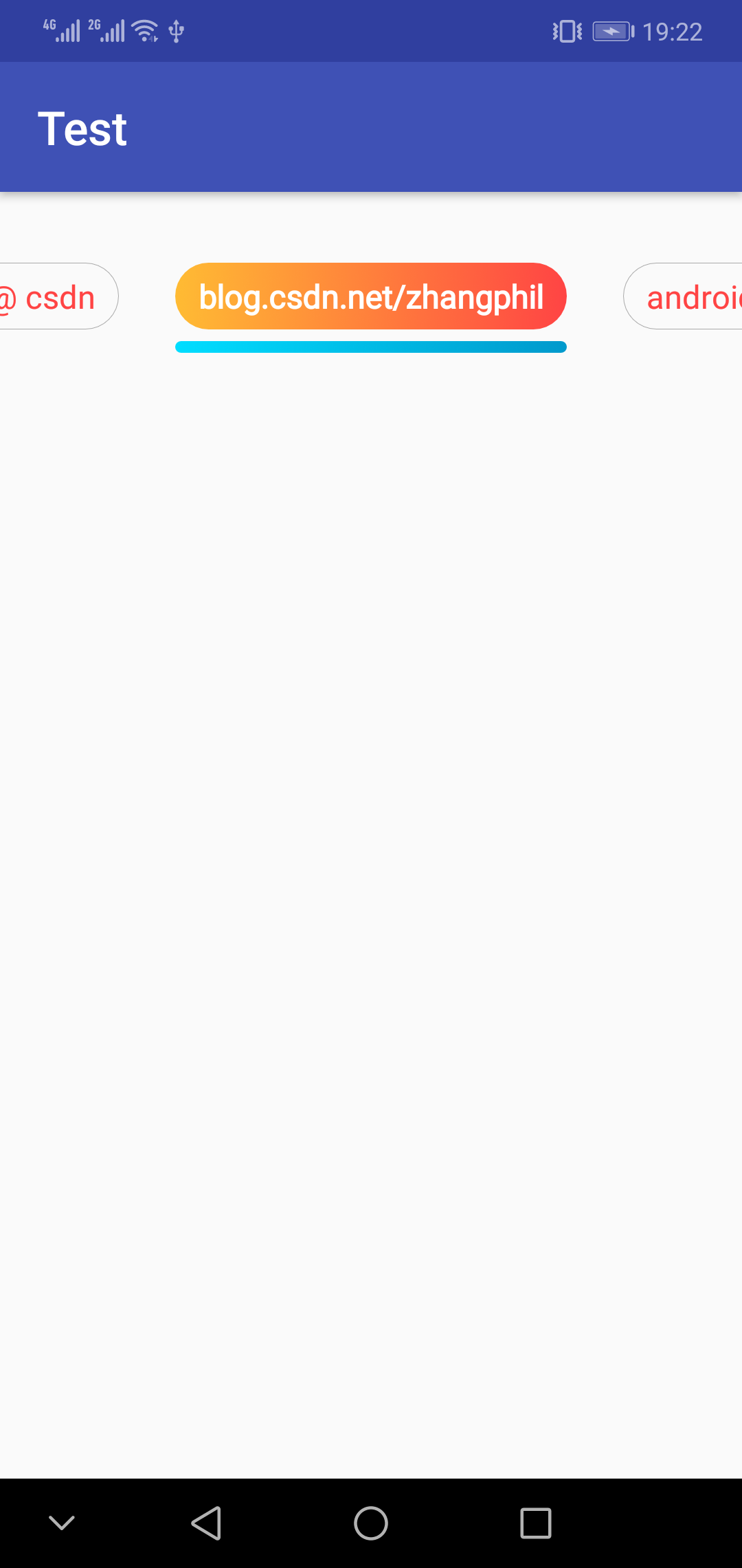
1, 当选中某一个切换卡时候,文本字体变粗。
2,增加下划线指示器,并且下划线指示器是渐变圆角的。下划线从右往左,从浅蓝变深蓝。
实现效果如图所示:

继承自Android原生TabLayout的MyTabLayout.java:
package zhangphil.test;

import android.content.Context;
import android.graphics.Color;
import android.support.design.widget.TabLayout;
import android.text.TextPaint;
import android.util.AttributeSet;
import android.widget.ImageView;
import android.widget.TextView;

import java.util.ArrayList;
import java.util.List;


public class MyTabLayout extends TabLayout {
    private List<String> titles;

    public MyTabLayout(Context context) {
        super(context);
        init();
    }

    public MyTabLayout(Context context, AttributeSet attrs) {
        super(context, attrs);
        init();
    }

    public MyTabLayout(Context context, AttributeSet attrs, int defStyleAttr) {
        super(context, attrs, defStyleAttr);
        init();
    }

    private void init() {
        titles = new ArrayList<>();

        this.addOnTabSelectedListener(new TabLayout.OnTabSelectedListener() {

            @Override
            public void onTabSelected(Tab tab) {
                /**
                 * 设置当前选中的Tab为特殊高亮样式。
                 */
                if (tab != null && tab.getCustomView() != null) {
                    TextView tab_text = tab.getCustomView().findViewById(R.id.tab_text);

                    TextPaint paint = tab_text.getPaint();
                    paint.setFakeBoldText(true);

                    tab_text.setTextColor(Color.WHITE);
                    tab_text.setBackgroundResource(R.drawable.tablayout_item_pressed);

                    ImageView tab_layout_indicator = tab.getCustomView().findViewById(R.id.tab_indicator);
                    tab_layout_indicator.setBackgroundResource(R.drawable.tablayout_item_indicator);
                }
            }

            @Override
            public void onTabUnselected(Tab tab) {
                /**
                 * 重置所有未选中的Tab颜色、字体、背景恢复常态(未选中状态)。
                 */
                if (tab != null && tab.getCustomView() != null) {
                    TextView tab_text = tab.getCustomView().findViewById(R.id.tab_text);

                    tab_text.setTextColor(getResources().getColor(android.R.color.holo_red_light));
                    TextPaint paint = tab_text.getPaint();
                    paint.setFakeBoldText(false);
                    tab_text.setBackgroundResource(R.drawable.tablayout_item_normal);

                    ImageView tab_indicator = tab.getCustomView().findViewById(R.id.tab_indicator);
                    tab_indicator.setBackgroundResource(0);
                }
            }

            @Override
            public void onTabReselected(Tab tab) {

            }
        });
    }

    public void setTitle(List<String> titles) {
        this.titles = titles;

        /**
         * 开始添加切换的Tab。
         */
        for (String title : this.titles) {
            Tab tab = newTab();
            tab.setCustomView(R.layout.tablayout_item);

            if (tab.getCustomView() != null) {
                TextView tab_text = tab.getCustomView().findViewById(R.id.tab_text);
                tab_text.setText(title);
            }

            this.addTab(tab);
        }
    }
}
在onTabSelected中把选中的tab的文本变粗变成白色。同时设置下划线指示器可见。涉及到的下划线res/drawable/tablayout_item_indicator.xml:
<?xml version="1.0" encoding="utf-8"?>
<shape xmlns:android="http://schemas.android.com/apk/res/android"
    android:shape="rectangle">

    <corners android:radius="50dp" />

    <gradient
        android:angle="180"
        android:endColor="@android:color/holo_blue_bright"
        android:startColor="@android:color/holo_blue_dark"
        android:type="linear" />
</shape>
是一个由右往左渐变的颜色圆角背景shape.
在MyTabLayout的setTitle中,为该切换View增加的res/layout/tablayout_item.xml:
<?xml version="1.0" encoding="utf-8"?>
<LinearLayout xmlns:android="http://schemas.android.com/apk/res/android"
    android:layout_width="wrap_content"
    android:layout_height="wrap_content"
    android:orientation="vertical">

    <TextView xmlns:android="http://schemas.android.com/apk/res/android"
        android:id="@+id/tab_text"
        android:layout_width="wrap_content"
        android:layout_height="wrap_content"
        android:background="@drawable/tablayout_item_normal"
        android:gravity="center"
        android:paddingBottom="5dp"
        android:paddingLeft="10dp"
        android:paddingRight="10dp"
        android:paddingTop="5dp"
        android:textColor="@android:color/holo_red_light"
        android:textSize="14dp"></TextView>

    <ImageView
        android:id="@+id/tab_indicator"
        android:layout_width="match_parent"
        android:layout_height="5dp"
        android:layout_gravity="center_horizontal"
        android:layout_marginTop="5dp" />
</LinearLayout>
res/layout/tablayout_item.xml为每一个添加到切换条上的其中一个选项tab。它使用了默认的(未选中)的背景资源作为未选中时候的背景res/drawable/tablayout_item_normal.xml:
<?xml version="1.0" encoding="utf-8"?>
<shape xmlns:android="http://schemas.android.com/apk/res/android"
    android:shape="rectangle">
    <corners android:radius="50dp" />

    <stroke
        android:width="1px"
        android:color="@android:color/darker_gray" />
</shape>
res/drawable/tablayout_item_normal.xml其实是一个简单的有圆角边框的shape,没有选中的tab将以此作为背景资源。
当选中了某一个tab时候,把一个具有颜色到的背景资源文件作为tab的背景衬上去res/drawable/tablayout_item_pressed.xml:
<?xml version="1.0" encoding="utf-8"?>
<shape xmlns:android="http://schemas.android.com/apk/res/android"
    android:shape="rectangle">

    <corners android:radius="50dp" />

    <gradient
        android:angle="180"
        android:endColor="@android:color/holo_orange_light"
        android:startColor="@android:color/holo_red_light"
        android:type="linear" />
</shape>
这其实就是一个具有橙红色从右往左渐变的圆角背景。
具体使用和Android的原生TabLayout一致,写到xml布局里面:
扫描二维码关注公众号,回复:
1373357 查看本文章

<?xml version="1.0" encoding="utf-8"?>
<LinearLayout xmlns:android="http://schemas.android.com/apk/res/android"
    xmlns:app="http://schemas.android.com/apk/res-auto"
    android:layout_width="match_parent"
    android:layout_height="match_parent"
    android:orientation="vertical">

    <zhangphil.test.MyTabLayout
        android:id="@+id/tab_layout"
        android:layout_width="match_parent"
        android:layout_height="100dp"
        app:tabIndicatorHeight="0dp"
        app:tabMode="scrollable" />

</LinearLayout>
上层Java代码:
package zhangphil.test;

import android.os.Bundle;
import android.support.annotation.Nullable;
import android.support.v7.app.AppCompatActivity;

import java.util.Arrays;
import java.util.List;

public class TabActivity extends AppCompatActivity {

    @Override
    protected void onCreate(@Nullable Bundle savedInstanceState) {
        super.onCreate(savedInstanceState);
        setContentView(R.layout.tab_avtivity);

        String[] str = {"zhang", "phil", "zhang phil", "csdn", "zhang phil csdn", "zhang phil @ csdn", "blog.csdn.net/zhangphil", "android"};

        List<String> titles = Arrays.asList(str);

        MyTabLayout tabLayout = findViewById(R.id.tab_layout);
        tabLayout.setTitle(titles);
    }
}
代码运行结果就是前文的配图。
附录:1,《Android深度定制化TabLayout:圆角,渐变色,背景边框,基于Android原生TabLayout》链接:https://blog.csdn.net/zhangphil/article/details/80489089