implementing PCA
前言
PCA,即主成分分析,是流行的降维算法(无监督学习算法),其主要应用有
- 减小数据集的特征维度,从而减小内存或者磁盘储存的消耗
- 提升算法效率,加快算法的运行
- 将数据集的特征维度减小到3维及以下,方便可视化

代码分析
首先导入类库
import numpy as np
import matplotlib.pyplot as plt
import scipy.io #Used to load the OCTAVE *.mat files
from random import sample #Used for random initialization
import scipy.misc #Used to show matrix as an image
import matplotlib.cm as cm #Used to display images in a specific colormap
from scipy import linalg #Used for the "SVD" function
import imageio
from mpl_toolkits.mplot3d import Axes3D

%matplotlib inline
导入数据并可视化
datafile = 'data/ex7data1.mat'
mat = scipy.io.loadmat( datafile )
X = mat['X']

#Quick plot
plt.figure(figsize=(7,5))
plot = plt.scatter(X[:,0], X[:,1], s=30, facecolors='none', edgecolors='b')
plt.title("Example Dataset",fontsize=18)
plt.grid(True)

下面开始编写PCA算法
数据集标准化函数
def featureNormalize(myX):
    means = np.mean(myX,axis=0)#对每列求均值
    myX_norm = myX - means
    stds  = np.std(myX_norm,axis=0)#对每列求标准差σ
    myX_norm = myX_norm / stds
    return means, stds, myX_norm
奇异值分解(SVD)函数,得到矩阵U,S,V
#SVD singular value decomposition
def getUSV(myX_norm):
    #求协方差矩阵
    cov_matrix = myX_norm.T.dot(myX_norm)/myX_norm.shape[0]
    # Run single value decomposition to get the U principal component matrix
    U, S, V = scipy.linalg.svd(cov_matrix, full_matrices = True, compute_uv = True)
    return U, S, V
好了,算法编写完毕
调用算法,得到参数
# Feature normalize
means, stds, X_norm = featureNormalize(X)
# Run SVD
U, S, V = getUSV(X_norm)
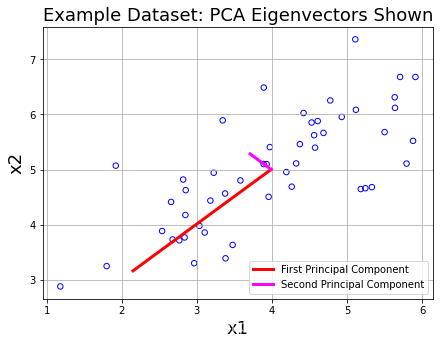
将principal component可视化
print('Top principal component is ',U[:,0])

#快速绘图,现在包括主成分
plt.figure(figsize=(7,5))
plot = plt.scatter(X[:,0], X[:,1], s=30, facecolors='none', edgecolors='b')
plt.title("Example Dataset: PCA Eigenvectors Shown",fontsize=18)
plt.xlabel('x1',fontsize=18)
plt.ylabel('x2',fontsize=18)
plt.grid(True)

#绘制主要组成部分
#means是数据集的中点,S的是主要成分的主要程度
plt.plot([means[0], means[0] + 1.5*S[0]*U[0,0]],
         [means[1], means[1] + 1.5*S[0]*U[0,1]],
        color='red',linewidth=3,
        label='First Principal Component')
plt.plot([means[0], means[0] + 1.5*S[1]*U[1,0]],
         [means[1], means[1] + 1.5*S[1]*U[1,1]],
        color='fuchsia',linewidth=3,
        label='Second Principal Component')

leg = plt.legend(loc=4)
如下图所示,红色的线段为最主要的component,洋红色的线段其次
下面调用算法,观察投影点情况
计算X在U_reduce上的投影点的向量
def projectData(myX, myU, K):
    Ureduced = myU[:,:K]
    z = myX.dot(Ureduced)
    return z
调用投影函数,得到一个二维样本点投影得到的一维坐标
#z为X在U_reduce上的投影点的向量(即投影点,一维)
z = projectData(X_norm,U,1)
print('Projection of the first example is %0.3f.'%float(z[0]))
Projection of the first example is 1.496.
下面进行原始数据的重构,即根据降维后的数据重构原始数据
重构函数
#原始数据的重构,返回 x_approx
#由于投影点z是一维的,不方便可视化,故转化为x_approx
def recoverData(myZ, myU, K):
    Ureduced = myU[:,:K]
    Xapprox = myZ.dot(Ureduced.T)
    return Xapprox
测试
X_rec = recoverData(z,U,1)
print('Recovered approximation of the first example is ',X_rec[0])
Recovered approximation of the first example is [-1.05805279 -1.05805279]
得到了重构的二维原始数据
下面可视化投影过程
#Quick plot, now drawing projected points to the original points
plt.figure(figsize=(7,5))
#绘制原始散点图
plot = plt.scatter(X_norm[:,0], X_norm[:,1], s=30, facecolors='none',
                   edgecolors='b',label='Original Data Points')
#绘制投影后的散点图
plot = plt.scatter(X_rec[:,0], X_rec[:,1], s=30, facecolors='none',
                   edgecolors='r',label='PCA Reduced Data Points')

plt.title("Example Dataset: Reduced Dimension Points Shown",fontsize=14)
plt.xlabel('x1 [Feature Normalized]',fontsize=14)
plt.ylabel('x2 [Feature Normalized]',fontsize=14)
plt.grid(True)

for x in range(X_norm.shape[0]):
    #绘制样本点和投影点的连线
    plt.plot([X_norm[x][0],X_rec[x][0]],[X_norm[x][1],X_rec[x][1]],'k--')

leg = plt.legend(loc=4)

#Force square axes to make projections look better
dummy = plt.xlim((-2.5,2.5))
dummy = plt.ylim((-2.5,2.5))

Face Image Dataset
前言
代码分析
导入数据
datafile = 'data/ex7faces.mat'
mat = scipy.io.loadmat( datafile )
X = mat['X']
编写将numpy数组可视化的函数
#传入一张图片(1024,1)numpy数组,转化为(32,32)
def getDatumImg(row):
    width, height = 32, 32
    square = row.reshape(width,height)
    return square.T

#可视化数据
def displayData(myX, mynrows = 10, myncols = 10):
    width, height = 32, 32
    nrows, ncols = mynrows, myncols
    #大图片
    big_picture = np.zeros((height*nrows,width*ncols))

    irow, icol = 0, 0
    for idx in range(nrows*ncols):#每10张图片换行一次,遍历100张图片
        if icol == ncols:
            irow += 1
            icol  = 0
        iimg = getDatumImg(myX[idx])#读取图片的numpy数组(32,32)
        big_picture[irow*height:irow*height+iimg.shape[0],icol*width:icol*width+iimg.shape[1]] = iimg
        icol += 1
    fig = plt.figure(figsize=(10,10))
    plt.imshow(big_picture,cmap ='gray')
测试
displayData(X)

下面调用PCA算法对图片进行降维
# Feature normalize
means, stds, X_norm = featureNormalize(X)
# Run SVD
U, S, V = getUSV(X_norm)
得到矩阵U,由于矩阵U的每一个向量都是数据集的特征向量,注意到每个特征向量刚好满足(1024,1),与图片(32x32)格式相同,于是我们尝试可视化前36个principal component
# Visualize the top 36 eigenvectors found
#将前36个principal component可视化
displayData(U[:,:36].T,mynrows=6,myncols=6)

然后,我们再对图像进行降维,复原测试
1024维降到36维度
# Project each image down to 36 dimensions
#将每个图像投影到36维
#这里的k可以从1到1024(32x32)

#U中包含了所有特征向量,我们可以自行决定要降维到几维,只不过数据方差尽量维持在99%以上
z = projectData(X_norm, U, K=36)
36维度复原为图片
# Attempt to recover the original data
X_rec = recoverData(z, U, K=36)
可视化
# Plot the dimension-reduced data
displayData(X_rec)

1024维降到500维度
z = projectData(X_norm, U, K=500)
500维度复原为图片
X_rec = recoverData(z, U, K=500)
可视化
displayData(X_rec)

可见降维要选择合适的维度,保证数据方差 ≥ \ge ≥ 99%
PCA for visualization
前言
在上次作业有一个图片压缩问题,采用K-means聚类算法,将成千上万种颜色聚类为16种,因为像素点为三维数据(red,green,bule),散落在三维RGB空间,我们当然可以将其可视化
但是三维空间的可视化较为臃肿,这里就可以用PCA算法将数据集降维到2维,从而轻松进行可视化了
代码分析
首先,我们先三维可视化样本点
subX = []
#遍历cluster,将样本点(像素)按颜色分类装入subX中
for x in range(len(np.unique(idxs))):
    subX.append(np.array([A[i] for i in range(A.shape[0]) if idxs[i] == x]))

fig = plt.figure()
ax = Axes3D(fig)
#ax.legend(loc='best')
ax.set_zlabel('Z', fontdict={

    'size': 15, 'color': 'red'})
ax.set_ylabel('Y', fontdict={

    'size': 15, 'color': 'red'})
ax.set_xlabel('X', fontdict={

    'size': 15, 'color': 'red'})

for x in range(len(subX)):
    newX = subX[x]
    # 绘制散点图
    ax.scatter(newX[:,0], newX[:,1], newX[:,2])

然后我们运行PCA算法
# Feature normalize
#标准化特征
means, stds, A_norm = featureNormalize(A)
# Run SVD
U, S, V = getUSV(A_norm)
将x(三维)降维得到z(二维)
# Use PCA to go from 3->2 dimensions
z = projectData(A_norm,U,2)
下面进行二维可视化
# Make the 2D plot
subX = []
#遍历cluster,将样本点(像素)按颜色分类装入subX中
for x in range(len(np.unique(idxs))):
    subX.append(np.array([z[i] for i in range(A.shape[0]) if idxs[i] == x]))

fig = plt.figure(figsize=(8,8))
for x in range(len(subX)):
    newX = subX[x]
    plt.plot(newX[:,0],newX[:,1],'.',alpha=0.3)

plt.xlabel('z1',fontsize=14)
plt.ylabel('z2',fontsize=14)
plt.title('PCA Projection Plot',fontsize=16)
plt.grid(True)


PCA算法完美完成降维任务,实现了降维打击,实现了可视化
数据集
ex7data1.mat
ex7faces.mat
这里偷个懒,数据可以上kaggle查