居中效果在CSS中很是普通的效果,居中效果主要分为三大类:水平居中、垂直居中和水平垂直居中。
常用的水平居中的实现方案如下,给定一个显示的宽度,将margin左右值设置为auto。如下:
.textCenter {


    width: 1000px;
    margin-left: auto;
    margin-right: auto;
}
但是在很多情况之下,我们是无法确定元素容器的宽度。当未有明确宽度的时候,上面的方法便无法让我们实现元素水平居中。
废话不话,设计一个页面效果如下:

HTML:
<div class="pagination">
        <ul>
            <li><a href="#">Prev</a></li>
            <li><a href="#">1</a></li>
            <li><a href="#">2</a></li>
            <li><a href="#">3</a></li>
            <li><a href="#">4</a></li>
            <li><a href="#">5</a></li>
            <li><a href="#">Next</a></li>
        </ul>
        </div>
CSS:
.pagination li {


            line-height: 25px;
            display: inline;
        }

        .pagination a {


            text-decoration: none;
            display: block;
            color: #f2f2f2;
            text-shadow: 1px 0 0 #101011;
            padding: 0 10px;
            border-radius: 2px;
            box-shadow: 0 1px 0 #5a5b5c inset, 0 1px 0 #080808;
            background: linear-gradient(#434345, #2f3032);
        }

        .pagination a:hover {


            text-decoration: none;
            box-shadow: 0 1px 0 #f9bd71 inset, 0 1px 0 #0a0a0a;
            background: linear-gradient(#f48b03, #c87100);
        }
总共举例4个例子,实现元素水平垂直居中。
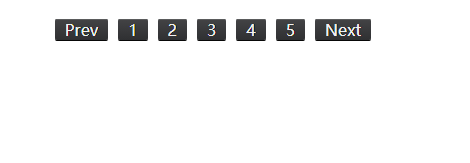
1.inline-block实现水平居中方法
仅inline-block属性是无法让元素水平居中,他的关键之处要在元素的父容器中设置text-align的属性为“center”,这样才能达到效果:
.pagination {


            text-align: center;
            font-size: 0;
            letter-spacing: -4px;
            word-spacing: -4px;
        }

        .pagination li {


            line-height: 25px;
            margin: 0 5px;
            display: inline-block;
            *display: inline;
            zoom: 1;
            letter-spacing: normal;
            word-spacing: normal;
            font-size: 12px;
        }

        .pagination a {


            text-decoration: none;
            display: block;
            color: #f2f2f2;
            text-shadow: 1px 0 0 #101011;
            padding: 0 10px;
            border-radius: 2px;
            box-shadow: 0 1px 0 #5a5b5c inset, 0 1px 0 #080808;
            background: linear-gradient( #434345, #2f3032);
        }

        .pagination a:hover {


            text-decoration: none;
            box-shadow: 0 1px 0 #f9bd71 inset, 0 1px 0 #0a0a0a;
            background: linear-gradient(#f48b03, #c87100);
        }
页面如下:
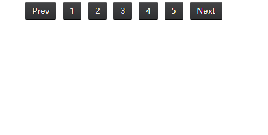
2.浮动实现水平居中的方法
其实浮动也可用来实现水平居中。
.pagination {


            float: left;
            width: 100%;
            overflow: hidden;
            position: relative;
        }

        .pagination ul {


            clear: left;
            float: left;
            position: relative;
            left: 50%;
            /*向右边移动宽度的50%*/
            text-align: center;
        }

        .pagination li {


            line-height: 25px;
            margin: 0 5px;
            display: block;
            float: left;
            position: relative;
            right: 50%;
            /*向左边移动宽度的50%*/
        }

        .pagination a {


            text-decoration: none;
            display: block;
            color: #f2f2f2;
            text-shadow: 1px 0 0 #101011;
            padding: 0 10px;
            border-radius: 2px;
            box-shadow: 0 1px 0 #5a5b5c inset, 0 1px 0 #080808;
            background: linear-gradient(#434345, #2f3032);
        }

        .pagination a:hover {


            text-decoration: none;
            box-shadow: 0 1px 0 #f9bd71 inset, 0 1px 0 #0a0a0a;
            background: linear-gradient(#f48b03, #c87100);
        }
页面如下:
这种方法实现和前面的与众不同,使用了浮动配合position定位实现。
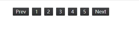
3.fit-content实现水平居中方法
“fit-content”是CSS中给“width”属性新加的一个属性值,他配合margin可以轻松的实现水平居中的效果:
 .pagination ul {


            width: -moz-fit-content;
            width: -webkit-fit-content;
            width: fit-content;
            margin-left: auto;
            margin-right: auto;
        }

        .pagination li {


            line-height: 25px;
            margin: 0 5px;
            float: left;
        }

        .pagination li {


            line-height: 25px;
            margin: 0 5px;
            float: left;
            display: inline;
        }

        .pagination a {


            text-decoration: none;
            display: block;
            color: #f2f2f2;
            text-shadow: 1px 0 0 #101011;
            padding: 0 10px;
            border-radius: 2px;
            box-shadow: 0 1px 0 #5a5b5c inset, 0 1px 0 #080808;
            background: linear-gradient(#434345, #2f3032);
        }

        .pagination a:hover {


            text-decoration: none;
            box-shadow: 0 1px 0 #f9bd71 inset, 0 1px 0 #0a0a0a;
            background: linear-gradient(#f48b03, #c87100);
        }
页面如下:
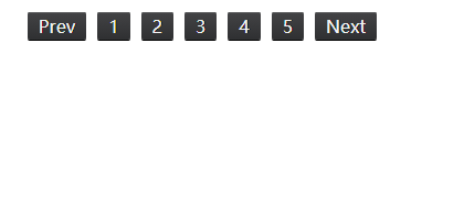
4.flex实现水平居中方法
CSS3的flex是一个很强大的功能,她能让我们的布局变得更加灵活与方便,唯一的就是目前浏览器的兼容性较差。
.pagination {


            display: flex;
            flex-wrap:nowrap;
            justify-content:center;
        }

        .pagination li {


            line-height: 25px;
            margin: 0 5px;
            float: left;
            display: inline;
        }

        .pagination a {


            text-decoration: none;
            /* display: block; */
            color: #f2f2f2;
            text-shadow: 1px 0 0 #101011;
            padding: 0 10px;
            border-radius: 2px;
            box-shadow: 0 1px 0 #5a5b5c inset, 0 1px 0 #080808;
            background: linear-gradient(#434345, #2f3032);
        }

        .pagination a:hover {


            text-decoration: none;
            box-shadow: 0 1px 0 #f9bd71 inset, 0 1px 0 #0a0a0a;
            background: linear-gradient(#f48b03, #c87100);
        }
页面如下: