对微信小程序有兴趣的可以关注我或者加入我的微信小程序开发交流群(173683895)相互交流学习。 禁止闲扯和广告。
自定义组件我把它分为简单的三个步骤, 1.创建组件 --- 2.编写组件 --- 3.调用,使用组件.
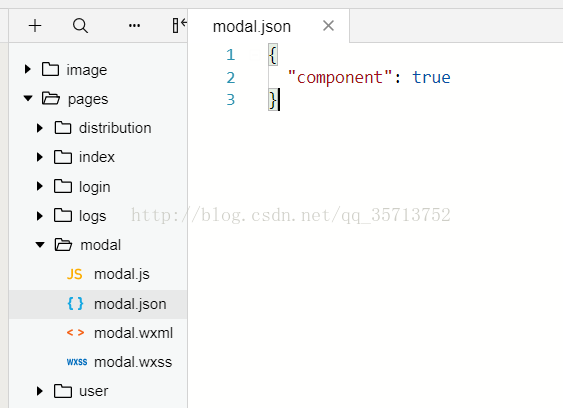
第一步:创建组件
创建一个modal文件夹,里面包含 josn.wxml.wcss.js 四个文件,然后在josn里面添加 "component":true (作用是声明这一组文件为自定义组件)
第二步. 编写组件代码
在modal.wxml :
<view hidden='{{modalHidden}}'>
  <view class='mask_layer' bindtap='modal_click_Hidden' />
  <view class='modal_box'>
    <view class="title">提示</view>
    <view class='content'>
      <text class='modalMsg'>{{modalMsg}}</text>
    </view>
    <view class='btn'>
      <view bindtap='modal_click_Hidden' class='cancel'>取消</view>
      <view bindtap='Sure' class='Sure'>确定</view>
    </view>
  </view>
</view>
在modal.wxss:
.mask_layer {
  width: 100%;
  height: 100%;
  position: fixed;
  z-index: 1000;
  background: #000;
  opacity: 0.5;
  overflow: hidden;
}
.modal_box {
  width: 76%;
  overflow: hidden;
  position: fixed;
  top: 50%;
  left: 0;
  z-index: 1001;
  background: #fafafa;
  margin: -150px 12% 0 12%;
  border-radius: 3px;
}

.title {
  padding: 15px;
  text-align: center;
  background-color: gazure;
}

.content {
  overflow-y: scroll; /*超出父盒子高度可滚动*/
}

.btn {
  width: 100%;
  margin-top: 65rpx;
  display: flex;
  flex-direction: row;
  align-items: center;
  justify-content: space-between;
  box-sizing: border-box;
  background-color: white;
}

.cancel {
  width: 100%;
  padding: 10px;
  text-align: center;
  color: red;
}

.Sure {
  width: 100%;
  padding: 10px;
  background-color: gainsboro;
  text-align: center;
}

.modalMsg {
  text-align: center;
  margin-top: 45rpx;
  display: block;
}
在modal.js
Component({
  properties: {
    modalHidden: {
      type: Boolean,
      value: true
    }, //这里定义了modalHidden属性,属性值可以在组件使用时指定.写法为modal-hidden
    modalMsg: {
      type: String,
      value: ' ',
    }
  },
  data: {
    // 这里是一些组件内部数据
    text: "text",
  },
  methods: {
    // 这里放置自定义方法
    modal_click_Hidden: function () {
      this.setData({
        modalHidden: true,
      })
    },
    // 确定
    Sure: function () {
      console.log(this.data.text)
    }
  }
})
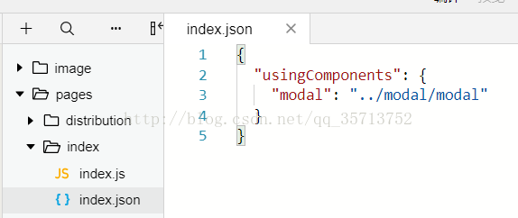
第三步, 使用组件
这里我是在 pages/index/index 页面调用 pages/modal/modal 自定义组件
首先在index.json中进行引用说明, 这里是设置自定义组件的标签名和引用路径
{
  "usingComponents": {
    "modal": "../modal/modal"
  }
}
然后在index.wxml调用组件
<!-- 调用modal组件 -->
<modal modal-hidden="{{is_modal_Hidden}}" modal-msg="{{is_modal_Msg}}"/>
在index.js绑定数据,
Page({
data: {
is_modal_Hidden:false,
is_modal_Msg:'我是一个自定义组件'
}
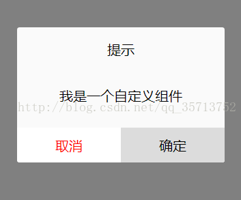
})效果图: