7. 拓展@
7.1 margin负值之美
1). 负边距+定位:水平垂直居中
咱们前面讲过, 一个绝对定位的盒子, 利用 父级盒子的 50%, 然后 往左(上) 走 自己宽度的一半 ,可以实现盒子水平垂直居中。
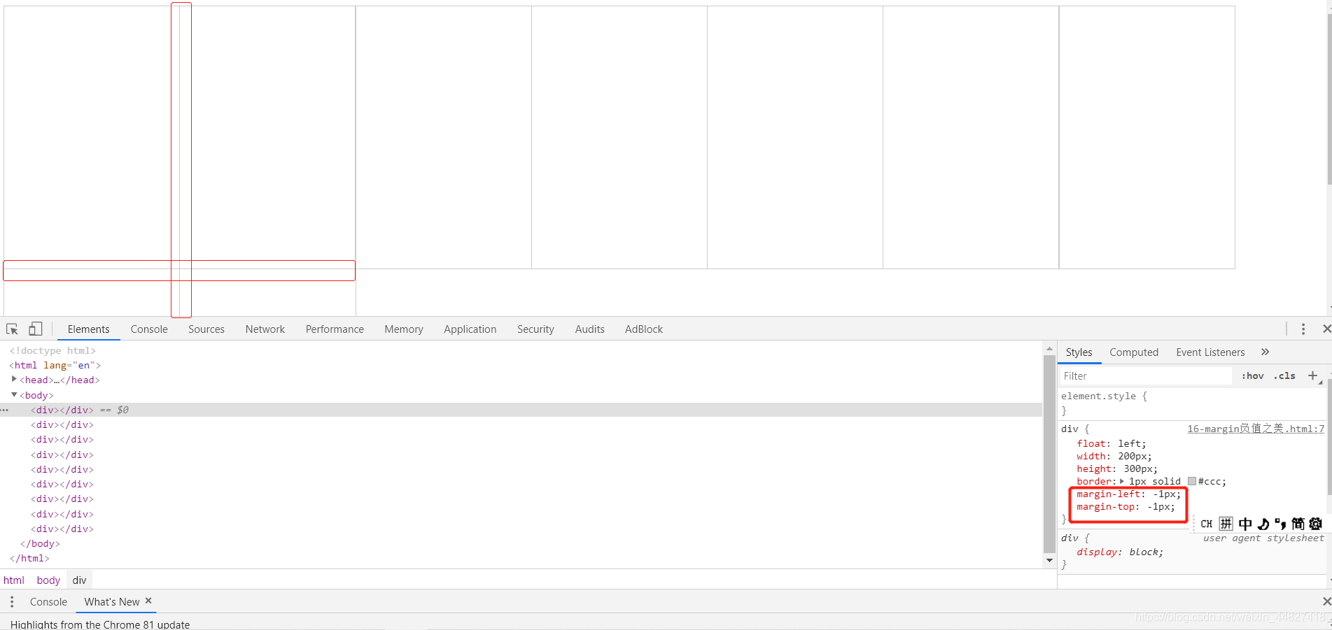
2). 压住盒子相邻边框
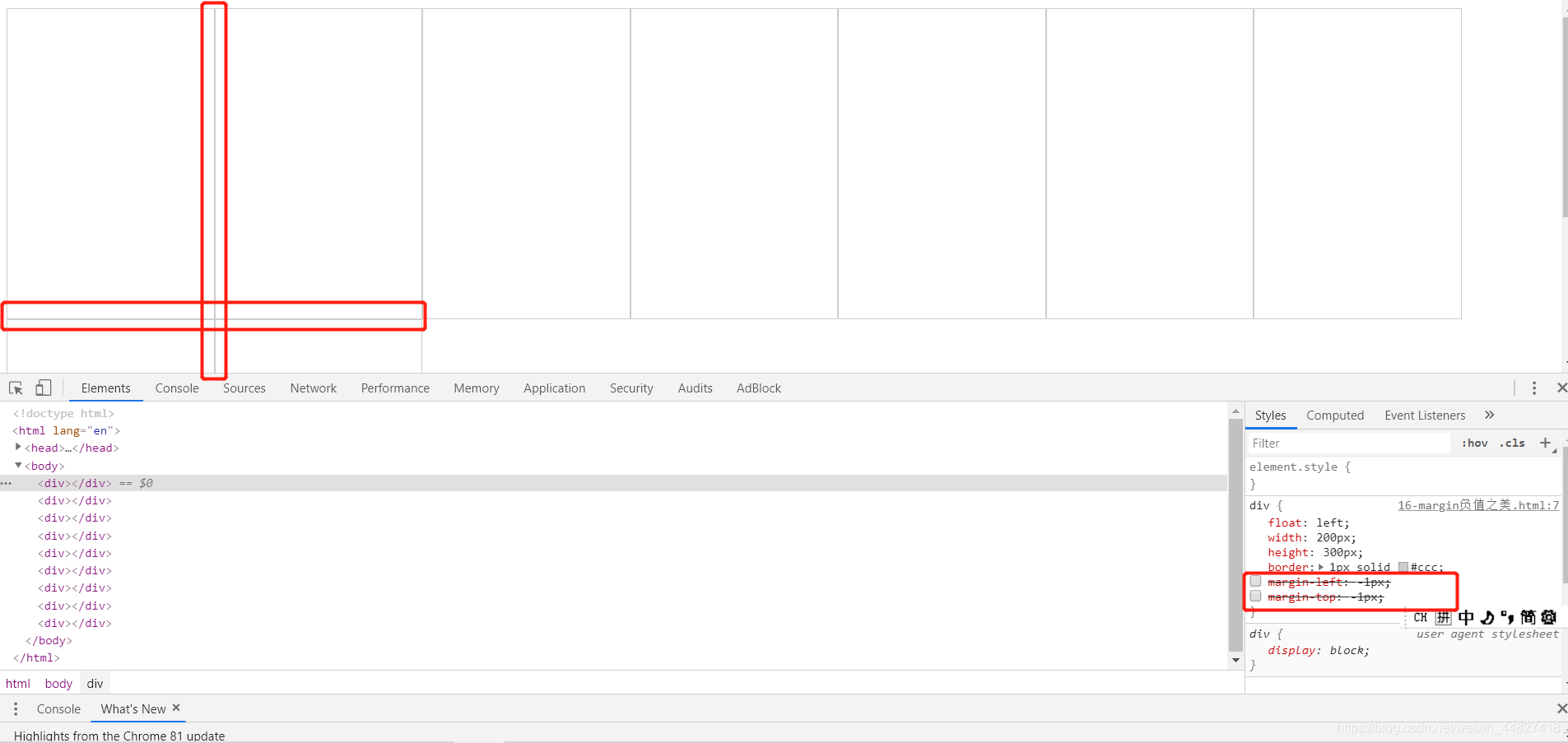
上图第一个div的右边框 与 第二个div的左边框没有重叠 1px + 1px = 2px ,所以边框线变粗
可以通过给每个div加上
margin-left: -1px;
margin-top: -1px;
让第一个div的右边框 与 第二个div的左边框完全重叠 ,这样边框的宽度还是为1px!
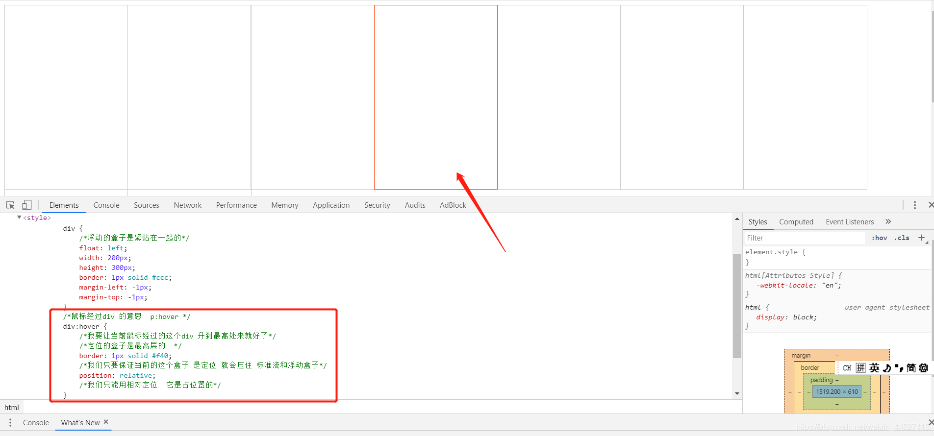
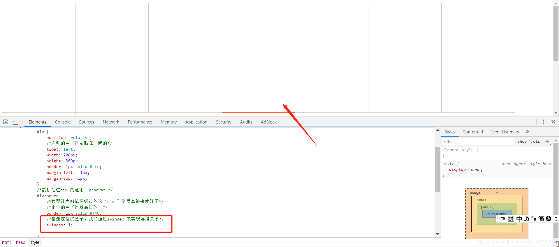
实现鼠标悬浮边框变成橙色:
方法一:
我们只要保证当前的这个盒子是定位就会压住标准流和浮动盒子*/
position:relative;
我们只能用相对定位它是占位置的
方法二:添加z-index:1; 实现鼠标经过某个div时,提高当前div的层级
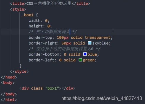
7.2 CSS三角形之美
 div {

 	width: 0;

    height: 0;
    line-height:0;
    font-size: 0;
	border-top: 10px solid red;

	border-right: 10px solid green;

	border-bottom: 10px solid blue;

	border-left: 10px solid #000;

 }
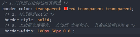
一张图, 你就知道 css 三角是怎么来的了, 做法如下:
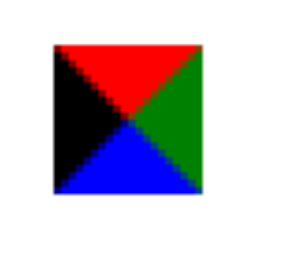

- 我们用css 边框可以模拟三角效果
- 宽度高度为0
- 我们4个边框都要写, 只保留需要的边框颜色,其余的不能省略,都改为 transparent 透明就好了
- 为了照顾兼容性 低版本的浏览器,加上 font-size: 0; line-height: 0;
京东案例:


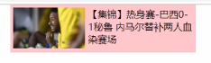
7.3 文字围绕浮动元素的巧妙运用
只需要为装有图片的元素添加float:left; 浮动,文字便会自动围绕图片来显示
7.4 行内块元素的巧妙运用
- 为父元素box添加text-align: center,则其所有的子元素(必须是行内块元素)都会实现水平居中对齐
- 在一行内显示多个行内块元素时,行内块元素之间会自然产生一个空白的间距

<!DOCTYPE html>
<html>
<head>
<meta charset="utf-8" />
<title>行内块元素的巧妙运用</title>
<style type="text/css">
* {
margin: 0;
padding: 0;
}
.box {
text-align: center;/* 为父元素box添加text-align: center,则其所有的子元素(必须是行内块元素)都会实现水平居中对齐 */
}
.box a {
display: inline-block; /* 在一行内显示多个行内块元素时,行内块元素之间会自然产生一个空白的间距 */
width: 36px;
height: 36px;
background-color: #f7f7f7;
border: 1px solid #ccc;
text-align: center;
line-height: 36px;
text-decoration: none;
color: #333;
font-size: 14px;
}
.box .prev,
.box .next {
width: 85px;
}
.box .current,
.box .elp {
background-color: #fff;
border: none;
}
.box input {
width: 45px;
height: 36px;
border: 1px solid #ccc;
outline: none;
/* 取消选中后的边框 */
}
.box button {
width: 60px;
height: 36px;
background-color: #f7f7f7;
border: 1px solid #ccc;
}
</style>
</head>
<body>
<div class="box">
<a href="#" class="prev"><<上一页</a>
<a href="#" class="current">2</a>
<a href="#">3</a>
<a href="#">4</a>
<a href="#">5</a>
<a href="#">6</a>
<a href="#" class="elp">...</a>
<a href="#" class="next">>>下一页</a>
到第
<input type="text">
页
<button>确定</button>
</div>
</body>
</html>
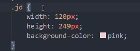
7.5 CSS三角形的巧妙运用
1)效果图:

2)原理:将直角三角形用子绝父相的方法定位到红色区域的右边,并把直角三角形的颜色改为白色
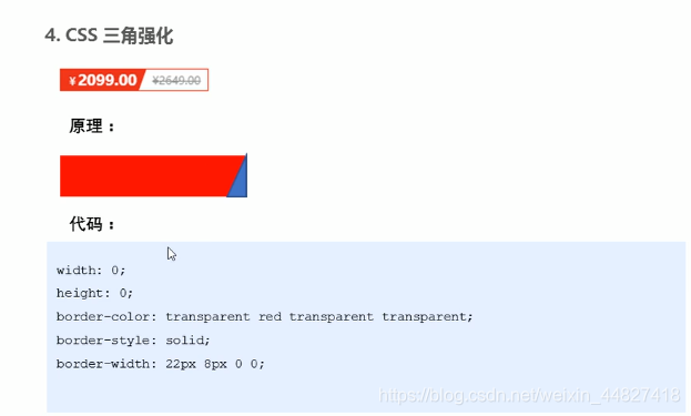
实现直角三角形的方法:
1)正常的写法:
2)简写:
效果图的实现代码:
<!DOCTYPE html>
<html>
<head>
<meta charset="utf-8">
<title>CSS三角巧妙运用</title>
<style type="text/css">
*{
margin: 0;
padding: 0;
}
.price {
width: 160px;
height: 22px;
border: 1px solid red;
margin: 0 auto;
line-height: 24px;
}
.miaosha {
position: relative;
float: left;
width: 90px;
height: 100%;
background-color: red;
text-align: center;
color: #fff;
font-weight: 700;
margin-right: 8px;
}
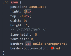
.miaosha i {
position: absolute;
top: 0;
right: 0;
width: 0;
height: 0;
border-color: transparent #fff transparent transparent;
border-style: solid;
border-width: 22px 10px 0 0; /* 第一个值相当于三角形的高度,第二个值相当于三角形的宽度 */
}
.origin {
font-size: 12px;
color: gray;
text-decoration: line-through; /* 设置删除线 */
}
</style>
</head>
<body>
<div class="price">
<span class="miaosha">
$1650
<i></i>
</span>
<span class="origin">$5650</span>
</div>
</body>
</html>