
作业说明:
1、基于第二天实践使用Python来爬去百度百科中《青春有你2》所有参赛选手的信息,进行数据可视化分析;
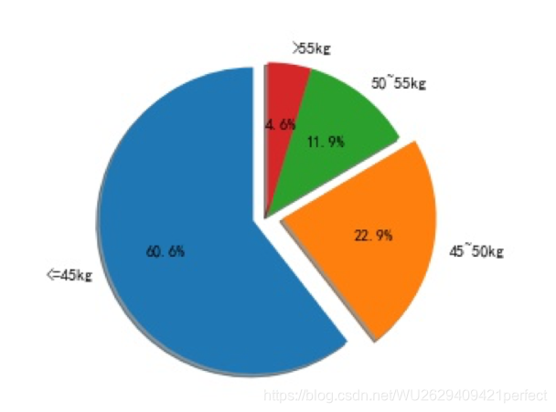
2、对《青春有你2》对选手体重分布进行可视化,绘制饼状图
实现效果:
思路:
准备工作:
# 如果需要进行持久化安装, 需要使用持久化路径, 如下方代码示例:
#!mkdir /home/aistudio/external-libraries
#!pip install matplotlib -t /home/aistudio/external-libraries

# 同时添加如下代码, 这样每次环境(kernel)启动的时候只要运行下方代码即可:
# Also add the following code, so that every time the environment (kernel) starts, just run the following code:
import sys
sys.path.append('/home/aistudio/external-libraries')

# 下载中文字体
!wget https://mydueros.cdn.bcebos.com/font/simhei.ttf
# 将字体文件复制到matplotlib字体路径
!cp simhei.ttf /opt/conda/envs/python35-paddle120-env/lib/python3.7/site-packages/matplotlib/mpl-data/fonts/ttf/
# 一般只需要将字体文件复制到系统字体目录下即可,但是在aistudio上该路径没有写权限,所以此方法不能用
# !cp simhei.ttf /usr/share/fonts/

# 创建系统字体文件路径
!mkdir .fonts
# 复制文件到该路径
!cp simhei.ttf .fonts/
!rm -rf .cache/matplotlib
如果字体下载不了,就直接去官网下载到本地,然后上传
GO:
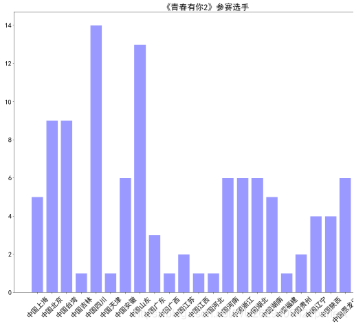
绘制选手区域分布柱状图:
import matplotlib.pyplot as plt
import numpy as np
import json
import matplotlib.font_manager as font_manager
import pandas as pd

#显示matplotlib生成的图形
%matplotlib inline


df = pd.read_json('data/data31557/20200422.json')
#print(df)

grouped=df['name'].groupby(df['zone'])
s = grouped.count()

zone_list = s.index
count_list = s.values


# 设置显示中文
plt.rcParams['font.sans-serif'] = ['SimHei'] # 指定默认字体

plt.figure(figsize=(20,15))

plt.bar(range(len(count_list)), count_list,color='r',tick_label=zone_list,facecolor='#9999ff',edgecolor='white')

# 这里是调节横坐标的倾斜度,rotation是度数,以及设置刻度字体大小
plt.xticks(rotation=45,fontsize=20)
plt.yticks(fontsize=20)

plt.legend()
plt.title('''《青春有你2》参赛选手''',fontsize = 24)
plt.savefig('/home/aistudio/work/result/bar_result02.jpg')
plt.show()
绘制饼状图:
import matplotlib.pyplot as plt
import numpy as np
import json
import matplotlib.font_manager as font_manager

#显示matplotlib生成的图形
%matplotlib inline

with open('data/data31557/20200422.json', 'r', encoding='UTF-8') as file:
         json_array = json.loads(file.read())

#将参赛选手的体重放入列表
weight = []
for star in json_array:     #遍历每个明星并将她们的体重放在列表里
    weig = star['weight']
    weight.append(weig)
print(len(weight))          #打印体重和人数
print(weight)

size1 = 0
size2 = 0
size3 = 0
size4 = 0

for num in weight:
    if num <= '45kg':
        size1 += 1
    elif '45kg' < num <= '50kg':
        size2 += 1
    elif '50kg' < num <= '55kg':
        size3 += 1
    else:
        size4 += 1


labels = ['<=45kg','45~50kg','50~55kg','>55kg']   #标签
sizes = [size1, size2, size3, size4]
explode = (0.1,0.1,0,0)
fig1, ax1 = plt.subplots()
ax1.pie(sizes, explode = explode, labels = labels, autopct='%1.1f%%', shadow=True)
ax1.axis('equal')
plt.savefig('/home/aistudio/work/result/pie_result01.jpg')  #将饼图存在目录下
plt.show()      #显示饼图
至此,数据分析成功!
| ♥ 喜 欢 请 点 赞 哟 ♥ |
| (●ˇ∀ˇ●) |