0. 前期准备:
导入三个必备的库,推荐使用jupyter notebook或者spyder编程环境
import numpy as np
import pandas as pd
import matplotlib.pyplot as plt
1. 线形图
1) Series直接生成线形图
参数介绍:
Series.plot():series的index为横坐标,value为纵坐标
kind → line,bar,barh…(折线图,柱状图,柱状图-横…)
label → 图例标签,Dataframe格式以列名为label
style → 风格字符串,这里包括了linestyle(-),marker(.),color(g)
color → 颜色,有color指定时候,以color颜色为准
alpha → 透明度,0-1
use_index → 将索引用为刻度标签,默认为True
rot → 旋转刻度标签,0-360
grid → 显示网格,一般直接用plt.grid
xlim,ylim → x,y轴界限
xticks,yticks → x,y轴刻度值
figsize → 图像大小
title → 图名
legend → 是否显示图例,一般直接用plt.legend()
ts = pd.Series(np.random.randn(1000), index=pd.date_range('1/1/2020', periods=1000))
ts = ts.cumsum()
ts.plot(kind='line',
       label = 'demo',
       style = '--g.',
       color = 'red',
       alpha = 0.4,
       use_index = True,
       rot = 45,
       #grid = True,
       ylim = [-50,50],
       yticks = list(range(-50,50,10)),
       figsize = (8,4),
       title = 'test',
       legend = True)
–> 输出的结果为:(网格一些基础设置之前已经设置过了)

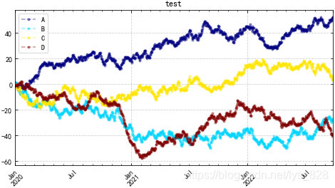
2)Dataframe直接生成图表
参数介绍:
subplots → 是否将各个列绘制到不同图表,默认False
colormap → 因为是默认按列进行绘图,所以有个colormap参数可以设置,具体的可取样式,可以参照上个博客的讲解方式
df = pd.DataFrame(np.random.randn(1000, 4), index=ts.index, columns=list('ABCD'))
df = df.cumsum()
df.plot(kind='line',
       style = '--.',
       alpha = 0.4,
       use_index = True,
       rot = 45,
       grid = True,
       figsize = (8,4),
       title = 'test',
       legend = True,
       subplots = False,
       colormap = 'jet')
–> 输出的结果为:(可以试试subplots = True的情况)
2. 柱状图与堆叠图
1) plt.plot(kind='bar/barh')
ax参数 → 选择第几个子图,之前博客已经有介绍
随机生成数据:
plt.rcParams['figure.dpi'] = 200
fig,axes = plt.subplots(4,1,figsize = (10,10))
s = pd.Series(np.random.randint(0,10,16),index = list('abcdefghijklmnop'))
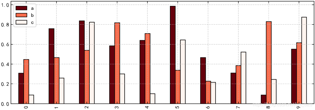
df = pd.DataFrame(np.random.rand(10,3), columns=['a','b','c'])
① 单系列柱状图:plt.plot(kind='bar/barh')
s.plot(kind='bar',color = 'k',grid = True,alpha = 0.5,ax = axes[0],edgecolor = 'k')
–> 输出的结果为:
② 多系列柱状图:直接使用DataFrame的多列数据
df.plot(kind='bar',ax = axes[1],grid = True,colormap='Reds_r',edgecolor = 'k')
–> 输出的结果为:
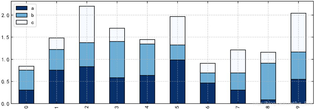
③ 多系列堆叠图:stacked 参数→ 堆叠
df.plot(kind='bar',ax = axes[2],grid = True,colormap='Blues_r',stacked=True,edgecolor = 'k')
–> 输出的结果为:
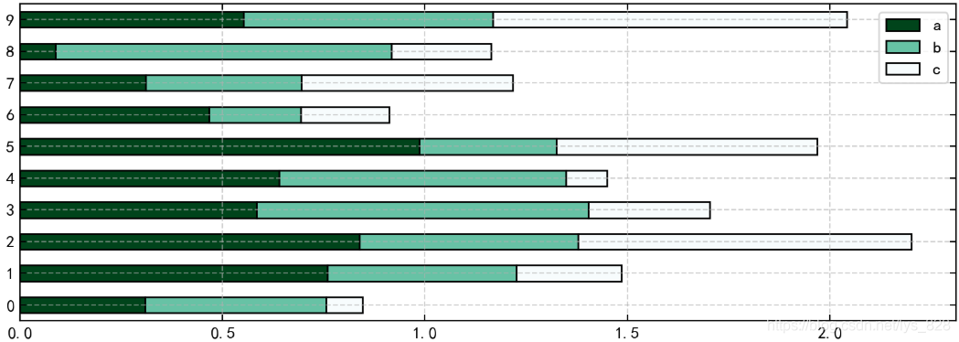
④ 横向柱状图:df.plot.barh()/df.plot(kind = 'barh')
df.plot.barh(ax = axes[3],grid = True,stacked=True,colormap = 'BuGn_r',edgecolor = 'k')
#df.plot(kind = 'barh',ax = axes[3],grid = True,stacked=True,colormap = 'BuGn_r',edgecolor = 'k')
–> 输出的结果为:
2) plt.bar()
x,y参数 → x,y值
width → 宽度比例
facecolor → 柱状图里填充的颜色
edgecolor → 是边框的颜色
left → 每个柱x轴左边界
bottom → 每个柱y轴下边界 , bottom扩展即可化为甘特图 Gantt Chart
align → 决定整个bar图分布,默认left表示默认从左边界开始绘制,center会将图绘制在中间位置
xerr/yerr → x/y方向error bar
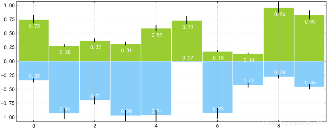
plt.figure(figsize=(10,4))
x = np.arange(10)
y1 = np.random.rand(10)
y2 = -np.random.rand(10)

plt.bar(x,y1,width = 1,facecolor = 'yellowgreen',edgecolor = 'white',yerr = y1*0.1)
plt.bar(x,y2,width = 1,facecolor = 'lightskyblue',edgecolor = 'white',yerr = y2*0.1)

for i,j in zip(x,y1):
    plt.text(i+0.3,j-0.15,'%.2f' % j, color = 'white')
for i,j in zip(x,y2):
    plt.text(i+0.3,j+0.05,'%.2f' % -j, color = 'white')
#批量加注解
plt.margins(0.005)
–> 输出的结果为:(注意注解的微调,plt.margins() 两边间距的调整)
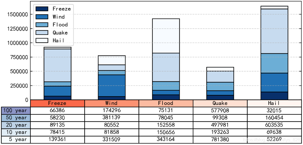
★★★★★ 3) 外嵌图表plt.table()
plt.table(cellText=None, cellColours=None,cellLoc=‘right’, colWidths=None,rowLabels=None, rowColours=None, rowLoc=‘left’,
colLabels=None, colColours=None, colLoc=‘center’,loc=‘bottom’, bbox=None)
参数讲解:
cellText:表格文本
cellLoc:cell内文本对齐位置
rowLabels:行标签
colLabels:列标签
rowLoc:行标签对齐位置
loc:表格位置 → left,right,top,bottom
data = [[ 66386, 174296,  75131, 577908,  32015],
        [ 58230, 381139,  78045,  99308, 160454],
        [ 89135,  80552, 152558, 497981, 603535],
        [ 78415,  81858, 150656, 193263,  69638],
        [139361, 331509, 343164, 781380,  52269]]
columns = ('Freeze', 'Wind', 'Flood', 'Quake', 'Hail')
rows = ['%d year' % x for x in (100, 50, 20, 10, 5)]
df = pd.DataFrame(data,columns = ('Freeze', 'Wind', 'Flood', 'Quake', 'Hail'),
                 index = ['%d year' % x for x in (100, 50, 20, 10, 5)])

df.plot(kind='bar',grid = True,colormap='Blues_r',stacked=True,figsize=(8,3))
# 创建堆叠图

plt.table(cellText = data,
          cellLoc='center',
          cellColours = None,
          rowLabels = rows,
          rowColours = plt.cm.BuPu(np.linspace(0, 0.5,5))[::-1],  # BuPu可替换成其他colormap
          colLabels = columns,
          colColours = plt.cm.Reds(np.linspace(0, 0.5,5))[::-1],
          rowLoc='right',
          loc='bottom')
–> 输出的结果为:(科研或者工程常用制图)
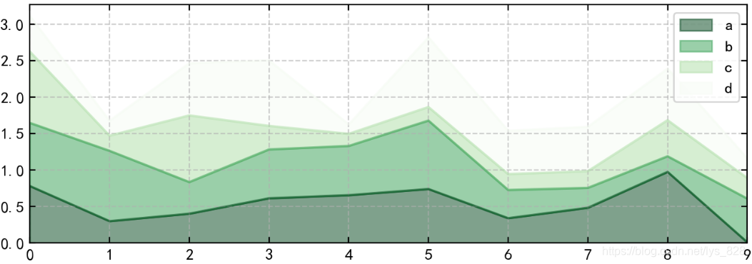
3. 面积图
plt.plot.area():
使用Series.plot.area()和DataFrame.plot.area()创建面积图
stacked:是否堆叠,默认情况下,区域图被堆叠
为了产生堆积面积图,每列必须是正值或全部负值!
当数据有NaN时候,自动填充0,所以图标签需要清洗掉缺失值
fig,axes = plt.subplots(2,1,figsize = (8,6))
df1 = pd.DataFrame(np.random.rand(10, 4), columns=['a', 'b', 'c', 'd'])
df1.plot.area(colormap = 'Greens_r',alpha = 0.5,ax = axes[0])
–> 输出的结果为:
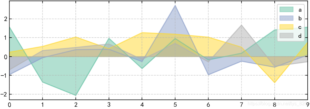
stacked参数的使用
df2 = pd.DataFrame(np.random.randn(10, 4), columns=['a', 'b', 'c', 'd'])
df2.plot.area(stacked=False,colormap = 'Set2',alpha = 0.5,ax = axes[1])
–> 输出的结果为:
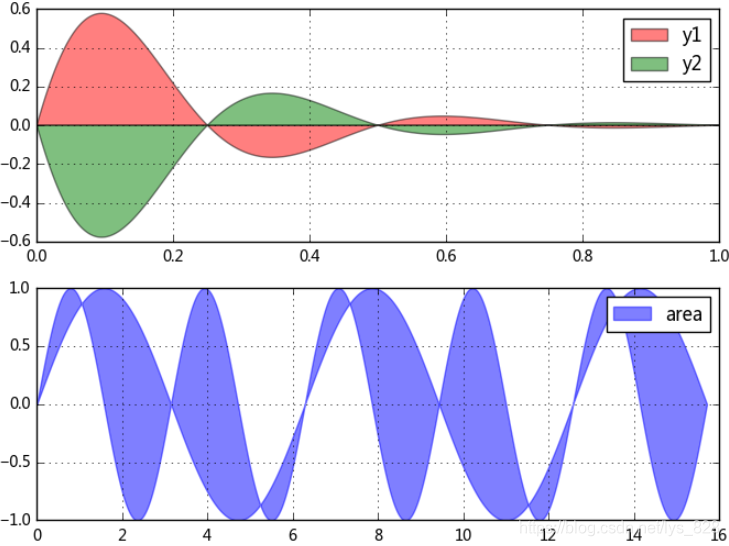
4. 填图
1) 对函数与坐标轴之间的区域进行填充,使用fill函数
2) 填充两个函数之间的区域,使用fill_between函数
fig,axes = plt.subplots(2,1,figsize = (8,6))

x = np.linspace(0, 1, 500)
y1 = np.sin(4 * np.pi * x) * np.exp(-5 * x)
y2 = -np.sin(4 * np.pi * x) * np.exp(-5 * x)
axes[0].fill(x, y1, 'r',alpha=0.5,label='y1')
axes[0].fill(x, y2, 'g',alpha=0.5,label='y2')
# 也可写成:plt.fill(x, y1, 'r',x, y2, 'g',alpha=0.5)

x = np.linspace(0, 5 * np.pi, 1000)
y1 = np.sin(x)
y2 = np.sin(2 * x)
axes[1].fill_between(x, y1, y2, color ='b',alpha=0.5,label='area')

for i in range(2):
    axes[i].legend()
    axes[i].grid()
–> 输出的结果为:
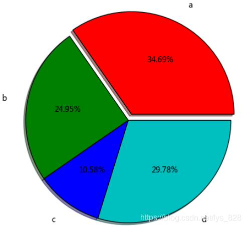
5. 饼图
plt.pie(x, explode=None, labels=None, colors=None, autopct=None, pctdistance=0.6, shadow=False, labeldistance=1.1, startangle=None,
radius=None, counterclock=True, wedgeprops=None, textprops=None, center=(0, 0), frame=False, hold=None, data=None)
参数讲解:
第一个参数x:数据
explode:指定每部分的偏移量
labels:标签
colors:颜色
autopct:饼图上的数据标签显示方式
pctdistance:每个饼切片的中心和通过autopct生成的文本开始之间的比例
labeldistance:被画饼标记的直径,默认值:1.1
shadow:阴影
startangle:开始角度
radius:半径
frame:图框
counterclock:指定指针方向,顺时针或者逆时针
s = pd.Series(3 * np.random.rand(4), index=['a', 'b', 'c', 'd'], name='series')
plt.axis('equal')  # 保证长宽相等
plt.pie(s,
       explode = [0.1,0,0,0],
       labels = s.index,
       colors=['r', 'g', 'b', 'c'],
       autopct='%.2f%%',
       pctdistance=0.6,
       labeldistance = 1.2,
       shadow = True,
       startangle=0,
       radius=1.5,
       frame=False)
print(s)
–> 输出的结果为: