Introducción al elemento componente: https://doc.qt.io/qt-5/qml-qtqml-component.html
Introducción de ButtonStyle: https://doc.qt.io/qt-5/qml-qtquick-controls-styles-buttonstyle.html
Ejemplo
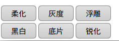
Efecto de estilo de botón:
Código fuente:
import QtQuick 2.6
import QtQuick.Window 2.2
import QtQuick.Controls 1.1
import QtQuick.Controls.Styles 1.1

Window {
    visible: true
    width: 640
    height: 480
    title: qsTr("美化")
    Component{
        id: btnStyle;
        ButtonStyle {
            background: Rectangle {
                implicitWidth: 70;
                implicitHeight: 25;
                border.width: control.pressed ? 2 : 1;
                border.color: (control.pressed || control.hovered) ? "#00A060" : "#888888";
                radius: 6;
                gradient: Gradient {
                    GradientStop { position: 0 ; color: control.pressed ? "#cccccc" : "#e0e0e0"; }
                    GradientStop { position: 1 ; color: control.pressed ? "#aaa" : "#ccc"; }
                }
            }
        }
    }

    Grid {
        id: op;
        anchors.left: parent.left;
        anchors.leftMargin: 4;
        anchors.bottom: parent.bottom;
        anchors.bottomMargin: 4;
        rows: 2;
        columns: 3;
        rowSpacing: 4;
        columnSpacing: 4;
        z: 1;

        Button {
            text: "柔化";
            style: btnStyle;
        }

        Button {
            text: "灰度";
            style: btnStyle;
        }

        Button {
            text: "浮雕";
            style: btnStyle;
        }
        Button {
            text: "黑白";
            style: btnStyle;
        }

        Button {
            text: "底片";
            style: btnStyle;
        }

        Button {
            text: "锐化";
            style: btnStyle;
        }
    }

}