
Note: Unless otherwise specified, Flutter version and Dart versions are as follows:
- Flutter Version: 1.12.13 + hotfix.5
- Dart Version: 2.7.0
Flutter built more than 10 kinds of Button (Button) class for us to use controls, these controls will help improve our understanding of the development speed.
RaisedButton
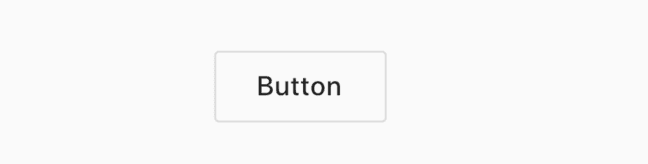
RaisedButton is a material style "bump" buttons, the basic usage:
RaisedButton(
  child: Text('Button'),
  onPressed: (){
  },
)
effect:

onPressedIs null or not set, the button is disabled.
onHighlightChangedTo highlight changes in the callback, when pressed is highlighted, raised in a non-highlighted state, is used as follows:
RaisedButton(
  onHighlightChanged: (high){
  },
  ...
)
Button to set the font and color of the various states, summarized as follows:
| Attributes | Explanation |
|---|---|
| textColor | font color |
| disabledTextColor | The disabled state font color |
| color | background color |
| disabledColor | Background color for disabled |
| highlightColor | Highlight color, the color when pressed |
| splashColor | Water ripples color, water ripple effect will press the release |
To textColor, for example, is used as follows:
RaisedButton(
  textColor: Colors.red,
  ...
)
You can also set the font style by textTheme, used as follows:
RaisedButton(
  textTheme: ButtonTextTheme.primary,
  ...
)
ButtonTextTheme values are described below:
- normal: black or white font, depending on
ThemeData.brightness - accent: font color depends on the
ThemeData.accentColor - primary: font color depends on the
ThemeData.primaryColor
These three values are provided MaterialApp global control, as follows:
MaterialApp(
  title: 'Flutter Demo',
  theme: ThemeData(
    primaryColor: Color(0xFF42A5F5),
    accentColor: Colors.yellow,
    brightness: Brightness.light
  ),
  ...
)
Settings button shadow, highlight shadows, disable shadows, usage is as follows:
RaisedButton(
  elevation: 5.0,
  highlightElevation: 5.0,
  disabledElevation: 5.0,
  ...
)shapeSet the shape of the button, such as a circular shape is provided, as follows:
RaisedButton(
  shape: CircleBorder(),
  ...
)
Results are as follows:

And hoverrelated properties refers to the mouse-over state, the mobile terminal has no effect, focusthe relevant property is acquired focus state.
FlatButton
FlatButton is a flat button, and use the same RaisedButton, as follows:
FlatButton(
  child: Text('Button'),
  color: Colors.blue,
  onPressed: () {},
)
Results are as follows:

OutlineButton
OutlineButton is a button with a border, usage and RaisedButton same code as follows:
OutlineButton(
  child: Text('Button'),
  onPressed: () {},
)
Results are as follows:
Border style which is provided, as follows:
OutlineButton(
  borderSide: BorderSide(color: Colors.blue,width: 2),
  disabledBorderColor: Colors.black,
  highlightedBorderColor: Colors.red,
  child: Text('Button'),
  onPressed: () {},
)
Results are as follows: 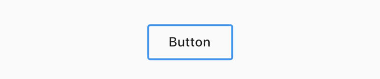
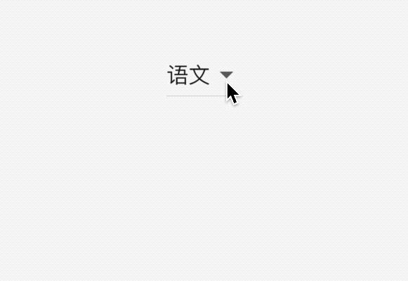
DropdownButton
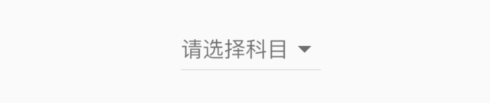
DropdownButton selection button drop-down, basic usage is as follows:
var _dropValue = '语文';

_buildButton() {
  return DropdownButton(
    value: _dropValue,
    items: [
      DropdownMenuItem(child: Text('语文'),value: '语文',),
      DropdownMenuItem(child: Text('数学'),value: '数学'),
      DropdownMenuItem(child: Text('英语'),value: '英语'),
    ],
    onChanged: (value){
      setState(() {
        _dropValue = value;
      });
    },
  );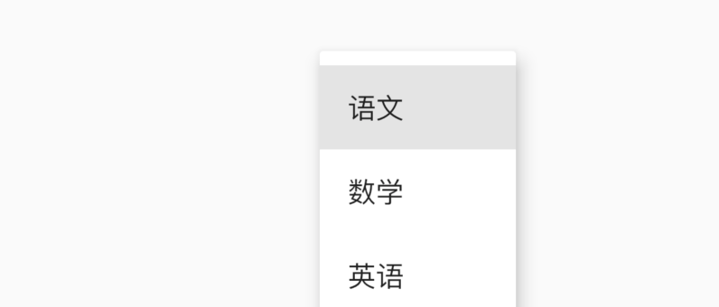
}itemsClick the pop-up option, onChangedthe callback option changes. Results are as follows:
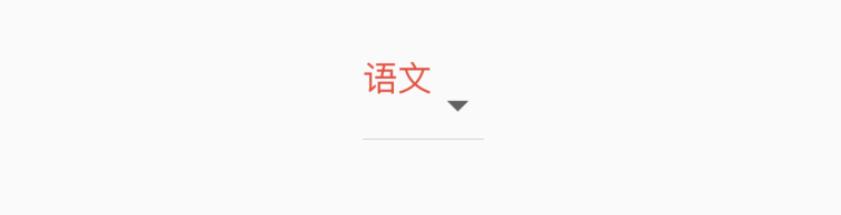
If the option to select the style you are not satisfied, you can customize, is used as follows:
DropdownButton(
  selectedItemBuilder: (context){
    return [
      Text('语文',style: TextStyle(color: Colors.red),),
      Text('数学',style: TextStyle(color: Colors.red),),
      Text('英语',style: TextStyle(color: Colors.red),)
    ];
  },
  ...
)
Components selectedItemBuilder returned to and itemsin correspondence, the selected style as follows:
When the user is not selected, i.e., value is null, display the 'select', used as follows:
DropdownButton(
  hint: Text('请选择'),
  value: null,
  ...
)
Results are as follows:
By default, the icon drop-down option is the inverted triangle, it can also be customized, used as follows:
DropdownButton(
  icon: Icon(Icons.add),
  iconSize: 24,
  iconDisabledColor: Colors.red,
  iconEnabledColor: Colors.red,
  ...
)
Results are as follows:

RawMaterialButton
RawMaterialButton is based Semantics, Materialand InkWellcomponents created, it does not use the current system theme and button topic for custom buttons or merge an existing style, but RaisedButton and FlatButton are based on the system configuration RawMaterialButton button themes and topics related properties you can refer RaisedButton, essentially the same parameters, the following basic usage:
RawMaterialButton(
  onPressed: (){},
  fillColor: Colors.blue,
  child: Text('Button'),
)
Results are as follows:

PopupMenuButton
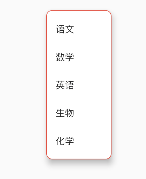
PopupMenuButton is a menu selected widget, use the following:
PopupMenuButton<String>(
  itemBuilder: (context) {
    return <PopupMenuEntry<String>>[
      PopupMenuItem<String>(
        value: '语文',
        child: Text('语文'),
      ),
      PopupMenuItem<String>(
        value: '数学',
        child: Text('数学'),
      ),
      PopupMenuItem<String>(
        value: '英语',
        child: Text('英语'),
      ),
      PopupMenuItem<String>(
        value: '生物',
        child: Text('生物'),
      ),
      PopupMenuItem<String>(
        value: '化学',
        child: Text('化学'),
      ),
    ];
  },
)
Results are as follows:

Set initial values:
PopupMenuButton<String>(
  initialValue: '语文',
  ...
)
After setting an initial value, open a menu, the set value will be highlighted, the effect is as follows:
Get the value of an item selected by the user, or the user is not selected, as follows:
PopupMenuButton<String>(
  onSelected: (value){
    print('$value');
  },
  onCanceled: (){
    print('onCanceled');
  },
  ...
)tooltipIs a long-time pop-up prompt, use the following:
PopupMenuButton<String>(
  tooltip: 'PopupMenuButton',
  ...
)
Results are as follows:

Which set the background color shading values, and padding of the pop-up menu:
PopupMenuButton<String>(
elevation: 5,
padding: EdgeInsets.all(5),
color: Colors.red,
...
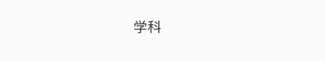
)By default, the display PopUpMenuButton bullet 3, we can set aligned, set the text below:
PopupMenuButton<String>(
  child: Text('学科'),
  ...
)childComponents will be InkWell package, click on the pop-up menu, the effect is as follows:
You can also set other icons:
PopupMenuButton<String>(
    icon: Icon(Icons.add),
    ...
)
Results are as follows:

Setting pop-up menu border:
PopupMenuButton<String>(
  shape: RoundedRectangleBorder(
    side: BorderSide(
      color: Colors.red
    ),
    borderRadius: BorderRadius.circular(10)
  ),
    ...
)
Results are as follows:
IconButton
IconButton is an icon button is used as follows:
IconButton(
icon: Icon(Icons.person),
iconSize: 30,
color: Colors.red,
onPressed: () {},
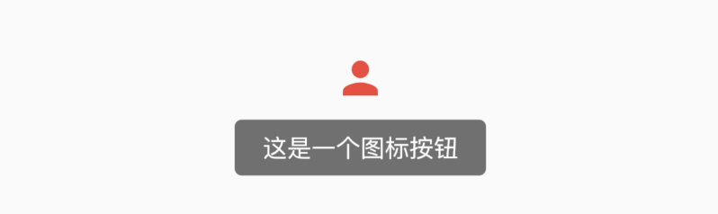
)Set the prompt properties:
IconButton(
  tooltip: '这是一个图标按钮',
  icon: Icon(Icons.person),
  iconSize: 30,
  color: Colors.red,
  onPressed: () {},
)
When the long-time displays a prompt effect is as follows:
BackButton
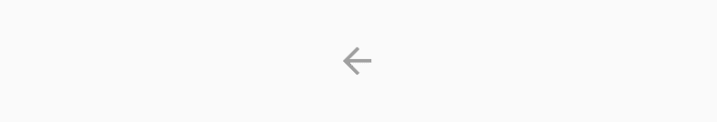
BackButton material is a back button style itself is a IconButton, default execution when you click Navigator.maybePopthat, if the routing stack has Prev returns to the previous page.
BackButton()Android and IOS platforms icon displayed is not the same, ios effect is as follows:

Android effect is as follows:
CloseButton
CloseButton material is a style close button itself is a IconButton, default execution when you click Navigator.maybePopthat, if the routing stack has Prev returns to the previous page.
And BackButton different application scenarios, BackButton apply to full-screen page, CloseButton suitable for pop-up Dialog.
Usage is as follows:
CloseButton()Results are as follows:

ButtonBar
ButtonBar not a single button control, but the end of the alignment control container class, when there is not enough space in the horizontal direction when the button is integrally arranged vertically, instead of wrapping around. The basic usage is as follows:
ButtonBar(
  children: <Widget>[
    RaisedButton(),
    RaisedButton(),
    RaisedButton(),
    RaisedButton(),
  ],
)
Results are as follows:

Set the spindle and the spindle alignment dimensions:
ButtonBar(
  alignment: MainAxisAlignment.center,
  mainAxisSize: MainAxisSize.max,
  ...
)
Results are as follows:

ToggleButtons
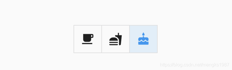
ToggleButtons component multiple components together, and let the user choose, ToggleButtons basic usage is as follows:
List<bool> _selecteds = [false, false, true];
ToggleButtons(
      isSelected: _selecteds,
      children: <Widget>[
        Icon(Icons.local_cafe),
        Icon(Icons.fastfood),
        Icon(Icons.cake),
      ],
      onPressed: (index) {
        setState(() {
          _selecteds[index] = !_selecteds[index];
        });
      },
);isSelectedBool property is a collection type, and the same number of children, and onPressedclicking on the callback, then there is a good line toggle button, the effect is as follows:
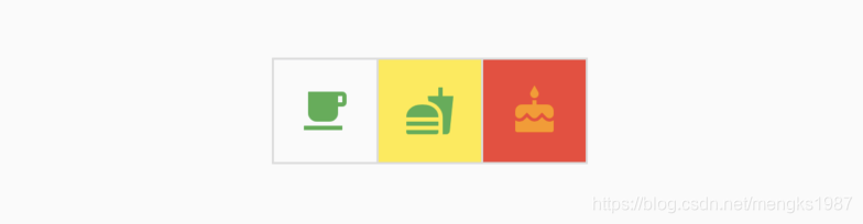
We can also customize the appearance, such as setting the color of the button:
ToggleButtons(
      color: Colors.green,
      selectedColor: Colors.orange,
          fillColor: Colors.red,
      ...
)
Results are as follows:

fillColorButton is selected the background color.
If no border can be renderBorderset to false:
ToggleButtons(
    renderBorder: false,
)
Results are as follows:

Of course, we can set the border fillet radius, width, color:
ToggleButtons(
      borderRadius: BorderRadius.circular(30),
      borderColor: Colors.orange,
      borderWidth: 3,
      selectedBorderColor: Colors.deepOrange,
)
Results are as follows:

Click ripple you can even set the color (splashColor) and highlight color (highlightColor) when the press:
ToggleButtons(
      splashColor: Colors.purple,
      highlightColor: Colors.yellow,
      )
Results are as follows:
If the button is disabled, you can set the color of the button and the disabled state border:
ToggleButtons(
      onPressed: null,
      disabledColor: Colors.grey[300],
      disabledBorderColor: Colors.blueGrey,
      )
Results are as follows:

If you are developing a web application, we can set the mouse-over color:
ToggleButtons(
      hoverColor: Colors.cyan,
      )
Welcome to the Flutter micro letter exchange group ( mqd_zzy ), learn together and progress together, live in front of more than struggling, as well as poetry and "distant."
Of course, I also very much hope that your interest in my personal public numbers, there are a variety of benefits waiting for you, oh.

