Interpretation matplotlib vernacular usage - a line chart
Recap
Interpretation matplotlib usage vernacular - a generic function and the histogram , vernacular interpretation matplotlib usage - histogram , vernacular interpretation matplotlib Usage - add data on the column
Hello everyone, I am a W
Introduction: In the previous article we looked at three histograms, bar charts, line charts then you must look up.
line chart
Introduction and use scenarios line chart
Line graph suggests that it is connected in a line to draw out the map by coordinate axes point, he embodied the same thing in a different time period changes in the number, quality , an object which compare the same target under different conditions trends. So when looking at line graph mainly to see the changes as you draw, it should also reflected changing trends.
scenes to be used
- The temperature at different times of the change in a city one day
- Nearly three decades of changes in the water level of a river basin
- Gold price changes in 30 years
- Between a city 10-year average house price changes in
...
Examples explain (copy code available)
Draw a simple line chart, bar chart with the same need only call plt.plot(), the x, y-axis data show thrown into the family to stay out.
import random
import matplotlib.pyplot as plt
plt.rcParams['font.sans-serif'] = ['SimHei'] # 显示中文
plt.rcParams['axes.unicode_minus'] = False # 显示负号
# 随机出y轴的数字 10个
y = [random.uniform(20, 35) for i in range(10)]
x = range(10)
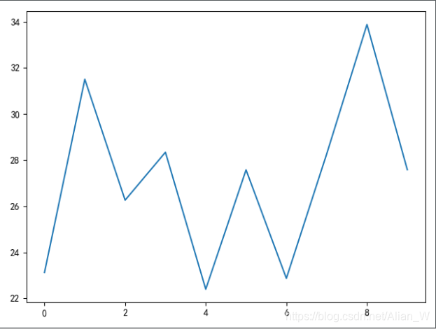
plt.plot(x, y)
plt.show()
effect:
Just add some of the label and the title can make good results in the line chart.
So plot methods in what parameters? Opening the _axes.py you can see the plot of the method, a long document, I will not copy, pick up a few common, generic parameters to explain.
>>> plot(x, y) # plot x and y using default line style and color
这个方法使用x,y展示数据,并且线条和颜色都是默认的
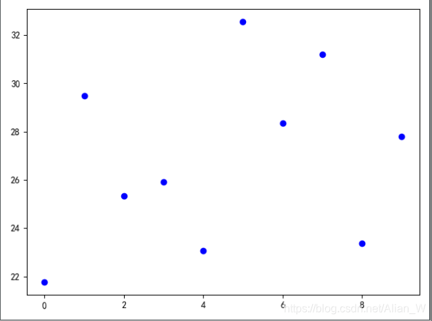
>>> plot(x, y, 'bo') # plot x and y using blue circle markers
plot使用x,y的数据,并且将数据展示成蓝色圆圈的样子,没有线连接点
>>> plot(y)           # plot y using x as index array 0..N-1
直接丢y轴的数据,而x轴从0~n-1
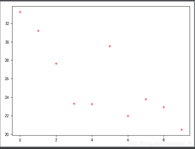
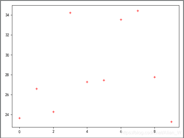
>>> plot(y, 'r+')     # ditto, but with red plusses
plot从0~n-1展示数据,并且数据点用红色的+号表示,跟上面的蓝色圆圈对应
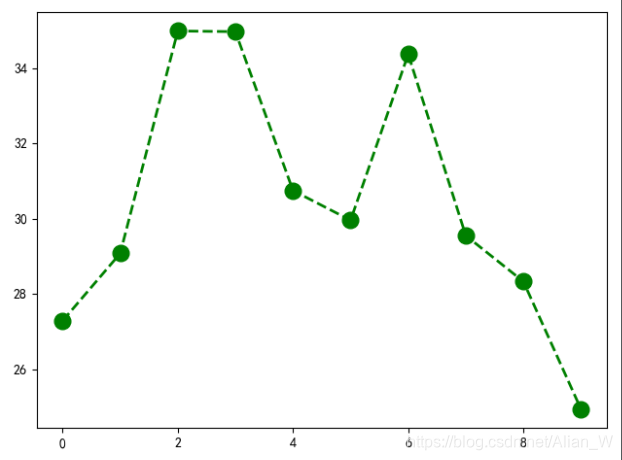
plt.plot(x, y, 'go--', linewidth=2, markersize=12)
# 第三个位置参数表示线的展示方式,'go--'表示一个圆点来打坐标,坐标间的线用虚线表示
# linewdith=:表示线的宽度
# markersize=:表示坐标点的打点大小
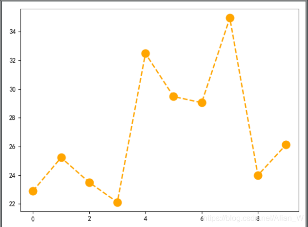
plt.plot(x, y, color='orange', marker='o', linestyle='dashed', linewidth=2, markersize=12)
# x、y表示位置参数
# color=:表示折线图中折线和点的颜色
# marker=:表示折线图中打点的方式
**Markers**打点方式文档全介绍

    =============    ===============================
    character        description
    =============    ===============================
    ``'.'``          point marker 点
    ``','``          pixel marker 像素点
    ``'o'``          circle marker 圆点
    ``'v'``          triangle_down marker 实心倒三角
    ``'^'``          triangle_up marker 实心上三角
    ``'<'``          triangle_left marker 实现左三角
    ``'>'``          triangle_right marker 实心右三角
    ``'1'``          tri_down marker 向下箭头
    ``'2'``          tri_up marker 向上箭头
    ``'3'``          tri_left marker 略
    ``'4'``          tri_right marker 略
    ``'s'``          square marker 实心正方形
    ``'p'``          pentagon marker 实心五边形
    ``'*'``          star marker 星号
    ``'h'``          hexagon1 marker 实心六边形
    ``'H'``          hexagon2 marker 实心六边形
    ``'+'``          plus marker +号
    ``'x'``          x marker x号
    ``'D'``          diamond marker 转了45度的实心正方形
    ``'d'``          thin_diamond marker 菱形◇
    ``'|'``          vline marker 垂线|
    ``'_'``          hline marker 下换线_


# linestyle=:表示线的样式
**Line Styles**

    =============    ===============================
    character        description
    =============    ===============================
    ``'-'``          solid line style 实线
    ``'--'``         dashed line style 长虚线
    ``'-.'``         dash-dot line style 长虚+点线
    ``':'``          dotted line style 虚线
    =============    ===============================
It is worth mentioning that the above marker and linestyle can be used together, but the two can not be together with fmt, because the position parameter fmt is some fixed combination of lines and points, with a marker and if that means you linestyle dotted line made a set, do not use fmt.
plt.plot(y, 'r+')
ok, the parameters of the line graph finished school here, a number of other common methods of use are in line with pyplot in the previous article, also spoke.
Since there is no demand for the right production line chart on my hand, so we do not do a complete Figure, and the whole line chart is very simple to use, as long as the understanding of the parameters on the line.
