Recently a series of blog updates, on the basis of knowledge to be consolidated and re-combing.
A, position positioning
(A): position of the property
1.absolute: generating element absolute positioning, relative to the parent element is not static locate the nearest one to locate;
2.relative: generating element located opposite, with respect to its position where the normal document positioning stream;
3.static: defaults, no positioning elements appear in the normal flow of the document;
4.fixed: Old IE does not support, and absolute consistency, positioned relative to the window, when the scroll bar appears, scrolled without scrolling with;
5.sticky: (CSS3) compatibility issues, and it is fixed relative fit such, when the conventional flow in a screen layout, when the scroll screen is manifested as an outer fixed. The performance of the property is the adsorption effect you see in reality.
(B): on position generally caused by the use of
1. If there is a default width of 100% div, when combined with absolute absolute positioning, the inline-block of elements immediately, will default internal width adaptive elements can cause collapse of the page width and height.
2. Due to the flexibility absolute absolute positioning, for general page layout, sometimes for reasons of easy way is likely to cause absolute / relative / top / left / z-index of the abuse, it would be the latter part of the expansion and maintenance of causing trouble
(C): position code sample
1.relative relative positioning.
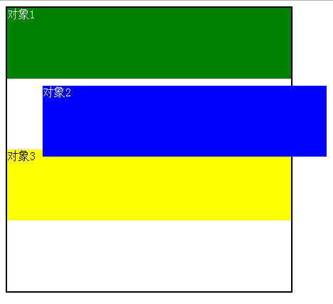
The object 2 with respect to its own original document flow position, and also occupy document flow, following the yellow block in accordance with its original position to continue down arrangement, relative positions only visually changed.
<style>
body{color: #fff;}
.aa{width: 400px;margin: 0 auto;border: 2px solid #000;height: 400px}
#position1 {height: 100px;background: green;}
#position2 {height: 100px;background: blue;position: relative;top: 10px;left: 50px;}
#position3{height: 100px;background: yellow;color: #000}</style><body><div class="aa">
<div id="position1">对象1</div>
<div id="position2">对象2</div>
<div id="position3">对象3</div></div>
</body>
2.absolute absolute positioning
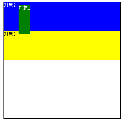
Object 1absolut properties relative to the parent div shifted from the normal flow, collapse width and height, above the document flow.
<style>
body{color: #fff;}
.aa{width: 400px;margin: 0 auto;border: 2px solid #000;height: 400px;position: relative;}
#position1 {height: 100px;background: green;position: absolute;top: 10px;left:50px; }
#position2 {height: 100px;background: blue;}
#position3{height: 100px;background: yellow;color: #000}</style></head><body><div class="aa">
<div id="position1">对象1</div>
<div id="position2">对象2</div>
<div id="position3">对象3</div></div>
Two, float float
(A) the definition of the float
Floating elements float attribute defines the left / right direction. Floating element generates a block-level box, regardless of what element itself.
Value of float: left / right / none
(B) a float implemented text wrapping
Element attributes with floating elements may be made inline-block of having encapsulated, merged block elements such that the elements and inline elements advantages. Attribute with floating elements will be arranged from the standard layout stream, flow out of the standard float element floats above a normal block, but still occupy the normal text document flow space, such that in addition to the text after the floating element space It is a reference arrangement, the effect of forming text surrounded.
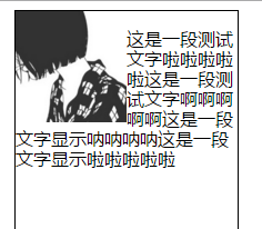
<style>
.a{width: 200px;height: 400px;margin: 0 auto;border: 1px solid #000;}
.pic{float: left;}
p{font-size: 16px;line-height: 18px;font-family: "Microsoft Yahei"}</style></head><body><div class="a">
<img src="2.jpg" width="100" width="100" class="pic">
<p> This is a test text la la la This is a test text ah ah ah This is a text display na na na na This is a text display la la la </ p> </ div>
(Iii) a float floating layout
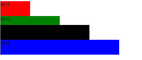
Standard document flow from top to bottom order.
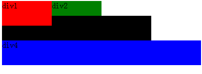
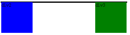
After div1 left float, it is clear that the height of collapse, and Div2 div3 div1 and overlap.
(D) Why do you want to clear a few ways to clear floating and floating
Since the height of the floating elements cause side effects collapse, the parent can not be softened box frame, the background can not be displayed, the parent-child between margin and padding set value can not be correctly displayed.
<style>
.div1{width: 400px;border: 2px solid #000;}
.div2{width: 100px;height: 100px;background: blue;float: left;}
.div3{width: 100px;height: 100px;background: green;float: right;}</style></head><body><div class="div1">
<div class="div2">div2</div>
<div class="div3">div3</div></div>
Method 1: before the end of the parent, to add a sub-tag <div style = "clear: both ;"> </ div>
<div class="div1">
<div class="div2">div2</div>
<div class="div3">div3</div>
<div style="clear:both;"></div></div>
Method 2: In the parent css attributes add the overflow: hidden; zoom: 1; or overflow: auto; zoom: 1;
Method 3: In the parent with zoom +: after method similar principle clear: both, with CSS manner: after adding a clear internal elements: both the element blocks
.box1 {zoom: 1;}
.box1:after{display:block; content:'clear'; clear:both; line-height:0; visibility:hidden;}
Method 4: The parent disposed directly suitable height distraction
(V) float and JavaScript
IE browser:
obj.style.styleFloat = "left";
Other browsers:
obj.style.cssFloat = "left";
Reference: https://www.cnblogs.com/huanqiuxuexiji/p/9063338.html