This series of articles is in the process of building my garden blog blog going through.
On the one how to tune your blog Episode1-- modify the overall style , we CSS style by adding, modifying the overall layout of the page. But after issuing the article, blog layout issues emerged:
Due to modify the overall layout, leading to default style blog Park is not working. Further horizontal scrollbar will appear at the end of the movement. Let us continue the magic to change this blog now!
1. Main Window increased adaptive
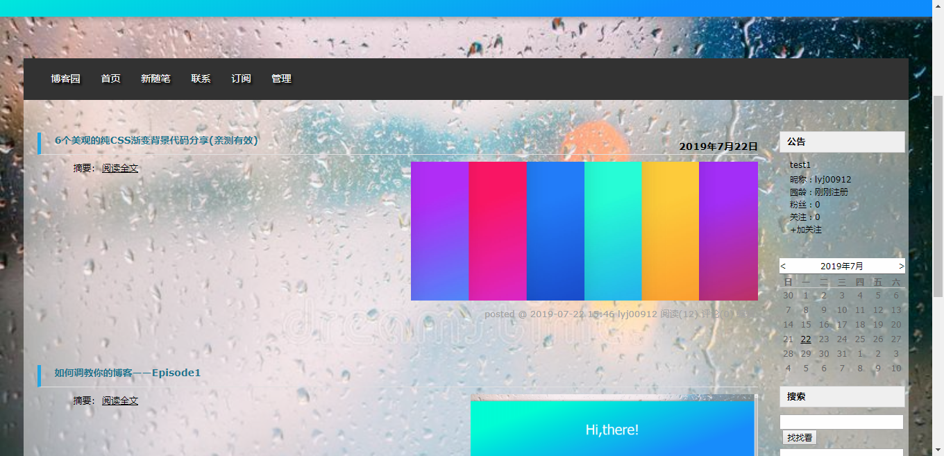
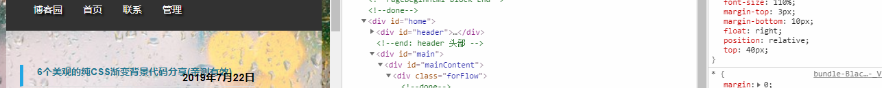
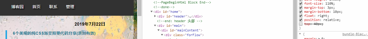
In the previous article, we have the id of the width of the main div main page revised to 95%. But it horizontal scroll bar will appear on the page when narrowing. A check style sheets, found to be the main cause of min-width options:
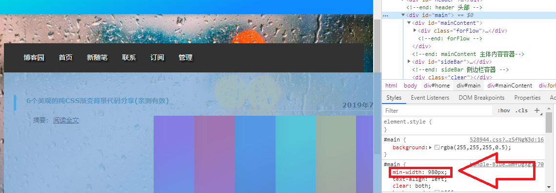
The solution is changed to a width 0px min-width, so that can be infinitely narrow, does not produce a horizontal scrollbar. To avoid the two rules conflict, behind this rule added! Important, this rule is set to the highest priority. Well, problem solved!
#main{
    min-width: 0px !important;
}
2. Adjust the title bar style
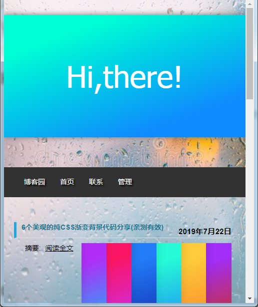
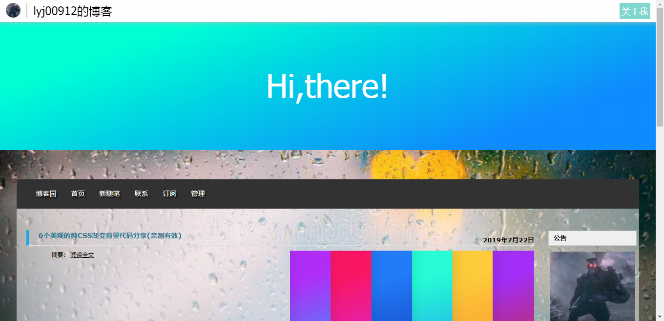
After the blog post, we found an important question: Tell me what gentlemen do not know who I am. . . Top of the page is missing a title, a "Hi, there!" Looks very awkward:

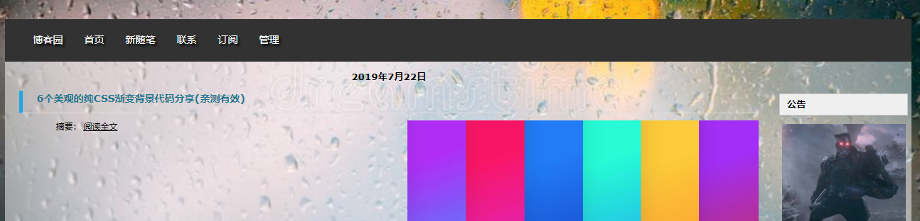
So I improved a little bit, adding a navigation bar, the effect is this:
3. Adjust the movable end date the problem of overlapping
Article Directory page layout is the most chaotic place, needs a good "tune" look!
First, overlap the movement end date:
The top: 40px element to disable the swap will find the original title and date are two separate elements:
.dayTitle{
    float:none !important;
    top:0px !important;
    text-align:center;
}
这段代码把top改成了0px,文字进行居中,但效果不尽人意:
还是直接隐藏日期吧:
.dayTitle{
    display:none;
}
4.为缩略图设置统一大小
文章缩略图会根据自己的大小按比例显示,这就导致了图片大小参差不齐:
一开始的想法是把图片的宽度都设置成100%,高度让它自动缩放。但这样高度不会缩放,而是会变形,这时可以定义一个max-height:10000px,他就开始自动缩放了。高度不缩放可能是CSS标准没写明的地方,但定义max-height可能就会触发浏览器重载图片,达到目的。代码如下:
.c_b_p_desc img{
    width:100%;
    max-height:10000px;
}

5.测试结果
分别在Windows7下的Chrome 75.0.3770.142和Android P默认浏览器下进行的测试,结果如图:
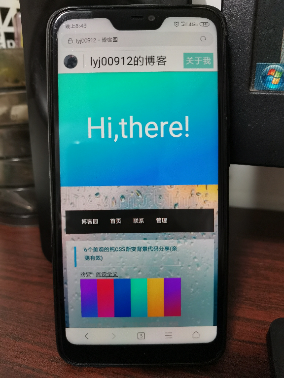
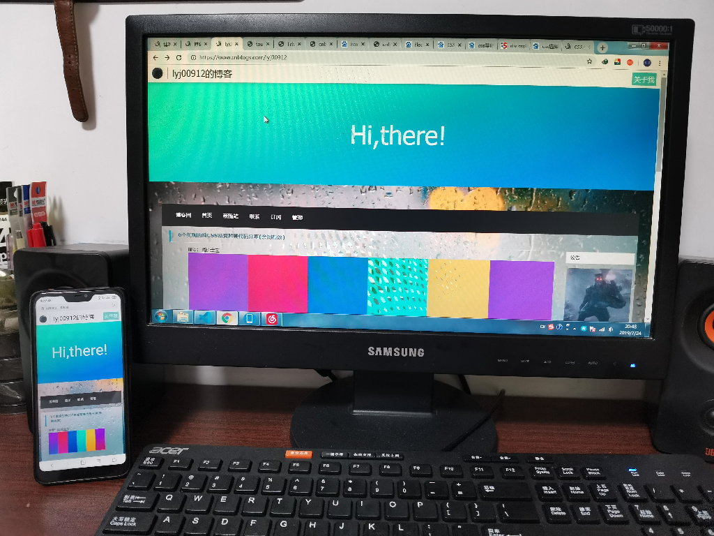
总体来说实现了移动端和PC端的兼容,优化了手机用户的体验。