This article reprinted from: https://mp.weixin.qq.com/s?__biz=MjM5MTQzNzU2NA==&mid=208614231&idx=2&sn=a54d208f1e955ee4dcf7f7eef579da00&scene=21#wechat_redirect
Senior visual effects
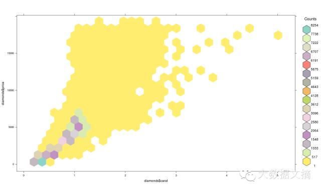
What is Hexbin Binning?
If there are many points (overplotting) in the same place, we can use Hexbin package. Hexagonal binning is a binary histogram is useful for visualizing a large number of data sets stage structure. Here is the code:
>library(hexbin)
>a=hexbin(diamonds$price,diamonds$carat,xbins=40)
>library(RColorBrewer)
>plot(a)

We can also create a palette, then Hexbin graphics to get a better visual effect. Here is the code:
>library(RColorBrewer)
>rf <- colorRampPalette(rev(brewer.pal(40,'Set3')))
>hexbinplot(diamonds$price~diamonds$carat, data=diamonds, colramp=rf)
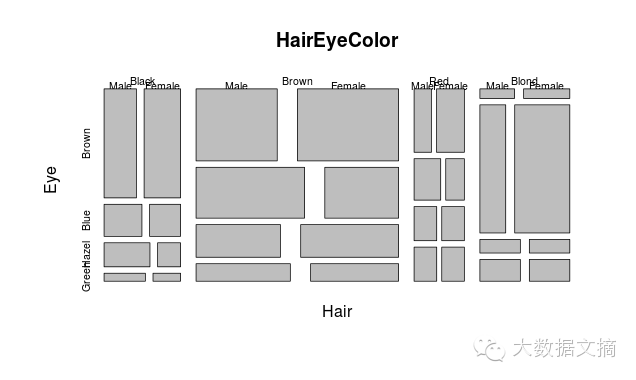
Mosaic
Mosaic can be occupied by the data area size to effectively display the relative proportions of the classification data.
> data(HairEyeColor)
> mosaicplot(HairEyeColor)
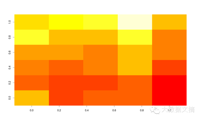
Heat Map
FIG axis allows you to heat in two dimensions, the intensity of the color is the third dimension for data exploratory analysis. However, you need the data sets into a matrix form. Here is the code:
> heatmap(as.matrix(mtcars))
You can also use image () command to do this type of visualization:
> image(as.matrix(b[2:7]))
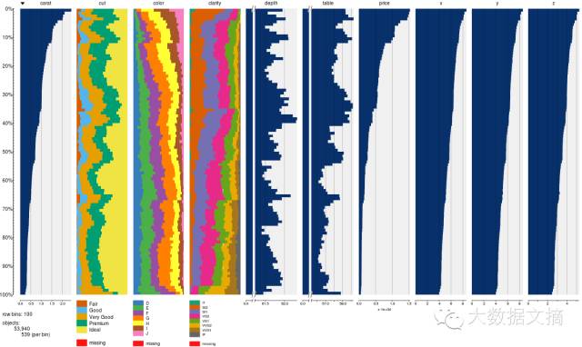
How to Sum large amounts of data?
您可以使用tabplot包中的tableplot功能,快速汇总大量数据
地图可视化
R语言中最新的东西是通过Javascript库来进行数据可视化。Leaflet是JavaScript开源库中最受欢迎的一个库,用于互动地图。有关它的内容,请参考https://rstudio.github.io/leaflet/。
您可以用下面的代码直接从github安装Leaflet。
devtools::install_github("rstudio/leaflet")
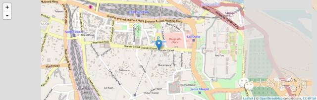
制作上述地图的代码是非常简单的:
library(magrittr)
library(leaflet)
m <- leaflet() %>%
addTiles() %>% # Add default OpenStreetMap map tiles
addMarkers(lng=77.2310, lat=28.6560, popup="The delicious food of chandni chowk")
m # Print the map
3维图
用R语言的的功能让人闪瞎眼的最简单的方法之一是通过创建一张3维图,而不需要用R语言写一行代码,并且在3分钟内就能完成。这样要求是不是太过分呢?
我们使用R Commander包作为图形用户界面(GUI)。操作步骤如下:
1. 只需安装Rcmdr包
2. 使用来自图中的3D绘图选项
下面的代码不是用户输入的,是自动生成的。
便签:当我们交换图的坐标轴时,您应该看到有着相应代码的图,我们是如何使用xlab和ylab来传递轴标签,图标题用Main函数,颜色是col参数。
>data(iris, package="datasets")
>scatter3d(Petal.Width~Petal.Length+Sepal.Length|Species, data=iris, fit="linear"
>residuals=TRUE, parallel=FALSE, bg="black", axis.scales=TRUE, grid=TRUE, ellipsoid=FALSE)

您还可以使用Lattice包来做3维图。Lattice也可以用于xyplot。下面是代码:
>attach(iris)# 3d scatterplot by factor level
>cloud(Sepal.Length~Sepal.Width*Petal.Length|Species, main="3D Scatterplot by Species")
>xyplot(Sepal.Width ~ Sepal.Length, iris, groups = iris$Species, pch= 20)


相关图(GUIs)
相关图帮助我们把相关矩阵内的数据可视化。下面是代码:
> cor(iris[1:4])
Sepal.Length Sepal.Width Petal.Length Petal.Width
Sepal.Length 1.0000000 -0.1175698 0.8717538 0.8179411
Sepal.Width -0.1175698 1.0000000 -0.4284401 -0.3661259
Petal.Length 0.8717538 -0.4284401 1.0000000 0.9628654
Petal.Width 0.8179411 -0.3661259 0.9628654 1.0000000
> corrgram(iris)

R语言有三个主要的GUI包。RCcommander和KMggplot及Rattle用于数据挖掘,Deducer用于数据可视化。这些有助于自动完成多个工作。
结束语
我真的享受写这篇文章,R语言所用到的各种方式使得它成为世界上最好的数据可视化软件。Python也许在Seaborn(译者注:Seaborn是python中基于matplotlib的统计绘图模块)和ggplot(译者注:ggplot是用于绘图的R语言扩展包在Python的移植)上获得进展,而没有什么能打败在统计数据可视化上拥有绝对数量巨大软件包的R语言。
我在本文中已经讨论了各种形式的可视化,是通过用R语言编程实现从基础到高级的有助于展示数据的图表。