R language data visualization ggplot2 basics 1 ggplot2 graphics layered grammar Introduction to Layered Grammar
ggplot2 is part of the tidyverse package. Tidyverse is a package developed by Hadley Wickham and his team in order to be able to process data and charts systematically. For us statisticians, although R language provides many methods for data visualization, ggplot2 is still the most elegant and powerful package for R language for visualization. The meaning of gg is grammar of graphics, which implies that ggplot2 is a language for describing and creating graphics. In this lecture, we introduce the main content of the layered grammar, which will help you understand the functions and commands of ggplot2. For some details, please refer to Hadley Wickham's article A Layered Grammar of Graphics . This article introduces Hadley Wickham's understanding of graphic objects, the composition and application of Layered Grammar, and so on.
Hadley Wickham believes that a plot needs to have the following components:
- Layer: Data set, a series of aesthetic mappings that turn the data set into graphics, geometric objects composed of one or a series of graphics (as a layer), and statistical transformations (centralization, Standardization, etc.), position adjustment
- Panel (facet): A facet is composed of multiple subplots, which can manipulate the angle and position of each subplot
- Scale
- Coordinates system
Below we introduce these contents one by one.
The composition of the hierarchical grammar (data-stat-geom-scale-coord-facet)
Data ( data ) is of course the basis of drawing, but in the hierarchical grammar, the data and the command to create the graph are independent. We regard the code as a mapping, data is the input of the mapping, and the graph is the output of the mapping , So the command to create a graphic should be applicable to different data sets. According to Hadley Wickham’s original words, Data are what turns an abstract graphic into a concrete graphic.
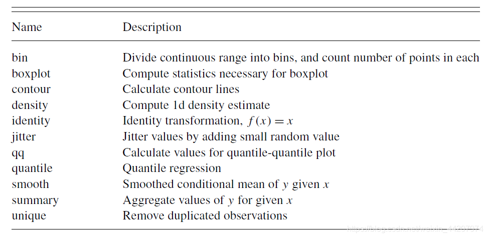
Usually for the input data set, we can do some statistical transformation (statistical transformation, referred to as stat ) to make the graph "good-looking", the following is the commonly used stat in ggplot2:
stat is a mapping, which takes the original data as input, and then uses The output data is used as the data for creating the graph. In fact, the stat step is the statistical processing of raw data that we are familiar with. Note that stat by the scale ( Scale ) coordinate system (coordinate system, referred coord impact), such as smoothing operation, then, in Cartesian coordinates and polar coordinates smoothing effect is certainly different, even in the Cartesian coordinate system In, the effect of smoothing under different axis scales is also different.
A geometric object ( geom for short ) is an abstract object. For example, an interval is an abstract object. We can use different rendering methods to express it. For example, the following four are all interval rendering methods:

a geom only Can display specific graphics, such as scatter chart objects can only display scatter charts, but we can adjust the color, shape, size, position and other attributes of the scatter points through parameters; a layer contains a geom, if you want to add another geometry Object, you need to create another layer to operate.
Finally, it is about the facet. The function of the facet is to display multiple subplots in one plot, such as the following figure:
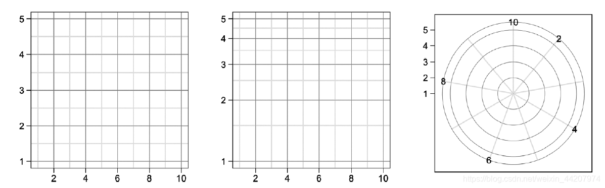
This is composed of 1 × 3 1 \times 31×3 subplots form a facet. The first subplot is a rectangular coordinate system, the second is semi-log coordinates, and the second is polar coordinates.
Use layered syntax to understand a piece of ggplot2 code
Let's look at a simple example to learn how to use the hierarchical syntax framework (data-stat-geom-scale-coord-facet) to understand a piece of ggplot2 code.
Suppose we want to create the following graph:
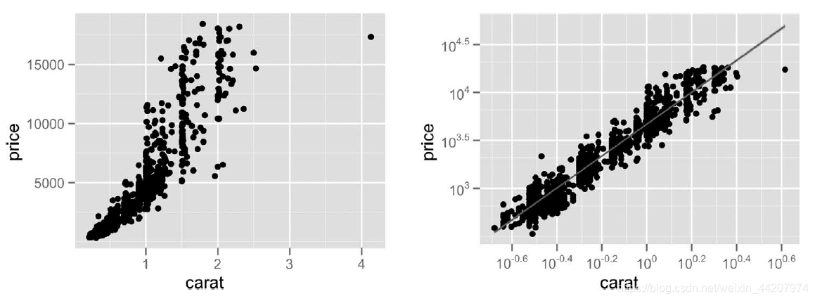
This is a 1 × 2 1 \times 21×For facet 2 , the subplot on the left is the relationship between diamond prices and carats in a rectangular coordinate system; the subplot on the right is the relationship between diamond prices and carats in a logarithmic coordinate system. We will not introduce the facet operation for the time being, the following is an analysis of the ggplot2 code of these two subplots. We review the composition of layered grammar: layer(data-stat-geom)-scale-coord-facet, we will find that the code of ggplot2 drawing is completely consistent with the layered grammar, which means that ggplot2 is designed strictly according to the layered grammar of. The beginning of ggplot() means that the next step is to apply graphic grammar to create graphic objects. The first step is to create layers. Each layer contains data, mapping (aesthetic mapping), geometric objects, statistical transformation, and position adjustment; the second step is to specify scale and coordinate system.
Subplot 1
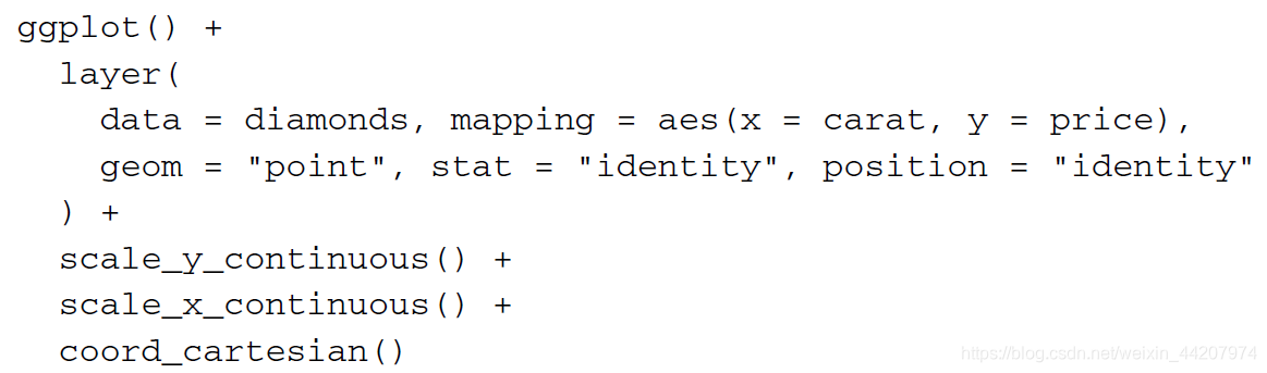
This is the ggplot2 code needed to create the first figure. Start with ggplot(), and then use layer() to create a layer. The dataset used for this layer is diamond; using aesthetic mapping is to specify the variable, because the relationship between diamond price and carat change is drawn, so xxx- axis is carat,yyThe y- axis is the price; the geometric object is a point, that is, to draw a scatter plot, no other parameters are specified, so the default style is used; the stat and position use identity, that is, identity transformation, indicating that we do not need to perform the original data Statistical processing or position adjustment. Next specifyxxx variable andyyThe scale of the y variable, continuous means that the scale changes continuously, without other scaling; the last specified coordinate system is a rectangular coordinate system.
Subplot 2
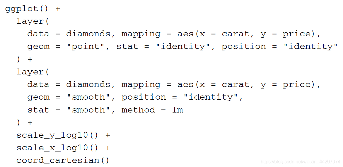
This is the ggplot2 code needed to create the second graph. Start with ggplot(), then use layer() to create two layers. The command for the first layer is the same as subplot 1. The data and mapping of the second layer are the same as the first layer, but the geometric object is smooth, which means that we hope the geometric object created by the second layer is the smooth curve of the scatter plot of the first layer, stat It is also smooth. The following method = lm means that we use a linear model to smooth the original data. Overlap these two layers. When scaling, set x, yx, yx,The y variables are all taken in log, and then displayed in a rectangular coordinate system, we can get subplot 2.
In summary, after understanding the hierarchical syntax of graphics, we can easily associate graphics with every command of ggplot2.