The default height and body elements heml
html and body are block elements, their default width is the width of the visible region of the browser, and their height, there are two defaults:
1. with html document DOCTYPE declaration, the default height of the html and body is zero, their height from the content they contain. common
<html id="html">
<head>
<style>
* {
padding: 0;
margin: 0;
}
html{
background:black;
}
p{
height:20px;
background:red;
}
</style>
</head>
<body id="body">
<p></p>
</body>
</html>
window.onload = function () {
console.log(window.getComputedStyle(document.querySelector("#html")).height);//20px
console.log(window.getComputedStyle(document.querySelector("#body")).height);//20px
}
</script>
2. Without html document DOCTYPE declaration, the default height of the html and body is visible in the browser client area height. uncommon
height:20px;
background:red;
}
window.onload = function () {
console.log(window.getComputedStyle(document.querySelector("#html")).height);//635px
console.log(window.getComputedStyle(document.querySelector("#body")).height);//635px
}
However, if the content is greater than the height of the default height of the html and body, then the height of the html and body comes from what they contain.
height:2000px;
background:red;
}
window.onload = function () {
console.log(window.getComputedStyle(document.querySelector("#html")).height);//2000px
console.log(window.getComputedStyle(document.querySelector("#body")).height);//2000px
}
The body background property
background:#b200ff;
}
p{
height:20px;
border:1px solid #fff;
}
<body id="body">
<p></p>
</body>
body background color is very special, its background color is applied to the entire document instead of its own, only the contents of its height it contains so high

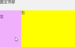
Full-screen layout
Full screen layout refers to the browser only displays visual content in the area in the client area, not on the visible elements of other areas all hidden, so there is no scroll bar, and then push the drop-down (isicroll) by js plugins, Swipe to control display of the remaining contents. Full-screen layout like this, first you need to use html and css to control the height of the body. In the html document DOCTYPE declaration, the height of html from a node to its content, but you can manually set it high = high screen viewing area.
<html>
<head>
<meta charset="utf-8" />
<title></title>
<meta name="viewport" content="width=device-width,initial-scale=1.0,user-scalable=0" />
<style>
* {
margin: 0;
padding: 0;
-webkit-box-sizing: border-box;
}
html, body {
height: 100%;
}
.containner-box {
width: 100%;
height: 100%;
background: #bceafe;
}
/*顶部搜索栏脱离标准流,containner-box的高度不再包含搜索栏的高度*/
.product-search-box {
width: inherit;
height: 45px;
position: fixed;
background: #F1F1F1;
}
.product-search-box a:first-child {
position: absolute;
top: 22.5px;
margin-top: -8px;
left: 5px;
}
.product-search-box a:last-child {
position: absolute;
top: 22.5px;
margin-top: -8px;
right: 8px;
}
.product-search-box form {
width: inherit;
height: inherit;
padding: 0 30px;
}
.product-search-box input {
width: inherit;
height: 32px;
margin-top: 6.5px;
border-radius: 3px;
border: 1px solid #DDDDDD;
}
.product-content {
width: 100%;
height: 100%; /*跟文档区域一样高*/
background: #ff6a00;
padding-top: 45px; /*padding一下避免被搜索栏挡住*/
}
.product-content .f_left, .product-content .f_right {
height: 100%;
}
/*左部导航浮动后脱离正常文档流*/
.product-content .left {
width: 90px;
height: 100%;
float: left;
overflow:hidden;
background: #f0b0fc;
}
/*左部因为浮动,此元素宽度默认占满父元素,*/
.product-content .right {
height: 100%;
overflow: hidden; /*设hidden,以便是浮动元素不会覆盖住当前元素*/
background: yellow;
}
</style>
</head>
<body>
<div class="containner-box">
<div class="product-search-box">
固定顶部
</div>
<div class="product-content">
<div class="left">
<div style="height:2000px;width:1000px;">
左
</div>
</div>
<div class="right">
<div style="height:2000px;width:1000px;">右</div>
</div>
</div>
</div>
</body>
</html>
<script src="Scripts/iscroll.js"></script> 需要用到这个插件
<script>
window.onload = function () {
var leftBox = document.querySelector('.left');
console.log(leftBox);
leftBox.addEventListener('touchmove', function (e) {
e.preventDefault();
});
var rightBox = document.querySelector('.right');
rightBox.addEventListener('touchmove', function (e) {
e.preventDefault();
});
//容器内上下左右滚动
//子容器尺寸大于父容器,哪怕只大1px也支持滚动,子元素必须大于
new IScroll(leftBox, {
scrollX: true,
scrollY: true
});
new IScroll(rightBox, {
scrollX: true,
scrollY: true
});
}
</script>