Table of contents
1. Flex Layout (Classification Programming Technology)
2. Home page layout construction
1. Bottom navigation bar settings
2. Construction of home page carousel image
2.1. Backend interface management
2.3. Construction of carousel chart
3. Home page meeting information construction
3.1. Simulate mock.js to transmit data
3.2. Build home page meeting information
Preface
When building a WeChat applet project, it is a common requirement to use Flex layout and Mock data interaction. Next, this blog will take you through the implementation of Flex layout, Mock data interaction and OA conference system homepage construction.
1. Flex layout ( categorical programming technology )
Web page layout (layout) is a key application of CSS.
The traditional solution for layout, based on the box model , relies on the display attribute + position attribute + float attribute. It is very inconvenient for those special layouts. For example, vertical centering is not easy to achieve.
In 2009, W3C proposed a new solution - Flex layout, which can realize various page layouts simply, completely and responsively. Currently, it is supported by all browsers, which means it is now safe to use this feature.

Flex layout will become the preferred solution for future layout. This article introduces the syntax of Flex layout.
The following content mainly refers to the following two articles: A Complete Guide to Flexbox and A Visual Guide to CSS3 Flexbox Properties .
1. What is Flex layout?
Flex is the abbreviation of Flexible Box, which means "flexible layout" and is used to provide maximum flexibility for box-shaped models.
Any container can be designated as a Flex layout.
.box{
  display: flex;
}
Inline elements can also use Flex layout.
.box{
  display: inline-flex;
}
Browsers with Webkit core must add the -webkit prefix.
.box{
  display: -webkit-flex; /* Safari */
  display: flex;
}
Note that after setting to Flex layout, the float, clear and vertical-align attributes of child elements will be invalid.
2. Basic concepts
Elements that use Flex layout are called Flex containers (flex containers), or "containers" for short. All its child elements automatically become container members, called Flex items (flex items), referred to as "items".

The container has two axes by default: the horizontal main axis and the vertical cross axis. The starting position of the main axis (the intersection with the border) is called main start, and the ending position is called main end; the starting position of the cross axis is called cross start, and the ending position is called cross end.
Items are arranged along the main axis by default. The main axis space occupied by a single item is called main size, and the cross axis space occupied by a single item is called cross size.
3. Container properties
The following 6 properties are set on the container.
- flex-direction
- flex-wrap
- flex-flow
- justify-content
- align-items
- align-content
3.1 flex-direction property
The flex-direction property determines the direction of the main axis (that is, the direction in which items are arranged).
.box {
  flex-direction: row | row-reverse | column | column-reverse;
}
It may have 4 values.
- row (default): The main axis is horizontal and the starting point is at the left end.
- row-reverse: The main axis is horizontal and the starting point is at the right end.
- column: The main axis is vertical, and the starting point is at the upper edge.
- column-reverse: The main axis is vertical and the starting point is at the lower edge.
3.2 flex-wrap attribute
By default, items are aligned on a line (also called a "pivot"). The flex-wrap attribute defines how to wrap the line if one axis cannot fit.

.box{
  flex-wrap: nowrap | wrap | wrap-reverse;
}
It may take three values.
(1) nowrap (default): no line breaks.
(2) wrap: wrap, with the first line at the top.

(3) wrap-reverse: wrap, the first line is below.
3.3 flex-flow
The flex-flow property is the abbreviation of the flex-direction property and the flex-wrap property. The default value is row nowrap.
.box {
  flex-flow: <flex-direction> <flex-wrap>;
}
3.4 justify-content attribute
The justify-content property defines the alignment of items on the main axis .
.box {
  justify-content: flex-start | flex-end | center | space-between | space-around;
}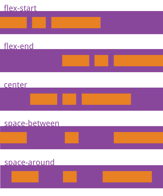
It may take 5 values, and the specific alignment is related to the direction of the axis. The following assumes that the main axis is from left to right.
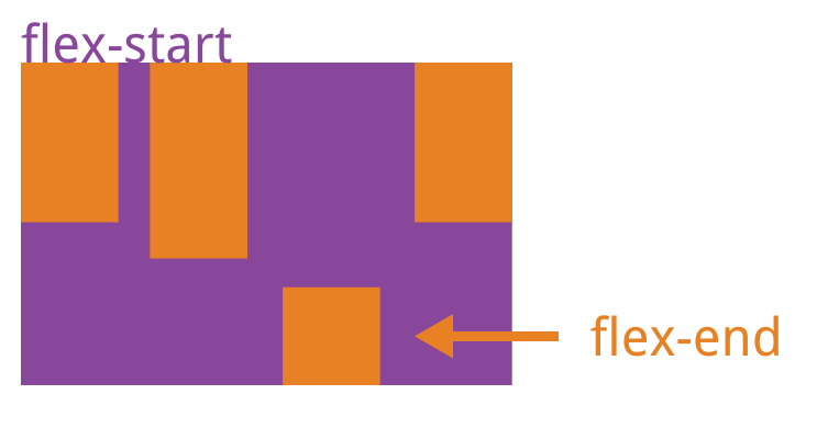
- flex-start (default): left aligned
- flex-end: right aligned
- center : centered
- space-between : Align both ends, and the spaces between items are equal.
- space-around : Each item is equally spaced on both sides. Therefore, the space between items is twice as large as the space between items and the border.
3.5 align-items attribute
The align-items property defines how items are aligned on the cross axis.
.box {
  align-items: flex-start | flex-end | center | baseline | stretch;
}
It may take 5 values. The specific alignment is related to the direction of the cross axis. It is assumed below that the cross axis is from top to bottom.
- flex-start : Align the starting point of the cross axis.
- flex-end : align the end points of the cross axis.
- center : align the midpoint of the cross axis.
- baseline : The baseline alignment of the first line of text of the item.
- stretch (default value): If the item does not set a height or is set to auto, it will occupy the entire height of the container.
3.6 align-content attribute
The align-content property defines the alignment of multiple axes. This property has no effect if the project has only one axis.
.box {
  align-content: flex-start | flex-end | center | space-between | space-around | stretch;
}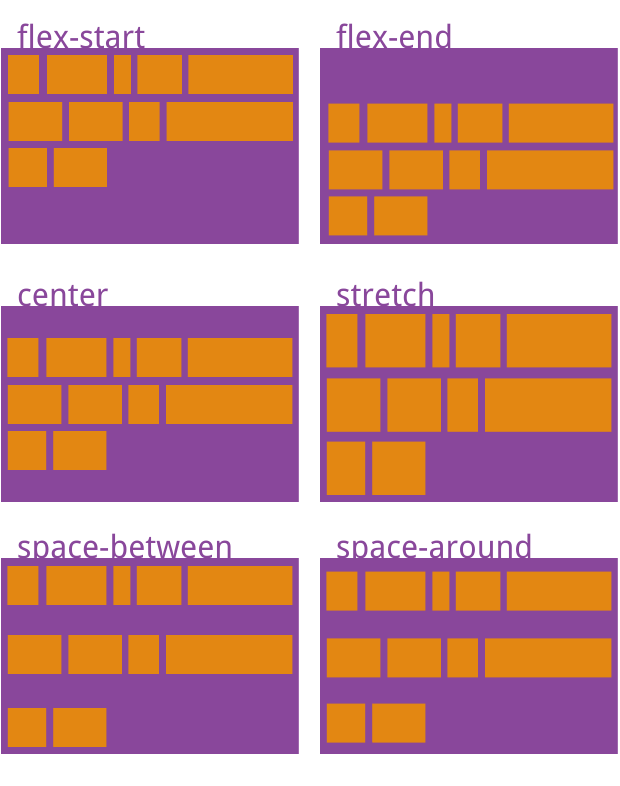
This attribute may take on 6 values.
- flex-start : Align with the starting point of the cross axis.
- flex-end : aligned with the end point of the cross axis.
- center : Aligned with the midpoint of the cross axis.
- space-between : Align with both ends of the cross axis, and the intervals between the axes are evenly distributed.
- space-around : Each axis is equally spaced on both sides. Therefore, the distance between the axes is twice as large as the distance between the axes and the frame.
- stretch (default): The axis occupies the entire cross axis.
4. Project attributes
The following 6 properties are set on the project.
- order
- flex-grow
- flex-shrink
- flex-basis
- flex
- align-self
4.1 order attribute
The order attribute defines the order in which items are sorted. The smaller the value, the higher the ranking. The default is 0.
.item {
  order: <integer>;
}
4.2 flex-grow attribute
The flex-grow attribute defines the magnification ratio of the item. The default is 0, that is, if there is remaining space, it will not be enlarged.
.item {
  flex-grow: <number>; /* default 0 */
}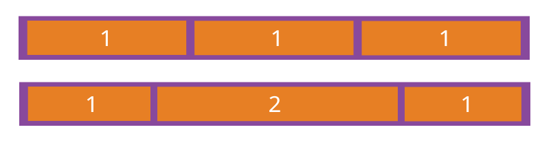
If all items have a flex-grow property of 1, they will equally divide the remaining space (if there is any). If one item's flex-grow property is 2 and the other items are all 1, the former will occupy twice as much remaining space as the other items.
4.3 flex-shrink attribute
The flex-shrink attribute defines the shrinkage ratio of the item. The default is 1, that is, if there is insufficient space, the item will shrink.
.item {
  flex-shrink: <number>; /* default 1 */
}
If the flex-shrink property of all items is 1, when there is insufficient space, they will all be reduced proportionally. If the flex-shrink property of one item is 0 and the other items are 1, the former will not shrink when there is insufficient space.
Negative values are not valid for this property.
4.4 flex-basis property
The flex-basis property defines the main size of the item before allocating excess space. The browser uses this attribute to calculate whether there is extra space on the main axis. Its default value is auto, which is the original size of the project.
.item {
  flex-basis: <length> | auto; /* default auto */
}
It can be set to the same value as the width or height properties (such as 350px), and the item will occupy a fixed space.
4.5 flex attribute
The flex property is the abbreviation of flex-grow, flex-shrink and flex-basis. The default value is 0 1 auto. The last two properties are optional.
.item {
  flex: none | [ <'flex-grow'> <'flex-shrink'>? || <'flex-basis'> ]
}
This property has two shortcut values: auto (1 1 auto) and none (0 0 auto).
It is recommended to use this attribute first instead of writing three separate attributes separately, because the browser will infer the relevant values.
4.6 align-self attribute
The align-self attribute allows a single item to be aligned differently from other items, overriding the align-items attribute. The default value is auto, which means inheriting the align-items attribute of the parent element. If there is no parent element, it is equivalent to stretch.
.item {
  align-self: auto | flex-start | flex-end | center | baseline | stretch;
}
This attribute may take 6 values. Except for auto, the others are exactly the same as the align-items attribute.
2. Home page layout construction
1. Bottom navigation bar settings
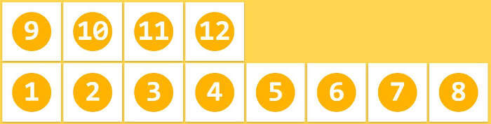
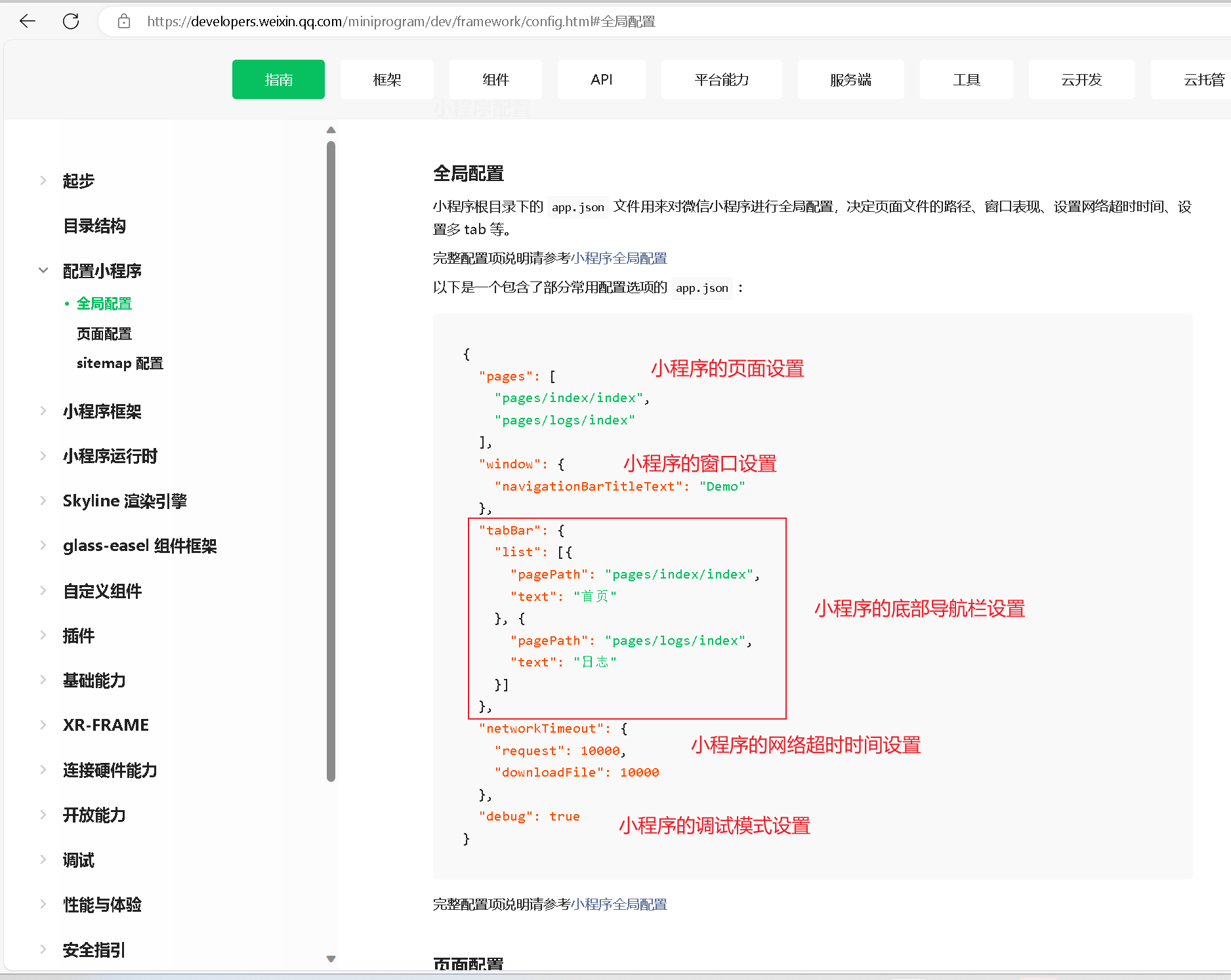
A bottom navigation bar is indispensable for a WeChat applet, so we first build a bottom navigation bar. According to the developer documentation of the WeChat applet, the bottom navigation bar needs to define tabBar in api.json and configure it accordingly ( note First define the page in pages ).
The bottom navigation bar without icons is very monotonous, so we also need to create a folder named static to store images.

Continue to create a file named tabBar in the static folder , put the icon we need, and reference the icon with the attribute iconPath .
{
    "pages": [
        "pages/index/index",
        "pages/meeting/list/list",
        "pages/vote/list/list",
        "pages/ucenter/index/index"
    ],
    "window": {
        "backgroundTextStyle": "light",
        "navigationBarBackgroundColor": "#fff",
        "navigationBarTitleText": "OA会议系统",
        "navigationBarTextStyle": "black"
    },
    "tabBar": {
        "list": [
            {
                "pagePath": "pages/index/index",
                "text": "首页",
                "iconPath": "/static/tabBar/coding.png",
                "selectedIconPath": "/static/tabBar/coding-active.png"
            },
            {
                "pagePath": "pages/meeting/list/list",
                "iconPath": "/static/tabBar/sdk.png",
                "selectedIconPath": "/static/tabBar/sdk-active.png",
                "text": "会议"
            },
            {
                "pagePath": "pages/vote/list/list",
                "iconPath": "/static/tabBar/template.png",
                "selectedIconPath": "/static/tabBar/template-active.png",
                "text": "投票"
            },
            {
                "pagePath": "pages/ucenter/index/index",
                "iconPath": "/static/tabBar/component.png",
                "selectedIconPath": "/static/tabBar/component-active.png",
                "text": "设置"
            }
        ]
    },
    "style": "v2",
    "sitemapLocation": "sitemap.json"
}
Effect demonstration

2. Construction of home page carousel image
2.1. Backend interface management
When the page loads, we need to request the latest meeting and notification data from the backend and render it onto the carousel. Since we don't have a backend interface yet, in order to facilitate debugging, we choose to use Mock.js to simulate the data.
onLoadUse Axios to initiate a request in the life cycle function :
onLoad: function () {
  // 获取轮播图数据
  axios.get('http://localhost:8080/demo/wx/swiperImgs').then(res => {
    this.setData({
      hotNews: res.data
    })
  })
}
For the convenience of later maintenance, we first save all the back-end interfaces in a file, create a new config folder in the root directory and then create the api.js file.
// 以下是业务服务器API地址
 // 本机开发API地址
 var WxApiRoot = 'http://localhost:8080/demo/wx/';
 // 测试环境部署api地址
 // var WxApiRoot = 'http://192.168.0.101:8070/demo/wx/';
 // 线上平台api地址
 //var WxApiRoot = 'https://www.oa-mini.com/demo/wx/';

 module.exports = {
   IndexUrl: WxApiRoot + 'home/index', //首页数据接口
   SwiperImgs: WxApiRoot+'swiperImgs', //轮播图
   MettingInfos: WxApiRoot+'meeting/list', //会议信息
 };
2.2.Mock.js simulates data
Next we will simulate data transmission through Mock.js
open mock

Pass in simulated data
Simulated carousel data
{
  "data": {
    "images":[
  {
    "img": "https://cdn-we-retail.ym.tencent.com/tsr/home/v2/banner1.png",
    "text": "1"
  },
  {
    "img": "https://cdn-we-retail.ym.tencent.com/tsr/home/v2/banner2.png",
    "text": "2"
  },
  {
    "img": "https://cdn-we-retail.ym.tencent.com/tsr/home/v2/banner3.png",
    "text": "3"
  },
  {
    "img": "https://cdn-we-retail.ym.tencent.com/tsr/home/v2/banner4.png",
    "text": "4"
  },
  {
    "img": "https://cdn-we-retail.ym.tencent.com/tsr/home/v2/banner5.png",
    "text": "5"
  },
  {
    "img": "https://cdn-we-retail.ym.tencent.com/tsr/home/v2/banner6.png",
    "text": "6"
  }
]
  },
  "statusCode": "200",
  "header": {
    "content-type":"applicaiton/json;charset=utf-8"
  }
}
Put the following example method into onLoadthe life cycle function and execute the following method
loadSwiperImgs(){
let that=this;
// http://localhost:8080/demo/wx/swiperImgs
wx.request({
url: api.SwiperImgs,
dataType: 'json',
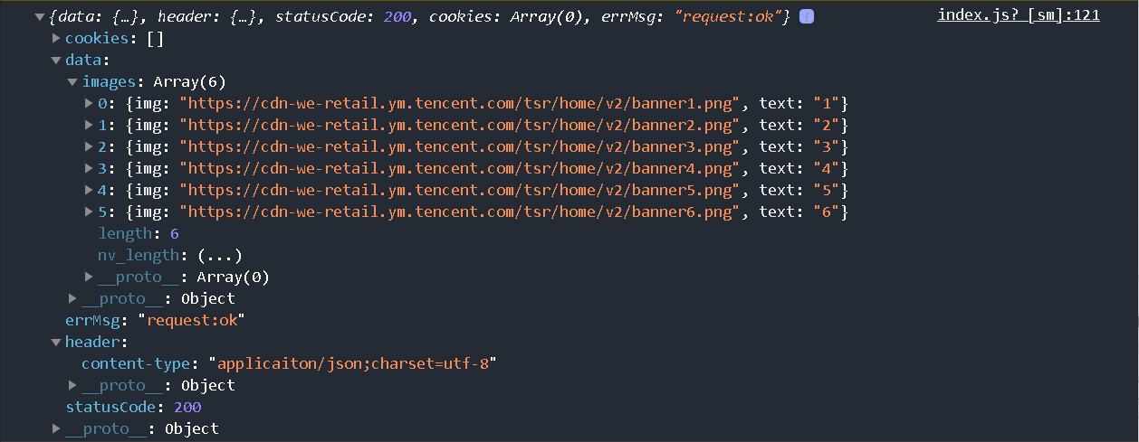
success(res) {
console.log(res)
that.setData({
imgSrcs:res.data.images
})
}
})
}We will be able to get the following data
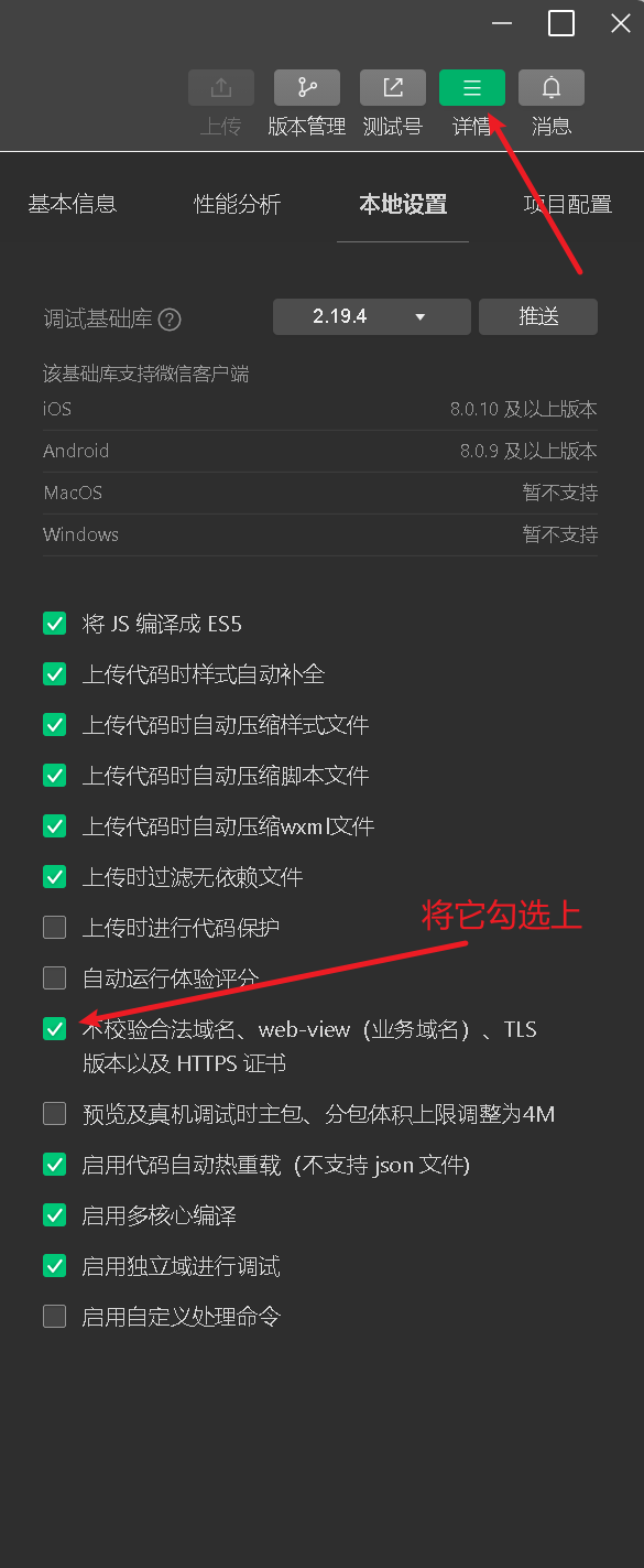
Notice:
Some people may encounter the following problems
Because our current mini program development checks the security certificate by default (the domain name is https), our request cannot pass. We only need to click the details button in WeChat mini program development , and then continue to click on local settings to turn on the option of not verifying legal domain names .

2.3. Construction of carousel chart
Build a carousel chart based on the component swiper provided by our official website .

Write components and styles
<!--index.wxml-->
<view>
    <d autoplay="true" indicator-dots="true">
        <block wx:for="{

   {imgSrcs}}" wx:key="text">
            <swiper-item>
                <view>
                    <image src="{

   {item.img}}" class="swiper-item" />
                </view>
            </swiper-item>
        </block>
    </swiper>
</view>
/**index.wxss**/
.swiper-item {
height: 300rpx;
width: 100%;
border-radius: 10rpx;
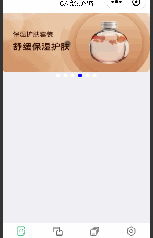
}vEffect demonstration
3. Home page meeting information construction
3.1. Simulate mock.js to transmit data
Send background request and put the method onLoadin the life cycle function
  //首页会议信息的ajax
  loadMeetingInfos(){
    let that=this;
    wx.request({
        url: api.MettingInfos,
        dataType: 'json',
        success(res) {
          console.log(res)
          that.setData({
              lists:res.data.lists
          })
        }
      })
  }
Simulated meeting information data
{
  "data": {
    "lists": [
        {
          "id": "1",
          "image": "/static/persons/1.jpg",
          "title": "对话产品总监 | 深圳·北京PM大会 【深度对话小米/京东/等产品总监】",
          "num":"304",
          "state":"进行中",
          "starttime": "2022-03-13 00:00:00",
          "location": "深圳市·南山区"
        },
        {
          "id": "1",
          "image": "/static/persons/2.jpg",
          "title": "AI WORLD 2016世界人工智能大会",
          "num":"380",
          "state":"已结束",
          "starttime": "2022-03-15 00:00:00",
          "location": "北京市·朝阳区"
        },
        {
          "id": "1",
          "image": "/static/persons/3.jpg",
          "title": "H100太空商业大会",
          "num":"500",
          "state":"进行中",
          "starttime": "2022-03-13 00:00:00",
          "location": "大连市"
        },
        {
          "id": "1",
          "image": "/static/persons/4.jpg",
          "title": "报名年度盛事,大咖云集!2016凤凰国际论坛邀您“与世界对话”",
          "num":"150",
          "state":"已结束",
          "starttime": "2022-03-13 00:00:00",
          "location": "北京市·朝阳区"
        },
        {
          "id": "1",
          "image": "/static/persons/5.jpg",
          "title": "新质生活 · 品质时代 2016消费升级创新大会",
          "num":"217",
          "state":"进行中",
          "starttime": "2022-03-13 00:00:00",
          "location": "北京市·朝阳区"
        }
      ]
  },
  "statusCode": "200",
  "header": {
    "content-type":"applicaiton/json;charset=utf-8"
  }
}
3.2. Build home page meeting information
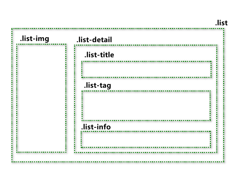
To build our look according to what we envisioned, the following is a style template diagram.
index.wxml
<!--pages/index/index.wxml-->
<!-- <text>pages/index/index.wxml</text> -->
<view>
    <swiper autoplay="true" indicator-dots="true" indicator-color="#fff" indicator-active-color="#00f">
        <block wx:for="{

   {imgSrcs}}" wx:key="text">
            <swiper-item>
                <view>
                    <image src="{

   {item.img}}" class="swiper-item" />
                </view>
            </swiper-item>
        </block>
    </swiper>
</view>
<view class="mobi-title">
    <text class="mobi-icon"></text>
    <text>会议信息</text>
</view>
<block wx:for-items="{

   {lists}}" wx:for-item="item" wx:key="item.id">
    <view class="list" data-id="{

   {item.id}}">
        <view class="list-img">
            <image class="video-img" mode="scaleToFill" src="{

   {item.image}}"></image>
        </view>
        <view class="list-detail">
            <view class="list-title"><text>{

   {item.title}}</text></view>
            <view class="list-tag">
                <view class="state">{

   {item.state}}</view>
                <view class="join"><text class="list-num">{

   {item.num}}</text>人报名</view>
            </view>
            <view class="list-info"><text>{

   {item.location}}</text>|<text>{

   {item.starttime}}</text></view>
        </view>
    </view>
</block>
<view class="section bottom-line">
		<text>到底啦</text>
</view>
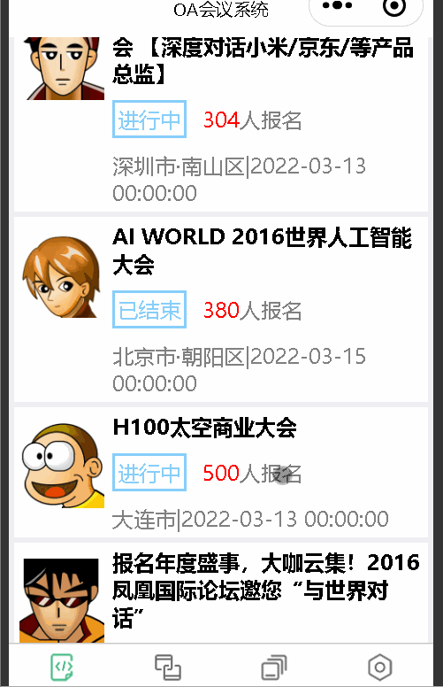
Effect demonstration

We didn’t adjust the style for it. Doesn’t it look beautiful? We will add our style next.
index.wxss
/* pages/index/index.wxss */
page{
	height: 100%;
	background-color: #efeff4;
}
.swiper-item {
    height: 300rpx;
    width: 100%;
    border-radius: 10rpx;
}
.mobi-title{
    font-size: 18px;
    margin: 10rpx;

}
.mobi-icon{
    background-color: red;
    padding: 3rpx;
}
.mobi-title text{
    margin-left: 10rpx;
}
.list{
    background-color: #fff;
    display: flex;
    margin: 10rpx;
    padding: 10rpx;
}
.list-img,.video-img{
    height: 150rpx;
    width: 150rpx;
}
.list-img{
    margin: 20rpx 0 0 0;
}
.list-detail{
    margin: 0 0 0 15rpx;

}
.list-title{
    font-weight: 700;
}
.list-tag{
    display: flex;
    margin: 10px 0;
}
.state{
    border: 2px solid lightskyblue;
    padding: 2px;
    color: lightskyblue;
}
.join{
    border: 2px solid #fff;
    padding: 2px;
    margin: 0 0 0 20rpx;
    color: gray;
}
.list-num{
    color: red;
}
.list-info{
    color: gray;
}
.bottom-line{
    text-align: center;
    margin-bottom: 10px;
}