Article directory
This article is adapted from: <HarmonyOS Lesson 1> Start with a simple page
https://developer.huawei.com/consumer/cn/training/course/slightMooc/C101667360160710997
All components
On macOS, the component files are located ~/Library/Huawei/Sdk/openharmony/9/ets/componenthere where you can see the classes and their properties and methods. Someone told me that not all components are in this folder.
For more officially stamped components and their uses, see this document: https://gitee.com/openharmony/docs/blob/master/zh-cn/application-dev/reference/arkui-ts/Readme-CN.md
Development tips
Before abstractly summarizing, let's draw the UI on HarmonyOS based on our previous UI experience. I believe we can have a more intuitive and practical understanding of HarmonyOS's UI development.
tips :
- You need to go to Your Devices first to start the emulator, and then run it;
- Like Xcode, click Command + Properties to enter the class file
- Restarting, reinstalling, rebuilding the project, and deleting are all good!
- Sometimes after installing the simulator and running it for the first time, there may be a problem with the desktop image display and the project may fail to run.
You can try to delete the emulator, reinstall it, and restart the program. Not just modifying compatible API versions. - Sometimes the code is modified, but the operation has no effect; you can check which Module you are running; the IDE will select the latest Module by default;
if restarting the IDE does not work, you can create a new project.
- Sometimes after installing the simulator and running it for the first time, there may be a problem with the desktop image display and the project may fail to run.
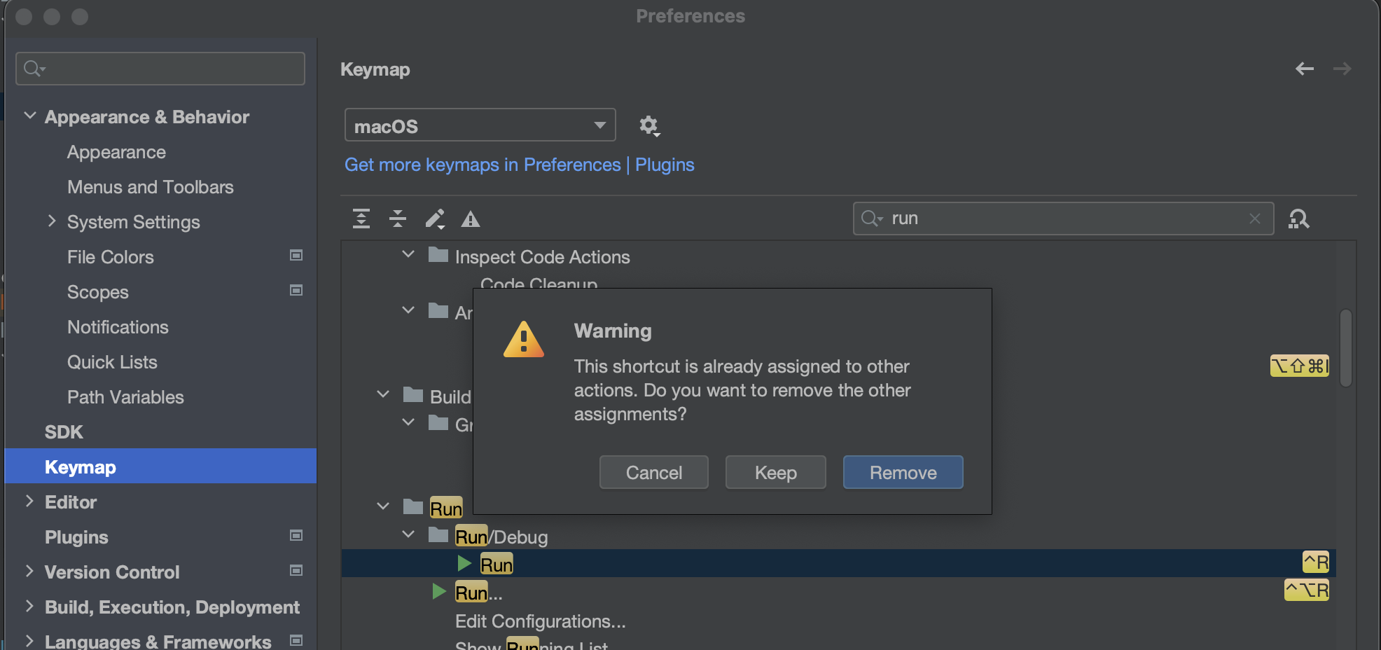
- Set the Command + R shortcut key
. For the convenience of debugging, Apple development students can change the shortcut to Command + R in the settings.
If there are duplicates, you will be prompted to remove (replace) the existing keys after setting them. You can see that EcoDev and PyCharm are the closest.
Blank
Blank()
  .backgroundColor(Color.Yellow)
  .width(100)
  .height(100)
Blank()
  .backgroundColor(Color.Blue)
  .width(100)
  .height(100)
Blank()
  .backgroundColor(Color.Red)
  .width(100)
  .height(100)

Text
That is UILabel on iOS
@Entry
@Component
struct Index {
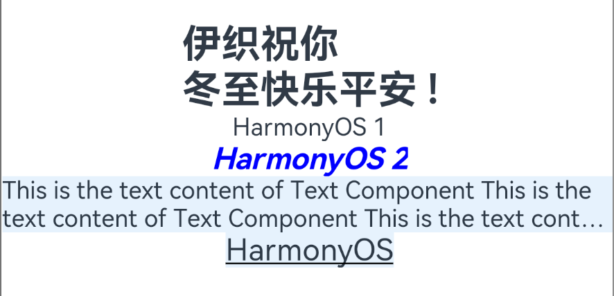
@State message: string = '伊织祝你\n冬至快乐平安 !'
build() {
Row() {
Column() {
Text(this.message)
.fontSize(26)
.fontWeight(FontWeight.Bold)
Text('HarmonyOS 1')
Text('HarmonyOS 2')
.fontColor(Color.Blue)
.fontSize(20)
.fontStyle(FontStyle.Italic)
.fontWeight(FontWeight.Bold)
.fontFamily('Arial')
Text('This is the text content of Text Component This is the text content of Text Component This is the text content of Text Component This is the text content of Text Component This is the text content of Text Component This is the text content of Text Component')
.fontSize(16)
.maxLines(2) // 显示的最大行数
.textOverflow({
overflow:TextOverflow.Ellipsis}) // 显示不下的文本用 “...” 表示
.backgroundColor(0xE6F2FD)
Text('HarmonyOS')
.fontSize(20)
.decoration({
type: TextDecorationType.Underline, color: Color.Black }) // 黑色修饰线
.backgroundColor(0xE6F2FD)
}
.width('100%')
}
.height('100%')
}
}
The effect is as follows:
Text property method
- fontColor: Set text color.
- fontSize: Set the text size. When Length is number type, use fp unit.
- minFontSize
- maxFontSize
- fontStyle: Set the font style of the text. Default value: FontStyle.Normal.
- Normal
- Italic
- fontWeight: Set the font weight of the text.
The number type value is [100, 900], the value interval is 100, and the default is 400. The larger the value, the thicker the font.
The string type only supports the string form of number type values, such as "400", and "bold", "bolder", "lighter", "regular", and "medium", which respectively correspond to the corresponding enumeration values in FontWeight. Default value: FontWeight.Normal. - textAlign
- TextAlign.Center
- TextAlign.Start
- TextAlign.End
- lineHeight
- textOverflow
- Clip
- Ellipsis
- None
- fontFamily: Set the font list for text. Use multiple fonts, use "," to separate them, and the priority will take effect in order. For example: "Arial, sans-serif".
- maxLines
- decoration
- None : Do not use text decoration lines.
- Underline: text underline modification.
- Overline: underline modification of text.
- LineThrough: A decorative line through the text.
- letterSpacing
- textCase
- baselineOffset
- copyOption
- None
- InApp
- LocalDevice
Image
Drag and drop files into the project
Place the file under Project Name – AppScope – resource – base – media
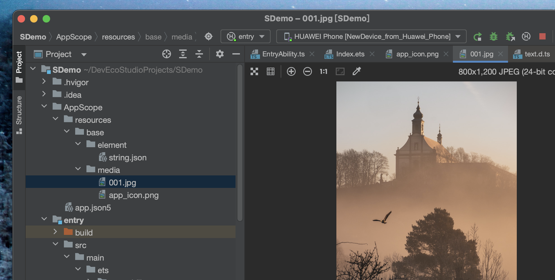
Tips: Currently, the file name cannot be modified in the project file list;
if the file name is modified in the folder, the modification will be synchronized in the project.
An unsolved problem: How to create a multi-level image directory?
In order to facilitate the management of pictures in different modules, I want to create a new folder. How to create a module and call it?
Creating a folder cannot be called in code
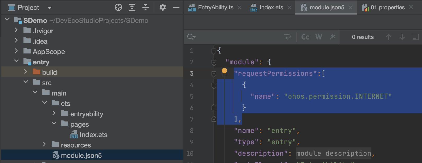
To load network images, you need to module.json5add a network access permission request to the file.
"requestPermissions":[
           {


             "name": "ohos.permission.INTERNET"
           }
        ],
Column() {


        Image($r("app.media.icon"))
          .width(100)
          .height(100)
        Image($r("app.media.001"))  // jpg 后缀,没有写 也可以正常显示
          .objectFit(ImageFit.Cover)
          .backgroundColor(0xCCCCCC)
          .width(100)
          .height(200)
        Image($r("app.media.002"))
          .objectFit(ImageFit.Auto) // 长款保持原比例、自适应
          .backgroundColor(0xCCCCCC)
          .width(200)
        // 加载网络图片
        Image('https://profile-avatar.csdnimg.cn/550af74bfcbd45a49d377d2ac3b13a01_lovechris00.jpg')
          .width(100)
      }
The effect is as follows

Image properties and methods
- alt
- matchTextDirection
- fitOriginalSize
- fillColor
- objectFit
- ImageFit.Contain
- ImageFit.Cover
- ImageFit.Auto
- ImageFit.Fill
- ImageFit.ScaleDown
- ImageFit.None
- objectRepeat
- autoResize
- renderMode
- interpolation
- sourceSize
- width
- height
- syncLoad
- colorFilter
- copyOption
- CopyOptions.None
- CopyOptions.InApp
- CopyOptions.LocalDevice
- draggable
- onComplete
- onError
- onFinish
TextInput

@Entry
@Component
struct Index {


  @State text1: string = ''

  build() {


    Row() {


      Column() {


        TextInput()
          .fontColor(Color.Blue)
          .fontSize(20)
          .fontStyle(FontStyle.Italic)
          .fontWeight(FontWeight.Bold)
          .padding(12)
          .backgroundColor(0xE6F2FD)
          .fontFamily('Arial')

        TextInput({

     placeholder: '请输入帐号' })
          .placeholderColor(0x999999)  //  设置 placeholder 属性
          .placeholderFont({

     size: 20, weight: FontWeight.Medium, family: 'cursive', style: FontStyle.Italic })
          .caretColor(Color.Blue)
          .onChange((value: string) => {


            this.text1 = value
          })
        Text(this.text1) // 监听上面输入内容
          .height(44)
          .width(200)
          .backgroundColor(Color.Pink)

        TextInput({

     placeholder: '请输入密码' })
          .type(InputType.Password) // 设置输入框类型 - 这里是密码输入框
      }
      .width('100%')
    }
    .height('100%')
  }
}
Properties and methods
- type
- InputType.Normal
- InputType.Number
- InputType.PhoneNumber
- InputType.Email
- InputType.Password
- style
- TextInputStyle.Default
- TextInputStyle.Inline
- fontColor
- fontFamily
- fontSize
- fontStyle
- fontWeight
- caretColor
- placeholderColor
- placeholderFont
- textAlign
- TextAlign.Center
- TextAlign.Start
- TextAlign.End
- enterKeyType
- EnterKeyType.Go
- EnterKeyType.Search
- EnterKeyType.Send
- EnterKeyType.Next
- EnterKeyType.Done
- inputFilter
- maxLength
- showPasswordIcon
- copyOption
- CopyOptions.None
- CopyOptions.InApp
- CopyOptions.LocalDevice
- onChange
- onCopy
- onCut
- onEditChange
- onEditChanged
- onPaste
- onSubmit
Button

		Button('登录', {

     type: ButtonType.Capsule, stateEffect: true })
          .width('90%')
          .height(40)
          .fontSize(16)
          .fontWeight(FontWeight.Medium)
          .backgroundColor('#007DFF')
          .onClick(() => {


            // 处理点击事件逻辑
          })

        Button({

     type: ButtonType.Circle, stateEffect: true }) {


          Image($r('app.media.app_icon'))
            .width(30)
            .height(30)
        }
        .width(55)
        .height(55)
        .backgroundColor(Color.Yellow)
      }
Button properties and methods
- type
- ButtonType.Capsule
- ButtonType.Circle
- ButtonType.Normal
- stateEffect
- fontColor
- fontSize
- fontWeight
- fontStyle
- FontStyle.Normal
- FontStyle.Italic
- fontFamily
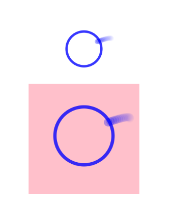
LoadingProgress
        LoadingProgress()
          .color(Color.Blue)
          .height(60)
          .width(60)
        LoadingProgress()
          .color(Color.Blue)
          .height(100)
          .width(100)
          .backgroundColor(Color.Pink)