In scenes with dense traffic such as shopping malls and supermarkets, it is often reported that some pedestrians fall and get injured on escalators. With the rapid development and popularization of AI technology, more and more scenes such as shopping malls, supermarkets and subways have begun to Install a dedicated safety detection and early warning system. The core working principle is the real-time calculation of the AI model and the camera image and video stream. Through real-time detection and identification of behaviors on the behavioral escalator, rapid warning and response to dangerous behaviors can be performed to avoid subsequent serious consequences. as a result of. The main purpose of this article is to develop and construct a pedestrian safety behavior detection and identification system based on the scene of supermarket escalators, and explore and analyze the feasibility of improving safety assurance based on AI technology. This article is the eighth article about AI helping to improve the safety of shopping mall escalators and other scenes. , the previous series is as follows:
《科技提升安全,基于SSD开发构建商超扶梯场景下行人安全行为姿态检测识别系统》
https://blog.csdn.net/Together_CZ/article/details/134892776

《科技提升安全,基于YOLOv3开发构建商超扶梯场景下行人安全行为姿态检测识别系统》
https://blog.csdn.net/Together_CZ/article/details/134892866

《科技提升安全,基于YOLOv4开发构建商超扶梯场景下行人安全行为姿态检测识别系统》
https://blog.csdn.net/Together_CZ/article/details/134893058

《科技提升安全,基于YOLOv5系列模型【n/s/m/l/x】开发构建商超扶梯场景下行人安全行为姿态检测识别系统》
https://blog.csdn.net/Together_CZ/article/details/134918766

《科技提升安全,基于YOLOv6开发构建商超扶梯场景下行人安全行为姿态检测识别系统》
https://blog.csdn.net/Together_CZ/article/details/134925452

《科技提升安全,基于YOLOv7【tiny/yolov7/yolov7x】开发构建商超扶梯场景下行人安全行为姿态检测识别系统》
https://blog.csdn.net/Together_CZ/article/details/134926357

《科技提升安全,基于YOLOv8全系列模型【n/s/m/l/x】开发构建商超扶梯场景下行人安全行为姿态检测识别系统》
https://blog.csdn.net/Together_CZ/article/details/134927317
First look at the example effect:

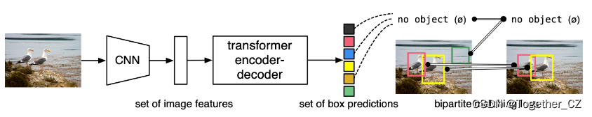
DETR (DEtection TRansformer) is an end-to-end target detection model based on Transformer architecture. Different from traditional target detection methods based on region proposals (such as Faster R-CNN), DETR adopts a new idea to transform the target detection problem into a sequence-to-sequence problem, and realizes the joint detection and target classification through the Transformer model. train.
The workflow of DETR is as follows:
The input image extracts feature maps through a convolutional neural network (CNN).
The feature map is used as the input of the encoder, and the representation of the image features is obtained through a series of encoder layers.
The object detection problem is modeled as a sequence-to-sequence conversion task, where the output of the encoder serves as the input of the decoder.
The decoder uses the self-attention mechanism to process the output of the encoder to obtain the location and category information of the target.
Finally, DETR classifies the output of the decoder through a linear layer and softmax function, and predicts the coordinates of the target box through a linear layer.
Advantages of DETR include:
End-to-end training: The DETR model can perform end-to-end training directly from the original image to the target detection results, avoiding the complex process of region proposal generation and feature alignment in traditional target detection methods, and simplifying the design of the model and training process.
Not limited by a fixed number of targets: DETR can handle variable-length input sequences and is therefore not limited by a fixed number of targets. This enables DETR to detect multiple targets in an image simultaneously and eliminates the need to set a predetermined number of targets.
Global context information: DETR can capture the relationship between targets at different locations in the image through the Transformer's self-attention mechanism, providing a wider range of context information. This helps improve the accuracy and robustness of object detection.
However, DETR also has some shortcomings:
High computational complexity: Since DETR uses the Transformer model, it requires a large amount of computing resources when processing large-size images, resulting in relatively slow training and inference speeds.
The detection performance of small targets is poor: the DETR model is prone to performance degradation when dealing with small targets. This is because the Transformer model may lose detailed information when processing small-sized targets, making it difficult to accurately locate and classify small targets.
Next, let’s take a look at the data set we built ourselves:
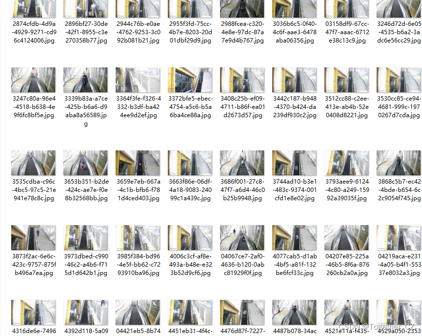
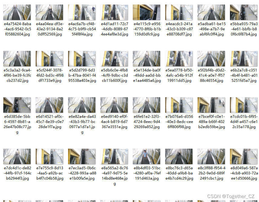
Kanpo kametchi is located这り, As shown below:
It can be seen that more than 1.2w of stars have been harvested so far, which is still very good.
DETRThe overall data flow diagram is as follows:
The official also provides the correspondingpre-trained model, which can be used by yourself:
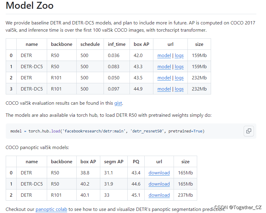
The official pre-training weight selected in this article is detr-r50-e632da11.pth. First, you need to develop weights that can be used in your own personalized data set based on the official pre-training weight, as shown below:
pretrained_weights = torch.load("./weights/detr-r50-e632da11.pth")
num_class = 4 + 1
pretrained_weights["model"]["class_embed.weight"].resize_(num_class+1,256)
pretrained_weights["model"]["class_embed.bias"].resize_(num_class+1)
torch.save(pretrained_weights,'./weights/detr_r50_%d.pth'%num_class)
Because the number of categories here is 4, num_class is modified to: 4+1. You can modify it according to your actual situation. After generation it looks like this:
Terminal execution:
python main.py --dataset_file "coco" --coco_path "/0000" --epoch 100 --lr=1e-4 --batch_size=32 --num_workers=0 --output_dir="outputs" --resume="weights/detr_r50_5.pth"
Training can be started. Training starts as follows:

The training is completed as follows:
Accumulating evaluation results...
DONE (t=0.40s).
IoU metric: bbox
 Average Precision  (AP) @[ IoU=0.50:0.95 | area=   all | maxDets=100 ] = 0.664
 Average Precision  (AP) @[ IoU=0.50      | area=   all | maxDets=100 ] = 0.915
 Average Precision  (AP) @[ IoU=0.75      | area=   all | maxDets=100 ] = 0.618
 Average Precision  (AP) @[ IoU=0.50:0.95 | area= small | maxDets=100 ] = 0.112
 Average Precision  (AP) @[ IoU=0.50:0.95 | area=medium | maxDets=100 ] = 0.301
 Average Precision  (AP) @[ IoU=0.50:0.95 | area= large | maxDets=100 ] = 0.709
 Average Recall     (AR) @[ IoU=0.50:0.95 | area=   all | maxDets=  1 ] = 0.603
 Average Recall     (AR) @[ IoU=0.50:0.95 | area=   all | maxDets= 10 ] = 0.743
 Average Recall     (AR) @[ IoU=0.50:0.95 | area=   all | maxDets=100 ] = 0.759
 Average Recall     (AR) @[ IoU=0.50:0.95 | area= small | maxDets=100 ] = 0.097
 Average Recall     (AR) @[ IoU=0.50:0.95 | area=medium | maxDets=100 ] = 0.503
 Average Recall     (AR) @[ IoU=0.50:0.95 | area= large | maxDets=100 ] = 0.898
Training time 40:13:04
Next, use the evaluation module to evaluate, compare and visualize the results:
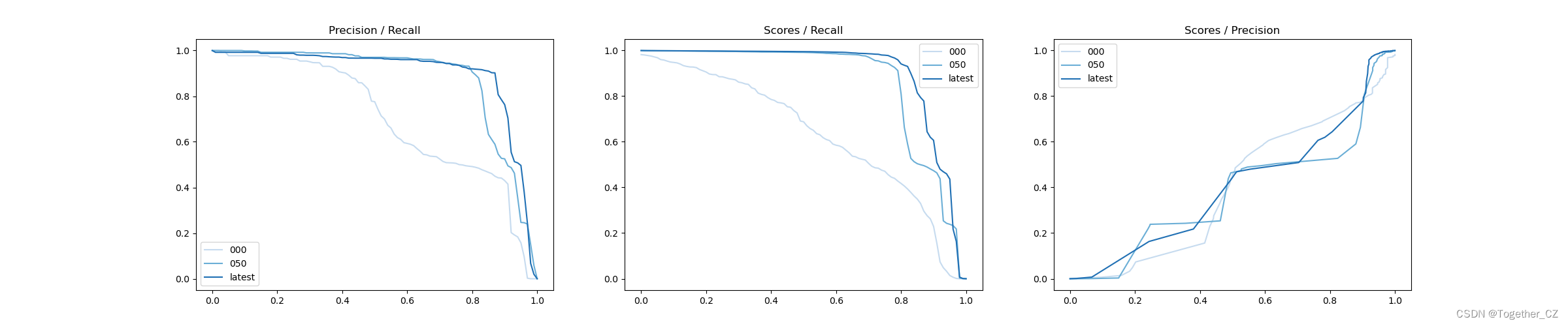
iter 000: mAP@50= 70.2, score=0.636, f1=0.802
iter 050: mAP@50= 87.7, score=0.862, f1=0.912
iter latest: mAP@50= 89.9, score=0.901, f1=0.930
iter 000: mAP@50= 70.2, score=0.636, f1=0.802
iter 050: mAP@50= 87.7, score=0.862, f1=0.912
iter latest: mAP@50= 89.9, score=0.901, f1=0.930
[Precision Curve]
The Precision-Recall Curve is a visualization tool used to evaluate the accuracy performance of a binary classification model under different thresholds. It helps us understand how the model performs at different thresholds by plotting the relationship between precision and recall at different thresholds.
Precision refers to the ratio of the number of samples that are correctly predicted as positive examples to the number of samples that are predicted to be positive examples. Recall refers to the ratio of the number of samples that are correctly predicted as positive examples to the number of samples that are actually positive examples.
The steps for plotting a precision curve are as follows:
Convert the predicted probabilities into binary class labels using different thresholds. Usually, when the predicted probability is greater than the threshold, the sample is classified as a positive example, otherwise it is classified as a negative example.
For each threshold, calculate the corresponding precision and recall.
Plot the precision and recall at each threshold on the same chart to form a precision curve.
Based on the shape and changing trend of the accuracy curve, an appropriate threshold can be selected to achieve the required performance requirements.
By observing the precision curve, we can determine the best threshold according to needs to balance precision and recall. Higher precision means fewer false positives, while higher recall means fewer false negatives. Depending on specific business needs and cost trade-offs, appropriate operating points or thresholds can be selected on the curve.
Precision curves are often used together with recall curves to provide a more comprehensive analysis of classifier performance and help evaluate and compare the performance of different models.
[Recall Curve]
Recall Curve is a visualization tool used to evaluate the recall performance of a binary classification model under different thresholds. It helps us understand the performance of the model under different thresholds by plotting the relationship between the recall rate at different thresholds and the corresponding precision rate.
Recall refers to the ratio of the number of samples that are correctly predicted as positive examples to the number of samples that are actually positive examples. Recall rate is also called sensitivity (Sensitivity) or true positive rate (True Positive Rate).
The steps for plotting a recall curve are as follows:
Convert the predicted probabilities into binary class labels using different thresholds. Usually, when the predicted probability is greater than the threshold, the sample is classified as a positive example, otherwise it is classified as a negative example.
For each threshold, calculate the corresponding recall rate and the corresponding precision rate.
Plot the recall and precision at each threshold on the same chart to form a recall curve.
Based on the shape and changing trend of the recall curve, an appropriate threshold can be selected to achieve the required performance requirements.
By observing the recall curve, we can determine the best threshold according to needs to balance recall and precision. Higher recall means fewer false negatives, while higher precision means fewer false positives. Depending on specific business needs and cost trade-offs, appropriate operating points or thresholds can be selected on the curve.
The recall curve is often used together with the precision curve (Precision Curve) to provide a more comprehensive analysis of classifier performance and help evaluate and compare the performance of different models.
[F1 value curve]
The F1 value curve is a visualization tool used to evaluate the performance of a binary classification model under different thresholds. It helps us understand the overall performance of the model by plotting the relationship between Precision, Recall and F1 score at different thresholds.
The F1 score is the harmonic average of precision and recall, which takes into account both performance indicators. The F1 value curve can help us determine a balance point between different precision and recall rates to choose the best threshold.
The steps to draw an F1 value curve are as follows:
Convert the predicted probabilities into binary class labels using different thresholds. Usually, when the predicted probability is greater than the threshold, the sample is classified as a positive example, otherwise it is classified as a negative example.
For each threshold, calculate the corresponding precision, recall and F1 score.
Plot the precision rate, recall rate and F1 score at each threshold on the same chart to form an F1 value curve.
Based on the shape and changing trend of the F1 value curve, an appropriate threshold can be selected to achieve the required performance requirements.
The F1 value curve is often used together with the receiver operating characteristic curve (ROC curve) to help evaluate and compare the performance of different models. They provide a more comprehensive analysis of classifier performance, allowing the selection of appropriate models and threshold settings based on specific application scenarios.
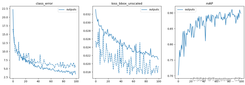
The loss visualization is as follows:
If you are interested, you can try it yourself!