Rendering:

1. Place the mask layer html code and the image in a div
I put it in .proBK.
<div class="proBK">
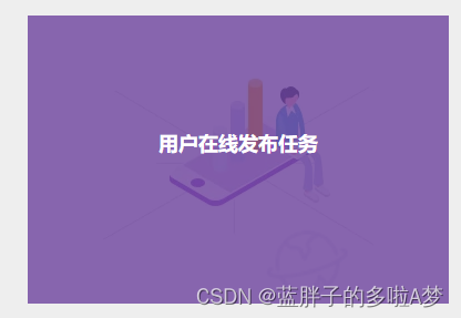
<img src="../../assets/image/taskPro.png" class="proImg">
<div class="imgText">
<h5>用户在线发布任务</h5>
</div>
</div>
2. Add styles to pictures and mask layers
Image: relative
Mask layer: absolute
Make the two styles overlap.
When the mouse is not on the image, the mask layer does not display .imgText{ opacity: 0; }.
.proBK {


    width: 380px;
    height: 260px;
    margin-bottom: 20px;
    position: relative;
}
  .proImg {


      width: 100%;
      height: 100%;
    }
  .imgText{


      position: absolute;
      background: rgba(106, 64, 155, 0.8);
      top: 0px;
      left: 0px;
      width: 100%;
      height: 100%;
      cursor: pointer;
      opacity: 0;
      color: #ffffff;
      text-align: center;
}
 h5 {


      padding-top: 103px;
      font-size: 18px;
}
  .proBK .imgText:hover {


    opacity: 1;
  }
3. Use hover
Change the transparency so that the mask layer shows through.
 .proBK .imgText:hover {


    opacity: 1;
  }