Uniapp zero-based development study notes (5) - Getting started with components and using container components
Follow the official website tutorial to learn how to use components, and focus on practicing the application of container components.
1. Introduction to components on the official website
The component is the basic unit of the view layer and is an encapsulation of a separate and reusable functional module.
Attributes can be written on the start tag. There can be multiple attributes. Multiple attributes should be separated by spaces.
Note: All component and attribute names are lowercase, with hyphens connecting words.
The following example is a button component, which has multiple attributes such as size, disabled, hover-start-time, etc., and the label is text
<template>
	<view>
		<button size="mini" :disabled="false" hover-start-time=20 >按钮</button>
	</view>
</template>
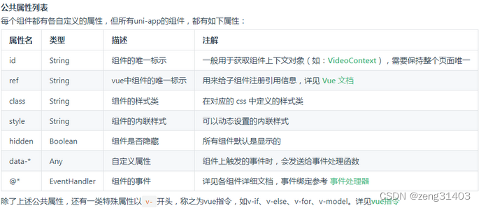
All components have the following public properties, but each component also has its own private properties.
Before using the component, you need to copy the corresponding component to the components directory.
JS variable binding can be used in the component.
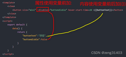
Add @ before the component's attribute to indicate that this is an event.
The attribute value of the event points to a js method defined in the script's methods. You can also pass parameters to the method.
There are many basic components, which can be roughly divided into several categories.
2. Simple practice use of view container
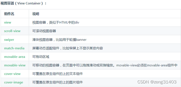
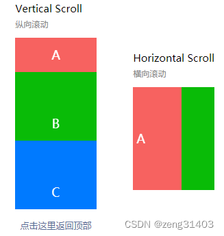
1. scroll-view scroll bar
can be referenced as vertical and horizontal.
When referencing vertically, scroll-y="true", class="scroll-Y", scroll-top refers to the js variable. Note that in order to maintain the original position of the scroll bar,
and the previous position, two variables are used.
When referencing horizontally, scroll-x="true", class="scroll-view_H"
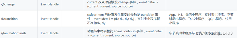
Three events are defined:
@scrolltoupper When scrolling to the top/left, the scrolltoupper event will be triggered. It is applicable to both vertical and horizontal directions.
@scrolltolower When scrolling to the bottom/right, the scrolltolower event will be triggered. It is applicable to both vertical and horizontal directions.
@scroll Triggered when scrolling, event.detail = {scrollLeft, scrollTop, scrollHeight, scrollWidth, deltaX, deltaY}, applicable to vertical and horizontal directions
Application effect
<!-- 引用纵向scroll-view的代码 -->
	<view>
		<view class="uni-title uni-common-mt">
						Vertical Scroll
						<text>\n纵向滚动</text>
		</view>
		<scroll-view :scroll-top="scrollTop" scroll-y="true" class="scroll-Y"
		@scrolltoupper="upper" @scrolltolower="lower" @scroll="scroll"
		enable-back-to-top="true" style="height: 500rpx" >
			<view id="demo1" class="scroll-view-item uni-bg-red">A</view>
			<view id="demo2" class="scroll-view-item uni-bg-green">B</view>
			<view id="demo3" class="scroll-view-item uni-bg-blue">C</view>
		</scroll-view>
	</view>
	<view @tap="goTop" class="uni-link uni-center uni-common-mt">
		<text>点击这里返回顶部</text>
	</view>
	<!-- 引用横向scroll-view的代码 -->
	<view>
		<view class="uni-title uni-common-mt">
						Horizontal Scroll
						<text>\n横向滚动</text>
		</view>
		<scroll-view class="scroll-view_H" scroll-x="true" @scroll="scroll"
		scroll-left="120" >
			<view id="demo1" class="scroll-view-item_H uni-bg-red">A</view>
			<view id="demo2" class="scroll-view-item_H uni-bg-green">B</view>
			<view id="demo3" class="scroll-view-item_H uni-bg-blue">C</view>
		</scroll-view>
	</view>
Corresponding<script></script>Supplementary JS definition
The @tap event is defined in the view below, and the trigger point goTop function is also added
data() {
			return {
				title: '首页',
				//滚动的初始位置为0,上一次滚动的位置存在old.scrollTop
				scrollTop: 0,
				old: {
					scrollTop: 0}
			}
		},
methods: {
			upper: function(e) {
				console.log(e)
			},
			lower: function(e) {
				console.log(e)
			},
			scroll: function(e) {
				console.log(e)
				//每次滚动以后,把当前的滚动位置存在this.old.scrollTop
				this.old.scrollTop = e.detail.scrollTop
			},
			goTop: function(e) {
				// 解决view层不同步的问题
				this.scrollTop = this.old.scrollTop
				this.$nextTick(function() {
					this.scrollTop = 0
				});
				uni.showToast({
					icon:"none",
					title:"纵向滚动 scrollTop 值已被修改为 0"
				})
			}
		}
Supplementary CSS style definition When using vertical scrolling, you need to give a fixed height, through css set height; When using horizontal scrolling, you need to add white-space: nowrap; style to to force the text not to wrap<style></style> <scroll-view> <scroll-view>
.scroll-Y {
	height: 300rpx;
}
.scroll-view_H {
	white-space: nowrap;//强制文字不换行
	width: 100%;
}
.scroll-view-item {
	height: 300rpx;
	line-height: 300rpx;
	text-align: center;
	font-size: 36rpx;
}
.scroll-view-item_H {
	display: inline-block;
	height: 300rpx;
	line-height: 300rpx;
	text-align: center;
	font-size: 36rpx;
}
2. swiper slider view container
Generally used for sliding left and right or up and down. Swiper is a single page component, suitable for banner carousels and simple list sliding left and right.
Application effect
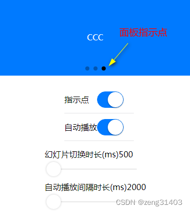
In the property settings of swiper, whether circular uses connected sliding, the default is false; whether indicator-dots displays panel indicator points, < a i=4> autoplay is whether to automatically switch, the default is false; interval is the automatic switching time interval, the default is 5000ms; duration is the sliding animation duration, the default is 500ms. Of course, these can be changed using JS. The attribute current is the current position, and the change of current triggers the @change event
<!-- swiper应用案例代码 -->
		<!-- swiper轮播图显示区 -->
		<view class="uni-margin-wrap">
			<swiper class="swiper" circular :indicator-dots="indicatorDots" :autoplay="autoplay"
			    :interval="interval" :duration="duration">
				<swiper-item>
					<view class="swiper-item uni-bg-red">AAA</view>
				</swiper-item>
				<swiper-item>
					<view class="swiper-item uni-bg-green">BBB</view>
				</swiper-item>
				<swiper-item>
					<view class="swiper-item uni-bg-blue">CCC</view>
				</swiper-item>
			</swiper>
		</view>
		<!-- swiper轮播播放方式设置 -->
		<view class="swiper-list">
			<view class="uni-list-cell uni-list-cell-pd">
				<view class="uni-list-cell-db">指示点</view>
				<!-- 引用了switch切换组件 -->
				<switch :checked="indicatorDots" @change="changeIndicatorDots" />
			</view>
			<view class="uni-list-cell uni-list-cell-pd">
				<view class="uni-list-cell-db">自动播放</view>
				<!-- 引用了switch切换组件 -->
				<switch :checked="autoplay" @change="changeAutoplay" />
			</view>
		</view>
		<!-- swiper轮播播放参数设置 -->
		<view class="uni-padding-wrap">
			<view class="uni-common-mt">
				<text>幻灯片切换时长(ms)</text>
				<text class="info">{

   {duration}}</text>
			</view>
			<!-- 引用了slider滑动条组件 -->
			<slider @change="durationChange" :value="duration" min="500" max="2000" />
			<view class="uni-common-mt">
				<text>自动播放间隔时长(ms)</text>
				<text class="info">{

   {interval}}</text>
			</view>
			<!-- 引用了slider滑动条组件 -->
			<slider @change="intervalChange" :value="interval" min="2000" max="10000" />
		</view>
Corresponding<script></script>Supplementary JS definition
data() {
			return {
				indicatorDots: true,
				autoplay: true,
				interval: 2000,
				duration: 500
			}
		},
methods: {
        //设置是否显示面板指示点
		changeIndicatorDots(e) {
            this.indicatorDots = !this.indicatorDots
        },
         //设置是否自动播放
        changeAutoplay(e) {
            this.autoplay = !this.autoplay
        },
         //设置幻灯片切换时长
        intervalChange(e) {
            this.interval = e.target.value
        },
        //自动播放间隔时长
        durationChange(e) {
            this.duration = e.target.value
        }
     }
In<style></style>Add CSS style definition
.uni-margin-wrap {
		width:690rpx;
		width: 100%;;
}
.swiper {
	height: 300rpx;
}
.swiper-item {
	display: block;
	height: 300rpx;
	line-height: 300rpx;
	text-align: center;
}
.swiper-list {
	margin-top: 40rpx;
	margin-bottom: 0;
}
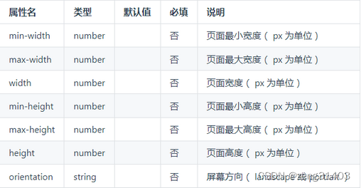
3. match-media adapts to the screen component
match-media is a basic view component that can adapt to different screens. You can specify a set of media query media query rules. This component will only be displayed when the query conditions are met. For example, if you place a sidebar in the match-media component and set the media query rule to display it only in wide screen, you can achieve the effect of displaying the side bar in the PC wide screen but not displaying the side bar in the narrow screen of the mobile phone.
<template>
    <view>
        <match-media :min-width="375" :max-width="800" >
            <view>当页面最小宽度 375px, 页面宽度最大 800px 时显示</view>
        </match-media>
        <match-media :min-height="400" :orientation="landscape">
            <view>当页面高度不小于 400px 且屏幕方向为横向时展示这里</view>
        </match-media>
    </view>
</template>
4. movable-area draggable area and movable-view movable view container
movable-area refers to the draggable range, in which movable-view is embedded Component is used to indicate the draggable area.
That is, you hold down the movable-view with your finger/mouse and drag or zoom with two fingers, but you cannot drag out of the range specified by the movable-area.
Of course, you can also use code to trigger the movement and scaling of movable-view in movable-area without dragging.
Apply effect

Sample code: Define movable-view attribute x in <movable-area>, y is the position of the upper left corner, direction can define the movement direction, including all, vertical, horizontal, none inertia defines whether the movable-view has inertial movement, the default is false out-of-bounds defines whether the movable-view can still be moved after exceeding the movable area. The default is falsemovable-view
<view class="uni-padding-wrap uni-common-mt">
				<view class="uni-title uni-common-mt">
					<text>\nmovable-view 区域小于 movable-area</text>
				</view>
				<movable-area>
				    <!-- css原始大小movable-view宽高150,movable-area高300px -->
					<movable-view :x="x" :y="y" direction="all" @change="onChange">text</movable-view>
				</movable-area>
				<view @tap="tap" class="uni-link uni-center uni-common-mt">
					点击这里移动至 (30px, 30px)
				</view>
				<view class="uni-title uni-common-mt">
					<text>movable-view区域大于movable-area</text>
				</view>
				<movable-area>
				    <!-- 通过css改大了movable-view,max样式宽高500px,movable-area高300px -->
					<movable-view class="max" direction="all">text</movable-view>
				</movable-area>
		</view>
Corresponding<script></script>Supplementary JS definition
<script>
export default {


    data() {


        return {


            x: 0,
            y: 0,
            old: {


                x: 0,
                y: 0
            }
        }
    },
    methods: {


        //定义tap移动到30,30位置
        tap: function(e) {


            this.x = this.old.x
            this.y = this.old.y
            this.$nextTick(function() {


                this.x = 30
                this.y = 30
            })
        },
        //定义onChange事件移动滑块位置
        onChange: function(e) {


            this.old.x = e.detail.x
            this.old.y = e.detail.y
        }
    }
}
</script>
In<style></style>Add CSS style definition
<style>
	movable-view {


		display: flex;
		align-items: center;
		justify-content: center;
		height: 150rpx;
		width: 150rpx;
		background-color: #007AFF;
		color: #fff;
	}
	movable-area {


		height: 300rpx;
		width: 100%;
		background-color: #D8D8D8;
		overflow: hidden;
	}
	.max {


		width:500rpx;
		height: 500rpx;
	}
</style>
5. cover-view covers the text view and cover-image covers the picture view
cover-view is a text view covering the native component
cover-image is an image view that covers the native component. The native components that can be covered are the same as cover-view and can be nested in cover-view.
Native components that can be overridden on app-vue: <video>、<map>
Supported events: click
Application effects
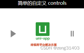
Introduce cover-view and vedio components first
Sample code:
Cover-view and cover-image can be placed inside the video or map tag
<!-- cover-view和cover-image,以及video示例 -->
<video class="video" id="demoVideo" :controls="false" :enable-progress-gesture="false"
	:show-center-play-btn="true"
	src="https://img.cdn.aliyun.dcloud.net.cn/guide/uniapp/%E7%AC%AC1%E8%AE%B2%EF%BC%88uni-app%E4%BA%A7%E5%93%81%E4%BB%8B%E7%BB%8D%EF%BC%89-%20DCloud%E5%AE%98%E6%96%B9%E8%A7%86%E9%A2%91%E6%95%99%E7%A8%[email protected]"
	poster="https://vkceyugu.cdn.bspapp.com/VKCEYUGU-dc-site/b1476d40-4e5f-11eb-b997-9918a5dda011.png">
		<cover-view class="controls-title">简单的自定义 controls</cover-view>
		<cover-image class="controls-play img" @click="play" src="/static/play.png"></cover-image>
		<cover-image class="controls-pause img" @click="pause" src="/static/pause.png"></cover-image>
</video>
Corresponding<script></script>Supplementary JS definition
When the page is mounted this.videoCtx = uni.createVideoContext('demoVideo') loads the video< a i=3> click triggers play ->this.videoCtx.play(); and pause->this.videoCtx.pause(); However, there are still some problems with video playback.
<script>
	export default {


		data() {


			return {

      }
		},
		//页面加载时创建媒体对象videoCtx
		mounted() {


			this.videoCtx = uni.createVideoContext('demoVideo')
		},
		methods: {


			play(event) {


				this.videoCtx.play();
				uni.showToast({


					title: '开始播放',
					icon: 'none'
				});
			},
			pause(event) {


				this.videoCtx.pause();
				uni.showToast({


					title: '暂停播放',
					icon: 'none'
				});
			}
		}
	}
</script>
In<style></style>Add CSS style definition
.video {
		position: relative;
	}

cover-view,
cover-image {
	display: inline-block;
}

.img {
	position: absolute;
	width: 100rpx;
	height: 100rpx;
	top: 50%;
	margin-top: -50rpx;
}

.controls-play {
	left: 50rpx;
}

.controls-pause {
	right: 50rpx;
}

.controls-title {
	width: 100%;
	text-align: center;
	color: #FFFFFF;
}