Table of Contents of Series Articles
Self-study notes for programming novices 16 (python office automation operation EXCEL table)
Self-study notes for programming novices fifteen (python office automation operation EXCEL table)
Self-study Notes 9 for Programmers (Introduction to Python Crawler + Detailed Code Explanation)
Table of contents
Table of Contents of Series Articles
1. Add background after condition selection
Preface
Today we study two small cases, which I feel are very practical:
- Small practice 1: Add background after selecting conditions
- Small practice 2: Generate histogram
1.Add background after selecting conditions
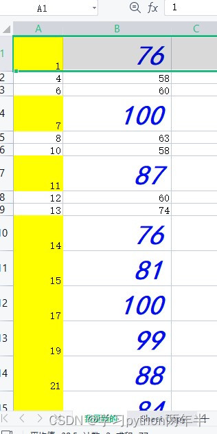
Yesterday we completed most of the operations on the table and copied the values greater than 50 to a new table. Now let's try changing the background of the rows with values greater than 50 to yellow and setting the text to any color. Let's try it first. Then let’s explain the code in detail. The first code we wrote is:
from openpyxl.styles import Font,PatternFill
import openpyxl
wb=openpyxl.load_workbook('大于50的表格.xlsx')
ws=wb.active
wb.copy_worksheet(ws)
ws.title='我是新的'
font = Font(name='黑体',size=30,bold=True,italic=True,color='000ff0')
fill = PatternFill(fill_type='solid',fgColor='ffff00')
rows = wb['我是新的'].rows
for row in rows:
    if int(row[1].value)>75:
        row[0].fill=fill
        row[1].font=font
wb.save('大于50的表格.xlsx')
After running, it was successful
Detailed code:
‘from openpyxl.styles import Font,PatternFill’, easy to understand, import font library and fill library
'wb.copy_worksheet(ws)', this code is to avoid destroying the original table, so I copied it again share.
After experiment, "color='000ff0'" is blue
There are still two aspects of this experiment that did not achieve the expected results;
One is that all cells in a row are not filled, and the font of all cells in a row is not changed. This is easy to do, because we write less and only need to add two lines of code.
Second, if we observe carefully, we can find that after we copy the workbook, we modify the original workbook. We want to modify the copied worksheet, and the renaming is also the copied worksheet. Everything in the original workbook remains unchanged. I put Delete the newly created worksheet and change the name of the original table back. We try to modify the code:
rom openpyxl.styles import Font,PatternFill
import openpyxl
wb=openpyxl.load_workbook('大于50的表格.xlsx')
ws=wb.active
ws=wb.copy_worksheet(ws)
ws.title='我是新的'
font = Font(name='黑体',size=30,bold=True,italic=True,color='000ff0')
fill = PatternFill(fill_type='solid',fgColor='ffff00')
rows = wb['我是新的'].rows
for row in rows:
    if int(row[1].value)>75:
        row[0].fill=fill
        row[1].fill = fill
        row[0].font = font
        row[1].font=font
wb.save('大于50的表格.xlsx')
After running successfully, we achieved the results we wanted.

2.Insert histogram
When using EXCEL tables, it is inevitable to generate histograms of data and insert them into the table, because the graphics will be more intuitive, and I found that it was very simple to generate icons in the previous office, but now you need to log in to WPS. I don’t know if you need a membership. After all, I don’t even want to log in after logging in. Let’s take a look at the code to generate the histogram:
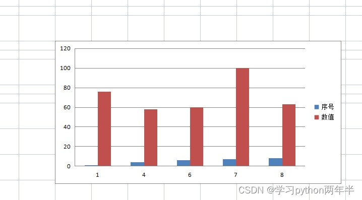
from openpyxl.chart import BarChart,Reference
import openpyxl
wb=openpyxl.load_workbook('大于50的表格.xlsx')
ws=wb['我是新的']
chart=BarChart()
data=Reference(worksheet=ws,min_row=1,max_row=6,min_col=1,max_col=2)
categories=Reference(ws,min_row=2,max_row=6,min_col=1)
chart.add_data(data,titles_from_data=True)
chart.set_categories(categories)
ws.add_chart(chart,'F6')
wb.save('大于50的表格.xlsx')
The operation is successful, let’s take a look at the results.
Detailed code explanation:
'from openpyxl.chart import BarChart,Reference' is the openpyxl library imported into the Python programming language Statements in the BarChart and Reference classes.
BarChart is a class in the openpyxl library used to create bar charts. It can accept a range of data and plot it into a bar chart.
Reference is a class in the openpyxl library that is used to reference cells or ranges in Excel worksheets. It can be used to set data sources in charts.
chart=BarChart() is a statement in the Python programming language to create a BarChart object.
BarChart is a class in the openpyxl library used to create bar charts. It can accept a range of data and plot it into a bar chart.
In this statement, we assign an instance of the BarChart class to the variable chart, so that we can use this instance to create and modify bar charts.
data=Reference(worksheet=ws,min_row=1,max_row=6,min_col=1,max_col=2) is a statement in the Python programming language that creates a data reference in an Excel worksheet.
Reference is a class in the openpyxl library that is used to reference cells or ranges in Excel worksheets. It can be used to set data sources in charts.
In this statement, we assign a Reference object to the variable data. This object specifies the range and location of the data to be referenced. Specifically, it specifies the worksheet to be referenced (ws in this case), and the minimum row number (1), maximum row number (6), minimum column number (1), and maximum column number of the cell to be referenced (2). This means we will reference all cells between rows 1 to 6 and columns 1 to 2.
chart.add_data(data,titles_from_data=True) is a statement in the Python programming language that adds data and titles when creating a BarChart object in the openpyxl library.
In this statement, we pass the data reference (data) and a Boolean value (True) as parameters to the add_data() method of the BarChart object. This method is used to add data to the chart.
At the same time, we also set a parameter named titles_from_data, whose value is True. This means we want to automatically extract titles from the data and add them to the chart. If we don't provide a title explicitly, this parameter will be ignored.
ws.add_chart(chart,'F6')
This indicates where the table is inserted, which is easy to understand.
In fact, this table did not meet our expectations. In this case, we did not want to generate two histograms for each serial number, but there were two columns, one blue and one red. Let's try and see how it goes. First, I changed the serial number Change the content to text and see what happens.
No errors were reported, and we got the style we wanted.
Second, let’s change the numerical value into text and see what happens.
There is no error reported, and the graph is generated, but there are no columns.
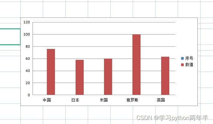
Third, we still change the code to get the results we want. After thinking about it, we can only change the code
data=Reference(worksheet=ws,min_row=1,max_row=6,min_col=1,max_col=2)
Change to
data=Reference(worksheet=ws,min_row=1,max_row=6,min_col=2)
Summarize
1024