Table of contents
Preface
In the previous blog chapter, we explained the components of Bootstrap.
In this chapter, we will talk about some JavaScript components.
1. Introduction to JavaScript plug-ins
- Why do you need a JavaScript plugin?
- Complex interactive effects encountered in the project, such as carousels, modal boxes, etc., can be easily completed using JavaScript plug-ins.
- How to introduce plug-ins
- data attribute
- The data attribute lowers the threshold for using JavaScript plug-ins
2. How to introduce plug-ins
- Introduce all plug-ins at once
- By introducing bootstrap.js or bootstrap.min.js, you can import them all at once
- Introduce plugins individually on demand
- Use a single "*.js" file provided by the Bootstrap framework and only introduce a certain plug-in for use
3. data attribute
- JavaScript plug-ins can achieve dynamic effects without writing any JavaScript code.
- Just follow the data attribute to operate
There are many data attributes. These attributes are followed by some nouns after data, such as the more commonly used data-toggle, data-target, data-dismiss, etc.
- How to use JavaScript plug-in
- Use the data attribute to call the JavaScript plug-in
- Use native code to call JavaScript plug-ins
Considering the convenience and speed of use, it is recommended to use the data attribute to call the JavaScript plug-in.
Fourth, close the data attribute
- You need to encapsulate the data attribute function yourself. If you hope that the data attribute of the Bootstrap framework will not affect your encapsulated functions, you need to turn off the data attribute of the Bootstrap framework.
grammar
$(document).off('.data-api');
- How to turn off the data attribute only for a specific plug-in?
- Just add the name of the specific plugin as namespace in front of data-api
grammar
// 关闭旋转轮播插件的data属性
$(document).off('.carousel.data-api');
5. Transition plug-in
- The animated transition effects used by Bootstrap are all based on CSS3 animations, so IE6-IE8 browsers cannot use transition effects.
If you use the compressed version of bootstrap.min.js file, there is no need to introduce the transition plug-in separately, because the function of the transition plug-in has been integrated into other plug-ins at this time.
- The transition plug-in is not a standard plug-in in the strict sense, but a basic auxiliary tool for the transitionEnd event.
- Often used by other plug-ins to detect whether the current browser supports CSS transition effects
- Transition effects can be disabled globally, and the disabling code must be placed behind transition.js (or bootstrap.min.js)
syntax
$.support.transition = false;
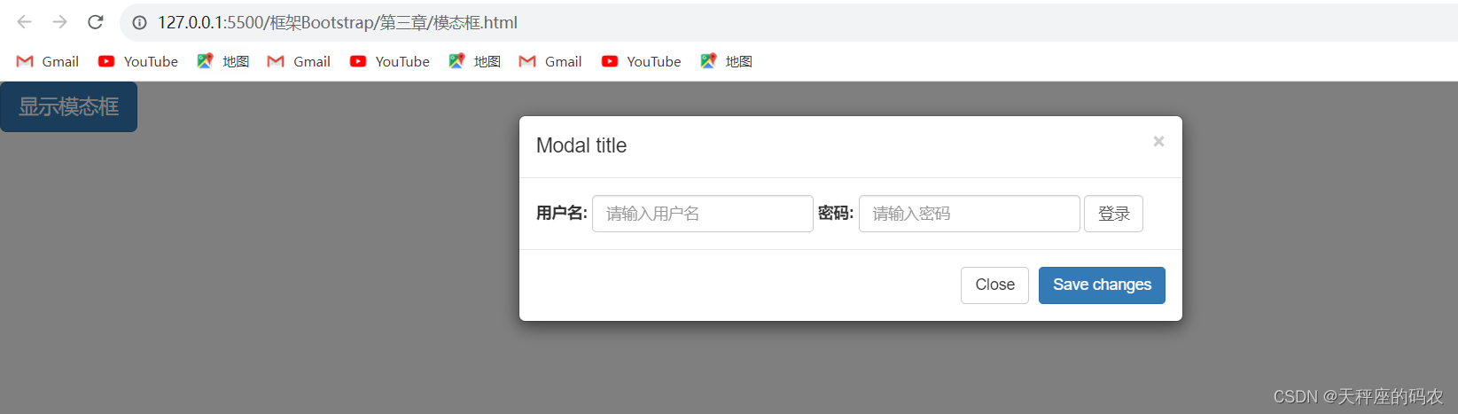
6. Modal box
- Modal is a subform covering the parent form
- The purpose is to display content from a separate source, allowing for some interaction without leaving the parent form
- Modal box components
- The modal box contains a header (modal box title and close button), a middle content area, and a set of buttons placed at the bottom
Example
<!DOCTYPE html>
<html lang="en">
<head>
<meta charset="UTF-8">
<meta name="viewport" content="width=device-width, initial-scale=1.0">
<title>模态框</title>
<link rel="stylesheet" href="../css/bootstrap.min.css">
</head>
<style>
</style>
<body>
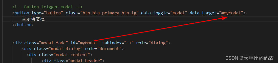
<!-- Button trigger modal -->
<button type="button" class="btn btn-primary btn-lg" data-toggle="modal" data-target="#myModal">
显示模态框
</button>
<div class="modal fade" id="myModal" tabindex="-1" role="dialog">
<div class="modal-dialog" role="document">
<div class="modal-content">
<div class="modal-header">
<button type="button" class="close" data-dismiss="modal" aria-label="Close"><span aria-hidden="true">×</span></button>
<h4 class="modal-title">Modal title</h4>
</div>
<div class="modal-body">
<form class="form-inline" action="#">
<div class="form-group">
<label for="user">用户名:</label>
<input type="text" class="form-control" id="user" placeholder="请输入用户名">
</div>
<div class="form-group">
<label for="pwd">密码:</label>
<input type="password" class="form-control" id="pwd" placeholder="请输入密码">
</div>
<input type="submit" class="form-control" value="登录">
</form>
</div>
<div class="modal-footer">
<button type="button" class="btn btn-default" data-dismiss="modal">Close</button>
<button type="button" class="btn btn-primary">Save changes</button>
</div>
</div><!-- /.modal-content -->
</div><!-- /.modal-dialog -->
</div><!-- /.modal -->
</body>
<script src="../js/jquery.js"></script>
<script src="../js/bootstrap.min.js"></script>
<script>
</script>
</html>
Notice
data-target="#myModal" 里面的 #myModal 要和 下面的id对应
- Never overlap a modal box on top of another modal box, otherwise it will not be effective
- Be sure to place the HTML code of the modal box at the highest level of the document (as a direct child element of the body element) to prevent other components from affecting the presentation and functionality of the modal box.
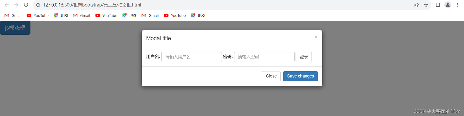
6.1, JavaScript operation modal box
-
In addition to the data attribute, you can also use JavaScript to operate the modal box.
-
Just one line of JavaScript code
- Call the modal box method to operate the modal box through the id of the modal box
-
JavaScript operation modal box
- Modal box properties
- Modal method
- Modal event
<!DOCTYPE html>
<html lang="en">
<head>
<meta charset="UTF-8">
<meta name="viewport" content="width=device-width, initial-scale=1.0">
<title>模态框</title>
<link rel="stylesheet" href="../css/bootstrap.min.css">
</head>
<style>
</style>
<body>
<button type="button" class="btn btn-primary btn-lg" id="jsbtn">
js模态框
</button><br>
<div class="modal fade" id="myModal" tabindex="-1" role="dialog">
<div class="modal-dialog" role="document">
<div class="modal-content">
<div class="modal-header">
<button type="button" class="close" data-dismiss="modal" aria-label="Close"><span aria-hidden="true">×</span></button>
<h4 class="modal-title">Modal title</h4>
</div>
<div class="modal-body">
<form class="form-inline" action="#">
<div class="form-group">
<label for="user">用户名:</label>
<input type="text" class="form-control" id="user" placeholder="请输入用户名">
</div>
<div class="form-group">
<label for="pwd">密码:</label>
<input type="password" class="form-control" id="pwd" placeholder="请输入密码">
</div>
<input type="submit" class="form-control" value="登录">
</form>
</div>
<div class="modal-footer">
<button type="button" class="btn btn-default" data-dismiss="modal">Close</button>
<button type="button" class="btn btn-primary">Save changes</button>
</div>
</div><!-- /.modal-content -->
</div><!-- /.modal-dialog -->
</div><!-- /.modal -->
</body>
<script src="../js/jquery.js"></script>
<script src="../js/bootstrap.min.js"></script>
<script>
$("#jsbtn").click(function(){
$('#myModal').modal('show')
})
</script>
</html>
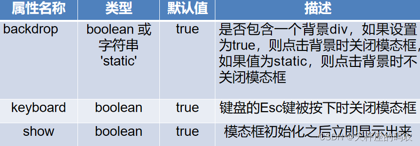
6.2, Modal box properties
Modal box properties can be manipulated through JavaScript
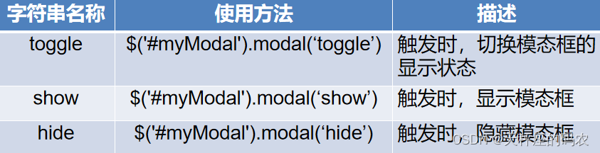
6.3, Modal box method
- The modal box supports passing in a specific string to execute its internal method
- Commonly used string names and descriptions of usage
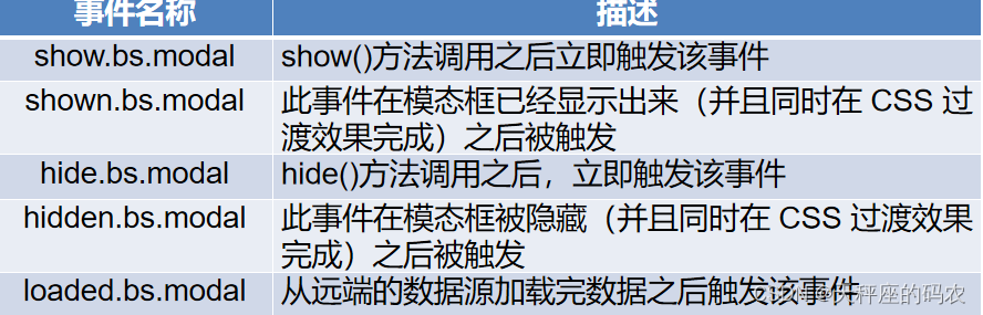
6.4, Modal box event
- In actual development, sometimes you want to perform some specific operations before or after the modal box pops up. How to do this?
- The modal box provides some events for monitoring the execution process of the modal box. During these processes, developers can execute customized code.
- Modal event
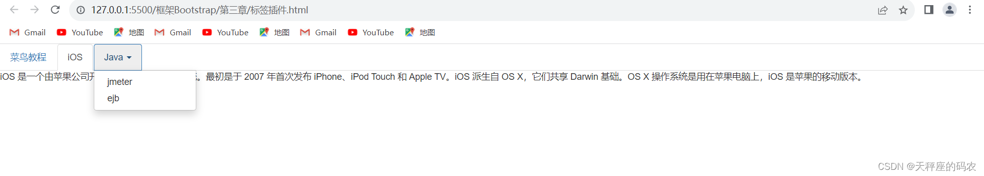
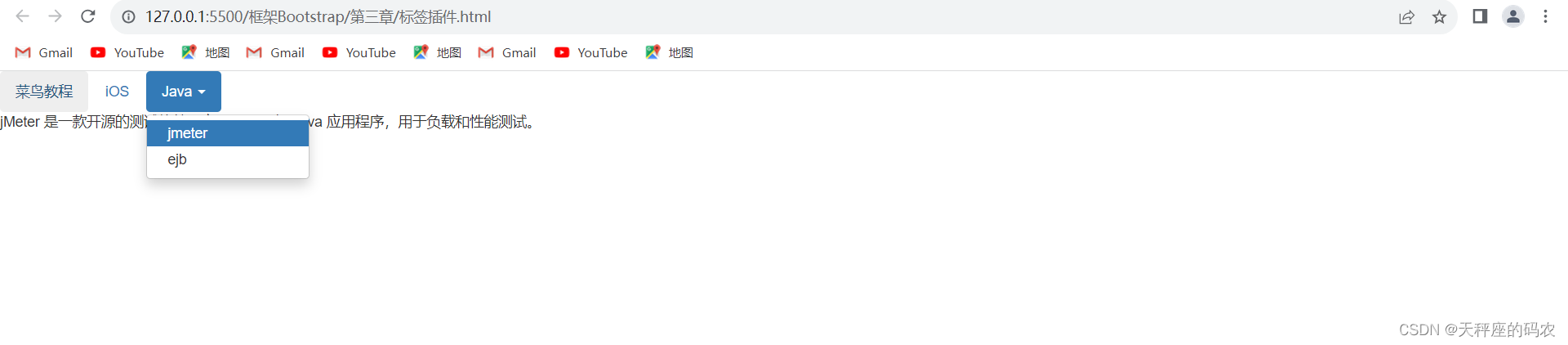
7. Introduction to tabs
- Tabs are also called tabs. By combining some data attributes, you can easily create a tabbed interface
- This plugin allows you to place content in tabs or even drop-down menu tabs
7.1, tab composition and implementation
- Tabs are composed of tab menu and tab panel.
<!DOCTYPE html>
<html lang="en">
<head>
    <meta charset="UTF-8">
    <meta name="viewport" content="width=device-width, initial-scale=1.0">
    <title>标签页</title>
    <link rel="stylesheet" href="../css/bootstrap.min.css">
</head>
<body>
    <ul id="myTab" class="nav nav-tabs">
        <li class="active">
            <a href="#home" data-toggle="tab">
                菜鸟教程
            </a>
        </li>
        <li><a href="#ios" data-toggle="tab">iOS</a></li>
        <li class="dropdown">
            <a href="#" id="myTabDrop1" class="dropdown-toggle"
               data-toggle="dropdown">Java
                <b class="caret"></b>
            </a>
            <ul class="dropdown-menu" role="menu" aria-labelledby="myTabDrop1">
                <li><a href="#jmeter" tabindex="-1" data-toggle="tab">jmeter</a></li>
                <li><a href="#ejb" tabindex="-1" data-toggle="tab">ejb</a></li>
            </ul>
        </li>
    </ul>
    <div id="myTabContent" class="tab-content">
        <div class="tab-pane fade in active" id="home">
            <p>菜鸟教程是一个提供最新的web技术站点,本站免费提供了建站相关的技术文档,帮助广大web技术爱好者快速入门并建立自己的网站。菜鸟先飞早入行——学的不仅是技术,更是梦想。</p>
        </div>
        <div class="tab-pane fade" id="ios">
            <p>iOS 是一个由苹果公司开发和发布的手机操作系统。最初是于 2007 年首次发布 iPhone、iPod Touch 和 Apple
                TV。iOS 派生自 OS X,它们共享 Darwin 基础。OS X 操作系统是用在苹果电脑上,iOS 是苹果的移动版本。</p>
        </div>
        <div class="tab-pane fade" id="jmeter">
            <p>jMeter 是一款开源的测试软件。它是 100% 纯 Java 应用程序,用于负载和性能测试。</p>
        </div>
        <div class="tab-pane fade" id="ejb">
            <p>Enterprise Java Beans(EJB)是一个创建高度可扩展性和强大企业级应用程序的开发架构,部署在兼容应用程序服务器(比如 JBOSS、Web Logic 等)的 J2EE 上。
            </p>
        </div>
    </div>


</body>
<script src="../js/jquery.js"></script>
<script src="../js/bootstrap.min.js"></script>
<script>
    $("ul a").on("shown.bs.tab",function(e){


        e.target
        e.relatedTarget
    })
</script>
</html>
7.2. Points to note when using tabs
- Notes on implementing tabs
- When implementing a tab panel, the tab menu and tab panel need to exist at the same time.
- The key to implementation is to set data-toggle="tab". Each tab menu and tab panel are corresponding by id. After corresponding, click the tab menu to display the corresponding tab panel.
- Tab panels need to be placed in a div element with the class name tab-content
7.3, capsule tab
- Things to note when using capsule tabs
- Replace the class name nav-tabs with nav-pill
- Replace the value of the class name data-toggle from tab to pill
<!DOCTYPE html>
<html lang="en">
<head>
    <meta charset="UTF-8">
    <meta name="viewport" content="width=device-width, initial-scale=1.0">
    <title>标签页</title>
    <link rel="stylesheet" href="../css/bootstrap.min.css">
</head>
<body>
    <ul id="myTab" class="nav nav-pills">
        <li class="active">
            <a href="#home" data-toggle="pill">
                菜鸟教程
            </a>
        </li>
        <li><a href="#ios" data-toggle="pill">iOS</a></li>
        <li class="dropdown">
            <a href="#" id="myTabDrop1" class="dropdown-toggle"
               data-toggle="dropdown">Java
                <b class="caret"></b>
            </a>
            <ul class="dropdown-menu" role="menu" aria-labelledby="myTabDrop1">
                <li><a href="#jmeter" tabindex="-1" data-toggle="pill">jmeter</a></li>
                <li><a href="#ejb" tabindex="-1" data-toggle="pill">ejb</a></li>
            </ul>
        </li>
    </ul>
    <div id="myTabContent" class="tab-content">
        <div class="tab-pane fade in active" id="home">
            <p>菜鸟教程是一个提供最新的web技术站点,本站免费提供了建站相关的技术文档,帮助广大web技术爱好者快速入门并建立自己的网站。菜鸟先飞早入行——学的不仅是技术,更是梦想。</p>
        </div>
        <div class="tab-pane fade" id="ios">
            <p>iOS 是一个由苹果公司开发和发布的手机操作系统。最初是于 2007 年首次发布 iPhone、iPod Touch 和 Apple
                TV。iOS 派生自 OS X,它们共享 Darwin 基础。OS X 操作系统是用在苹果电脑上,iOS 是苹果的移动版本。</p>
        </div>
        <div class="tab-pane fade" id="jmeter">
            <p>jMeter 是一款开源的测试软件。它是 100% 纯 Java 应用程序,用于负载和性能测试。</p>
        </div>
        <div class="tab-pane fade" id="ejb">
            <p>Enterprise Java Beans(EJB)是一个创建高度可扩展性和强大企业级应用程序的开发架构,部署在兼容应用程序服务器(比如 JBOSS、Web Logic 等)的 J2EE 上。
            </p>
        </div>
    </div>


</body>
<script src="../js/jquery.js"></script>
<script src="../js/bootstrap.min.js"></script>
<script>
    $("ul a").on("shown.bs.tab",function(e){


        e.target
        e.relatedTarget
    })
</script>
</html>
8. Introduction to carousel pictures
- Carousel, also known as carousel
- Is a flexible and responsive way to add sliders to your site
- Content can be images, iframes, videos, or whatever type it wants to be placed in
8.1, Rotating carousel implementation
<!DOCTYPE html>
<html lang="en">
<head>
    <meta charset="UTF-8">
    <meta name="viewport" content="width=device-width, initial-scale=1.0">
    <title>Document</title>
    <link rel="stylesheet" href="../css/bootstrap.min.css">
</head>
<style>
     .focus {


        width: 500px;
        height: 500px;
        background-color: pink;
        margin: 100px auto;
    }

    .carousel,
    .carousel img {


        width: 100%;
        height: 500px!important;
    }

</style>
<body>
    <div class="container">

    </div>

    <hr>


<div class="focus">
    <div id="carousel-example-generic" class="carousel slide" data-ride="carousel">
        <!-- Indicators 小圆点-->
        <ol class="carousel-indicators">
            <li data-target="#carousel-example-generic" data-slide-to="0" class="active"></li>
            <li data-target="#carousel-example-generic" data-slide-to="1"></li>
            <li data-target="#carousel-example-generic" data-slide-to="2"></li>
        </ol>

        <!-- Wrapper for slides 轮播图-->
        <div class="carousel-inner" role="listbox">
            <div class="item active">
                <img src="../../淘宝/img/轮播图1.png" alt="...">
                <!-- <div class="carousel-caption">
                    <img src="../../淘宝/img/轮播图1.png" alt="...">
                </div> -->
            </div>
            <div class="item">
                <img src="../../淘宝/img/轮播图2.png" alt="...">
                <!-- <div class="carousel-caption">
                    <img src="../../淘宝/img/轮播图2.png" alt="...">
                </div> -->
            </div>
            <div class="item">
                <img src="../../淘宝/img/轮播图3.png" alt="...">
                <!-- <div class="carousel-caption">
                    <img src="../../淘宝/img/轮播图3.png" alt="...">
                </div> -->
            </div>
        </div>

        <!-- Controls 左右翻页-->
        <a class="left carousel-control" href="#carousel-example-generic" role="button" data-slide="prev">
            <span class="glyphicon glyphicon-chevron-left" aria-hidden="true"></span>
            <span class="sr-only">Previous</span>
        </a>
        <a class="right carousel-control" href="#carousel-example-generic" role="button" data-slide="next">
            <span class="glyphicon glyphicon-chevron-right" aria-hidden="true"></span>
            <span class="sr-only">Next</span>
        </a>
    </div>
</div>

</body>
<script src="../js/jquery.js"></script>
<script src="../js/bootstrap.min.js"></script>
<!-- //设置自动播放换图时间   单位ms -->
<script>
    $('.carousel').carousel({


        interval: 2000
    })
</script>
</html>
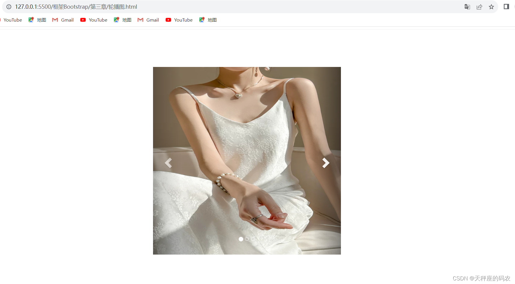
8.2. Analysis of rotating carousel structure
- The rotating carousel consists of three parts: image container, circle indicator, and left and right control buttons
- The image container is the main area of the rotating carousel and mainly carries the content that needs to be displayed.
- The displayed content is placed in a div with the class name item
- All content that needs to be displayed is wrapped in a div with the class name carousel-inner
- The function of the circle indicator is to locate the current carousel position. When you click the circle indicator, you can also switch the carousel image.
- The structure of the circle indicator consists of an ordered list
- The number of lists is determined by the number of items in the image display area.
- The function of the left and right control buttons is to control the carousel direction by clicking the control buttons.
- The left and right control buttons are implemented using two a elements
- The data-slide attribute is used on both a elements.
- The attribute value can only be prev or next, which means the previous or next picture respectively.
- The image container is the main area of the rotating carousel and mainly carries the content that needs to be displayed.
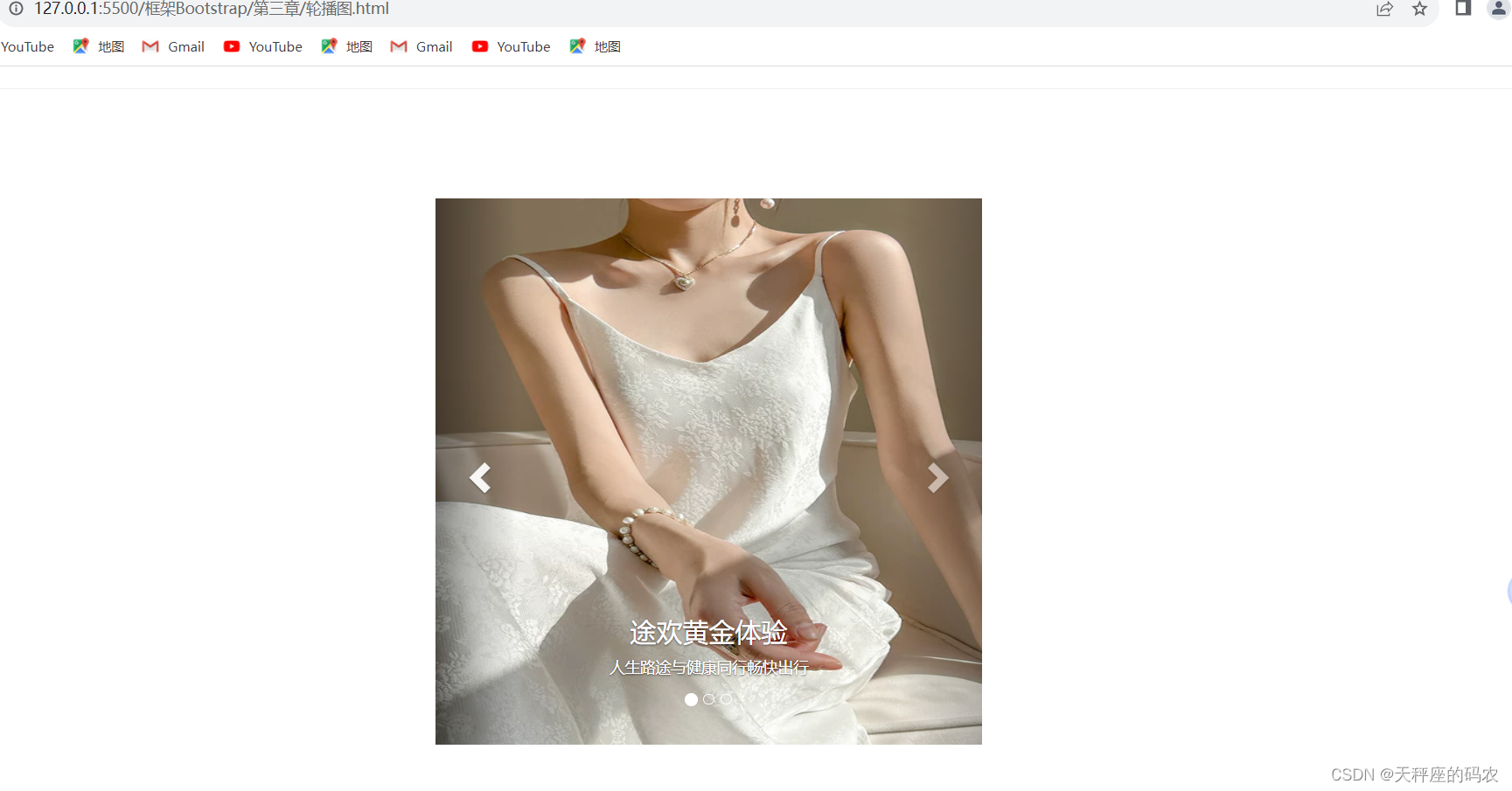
8.3, rotating carousel with text description
<!DOCTYPE html>
<html lang="en">
<head>
    <meta charset="UTF-8">
    <meta name="viewport" content="width=device-width, initial-scale=1.0">
    <title>Document</title>
    <link rel="stylesheet" href="../css/bootstrap.min.css">
</head>
<style>
     .focus {


        width: 500px;
        height: 500px;
        background-color: pink;
        margin: 100px auto;
    }

    .carousel,
    .carousel img {


        width: 100%;
        height: 500px!important;
    }

</style>
<body>
    <div class="container">

    </div>

    <hr>


<div class="focus">
    <div id="carousel-example-generic" class="carousel slide" data-ride="carousel">
        <!-- Indicators 小圆点-->
        <ol class="carousel-indicators">
            <li data-target="#carousel-example-generic" data-slide-to="0" class="active"></li>
            <li data-target="#carousel-example-generic" data-slide-to="1"></li>
            <li data-target="#carousel-example-generic" data-slide-to="2"></li>
        </ol>

        <!-- Wrapper for slides 轮播图-->
        <div class="carousel-inner" role="listbox">
            <div class="item active">
                <img src="../../淘宝/img/轮播图1.png" alt="...">
                <!-- <div class="carousel-caption">
                    <img src="../../淘宝/img/轮播图1.png" alt="...">
                </div> -->
                    <div class="carousel-caption">
                      <h3>途欢黄金体验</h3>
                      <p>人生路途与健康同行畅快出行</p>
                    </div>
            </div>
            <div class="item">
                <img src="../../淘宝/img/轮播图2.png" alt="...">
                <!-- <div class="carousel-caption">
                    <img src="../../淘宝/img/轮播图2.png" alt="...">
                </div> -->
            </div>
            <div class="item">
                <img src="../../淘宝/img/轮播图3.png" alt="...">
                <!-- <div class="carousel-caption">
                    <img src="../../淘宝/img/轮播图3.png" alt="...">
                </div> -->
            </div>
        </div>

        <!-- Controls 左右翻页-->
        <a class="left carousel-control" href="#carousel-example-generic" role="button" data-slide="prev">
            <span class="glyphicon glyphicon-chevron-left" aria-hidden="true"></span>
            <span class="sr-only">Previous</span>
        </a>
        <a class="right carousel-control" href="#carousel-example-generic" role="button" data-slide="next">
            <span class="glyphicon glyphicon-chevron-right" aria-hidden="true"></span>
            <span class="sr-only">Next</span>
        </a>
    </div>
</div>

</body>
<script src="../js/jquery.js"></script>
<script src="../js/bootstrap.min.js"></script>
<!-- //设置自动播放换图时间   单位ms -->
<script>
    $('.carousel').carousel({


        interval: 2000
    })
</script>
</html>
8.4, data attribute of rotating carousel
- In addition to data-ride, data-slide, etc., the rotation carousel plug-in also supports three other data attributes.
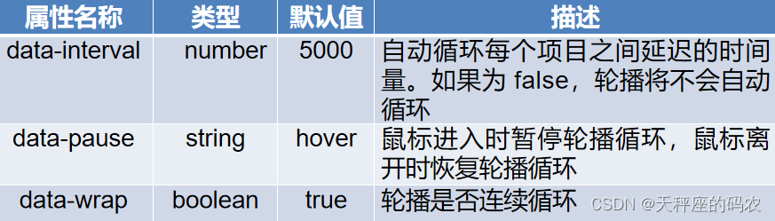
The above three data attributes can be used on the outer parent container of the rotating carousel.
at last
送大家一句话:只要有决心和毅力,什么时候也不算晚。