python drawing series article directory
往期python绘图合集:
python draws a simple line chart
python reads data in excel and draws multiple subgraphs and multiple groups of graphs on one canvas
python draws a histogram with error bars
python draws multiple subgraphs and displays them separately
python reads excel data and draws multiple y Axis image
python draws a histogram and beautifies it | Filling the columns with different colors
python randomly generates data and uses dual y-axes to draw two line charts with error bars
Python draws a histogram with error bars Gradient color filling with data annotation (advanced)
python drawing Scatter plot | Scatter size and color depth are determined by numerical values.
Matplotlib draws beautiful pie charts | python draws beautiful pie charts.
python reads excel data and draws histograms and line charts with dual y-axes. The columns are filled with gradient colors
python Modify image formats in batches | add watermarks to images in batches with python | resize images in batches with python
Contents of this article
1. Achieve goals
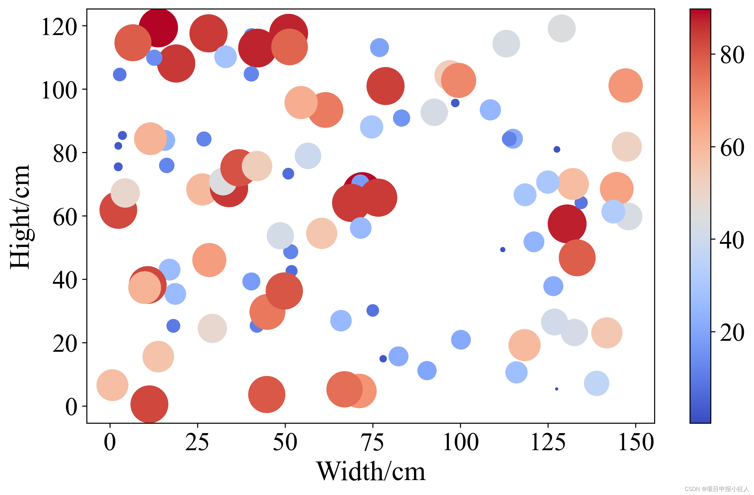
- First, 100 elements of random data x, y and z were generated, where x represents the abscissa, y represents the ordinate, and z represents the value corresponding to the bubble size and color.
- Use the scatter() function to draw a bubble chart. Here the bubble size is set to 10 times the z value, the color is determined by the z value, and the coolwarm color map is used.
- The figsize and dpi parameters are set in the plt.subplots() function, which are used to set the size and resolution of the graphics respectively.
- By modifying the rcParams attribute, the axis font is set to Times New Roman and the font size is 20. Then a color bar was added to illustrate the correspondence between bubble color and z value. The font size of the color bar label is also set to 20 here.
- Finally I added the title and axis labels and set their font size. Finally, use the show() function to display the graph.
2. Complete code
import numpy as np
import matplotlib.pyplot as plt
import matplotlib as mpl

# 生成随机数据
n = 100
x = np.random.rand(n) * 150
y = np.random.rand(n) * 120
z = np.random.rand(n) * 90

# 绘制气泡图
fig, ax = plt.subplots(figsize=(10,6),dpi=300)
scatter = ax.scatter(x, y, s=z*10, c=z, cmap="coolwarm")

# 设置坐标轴字体
mpl.rcParams['font.family'] = 'Times New Roman'
mpl.rcParams['font.size'] = 20

# 添加颜色条
cbar = plt.colorbar(scatter)
cbar.ax.tick_params(labelsize=20)

# 添加标题和坐标轴标签
plt.xlabel('Width/cm', fontsize=22)
plt.ylabel('Hight/cm', fontsize=22)

# 显示图形
plt.show()
3. Operation results