Machine learning is an experiential skill, and practice is one of the effective ways to master machine learning and improve the ability to use machine learning to solve problems. So how can machine learning be used to solve problems?
This section will introduce a regression problem step by step through an example.
This chapter mainly introduces the following contents:
- How to complete a model of a regression problem end-to-end.
- How to improve model accuracy through data transformation.
- How to improve the accuracy of the model by adjusting parameters.
- How to improve model accuracy through ensemble algorithms.
1 Define the problem
In this project, we will analyze and study the Boston House Price data set . Each row of data in this data set describes the housing prices around Boston or in towns. The data was collected statistically in 1978. The data contains the following 14 features and 506 pieces of data (as defined in the UCI Machine Learning Warehouse).
· CRIM: urban crime rate per capita.
· ZN: Proportion of residential land.
· INDUS: Proportion of non-residential land in cities and towns.
· CHAS: CHAS dummy variable, used for regression analysis.
· NOX: environmental index.
· RM: number of rooms per dwelling.
· AGE: Proportion of owner-occupied units built before 1940.
· DIS: Weighted distance to 5 Boston employment centers.
· RAD: convenience index of distance to highways.
· TAX: Real property tax rate per $10,000.
· PRTATIO: Teacher-pupil ratio in a town.
· B: Proportion of black people in the town.
· LSTAT: How many landlords in the area are low-income.
· MEDV: Median house price for owner-occupiers.
Through the description of these feature attributes, we can find that the measurement units of the input feature attributes are not uniform, and it may be necessary to adjust the measurement unit of the data.
2 Import data
First import the class libraries needed in the project. code show as below:
import pandas as pd
from sklearn.discriminant_analysis import LinearDiscriminantAnalysis
from sklearn.linear_model import LogisticRegression

from sklearn.model_selection import  KFold, cross_val_score
from sklearn.naive_bayes import GaussianNB
from sklearn.neighbors import KNeighborsClassifier
from sklearn.svm import SVC
from sklearn.tree import DecisionTreeClassifier
Next, import the data set into Python. This data set can also be downloaded from the UCI machine learning repository. When importing the data set, the name of the data attribute feature is also set.
code show as below:
#导入数据
path = 'D:\down\\BostonHousing.csv'
data = pd.read_csv(path)
3. Understanding the data
Analyze imported data to build appropriate models. First, look at the data dimensions, such as how many records there are in the data set and how many data features there are.
code show as below:
print('data.shape=',data.shape)
After execution, we can see that there are a total of 506 records and 14 feature attributes, which is consistent with the information provided by UCI.
data.shape= (506, 14)
Then check the field types of each feature attribute . code show as below:
#特征属性字段类型
print(data.dtypes)
It can be seen that all feature attributes are numbers, and most feature attributes are floating point
numbers, and some feature attributes are integer types. The execution results are as follows:
crim       float64
zn         float64
indus      float64
chas         int64
nox        float64
rm         float64
age        float64
dis        float64
rad          int64
tax          int64
ptratio    float64
b          float64
lstat      float64
medv       float64
dtype: object
Next, we will do a simple review of the data. Here we look at the first 30 records. code show as below:
print(data.head(30))
The execution results are as follows:
       crim    zn  indus  chas    nox  ...  tax  ptratio       b  lstat  medv
0   0.00632  18.0   2.31     0  0.538  ...  296     15.3  396.90   4.98  24.0
1   0.02731   0.0   7.07     0  0.469  ...  242     17.8  396.90   9.14  21.6
2   0.02729   0.0   7.07     0  0.469  ...  242     17.8  392.83   4.03  34.7
3   0.03237   0.0   2.18     0  0.458  ...  222     18.7  394.63   2.94  33.4
4   0.06905   0.0   2.18     0  0.458  ...  222     18.7  396.90   5.33  36.2
5   0.02985   0.0   2.18     0  0.458  ...  222     18.7  394.12   5.21  28.7
6   0.08829  12.5   7.87     0  0.524  ...  311     15.2  395.60  12.43  22.9
7   0.14455  12.5   7.87     0  0.524  ...  311     15.2  396.90  19.15  27.1
8   0.21124  12.5   7.87     0  0.524  ...  311     15.2  386.63  29.93  16.5
9   0.17004  12.5   7.87     0  0.524  ...  311     15.2  386.71  17.10  18.9
10  0.22489  12.5   7.87     0  0.524  ...  311     15.2  392.52  20.45  15.0
11  0.11747  12.5   7.87     0  0.524  ...  311     15.2  396.90  13.27  18.9
12  0.09378  12.5   7.87     0  0.524  ...  311     15.2  390.50  15.71  21.7
13  0.62976   0.0   8.14     0  0.538  ...  307     21.0  396.90   8.26  20.4
14  0.63796   0.0   8.14     0  0.538  ...  307     21.0  380.02  10.26  18.2
15  0.62739   0.0   8.14     0  0.538  ...  307     21.0  395.62   8.47  19.9
16  1.05393   0.0   8.14     0  0.538  ...  307     21.0  386.85   6.58  23.1
17  0.78420   0.0   8.14     0  0.538  ...  307     21.0  386.75  14.67  17.5
18  0.80271   0.0   8.14     0  0.538  ...  307     21.0  288.99  11.69  20.2
19  0.72580   0.0   8.14     0  0.538  ...  307     21.0  390.95  11.28  18.2
20  1.25179   0.0   8.14     0  0.538  ...  307     21.0  376.57  21.02  13.6
21  0.85204   0.0   8.14     0  0.538  ...  307     21.0  392.53  13.83  19.6
22  1.23247   0.0   8.14     0  0.538  ...  307     21.0  396.90  18.72  15.2
23  0.98843   0.0   8.14     0  0.538  ...  307     21.0  394.54  19.88  14.5
24  0.75026   0.0   8.14     0  0.538  ...  307     21.0  394.33  16.30  15.6
25  0.84054   0.0   8.14     0  0.538  ...  307     21.0  303.42  16.51  13.9
26  0.67191   0.0   8.14     0  0.538  ...  307     21.0  376.88  14.81  16.6
27  0.95577   0.0   8.14     0  0.538  ...  307     21.0  306.38  17.28  14.8
28  0.77299   0.0   8.14     0  0.538  ...  307     21.0  387.94  12.80  18.4
29  1.00245   0.0   8.14     0  0.538  ...  307     21.0  380.23  11.98  21.0
Next let’s look at the descriptive statistics of the data. code show as below:
#pandas 新版本
pd.options.display.precision=1
#pandas老版本
#pd.set_option("precision", 1)
Descriptive statistical information includes the maximum value, minimum value, median value, quartile value,
etc. of the data. Analyzing these data can deepen the understanding of data distribution, data structure, etc. The results are as follows
          crim     zn  indus     chas  ...  ptratio      b  lstat   medv
count  5.1e+02  506.0  506.0  5.1e+02  ...    506.0  506.0  506.0  506.0
mean   3.6e+00   11.4   11.1  6.9e-02  ...     18.5  356.7   12.7   22.5
std    8.6e+00   23.3    6.9  2.5e-01  ...      2.2   91.3    7.1    9.2
min    6.3e-03    0.0    0.5  0.0e+00  ...     12.6    0.3    1.7    5.0
25%    8.2e-02    0.0    5.2  0.0e+00  ...     17.4  375.4    6.9   17.0
50%    2.6e-01    0.0    9.7  0.0e+00  ...     19.1  391.4   11.4   21.2
75%    3.7e+00   12.5   18.1  0.0e+00  ...     20.2  396.2   17.0   25.0
max    8.9e+01  100.0   27.7  1.0e+00  ...     22.0  396.9   38.0   50.0
Next, let’s take a look at the pairwise correlation between data features. Here we look at the Pearson correlation coefficient of the data. code show as below:
         crim    zn  indus      chas   nox  ...   tax  ptratio     b  lstat  medv
crim     1.00 -0.20   0.41 -5.59e-02  0.42  ...  0.58     0.29 -0.39   0.46 -0.39
zn      -0.20  1.00  -0.53 -4.27e-02 -0.52  ... -0.31    -0.39  0.18  -0.41  0.36
indus    0.41 -0.53   1.00  6.29e-02  0.76  ...  0.72     0.38 -0.36   0.60 -0.48
chas    -0.06 -0.04   0.06  1.00e+00  0.09  ... -0.04    -0.12  0.05  -0.05  0.18
nox      0.42 -0.52   0.76  9.12e-02  1.00  ...  0.67     0.19 -0.38   0.59 -0.43
rm      -0.22  0.31  -0.39  9.13e-02 -0.30  ... -0.29    -0.36  0.13  -0.61  0.70
age      0.35 -0.57   0.64  8.65e-02  0.73  ...  0.51     0.26 -0.27   0.60 -0.38
dis     -0.38  0.66  -0.71 -9.92e-02 -0.77  ... -0.53    -0.23  0.29  -0.50  0.25
rad      0.63 -0.31   0.60 -7.37e-03  0.61  ...  0.91     0.46 -0.44   0.49 -0.38
tax      0.58 -0.31   0.72 -3.56e-02  0.67  ...  1.00     0.46 -0.44   0.54 -0.47
ptratio  0.29 -0.39   0.38 -1.22e-01  0.19  ...  0.46     1.00 -0.18   0.37 -0.51
b       -0.39  0.18  -0.36  4.88e-02 -0.38  ... -0.44    -0.18  1.00  -0.37  0.33
lstat    0.46 -0.41   0.60 -5.39e-02  0.59  ...  0.54     0.37 -0.37   1.00 -0.74
medv    -0.39  0.36  -0.48  1.75e-01 -0.43  ... -0.47    -0.51  0.33  -0.74  1.00

[14 rows x 14 columns]
From the above results, we can see that some feature attributes have strong correlations (>0.7 or <-0.7), such as:
· The Pearson correlation coefficient between NOX and INDUS is 0.76.
· The Pearson correlation coefficient between DIS and INDUS is -0.71.
· The Pearson correlation coefficient between TAX and INDUS is 0.72.
· The Pearson correlation coefficient between AGE and NOX is 0.73.
· The Pearson correlation coefficient between DIS and NOX is -0.77.
4 Data visualization
single feature chart
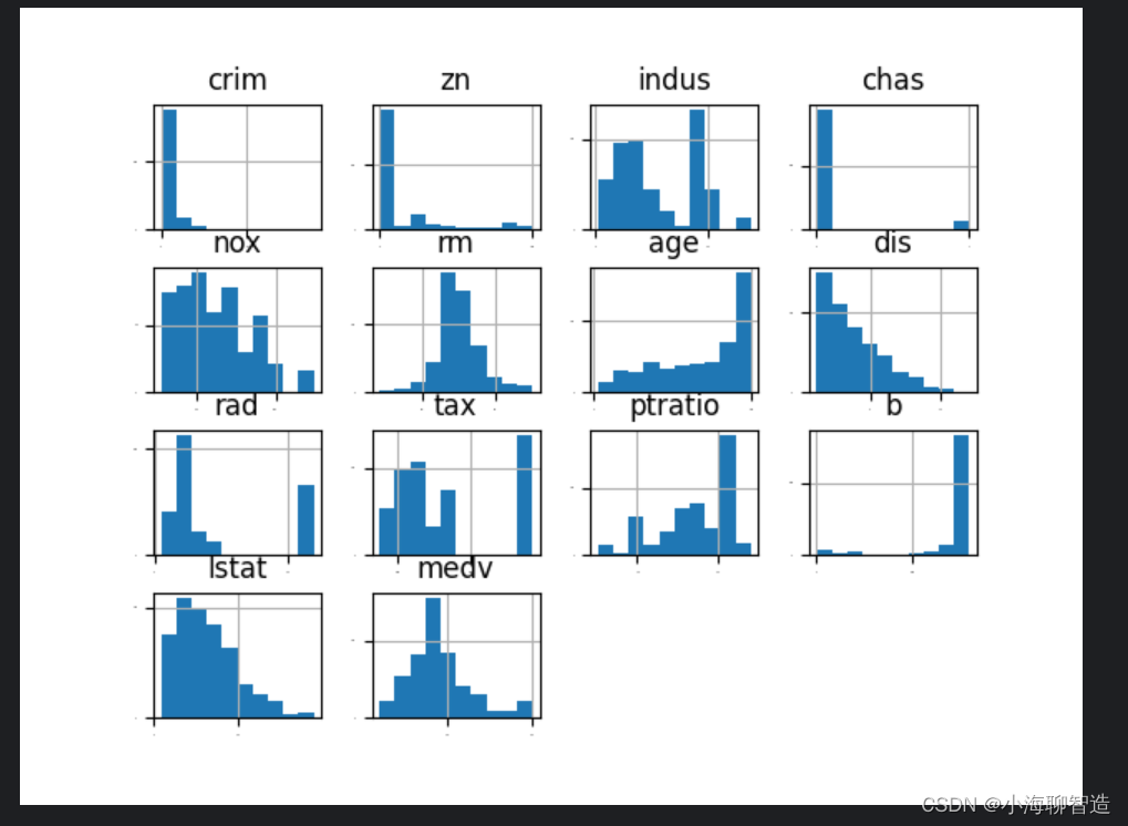
First look at the individual distribution diagrams for each data feature. Looking at several different diagrams will help you discover better methods. We can feel the distribution of the data by looking at the histogram of each data feature. code show as below:
data.hist(sharex=False,sharey=False,xlabelsize=1,ylabelsize=1)
pyplot.show()
The execution results are shown in the figure below. From the figure, you can see that some data are exponentially distributed, such as
CRIM, ZN, AGE, and B; some data features are bimodal, such as RAD and TAX.
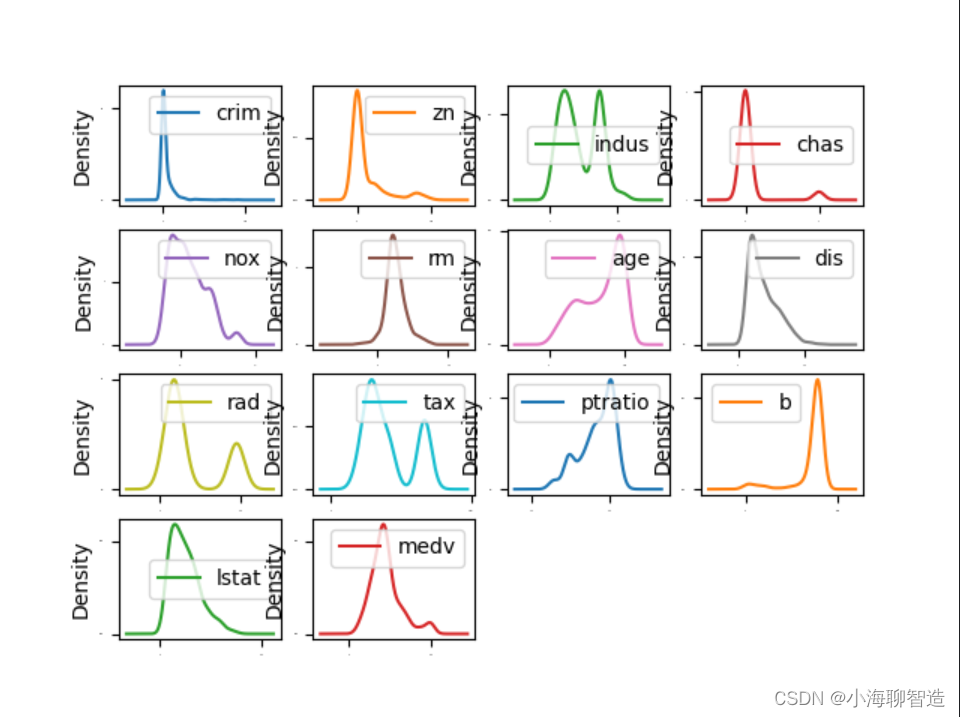
The characteristic attributes of these data can be displayed through density plots . Density plots display these data characteristics more smoothly than histograms. code show as below:
data.plot(kind='density',subplots=True,layout=(4,4),sharex=False,fontsize=1)
pyplot.show()
In the density plot, specify layout = (4, 4), which means that a graph with four rows and four columns is to be drawn
. The execution results are shown in the figure. You can check the status of each data feature
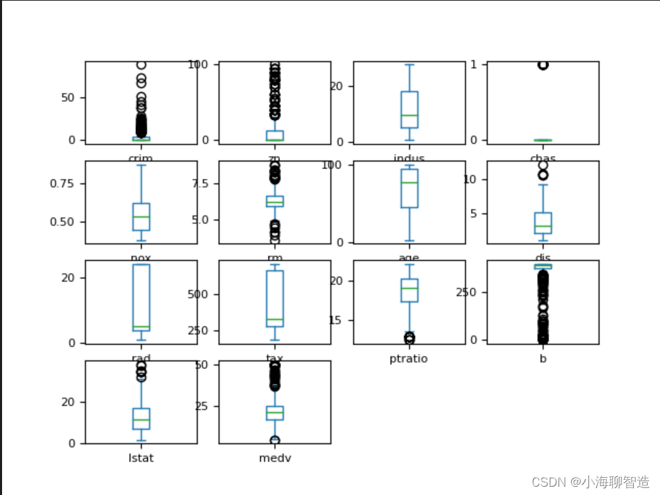
through the box plot , and you can also easily see the degree of skewness of the data distribution . code show as below:
data.plot(kind='box',subplots=True,layout=(4,4),sharex=False,fontsize=8)
pyplot.show()
Results of the:
Multiple data charts
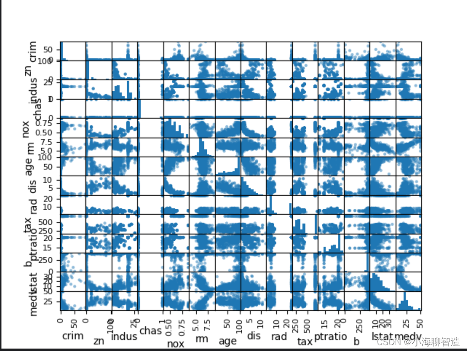
Next, use multiple data charts to see the interaction between different data features. First take a look at the scatter matrix plot. code show as below:
#散点矩阵图
scatter_matrix(data)
pyplot.show()
It can be seen from the scatter matrix plot that although the correlation between some data features is very strong, the distribution structure of these data is also very good. Even if it is not a linear distribution structure, it is a distribution structure that can be easily predicted. The execution results are shown in the figure.
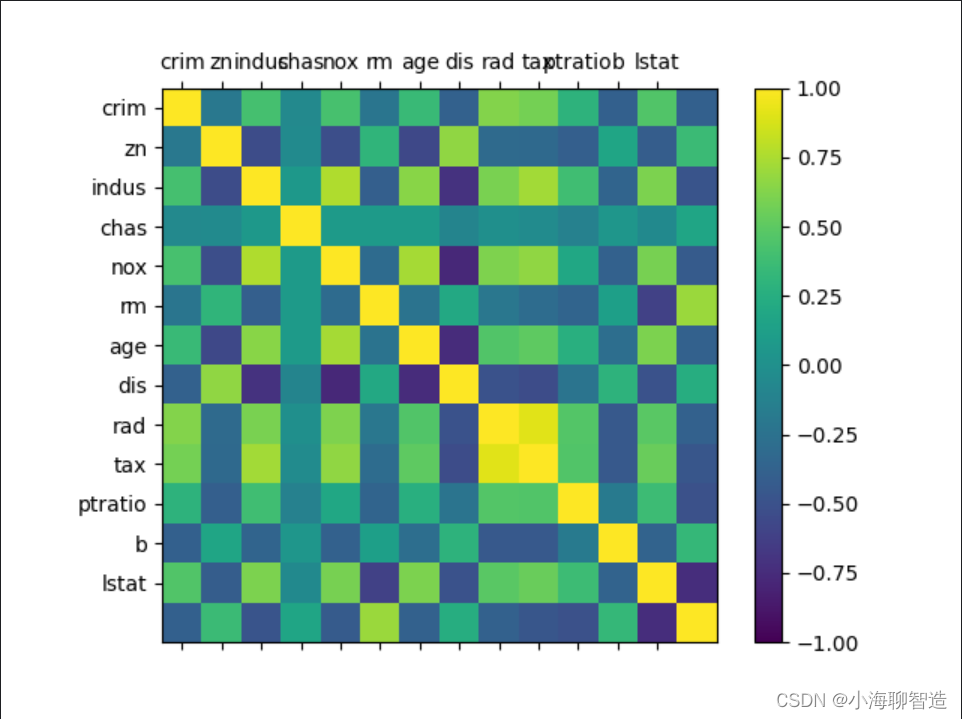
Take another look at the correlation matrix diagram of the mutual influence of the data. code show as below:
#相关矩阵图
names = ['crim', 'zn', 'indus', 'chas', 'nox', 'rm', 'age', 'dis', 'rad', 'tax','ptratio', 'b', 'lstat']
fig = pyplot.figure()
ax = fig.add_subplot(111)
cax = ax.matshow(data.corr(), vmin =-1,vmax =1, interpolation='none')
fig.colorbar(cax)
ticks = np.arange(0,13,1)
ax.set_xticks(ticks)
ax.set_yticks(ticks)
ax.set_xticklabels(names)
ax.set_yticklabels(names)
pyplot.show()
The execution results are shown in the figure. According to the legend, we can see that there are pairwise correlations between data feature attributes . Some attributes are strongly correlated. It is recommended to remove these feature attributes in subsequent processing to improve the accuracy of the algorithm. Spend.
Through data correlation and data distribution, it is found that the data structure in the data set is relatively complex, and data conversion needs to be considered to improve the accuracy of the model. You can try to process the data from the following aspects:
· Reduce most of the highly relevant features through feature selection.
· Reduce the impact of different data measurement units by standardizing data.
· Reduce different data distribution structures by normalizing data to improve the accuracy of the algorithm.
You can further look at the probability ranking (discretization) of the data, which can help improve the accuracy of the decision tree algorithm.
5. Separate evaluation data sets
It is a good idea to separate out an evaluation data set to ensure that the separate data set is completely isolated from the data set for training the model, which helps in ultimately judging and reporting the accuracy of the model. In the final step of the project, this evaluation dataset is used to confirm the accuracy of the model. Here, 20% of the data is separated as the evaluation data set, and 80% of the data is used as the training data set.
code show as below:
#分离数据集,分离出 20%的数据作为评估数据集,80%的数据作为训练数据集
array = data.values
X = array[:, 0:13]
Y = array[:, 13]
validation_size = 0.2
seed = 7
X_train,X_validation,Y_train,Y_validation = train_test_split(X,Y,test_size = validation_size,random_state=seed)
6 Evaluation Algorithm
After analyzing the data, you cannot immediately choose which algorithm is most effective for the problem that needs to be solved. We intuitively believe that due to the linear distribution of some data, linear regression algorithms and elastic network regression algorithms may be more effective in solving problems. In addition, due to the discretization of the data, it may be possible to generate high-accuracy models through the decision tree algorithm or the support vector machine algorithm.
At this point, it is still unclear which algorithm will generate the most accurate model, so an evaluation framework needs to be designed to select the appropriate algorithm. We used 10-fold cross-validation to separate the data and compare the accuracy of the algorithms through the mean square error. The closer the mean square error is to 0, the higher the accuracy of the algorithm.
code show as below:
seed = 7
num_folds = 10
scoring = 'neg_mean_squared_error'
No processing is done on the original data, and the algorithm is evaluated to form an algorithm evaluation benchmark. This benchmark value is the benchmark value for comparing the pros and cons of subsequent algorithm improvements. We select three linear algorithms and three nonlinear algorithms for comparison.
Linear algorithms: linear regression (LR), lasso regression (LASSO) and elastic network regression (EN).
Nonlinear algorithms: Classification and Regression Tree (CART), Support Vector Machine (SVM) and K Nearest Neighbor Algorithm (KNN).
The code for initializing the algorithm model is as follows:
#评估算法

models = {

    }

models['LR'] = LogisticRegression()
models['LASSO'] = Lasso()
models['EN'] = ElasticNet()
models['KNN'] = KNeighborsClassifier()
models['CART'] = DecisionTreeClassifier()
models['SVM'] = SVR()


X_train,X_validation,Y_train,Y_validation = train_test_split(X,Y,test_size = validation_size,random_state=seed)

results = []

for key in models:

  kflod = KFold(n_splits=num_folds,random_state=seed,shuffle=True)
  result = cross_val_score(models[key], X_train, Y_train.astype('int'), cv=kflod,scoring= scoring)
  results.append(result)
  print("%s: %.3f (%.3f)" % (key, result.mean(), result.std()))
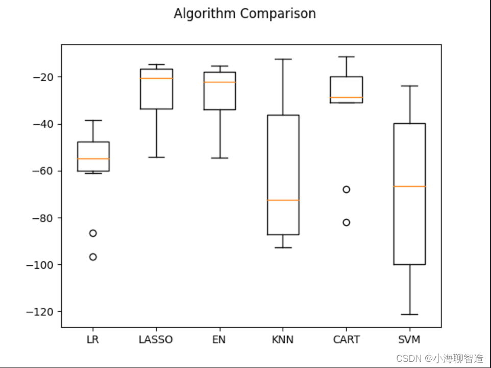
Judging from the execution results, Lasso Regression (LASSO) has the optimal MSE, followed by the Elastic Network Regression (EN) algorithm. The execution results are as follows:
LR: -59.150 (17.584)
LASSO: -27.313 (13.573)
EN: -28.251 (13.577)
KNN: -62.158 (28.251)
CART: -31.000 (19.562)
SVM: -68.676 (33.776)
Then look at the results of all 10-fold cross-split validations. code show as below:
#评估算法箱线图

fig = pyplot.figure()
fig.suptitle("Algorithm Comparison")
ax = fig.add_subplot(111)
pyplot.boxplot(results)
ax.set_xticklabels(models.keys())
pyplot.show()
The execution results are shown in the figure. It can be seen from the figure that the distribution of the linear algorithm is relatively similar
, and the result distribution of the classification and regression tree (CART) algorithm is very compact.
Evaluation Algorithm - Normalized Data
I guess here that maybe because the measurement units of different feature attributes in the original data are different, the results of some algorithms are not very good. Next, these algorithms are evaluated again by normalizing the data. Here, data conversion processing is performed on the training data set, and all data feature values are converted into data with "0" as the median value and standard deviation as "1". When normalizing data, in order to prevent data leakage, Pipeline is used to normalize the data and evaluate the model. For comparison with the previous results, the same evaluation framework is adopted here to evaluate the algorithmic model.
code show as below:
#评估算法--正态化数据

pipelines ={

    }

pipelines['ScalerLR'] = Pipeline([('Scaler',StandardScaler()),('LR',LinearRegression())])
pipelines['ScalerLASSO'] = Pipeline([('Scaler',StandardScaler()),('LASSO',Lasso())])
pipelines['ScalerEN'] = Pipeline([('Scaler',StandardScaler()),('EN',ElasticNet())])
pipelines['ScalerKNN'] = Pipeline([('Scaler',StandardScaler()),('KNN',KNeighborsRegressor())])

pipelines['ScalerCART'] = Pipeline([('Scaler',StandardScaler()),('CART',DecisionTreeRegressor())])
pipelines['ScalerSVM'] = Pipeline([('Scaler',StandardScaler()),('SVM',SVR())])


X_train,X_validation,Y_train,Y_validation = train_test_split(X,Y,test_size = validation_size,random_state=seed)

results = []


for key in pipelines:

  kflod = KFold(n_splits=num_folds,random_state=seed,shuffle=True)
  cv_result = cross_val_score(pipelines[key], X_train, Y_train, cv=kflod,scoring= scoring)
  results.append(cv_result)
  print("%s: %.3f (%.3f)" % (key, cv_result.mean(), cv_result.std()))
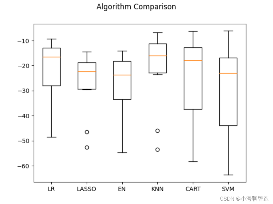
After execution, it was found that the K nearest neighbor algorithm has the optimal MSE. The execution results are as follows:
ScalerLR: -22.006 (12.189)
ScalerLASSO: -27.206 (12.124)
ScalerEN: -28.301 (13.609)
ScalerKNN: -21.457 (15.016)
ScalerCART: -27.813 (20.786)
ScalerSVM: -29.570 (18.053)
Next, let’s take a look at the results of all 10-fold cross-split validation. code show as below:
#评估算法箱线图

fig = pyplot.figure()
fig.suptitle("Algorithm Comparison")
ax = fig.add_subplot(111)
pyplot.boxplot(results)
ax.set_xticklabels(models.keys())
pyplot.show()
The execution results and the generated box plot are as shown in the figure. It can be seen that the K nearest neighbor algorithm has the optimal MSE and the most compact data distribution.
At present, the K nearest neighbor algorithm has good results for data sets that have undergone data transformation, but can the results be further optimized?
The default parameter number of neighbors (n_neighbors) of the K nearest neighbor algorithm is 5. The parameters are optimized below using the grid search algorithm. code show as below:
#调参改善算法-knn
scaler = StandardScaler().fit(X_train) # fit生成规则
#scaler = StandardScaler.fit(X_train)
rescaledX = scaler.transform(X_train)
param_grid ={

    'n_neighbors':[1,3,5,7,9,11,13,15,19,21]}
model = KNeighborsRegressor()

kflod = KFold(n_splits=num_folds,random_state=seed,shuffle=True)
grid = GridSearchCV(estimator =model,param_grid=param_grid,scoring=scoring,cv = kflod)

grid_result = grid.fit(X=rescaledX,y = Y_train)

print('最优:%s 使用%s'%(grid_result.best_score_,grid_result.best_params_))

cv_results = zip(grid_result.cv_results_['mean_test_score'],
                 grid_result.cv_results_['params'])


for mean,param in cv_results:
  print(mean,param)
Optimal result - the default parameter number of neighbors (n_neighbors) of the K nearest neighbor algorithm is 1. The execution
results are as follows:
最优:-19.497828658536584 使用{

    'n_neighbors': 1}
-19.497828658536584 {

    'n_neighbors': 1}
-19.97798367208672 {

    'n_neighbors': 3}
-21.270966658536583 {

    'n_neighbors': 5}
-21.577291737182684 {

    'n_neighbors': 7}
-21.00107515055706 {

    'n_neighbors': 9}
-21.490306228582945 {

    'n_neighbors': 11}
-21.26853270313177 {

    'n_neighbors': 13}
-21.96809222222222 {

    'n_neighbors': 15}
-23.506900689142622 {

    'n_neighbors': 19}
-24.240302870416464 {

    'n_neighbors': 21}
Determine the final model
We have decided to use the extreme random tree (ET) algorithm to generate the model. Next, we will train the algorithm and generate the model, and calculate the accuracy of the model. code show as below:
#训练模型

caler = StandardScaler().fit(X_train)
rescaledX = scaler.transform(X_train)
gbr = ExtraTreeRegressor()
gbr.fit(X=rescaledX,y=Y_train)
#评估算法模型

rescaledX_validation = scaler.transform(X_validation)
predictions = gbr.predict(rescaledX_validation)
print(mean_squared_error(Y_validation,predictions))
The execution results are as follows:
14.392352941176469
This project example completes a complete machine learning project starting from problem definition to final model generation. Through this project, I understood the template of the machine learning project introduced in the previous section , as well as the entire process of building a machine learning model.