Table of contents
1. Definition of data preprocessing
2. Boston house price data for data preprocessing
2.1 Download the Boston House Price Dataset
2.3 Read data into pandas DataFrame and transfer to csv file
2.4 View the type of each feature of the data set and whether there are null values
2.7 Draw box plots (box plots) for all features and check isolated points (outliers)
2.8 Draw a scatterplot after sorting the first feature
2.9 Draw a quantile map for the first feature
2.10 Draw quantile plots for all features
2.11 Fitting the first feature using the linear regression method
2.13 Draw the quantile-quantile diagram in two segments for the third feature
2.14 Draw a histogram to view the distribution and data skew of each feature
2.15 Draw a histogram for all features to view the distribution and data skew of the data
3. Boston house price data for simulation training (splitting data set 7:3)
3.6 The gap between the test value and the predicted value
Summarize
foreword
According to the process and steps of data preprocessing, perform data preprocessing and model training on the Boston house price data set (the data set needs to be divided into training set and test set) and perform data column normalization and feature reduction during model training /Feature extraction and other data preprocessing operations, after training a high-scoring model, test it on the test set, and verify the accuracy on the test set. If there is no update in the past few days, I am doing this big job of data preprocessing and other big jobs. Now it's finally finished, post it up for everyone to study and discuss together, please comment if there are any deficiencies, let's learn together~
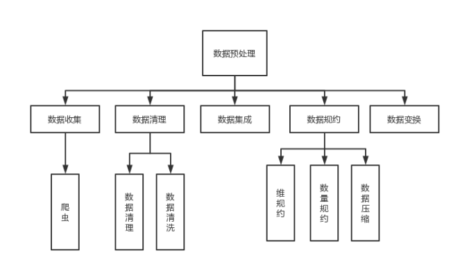
1. Definition of data preprocessing
Data Preprocessing refers to a series of processing tasks such as cleaning, collection and transformation of the original data before data mining, in order to meet the minimum specifications and standards required by mining algorithms for knowledge acquisition research. Through data preprocessing, the incomplete data can be made complete, the wrong data can be corrected, the redundant data can be removed, and then the required data can be integrated into the data. Common methods of data preprocessing include data cleaning, data integration, and data transformation.
The overall flow chart is shown in the figure below:
2. Boston house price data for data preprocessing
2.1 Download the Boston House Price Dataset
code:
from sklearn.datasets import load_boston

housing = load_boston()
print(housing.keys())
Renderings:

2.2 View the description, characteristics, number of data items, and number of features of the data set
code:
print(housing.DESCR)
print(housing.feature_names)

X=housing.data
print(X.shape,X)
y=housing.target
print(y.shape,y)
Renderings:
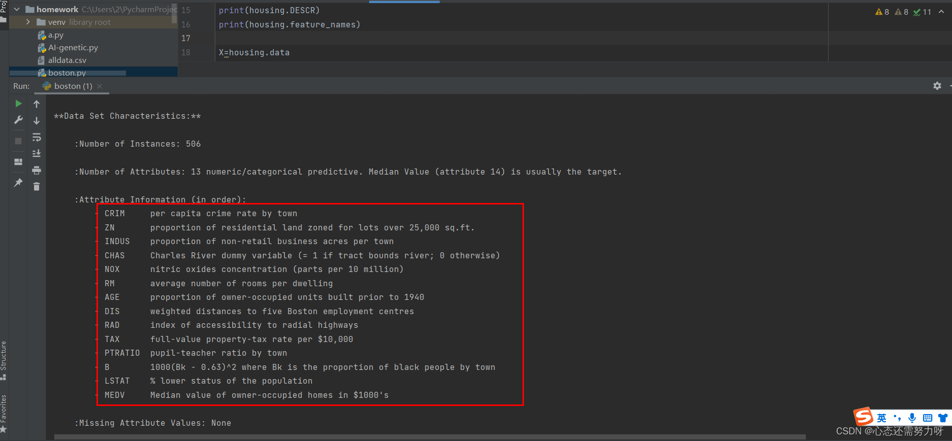

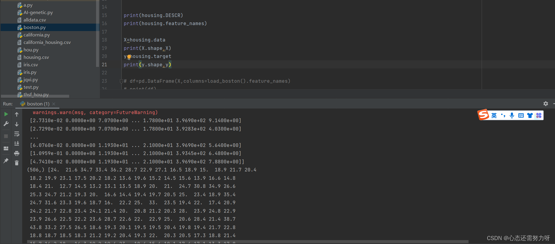
Analysis: It can be seen that Boston housing prices have 506 pieces of data and 13 characteristics.
The Chinese meaning of each feature is as follows:
CRIM: Urban crime rate per capita
ZN: % of residential land
INDUS: % of urban non-commercial land
CHAS: Charles River dummy variable for regression analysis
NOX: Environmental index
RM: Number of rooms per dwelling
AGE: 1940 Proportion of previously built owner-occupied units
DIS: Weighted distance to 5 Boston employment centers
RAD: Convenience index to highways
TAX: Real estate tax rate per $10,000
PTRATIO: Teacher-student ratio in town
B: City in town Black Percentage
LSTAT: How many landlords in the district are low-income
2.3 Read data into pandas DataFrame and transfer to csv file
code:
import pandas as pd
df=pd.DataFrame()
for i in range(X.shape[1]):
    df[housing.feature_names[i]]=X[:,i]
df['target']=y
df.to_csv('boston_housing.csv',index=None)
print(df)
Renderings:

Analysis: The .csv file has been generated and the data has been stored, and the printed rendering is shown in the figure above.
2.4 View the type of each feature of the data set and whether there are null values
code:
print(df.info())Renderings:
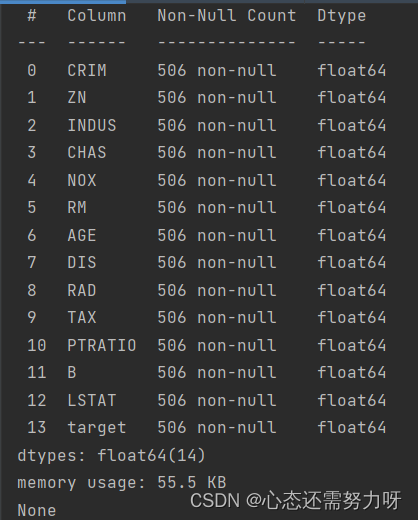
Analysis: It can be seen from the above figure that there are no null values.
2.5 Centralized measurement of the data set: calculate the median and mean of each feature, and analyze the median and mean
code:
print(df.describe())Renderings:
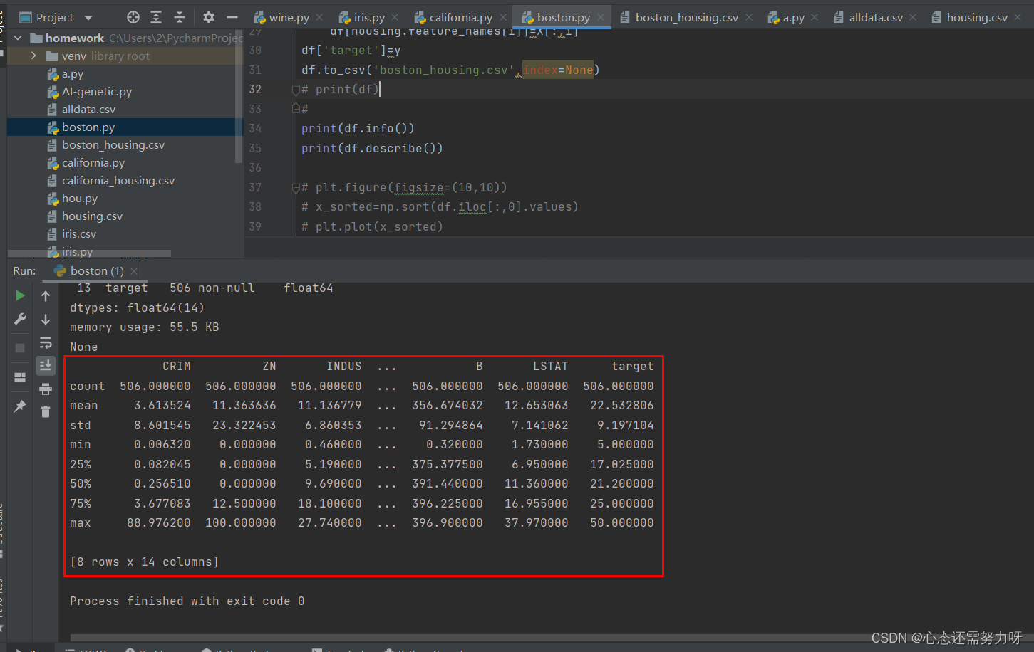
Analysis: From the figure above, we can see the mean and median of each feature of Boston housing prices. The mean and median values of each feature are similar. Only individual features, such as CRIM and ZN, deviate seriously.
2.6 Discretization measurement of the data set: draw a box plot (box plot) for the first feature, check isolated points (outliers)
code:
plt.boxplot(X[:,0],showmeans=True,meanline=True)
plt.show()
Renderings:
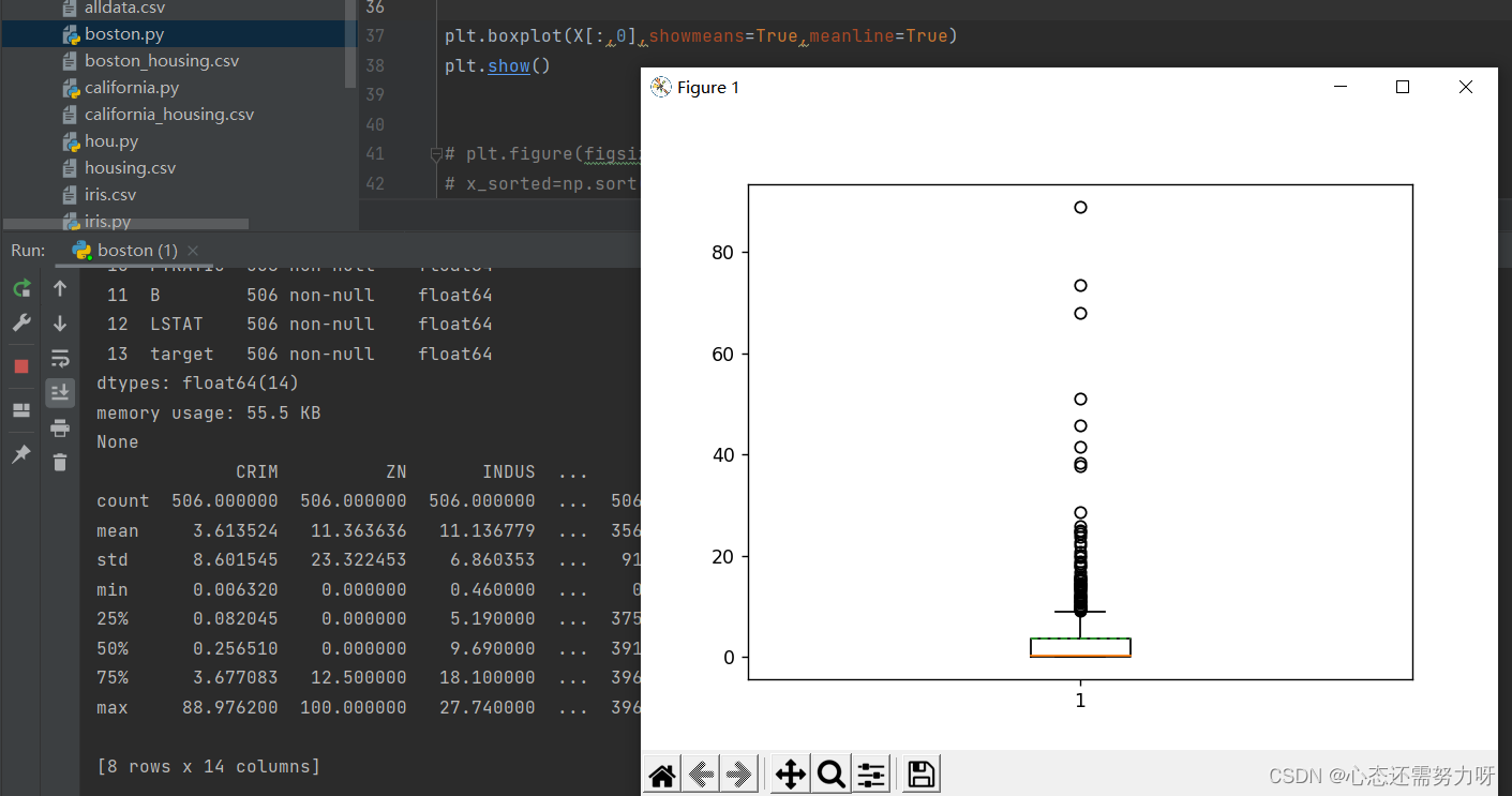
Analysis: There are many isolated points of the first feature, which is the same in mean and median analysis, and the deviation is serious.
2.7 Draw box plots (box plots) for all features and check isolated points (outliers)
code:
plt.figure(figsize=(15, 15))
#对所有特征(收入中位数)画盒图(箱线图)
for i in range(X.shape[1]):
    plt.subplot(4,4,i+1)
    plt.boxplot(X[:,i],showmeans = True ,meanline = True)
    #x,y坐标轴标签
    plt.xlabel(housing['feature_names'][i])
plt.subplot(4,4,14)
#绘制直方图
plt.boxplot(y, showmeans = True ,meanline = True)
#x,y坐标轴标签
plt.xlabel('target')
plt.show()
Renderings:

Analysis: It can also be seen that most of the features have no outliers, and only individual features have outliers. It can also be seen from the mean and median of each feature.
2.8 Draw a scatterplot after sorting the first feature
code:
x_sorted=np.sort(df.iloc[:,0].values)
# 画散点图
plt.scatter([i for i in range(X.shape[0])],x_sorted)
# 画x,y坐标轴标签
plt.xlabel('Count')
plt.ylabel('sorted'+housing['feature_names'][0])
plt.show()
Renderings:
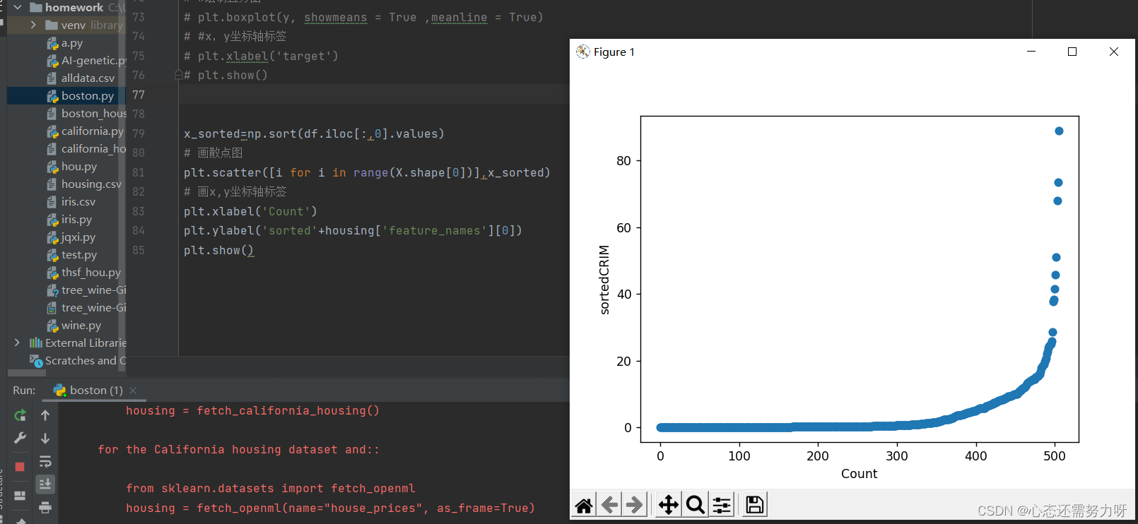
Analysis: Judging from the per capita crime rate, most crime rates are almost zero, and some crime rates are as high as 80%.
2.9 Draw a quantile map for the first feature
code:
x_sorted=np.sort(df.iloc[:,0].values)
# 画散点图
plt.scatter([i for i in range(X.shape[0])],x_sorted)
# 画中位数点
plt.scatter([round(X.shape[0]/4),round(X.shape[0]/2),round(X.shape[0]*3/4)],
           [np.quantile(x_sorted,0.25),np.quantile(x_sorted,0.5),np.quantile(x_sorted,0.75)],color='red')
# 画x,y坐标轴标签
plt.xlabel('Count')
plt.ylabel('sorted'+housing['feature_names'][0])
plt.show()
Renderings:
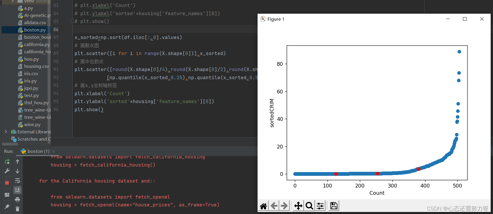
Analysis: It can be seen from the figure that the crime rate of 75% of the population is almost 0, and the crime rate of 25% of the population is relatively high.
2.10 Draw quantile plots for all features
code:
plt.figure(figsize=(10, 10))
for j in range(X.shape[1]):

    # 对第一个特征(收入中位数)数据排序
    x_sorted=np.sort(df.iloc[:,j].values)
    plt.subplot(4,4,j+1)
    # 画散点图
    plt.scatter([i for i in range(X.shape[0])],x_sorted)
    # 画中位数点
    plt.scatter([round(X.shape[0]/4),round(X.shape[0]/2),round(X.shape[0]*3/4)],
                [np.quantile(x_sorted,0.25),np.quantile(x_sorted,0.5),np.quantile(x_sorted,0.75)],color='red')
    # 画x,y坐标轴标签
    plt.xlabel('Count')
    plt.ylabel('sorted'+housing['feature_names'][j])
plt.subplot(4,4,13)
plt.show()
Renderings:

Analysis: From the graph, the trend and proportion of each feature can be analyzed.
2.11 Fitting the first feature using the linear regression method
code:
X_list=[i for i in range(X.shape[0])]
X_array=np.array(X_list)
# 转换为矩阵
X_reshape=X_array.reshape(X.shape[0],1)
# 排序
x_sorted=np.sort(df.iloc[:,0].values)
from sklearn import linear_model
linear=linear_model.LinearRegression()
# 进行线性回归拟合
linear.fit(X_reshape,x_sorted)
# 对训练结果做拟合度评分
print("training score: ",linear.score(X_reshape,x_sorted))
plt.scatter(X_list,x_sorted)

y_predict=linear.predict(X_reshape)
plt.plot(X_reshape,y_predict,color='red')
plt.show()
Renderings:

Analysis: Using linear regression to fit the first feature score is 33.9%, the fit is not high
2.12 Fit the first characteristic data using the local regression (Loess) curve (fitting a scatter plot with a curve) method
code:
X_list=[i for i in range(X.shape[0])]
X_array=np.array(X_list)
# 转换为矩阵
X_reshape=X_array.reshape(X.shape[0],1)
# 排序
x_sorted=np.sort(df.iloc[:,0].values)
from sklearn import linear_model
# linear=linear_model.LinearRegression()
linear=linear_model.Lasso(fit_intercept=False)
# 进行Lasso局部回归拟合
linear.fit(X_reshape,x_sorted)
# 对训练结果做拟合度评分
print("training score: ",linear.score(X_reshape,x_sorted))
plt.scatter(X_list,x_sorted)

y_predict=linear.predict(X_reshape)
plt.plot(X_reshape,y_predict,color='red')
plt.show()
Renderings:

Analysis: Using the local regression curve to fit the first feature score is 25.3%, and the fitting degree is not high.
2.13 Draw the quantile-quantile diagram in two segments for the third feature
code:
import numpy as np
import matplotlib.pyplot as plt
plt.figure(figsize=(5,5))

df_new1=df[df['INDUS']<=df['INDUS'].mean()]
df_new2=df[df['INDUS']>df['INDUS'].mean()]

part1=np.sort(df_new1.iloc[:,0].values)[:df_new2['INDUS'].count()]
part2=np.sort(df_new2.iloc[:,0].values)[:df_new2['INDUS'].count()]

plt.xlim(part2[0],part2[-1])
plt.ylim(part2[0],part2[-1])
plt.plot([part2[0],part2[-1]],[part2[0],part2[-1]])

plt.scatter(part1,part2)
plt.scatter([np.quantile(part1,0.25),np.quantile(part1,0.5),np.quantile(part1,0.75)],
            [np.quantile(part2,0.25),np.quantile(part2,0.5),np.quantile(part2,0.75)],color='red')
plt.show()
Renderings:
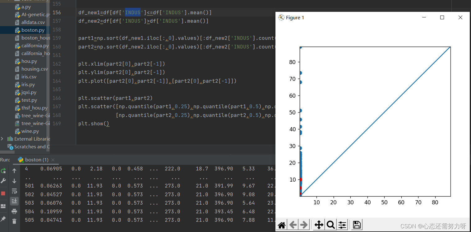
Analysis: Through the quantile-quantile diagram, it can be found that they are all above it. The per capita crime rate of 75% of the population is below 10%, and the crime rate of 25% of the population is above 10%.
2.14 Draw a histogram to view the distribution and data skew of each feature
code:
plt.hist(X[:,0],edgecolor='k')
plt.show()
Renderings:

Analysis: The above situation can also be seen from the histogram. The per capita crime rate is 0 for the majority. It is also in line with real life, but the crime rate in the city is relatively high.
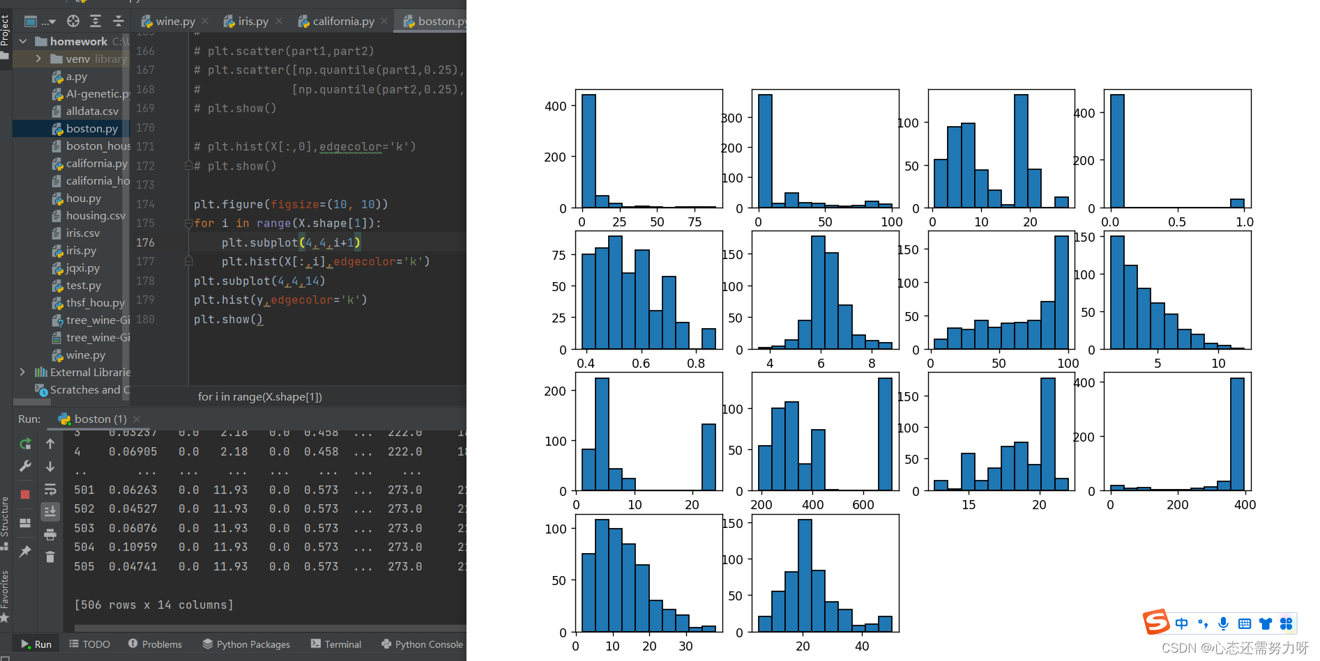
2.15 Draw a histogram for all features to view the distribution and data skew of the data
code:
plt.figure(figsize=(10, 10))
for i in range(X.shape[1]):
    plt.subplot(4,4,i+1)
    plt.hist(X[:,i],edgecolor='k')
plt.subplot(4,4,14)
plt.hist(y,edgecolor='k')
plt.show()
Renderings:
2.16 Find the correlation between all features and find the feature pairs with a correlation greater than 0.7, and do feature reduction
code:
for column in df.columns:
    correlations_data=df.corr()[column].sort_values()
    for key in correlations_data.keys():
        if key != column and abs(correlations_data[key]) >= 0.7:
            print('%s vs %s:' %(column,key),correlations_data[key])
Renderings:

Analysis: The number of correlations between features greater than 0.7 is relatively large. When we select features, it is best that the correlation between features is less than 0.7, so that we can analyze the data well and reduce unnecessary features. Reduce time when computing.
3. Boston house price data for simulation training (splitting data set 7:3)
3.1 Divide the data set into a training set and a test set at a ratio of 7:3, use a linear regression algorithm for training on all features (not sliced), and display the fitness of the training set and the fitness of the test set
code:
X_train,X_test, y_train, y_test = train_test_split(X, y, test_size=0.3, random_state=0)
print('y_train = ', y_train)
print('y_test = ', y_test)

#线性回归
from sklearn import linear_model
model = linear_model.LinearRegression()
# model.fit(wine_X_train,wine_y_train)

# 模型训练及评估
model.fit(X_train,y_train)
print('\nTrain score:',model.score(X_train,y_train))
print('Test score:',model.score(X_test,y_test))
Renderings:

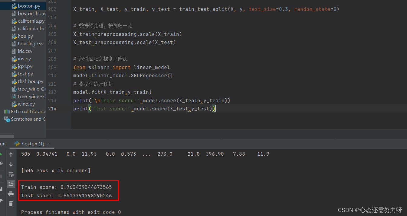
3.2 Normalize the data set by column, use the gradient descent algorithm for training, and display the fitting degree of the training set and the fitting degree of the test set
code:
X_train, X_test, y_train, y_test = train_test_split(X, y, test_size=0.3, random_state=0)

# 数据预处理,按列归一化
X_train=preprocessing.scale(X_train)
X_test=preprocessing.scale(X_test)

# 线性回归之梯度下降法
from sklearn import linear_model
model=linear_model.SGDRegressor()
# 模型训练及评估
model.fit(X_train,y_train)
print('\nTrain score:',model.score(X_train,y_train))
print('Test score:',model.score(X_test,y_test))
Renderings:
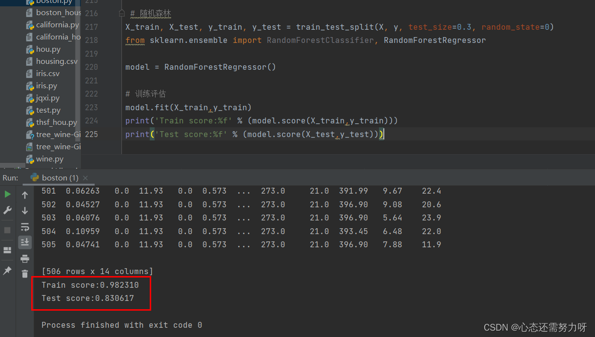
3.3 Using the random forest algorithm for regression problems: Divide the Boston house price data set into a training set and a test set at 7:3, use a random forest regressor for training, and show the accuracy of the training set and the accuracy of the test set
code:
X_train, X_test, y_train, y_test = train_test_split(X, y, test_size=0.3, random_state=0)
from sklearn.ensemble import RandomForestClassifier, RandomForestRegressor

model = RandomForestRegressor()

# 训练评估
model.fit(X_train,y_train)
print('Train score:%f' % (model.score(X_train,y_train)))
print('Test score:%f' % (model.score(X_test,y_test)))
Renderings:
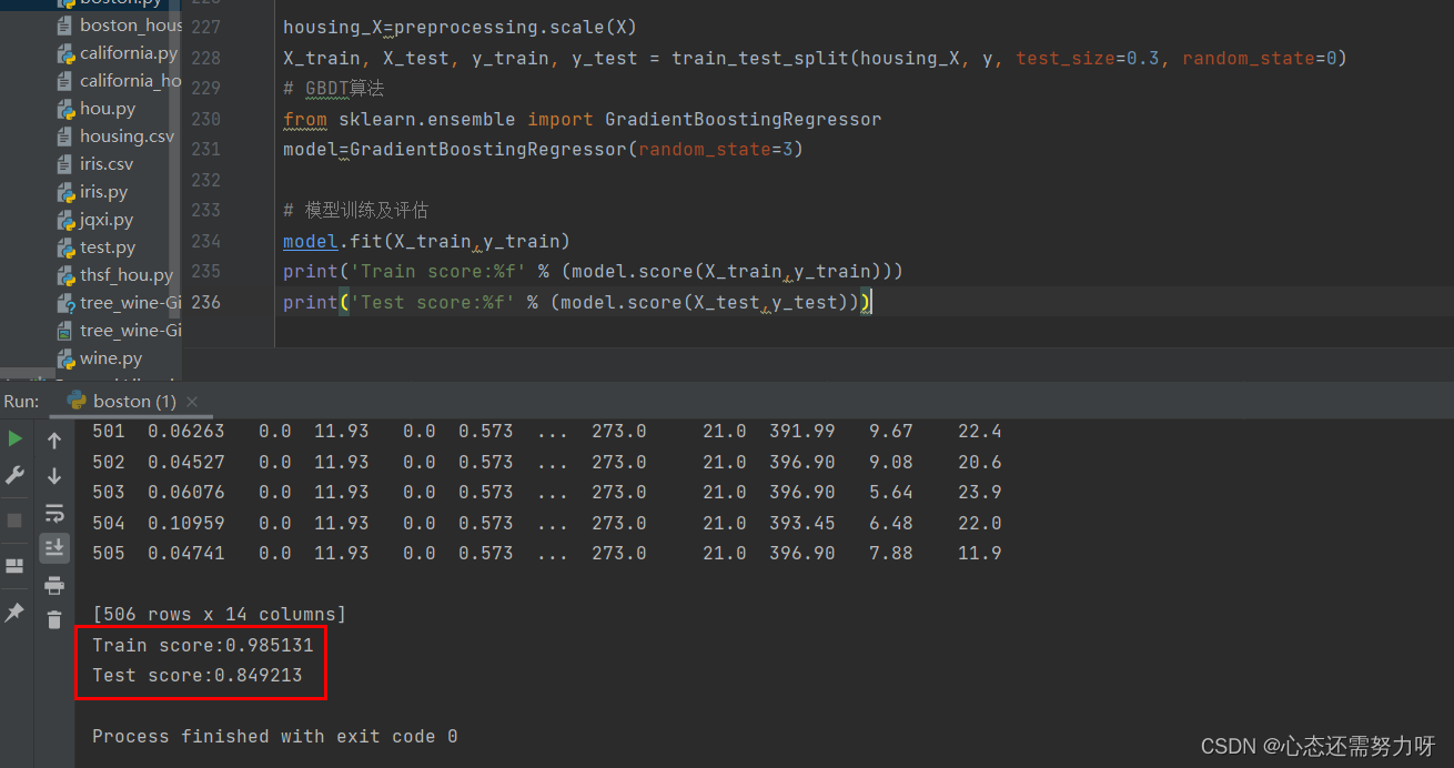
3.4 Using the GBDT algorithm for regression problems: Divide the Boston house price data set into a training set and a test set at 7:3, use the GBDT regressor for training, and show the accuracy of the training set and the accuracy of the test set
code:
housing_X=preprocessing.scale(X)
X_train, X_test, y_train, y_test = train_test_split(housing_X, y, test_size=0.3, random_state=0)
# GBDT算法
from sklearn.ensemble import GradientBoostingRegressor
model=GradientBoostingRegressor(random_state=3)

# 模型训练及评估
model.fit(X_train,y_train)
print('Train score:%f' % (model.score(X_train,y_train)))
print('Test score:%f' % (model.score(X_test,y_test)))
Renderings:
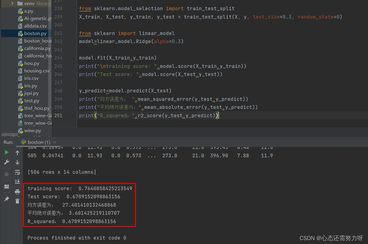
3.5 Use the ridge regression algorithm for regression problems: divide the Boston house price data set into a training set and a test set at 7:3, use the ridge regression algorithm for training, and display the fitness of the training set and the fit of the test set; import sklearn The MSE and MAE methods calculate the mean square error and mean absolute error evaluation indicators
code:
from sklearn.model_selection import train_test_split
X_train, X_test, y_train, y_test = train_test_split(X, y, test_size=0.3, random_state=0)

from sklearn import linear_model
model=linear_model.Ridge(alpha=0.3)

model.fit(X_train,y_train)
print("\ntraining score: ",model.score(X_train,y_train))
print("Test score: ",model.score(X_test,y_test))

y_predict=model.predict(X_test)
print("均方误差为: ",mean_squared_error(y_test,y_predict))
print("平均绝对误差为:",mean_absolute_error(y_test,y_predict))
print("R_squared:",r2_score(y_test,y_predict))
Renderings:
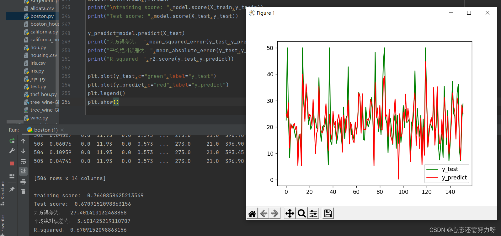
3.6 The gap between the test value and the predicted value
code:
plt.plot(y_test,c="green",label="y_test")
plt.plot(y_predict,c="red",label="y_predict")
plt.legend()
plt.show()
Renderings:
Summarize
At this point, I have shown you the code and related renderings for data preprocessing and model training of the Boston dataset. If you want to learn data preprocessing, you can import it under the python scikit-learn package and follow along. . There are also red wine data sets, iris data sets, and California house price data sets, etc., which can be used for practice. Among them, there are a lot of data on house prices in California, with tens of thousands of pieces of data. If you are proficient, this data set is very good for practice.