
As the most useful visualization tool in the domestic open source version, Datart is undoubtedly a low-cost, high-efficiency visualization tool that can be used for secondary development. Of course, free services must come with some pitfalls. In this article, we will talk about the visualization tool Datart’s guide to avoiding (avoiding) pitfalls (1) - non-reusable charts.

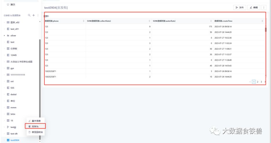
Version: 1.0.0-rc.2 Release The reusability of visualization charts is an important criterion for measuring the ease of use of a visualization tool. Of course, Datart does not provide a very rich template for users to quickly choose, after all, the positioning of the products is different. It provides general functions "save" and "copy" functions. We can reuse the dashboards and charts we have created in these two ways. However, this feature currently suffers from data misalignment and offset issues. For example: create a dashboard-test0904, including a chart 1
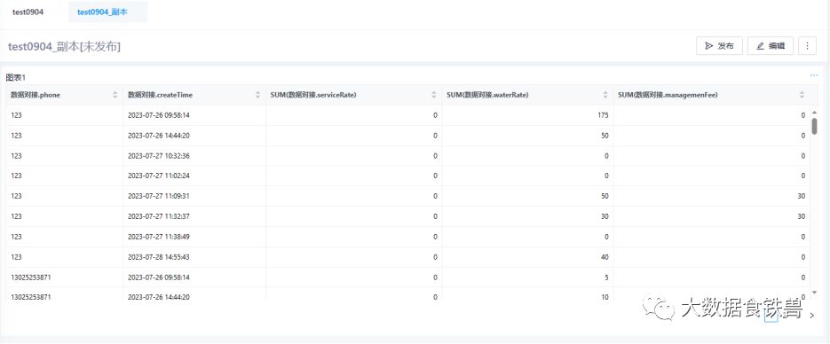
Create a copy by saving as and modify Chart 1 to Chart 2
When switching the chart to test0904, I found that the data displayed in the chart was misaligned and offset.
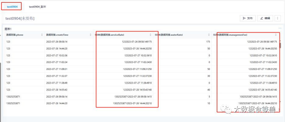
This problem occurs when the same chart component is reused in different dashboards, and was determined to be a bug by community leaders. It is currently being repaired, but the solution time is uncertain and may not be updated until 2 to 3 versions. There is currently no other solution except to avoid using "Save As" and "Copy and Paste" to reuse charts when creating charts, and the above problems will not occur.
To be continued …..
Add gzh "Big Data Iron-eating Beast" to learn more about pitfalls. The guide will be continuously updated!