First upload the code to show the problem:
<!DOCTYPE html>
<html lang="en">
<head>
<meta charset="UTF-8">
<meta http-equiv="X-UA-Compatible" content="IE=edge">
<meta name="viewport" content="width=device-width, initial-scale=1.0">
<title>Document</title>
</head>
<style>
* {
margin: 0;
padding: 0;
}
ul {
list-style: none;
}
a {
text-decoration: none;
}
.container {
/* background-color: pink; */
}
.content {
padding: 10px;
}
.content ul {
display: flex;
justify-content: space-evenly;
flex-wrap: wrap;
background-color: skyblue;
}
.content ul li {
width: 150px;
height: 150px;
margin: 10px 10px;
background-color: pink;
}
</style>
<body>
<div class="container">
<div class="content">
<ul>
<li>
<div class="box"></div>
</li>
<li>
<div class="box"></div>
</li>
<li>
<div class="box"></div>
</li>
<li>
<div class="box"></div>
</li>
<li>
<div class="box"></div>
</li>
</ul>
</div>
</div>
</body>
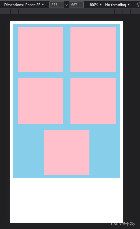
</html>operation result:
If I want to arrange it like this, as shown below:
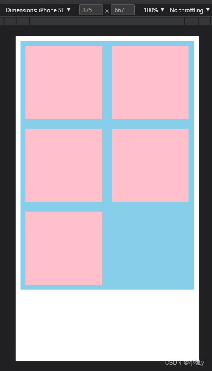
The solution is as shown in the following code:
<!DOCTYPE html>
<html lang="en">

<head>
    <meta charset="UTF-8">
    <meta http-equiv="X-UA-Compatible" content="IE=edge">
    <meta name="viewport" content="width=device-width, initial-scale=1.0">
    <title>Document</title>
</head>
<style>
    * {
        margin: 0;
        padding: 0;
    }

    ul {
        list-style: none;
    }

    a {
        text-decoration: none;
    }

    .container {}

    .content {
        padding: 10px;
    }

    .content ul {
        display: flex;
        /* 第一步:注释掉 */
        /* justify-content: space-evenly; */

        /* 自动换行 */
        flex-wrap: wrap;
        background-color: skyblue;
    }

    .content ul li {
        /* 第二步:计算让宽度为ul的一半 */
        width: 44.37%;
        height: 150px;
        margin: 10px 10px;
        background-color: pink;
    }
</style>

<body>
    <div class="container">
        <div class="content">
            <ul>
                <li>
                    <div class="box"></div>
                </li>
                <li>
                    <div class="box"></div>
                </li>
                <li>
                    <div class="box"></div>
                </li>
                <li>
                    <div class="box"></div>
                </li>
                <li>
                    <div class="box"></div>
                </li>
            </ul>
        </div>

    </div>

</body>

</html>