Table of contents
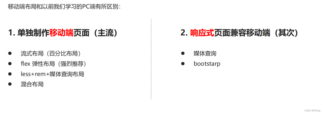
- 1. Mobile base
- 2. Mobile phone screen
- 3. Viewport
- Four, double the picture
- 6. Mobile technology solutions
- 7. Common layouts on mobile terminals
- Eight, flex layout
-
- 1. Flex layout principle
- 2. Common parent attributes
-
- 2.1 flex-direction sets the direction of the main axis
- 2.2 flex-direction Set the direction of the main axis
- 2.3 justify-content sets the arrangement of sub-elements on the main axis
- 2.4 flex-wrap sets whether the child element wraps
- 2.5 align-items Set the arrangement of sub-elements on the side axis (single line)
- 2.6 align-content Set the arrangement of child elements on the side axis (multiple lines)
- 2.7 The difference between align-content and align-items
- 2.8 flex-flow
- 3. Common attributes of flex layout children
1. Mobile base
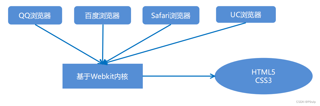
1. Current status of browsers
Domestic UC, QQ, Baidu and other mobile browsers are all modified kernels based on Webkit, and there is no self-developed kernel in China, just like domestic mobile operating systems are all modified and
developed based on Android.
Summary: Compatible with mobile mainstream browsers, only need to handle Webkit core browsers.
2. Common browsers on PC
360 browser, Google browser, Firefox browser, QQ browser, Baidu browser, Sogou browser, IE browser.
3. Common mobile browsers
UC Browser, QQ Browser, Oupeng Browser, Baidu Mobile Browser, 360 Security Browser, Google Chrome, Sogou Mobile Browser, Cheetah Browser, and other miscellaneous browsers.
2. Mobile phone screen
- The screen size of mobile devices is very large, and fragmentation is serious.
- Android devices have various resolutions: 480x800, 480x854, 540x960, 720x1280, 1080x1920, etc., as well as the legendary 2K and 4K screens.
- In recent years, the fragmentation of the iPhone has also intensified. The main resolutions of its devices are: 640x960, 640x1136, 750x1334, 1242x2208, etc.
- As a developer, you don't need to pay attention to these resolutions, because our common size unit is px.
3. Viewport
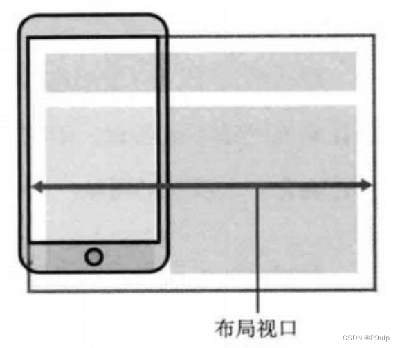
- The viewport is the area of the screen where the browser displays the content of the page. Viewports can be divided into layout viewports, visual viewports, and ideal viewports
1. layout viewport layout viewport
- Generally, the browsers of mobile devices have a layout viewport set by default, which is used to solve the problem of displaying early PC-side pages on mobile phones.
- iOS and Android basically set the viewport resolution to 980px , so most of the webpages on the PC can be rendered on the mobile phone, but the elements look small, and generally the webpage can be manually zoomed by default.
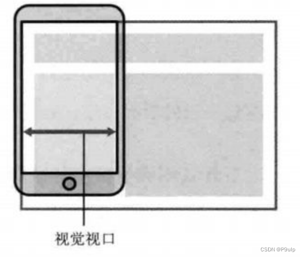
2. Visual Viewport
- Literally, it is the area of the website that the user is seeing. Note: is the area of the website.
- We can manipulate the visual viewport by zooming, but it will not affect the layout viewport, and the layout viewport will still maintain its original width.
3. Ideal viewport ideal viewport
- In order to make the website have the most ideal browsing and reading width on the mobile terminal
- Ideal viewport, for the device, is the most ideal viewport size
- It is necessary to manually add the meta viewport tag to notify the browser of the operation
- The main purpose of the meta viewport tag: the width of the layout viewport should be consistent with the width of the ideal viewport
- Simple understanding is how wide the device is, how wide is the viewport of our layout
4. meta viewport tag
<meta name="viewport" content="width=device-width, user-scalable=no,
initial-scale=1.0, maximum-scale=1.0, minimum-scale=1.0">
| Attributes | explain |
|---|---|
| width | Width is set to viewport width, you can set special value of device-width |
| initial-scale | Initial zoom ratio, a number greater than 0 |
| maximum-scale | The maximum zoom ratio, a number greater than 0 |
| minimum-scale | The minimum zoom ratio, a number greater than 0 |
| user-scalable | Whether the user can zoom, yes or no (1 or 0) |
5. Standard viewport settings
- The viewport width is consistent with the device
- The default zoom factor of the viewport is 1.0
- Do not allow user to zoom
- Maximum allowed zoom factor 1.0
- Minimum allowed scaling factor 1.0
Four, double the picture
1. Physical pixel & physical pixel ratio
- Physical pixels refer to the smallest particles displayed on the screen, which are physically real. This is set by the manufacturer when leaving the factory. For example, Apple 6\7\8 is 750* 1334
- 1px when we develop is not necessarily equal to 1 physical pixel
- On the PC side page, 1 px is equal to 1 physical pixel, but the mobile side is different
- The number of physical pixels that can be displayed in a px is called the physical pixel ratio or screen pixel ratio
- PC and earlier mobile phone screens/ ordinary mobile phone screens: 1 CSS pixel = 1 physical pixel
- Retina (retina screen) is a display technology that can compress more physical pixels into one screen, thereby achieving higher resolution and improving the fineness of the screen display.
2. Multiple graphs
- For a 50px * 50px picture, if it is opened on the Retina screen of the mobile phone, it will be enlarged according to the physical pixel ratio just now, which will cause the picture to be blurred
- In the standard viewport setting, use the double image to improve the picture quality and solve the blur problem in the high-definition device
- Usually use double image, because of the impact of iPhone 6\7\8, but now there are still 3 times image and 4 times image, this depends on the actual development company needs
- Background image attention zoom problem
We need a 50 by 50 pixel picture, which will be enlarged on both sides to 100 by placing it directly on the iphone8. The method of 100
is to first place a picture of 100 by 100, and then manually reduce the picture to 50 by 50. The
picture we prepared is larger than the size we actually need Twice, this is the double graph
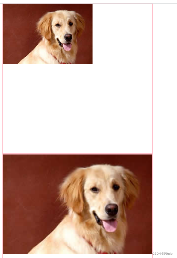
3. Background scaling background-size
The background-size attribute specifies the size of the background image
background-size: 背景图片宽度 背景图片高度;
- Unit: length|percentage|cover|contain;
- cover expands the background image to be large enough so that the background image completely covers the background area.
- contain expands the image image to its maximum size so that its width and height fit perfectly within the content area
<style>
        .w {


            width: 500px;
            height: 500px;
            border: 2px solid pink;
            background: url(../2022.7.19/dog.jpg) no-repeat;
        }

        .y {


            width: 500px;
            height: 500px;
            border: 2px solid pink;
            background: url(../2022.7.19/dog.jpg) no-repeat;
            /* 修改大小 */
            background-size: 500px;
        }
    </style>
insert image description here
5. Choice of mobile terminal development
1 Mainstream mobile solutions
- Separately make mobile terminal pages (mainstream)
JD.com mobile version,
Taobao touch screen version,
Suning.com mobile version - Responsive pages are compatible with mobile terminals (secondary)
2. Separate mobile page (mainstream)
Usually, adding m (mobile) in front of the website domain name can open the mobile terminal. By judging the device, if it is opened by a mobile device, jump to the mobile page.
3. Responsive compatible PC mobile terminal
Samsung Electronics official website: www.samsung.com/cn/ , change the style by judging the screen width to adapt to different terminals.
Disadvantages: It is troublesome to make, and it takes a lot of effort to adjust compatibility issues
6. Mobile technology solutions
1. Mobile browser
- Mobile browsers are basically based on the webkit kernel, so we consider webkit compatibility issues.
- We can safely use H5 tags and CSS3 styles.
- At the same time, we only need to consider adding webkit to the private prefix of our browser
2. CSS initialization normalize.css
It is recommended to use normalize.css/ for mobile CSS initialization
- Normalize.css: Protects valuable defaults
- Normalize.css: Fixed browser bug
- Normalize.css: is modular
- Normalize.css: has detailed documentation
- Official website address: http://necolas.github.io/normalize.css/
3. CSS3 box model box-sizing
- Traditional mode width calculation: box width = width + border + padding set in CSS
- CSS3 box model: the width of the box = the width set in CSS, width contains border and padding
- In other words, the box model in our CSS3, padding and border will not support the big box
/ CSS3 box model /
box-sizing: border-box;
/ Traditional box model /
box-sizing: content-box;
4. Special styles
/ CSS3 box model /
box-sizing: border-box;
-webkit-box-sizing: border-box;/ Tap to highlight we need to clear and set to transparent to complete transparency /
-webkit-tap-highlight-color: transparent;/ In the default appearance of mobile browsers, add this attribute on iOS to customize the style of buttons and input boxes /
-webkit-appearance: none;
/ Disable the pop-up menu when long pressing the page /
img,a { -webkit- touch-callout: none; }
7. Common layouts on mobile terminals
1. Flow layout (percentage layout)
- Flow layout is percentage layout, also known as non-fixed pixel layout.
- Set the width of the box to a percentage to scale according to the width of the screen, without being limited by fixed pixels, and the content fills to both sides.
- The fluid layout method is a relatively common layout method used in mobile web development
- max-width maximum width (max-height maximum height)
- min-width minimum width (min-height minimum height)
Eight, flex layout
1. Flex layout principle
flex is the abbreviation of flexible Box, which means "elastic layout", which is used to provide maximum flexibility for the box model, and any container can be designated as a flex layout.
- When we set the flex layout for the parent box, the float, clear and vertical-align properties of the child elements will be invalid.
- Flexible layout = flexible layout = flexible box layout = flexible box layout = flex layout
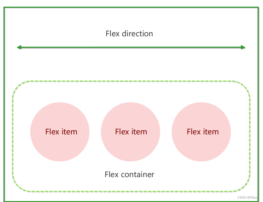
The elements that adopt the Flex layout are called the Flex container (flex container), or "container" for short. All of its child elements automatically become members of the container, called a flex item (flex item), or "item" for short.
- In the experience, div is the flex parent container.
- In the experience, span is a sub-container flex item
- Subcontainers can be arranged horizontally or vertically
Summarize the principle of flex layout:
it is to control the position and arrangement of child boxes by adding flex attributes to the parent box
2. Common parent attributes
The following 6 attributes are set on the parent element
- flex-direction: Set the direction of the main axis
- justify-content: Set the arrangement of child elements on the main axis
- flex-wrap: Set whether the child element wraps
- align-content: Sets the alignment of child elements on the side axis (multiple lines)
- align-items: Set the arrangement of child elements on the side axis (single line)
- flex-flow: Composite attribute, which is equivalent to setting flex-direction and flex-wrap at the same time
2.1 flex-direction sets the direction of the main axis
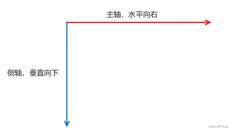
In the flex layout, it is divided into two directions: the main axis and the lateral axis. The same name is: row and column, x axis and y axis
- The default axis direction is the x-axis direction, horizontal to the right
- The default side axis direction is the y-axis direction, horizontally downward
2.2 flex-direction Set the direction of the main axis
The flex-direction attribute determines the direction of the main axis (that is, the direction in which items are arranged)
Note: The main axis and the side axis will change, it depends on who is the main axis in the flex-direction setting, and the rest is the side axis. And our child elements are arranged along the main axis
| attribute value | illustrate |
|---|---|
| row | Default is left to right |
| row-reverse | from right to left |
| column | top to bottom |
| column-reverse | bottom up |
2.3 justify-content sets the arrangement of sub-elements on the main axis
The justify-content attribute defines the alignment of the item on the main axis
Note: Before using this attribute, be sure to determine which main axis is
| Attributes | illustrate |
|---|---|
| flex-start | The default starts at the head and left to right if the main axis is the x-axis |
| flex-end | Sort from the end |
| center | Align at the center of the main axis (horizontally centered if the main axis is the x-axis) |
| space-around | Divide the remaining space equally |
| space-between | Fit both sides first and then divide the remaining space equally (important) |
2.4 flex-wrap sets whether the child element wraps
By default, items are arranged along a line (aka "axis"). The flex-wrap attribute defines that the default in the flex layout is not to wrap.
| attribute value | illustrate |
|---|---|
| nowrap | default, no newline |
| wrap | new line |
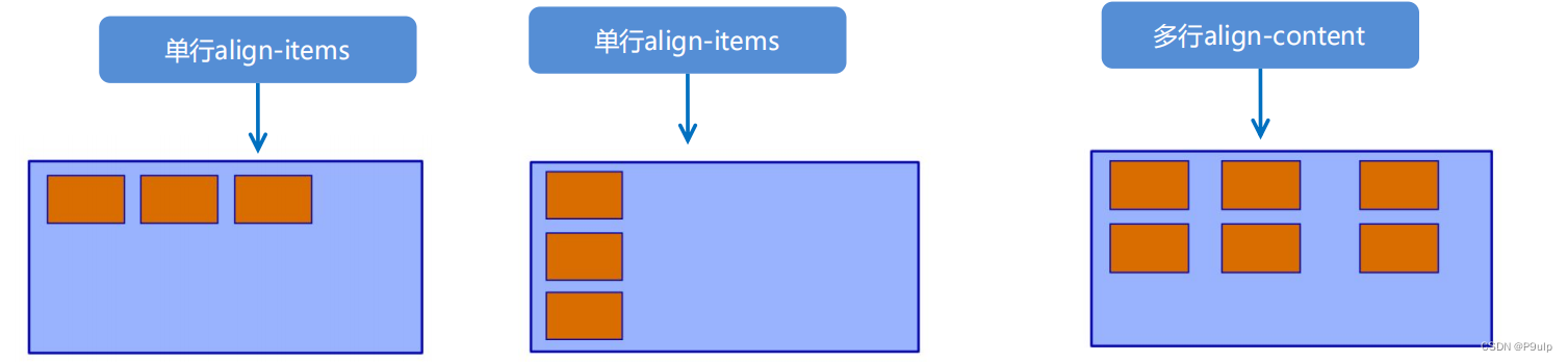
2.5 align-items Set the arrangement of sub-elements on the side axis (single line)
This property is to control the arrangement of sub-items on the side axis (y-axis by default). It is used when the sub-item is a single item (single line)
| attribute value | illustrate |
|---|---|
| flex-start | top to bottom |
| flex-end | bottom up |
| center | Squeeze together and center (vertically center) |
| stretch | Stretch (default) |
2.6 align-content Set the arrangement of child elements on the side axis (multiple lines)
Set the arrangement of sub-items on the side axis and can only be used when sub-items appear in newlines (multiple lines). It has no effect under single-line.
| attribute value | illustrate |
|---|---|
| flex-start | The default is to start aligning at the head of the cross axis |
| flex-end | Start alignment at the end of the cross axis |
| center | Show in the middle of the side axis |
| space-around | Children divide the remaining space equally on the cross axis |
| space-between | The child items are distributed at both ends on the side axis first, and then divide the remaining space equally |
| stretch | Set the height of the child element to equal the height of the parent element |
2.7 The difference between align-content and align-items
- align-items is suitable for single-line cases, only top alignment, bottom alignment, centering and stretching
- align-content is suitable for newlines (multiple lines) (invalid for a single line), you can set attribute values such as top alignment, bottom alignment, centering, stretching, and evenly distributing the remaining space.
- The summary is to find align-items in a single line and align-content in multiple lines
2.8 flex-flow
The flex-flow property is a compound property of the flex-direction and flex-wrap properties
flex-flow:row wrap;
- flex-direction: Set the direction of the main axis
- justify-content: Set the arrangement of child elements on the main axis
- flex-wrap: Set whether the child element wraps
- align-content: Sets the alignment of child elements on the side axis (multiple lines)
- align-items: Set the arrangement of child elements on the side axis (single line)
- flex-flow: Composite attribute, which is equivalent to setting flex-direction and flex-wrap at the same time
3. Common attributes of flex layout children
- Shares of flex items
- align-self controls the alignment of the child itself on the cross axis
- The order attribute defines the order in which subitems are arranged (before and after)
3.1 flex properties★
The flex attribute defines the sub-item to allocate the remaining space, and use flex to indicate how many copies it occupies.
.item {
 flex: <number>; /* default 0 */ }
3.2 align-self controls how the subitem itself is arranged on the side axis
The align-self attribute allows a single item to have a different alignment than other items, and can override the align-items attribute.
The default value is auto, which means inheriting the align-items attribute of the parent element. If there is no parent element, it is equivalent to stretch.
span:nth-child(2) {
 /* 设置自己在侧轴上的排列方式 */
 align-self: flex-end;
 }
3.3 The order attribute defines the order in which items are sorted
The smaller the value, the higher the ranking, and the default is 0.
Note: Not the same as z-index.
.item {
 order: <number>;
}