
This article is mainly based on the poor form filling experience of the project, which was taken off the line by customers and reorganized, and some ideas for new user experience design were carried out on the form.
1. Status
The traditional PC terminal has a large space, and can display all the information of the form together with warm reminders, etc., but seeing so much content at once will bring pressure to the user, and then give up filling out the form . The user experience of terminal form design is very bad.
In today's mobile Internet era, the design idea of the form is different from the previous PC side, and the following difficulties exist in the form design of the mobile side:
- The screen space of the mobile terminal is limited, and it is impossible to display all the information in a flat form in the design of the form like the PC terminal;
- There are a lot of field information in the form, which will make the entire form too long, so that at least 2 screens or more of content are presented, and too much content will prompt users to give up filling out the form;
- The prompts of the form are not friendly enough, and it does not create a pleasant environment for users to fill in the form, and users are more at a loss during the process of filling out the form;
- The input on the mobile terminal is difficult. Due to the limited space of the mobile device, it is difficult for the user to see clearly and correct the errors in the input process in time;
- The number of fields that can be carried by a single line of the selector for mobile selection is limited, and it is often not enough to carry the selection items with too many fields.
2. Design goals
- Allow as many users as possible to complete the form and reduce the bounce rate;
- The design of the form should make the user think less and operate less.
3. Design strategy
1. Delete "information"
Since the information in the form is too large and the location of the mobile terminal is limited, it is necessary to delete redundant information. There are two situations for deleting information:
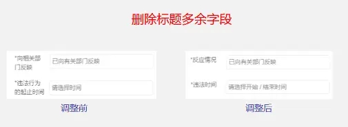
(1) Delete the redundant field of the title
In the business form submitted by the customer, most of the title fields are too long and long-winded. For example, the title of "Start and End Time of Illegal Behavior" in the complaint form can be changed to "Illegal Time" after the adjustment of "Delete". The warm prompt in the time selection box informs the user: Please select the start/end time to solve the problem.
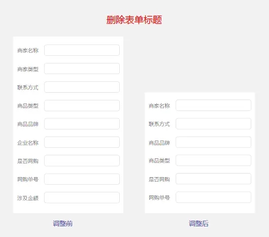
(2) Delete the title in the form
After research, it is found that: there are some title fields in the form submitted by customers, even if there are no title fields, it will not affect them to help users solve problems, which means that these title fields can be deleted, and the necessary information can be presented to users for them to complete. , Don’t force non-essential fields to users, one more title field will cause one more user to give up filling out the form.
2. Adjust typography
The page layout of the old version is from top to bottom, that is, the title field is on the top and the input box is on the bottom. This will make the page content of the form too long to a certain extent, and the different lengths of the field titles will destroy the layout structure.
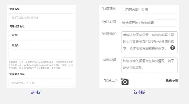
The layout of the new design is from left to right, with the title on the left and the input box on the right. This layout is based on the following two considerations:
- After the title is deleted, the title can basically be controlled within 4 fields. If the 4 fields are operated under special circumstances, it can be expanded into two lines by itself;
- The layout from left to right shortens the length of the form to a certain extent, and reduces the number of operations for users to swipe down.
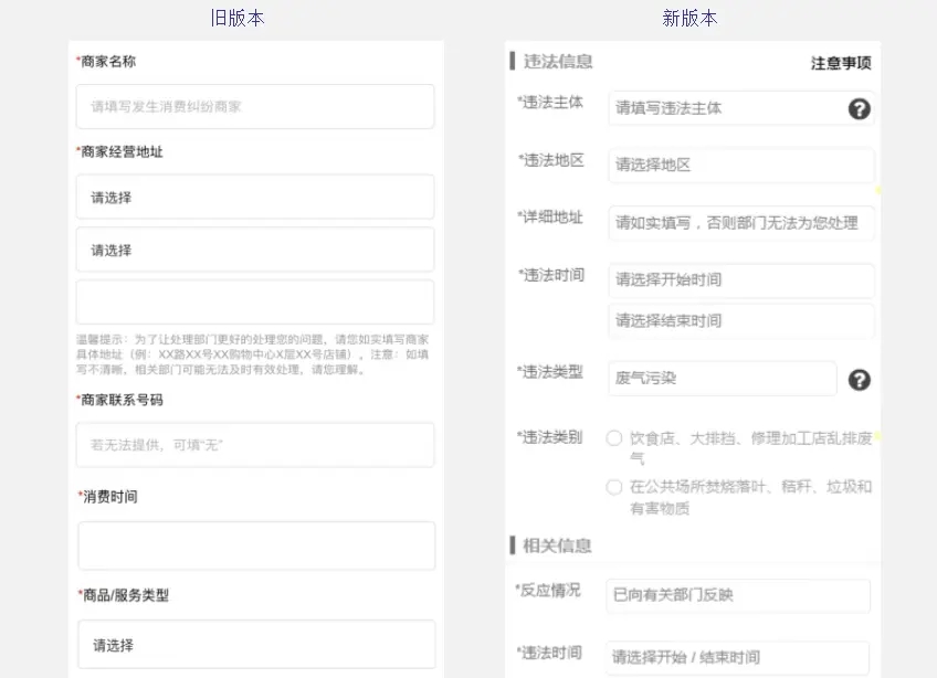
3. Organizing "Information"
The form information is laid out without organization, which will make users feel disorganized and without a clear understanding. In order to quickly help users establish a cognitive system, it is necessary to organize the title information in blocks and group appropriate things into the same group. go.
4. Hide "messages"
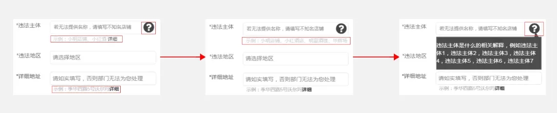
The prompts are set to allow users to fill in the form smoothly, but too long prompts will distract the user's attention, and not every user needs this level of prompts, so the corresponding prompts must be hidden. Click to get it if you need it, and ignore it if you don’t need it. There are two hidden display forms:
- Icon: hide the relevant text explanation content in the icon, click to get it in a pop-up window, and the design of the pop-up window is the same width as the input box, next to the input box, and the arrow points to the icon,
so that contact; - Text shrinkage: Click the word "details" to display all the sample content.
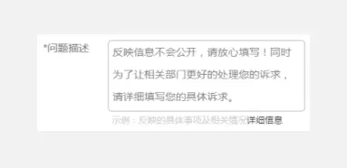
5. "Empathy" prompt
The prompt setting has two functions:
- Quickly help users build awareness and be easy to understand;
- Reduce the user's defensive mind, let the user feel that it is safe to fill out this form, and can fill it out with confidence.
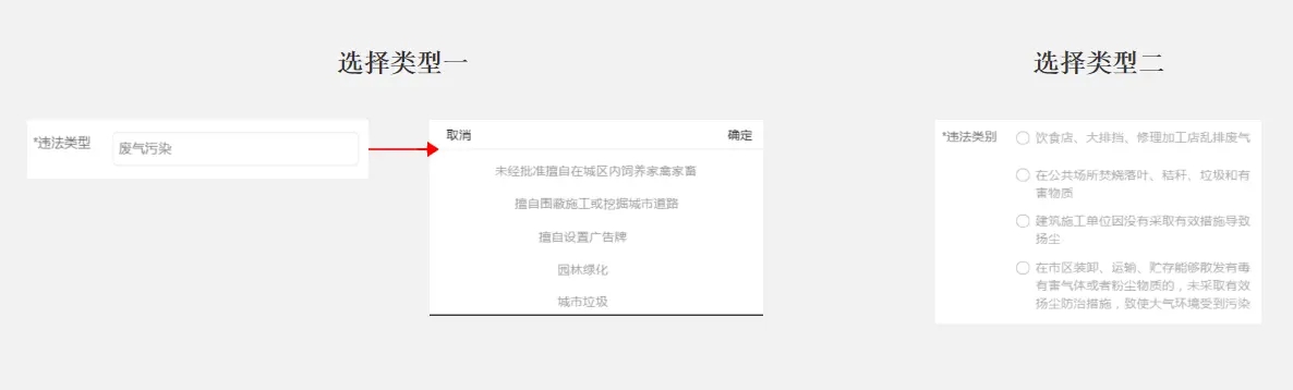
6. Let users do less
Due to the difficulty of input on the mobile terminal, and in order to allow users to reduce operations as much as possible, after research, it is found that the corresponding input item content can be converted into optional item content. This benefit is not only at the user level, but also at the customer level. They pinpoint the problem more precisely.
Instead of leaving an input box for users to freely fill in, and then the business department has to analyze the user's input content, which consumes too much time and energy.
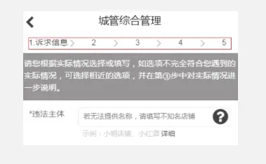
7. Give users a sense of control
The filling of the form is based on the process, so it is necessary for users to know where they come from and where they are going. At the same time, through the progress bar, people can clearly recognize how many steps are needed to complete the form. Users like the sense of control. Instead of being controlled, the progress bar can reduce the user's leaving rate and be more intuitive in the presentation of the page.
Summarize
Users themselves are lazy, not to mention that filling out the form is very cumbersome and requires users to do more, so the design of the form should be considered from the perspective of the user, learn to empathize, have empathy, and make the cumbersome content Simplify to make filling out the form enjoyable for the user.