Column Introduction
The arrangement direction is vertical (portrait) layout, which can accommodate multiple components;
| Attributes | effect |
|---|---|
| mainAxisAlignment | Spindle Alignment |
| crossAxisAlignment | horizontal axis alignment |
| textBaseline | text baseline |
| textDirection | Vertically |
| mainAxisSize | Spindle size |
| children | child layout units: (array) |
- Create a vertical alignment layout
class RowWidget extends StatelessWidget {


  @override
  Widget build(BuildContext context) {


    return Container(
      width: double.infinity,
      height: 100,
      color: Colors.yellow,
      child: Column(
        mainAxisAlignment: MainAxisAlignment.start,
        crossAxisAlignment: CrossAxisAlignment.start,
        children: [
          Container(
            width: 100,
            color: Colors.red,
            child: Text('top'),
          ),
          Container(
            width: 100,
            color: Colors.green,
            child: Text('center'),
          ),
          Container(
            width: 100,
            color: Colors.blueAccent,
            child: Text('bottom'),
          ),
        ],
      ),
    );
  }
}
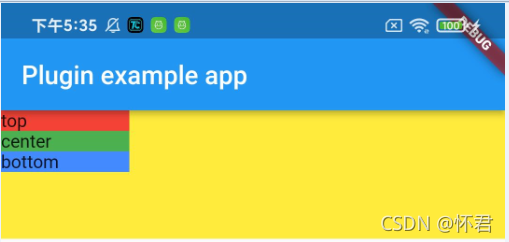
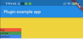
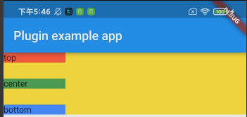
属性: crossAxisAlignment: CrossAxisAlignment.start
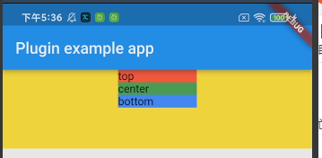
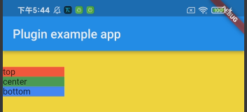
Attributes: crossAxisAlignment: CrossAxisAlignment.center
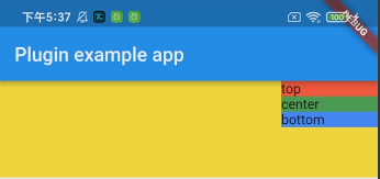
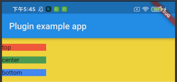
property: crossAxisAlignment: CrossAxisAlignment.end
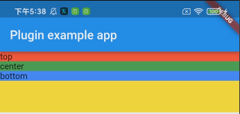
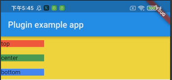
property: crossAxisAlignment: CrossAxisAlignment.stretch
It is equivalent to the full width of the sub-layout
property: mainAxisAlignment: MainAxisAlignment.end
property: mainAxisAlignment: MainAxisAlignment.center
Attributes: mainAxisAlignment: MainAxisAlignment.spaceEvenly
Property: mainAxisAlignment: MainAxisAlignment.spaceAround
Property: mainAxisAlignment: MainAxisAlignment.spaceBetween
common attributes
Expanded
Usage scenario: When a sub-layout needs to be filled along the main axishighused when the outer packageExpandedAttributes
          Expanded(
            child: Container(
              width: 100,
              color: Colors.green,
              child: Text('center'),
            ),
          ),
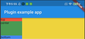
You can see that the remaining height of the parent layout is filled.
Expanded: filex attribute
Usage scenario: Equivalent to layout weight, proportionally distributed along the main axishigh
Column(
        mainAxisAlignment: MainAxisAlignment.start,
        crossAxisAlignment: CrossAxisAlignment.start,
        children: [
          Expanded(
            flex: 1,
            child: Container(
              width: 100,
              color: Colors.red,
              child: Text('top'),
            ),
          ),
          Expanded(
            flex: 2,
            child: Container(
              width: 100,
              color: Colors.green,
              child: Text('center'),
            ),
          ),
          Expanded(
            flex: 1,
            child: Container(
              width: 100,
              color: Colors.blueAccent,
              child: Text('bottom'),
            ),
          ),
        ],
      )
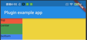
The effect can be seen that the height of the center layout is twice that of the top and bottom layouts.