MATLAB drawing function: Detailed explanation of Plot function
introduce
MATLAB is a commonly used scientific computing and data visualization tool, which provides powerful drawing functions, enabling users to create various types of charts and graphs.
basic grammar
plotThe basic syntax of a function is as follows:
plot(x, y)
where xand yare equal-length vectors denoting the abscissa and ordinate of the data points to be plotted, respectively. By passing in different xsum yvectors, we can create different types of graphs.
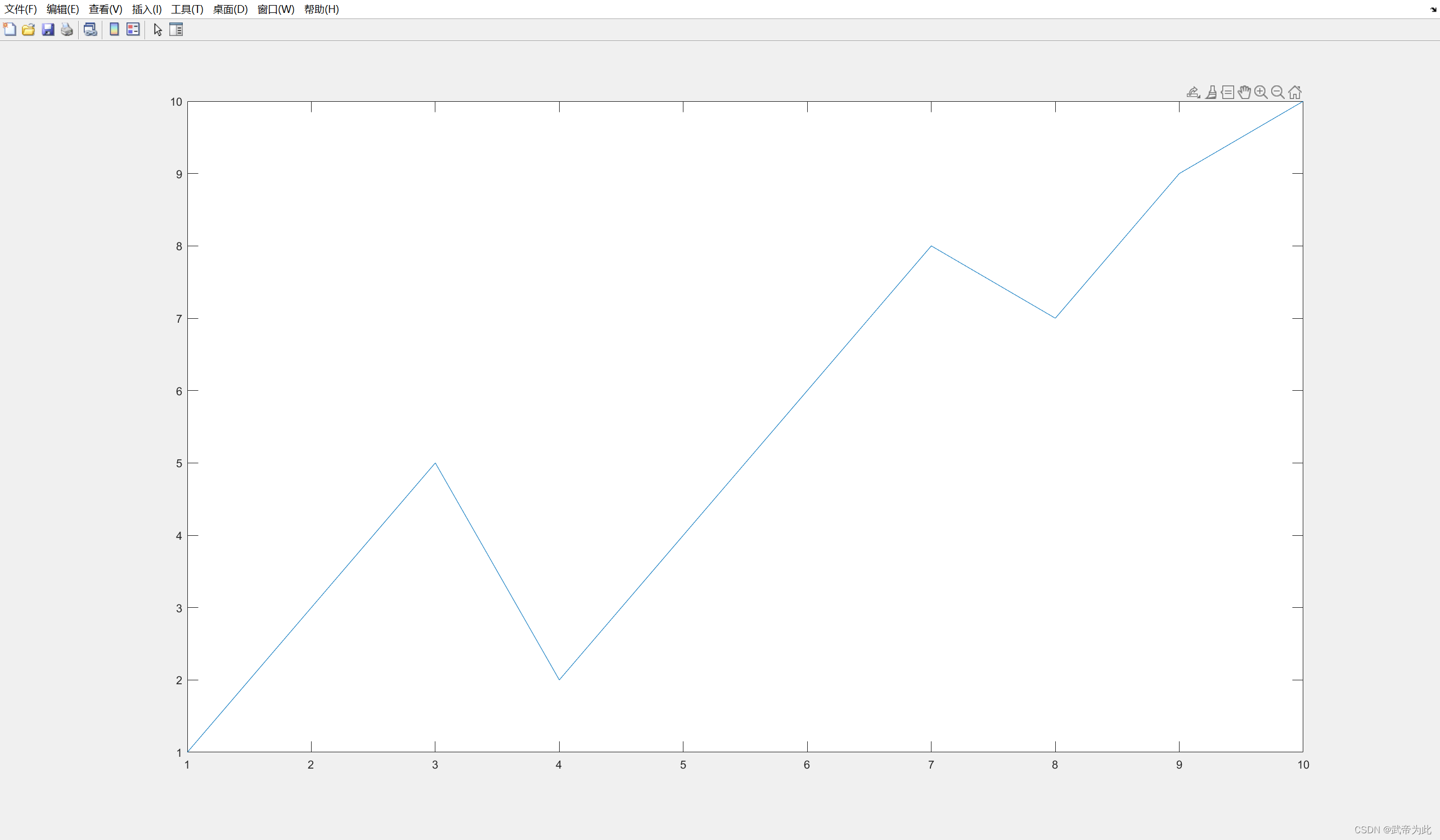
Draw a simple line chart
First, let's look at a simple example, drawing a line chart:
x = 1:10;
y = [1 3 5 2 4 6 8 7 9 10];
plot(x, y)
In this example, we define an abscissa vector of length 10 x, and an ordinate vector of length 10 y. plotThe function will draw a corresponding line graph based on the values of these two vectors.
Customize line styles and colors
plotThe function can also customize the drawn line style by specifying the line type and color parameters.
plot(x, y, 'LineStyle', '--', 'Color', 'r')
--In the example above, we specified the line style as dashed ( ) and the color as red ( r) by adding additional parameters . In this way, we can customize the drawing style according to our needs.

draw multiple curves
In addition to drawing a single curve, plotthe function can also draw multiple curves in the same coordinate system so that they can be displayed in the same graph.
x = 1:10;
y1 = [1 3 5 2 4 6 8 7 9 10];
y2 = [2 4 6 8 10 12 14 16 18 20];
plot(x, y1, x, y2)
In the example above, we defined two ordinate vectors y1and plotted y2using the same abscissa vector . xBy plotpassing multiple groups xand yvectors in the function, we can plot multiple curves in the same graph.

subplot drawing
MATLAB provides subplotfunctions to draw multiple subplots in the same graphics window. By specifying the number of rows and columns, and the position of the current subgraph, we can draw different graphics at different positions.
x = 1:10;
y1 = [1 3 5 2 4 6 8 7 9 10];
y2 = [2 4 6 8 10 12 14 16 18 20];

subplot(2, 1, 1);
plot(x, y1);
title('曲线1');

subplot(2, 1, 2);
plot(x, y2);
title('曲线2');
In the above example, we use subplotthe function to create a graph window with 2 rows and 1 column, and draw curve 1 at the first subgraph position, and draw curve 2 at the second subgraph position.

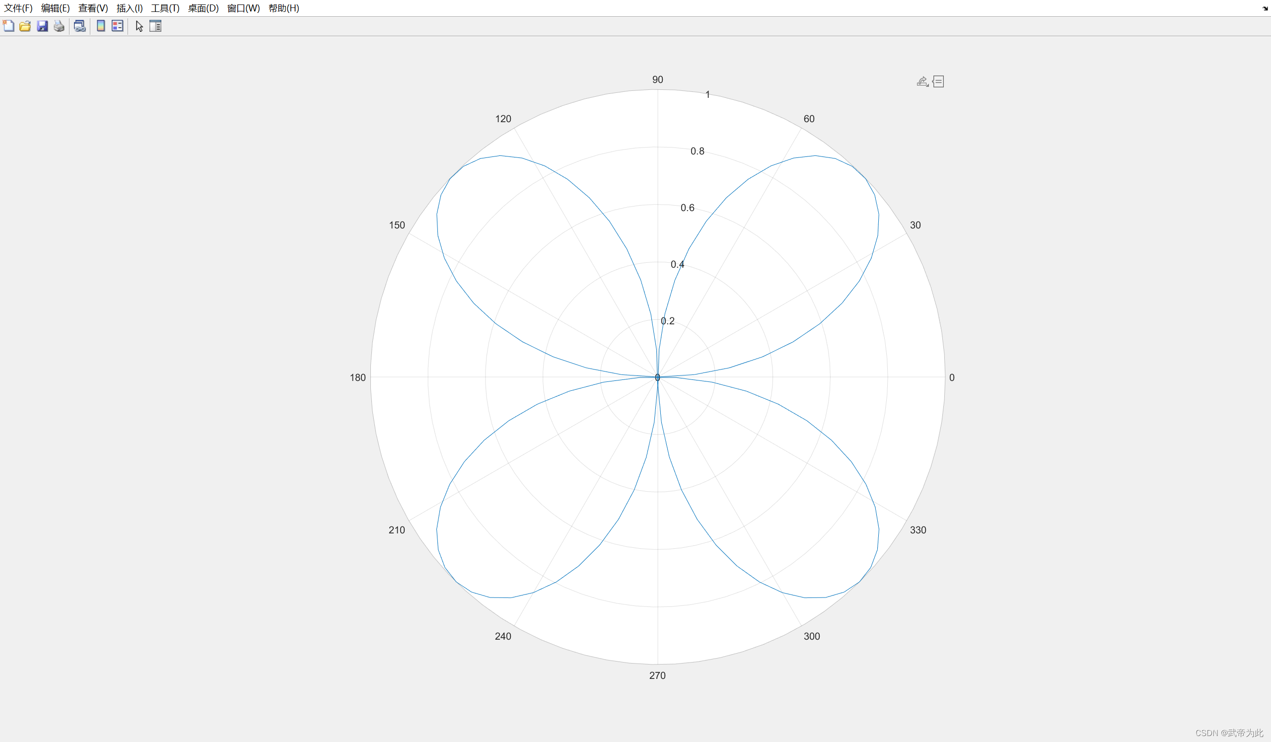
Polar plotting
Use polarplotfunctions to plot graphs in polar coordinates.
theta = linspace(0, 2*pi, 100);
rho = sin(2*theta);

polarplot(theta, rho)
In the above example, we defined the angle vector thetaand the polar vector rho, and used polarplotthe function to plot the corresponding polar coordinates.
Histogram drawing
'bar'Specify the plot type as a histogram by setting parameters.
x = categorical({

    'A', 'B', 'C', 'D'});
y = [3 5 2 7];

bar(x, y)
In the above example, we used categoricalthe function to create a categorical variable xand defined the corresponding height vector y. By setting 'bar'the parameters, we can draw the corresponding histogram.

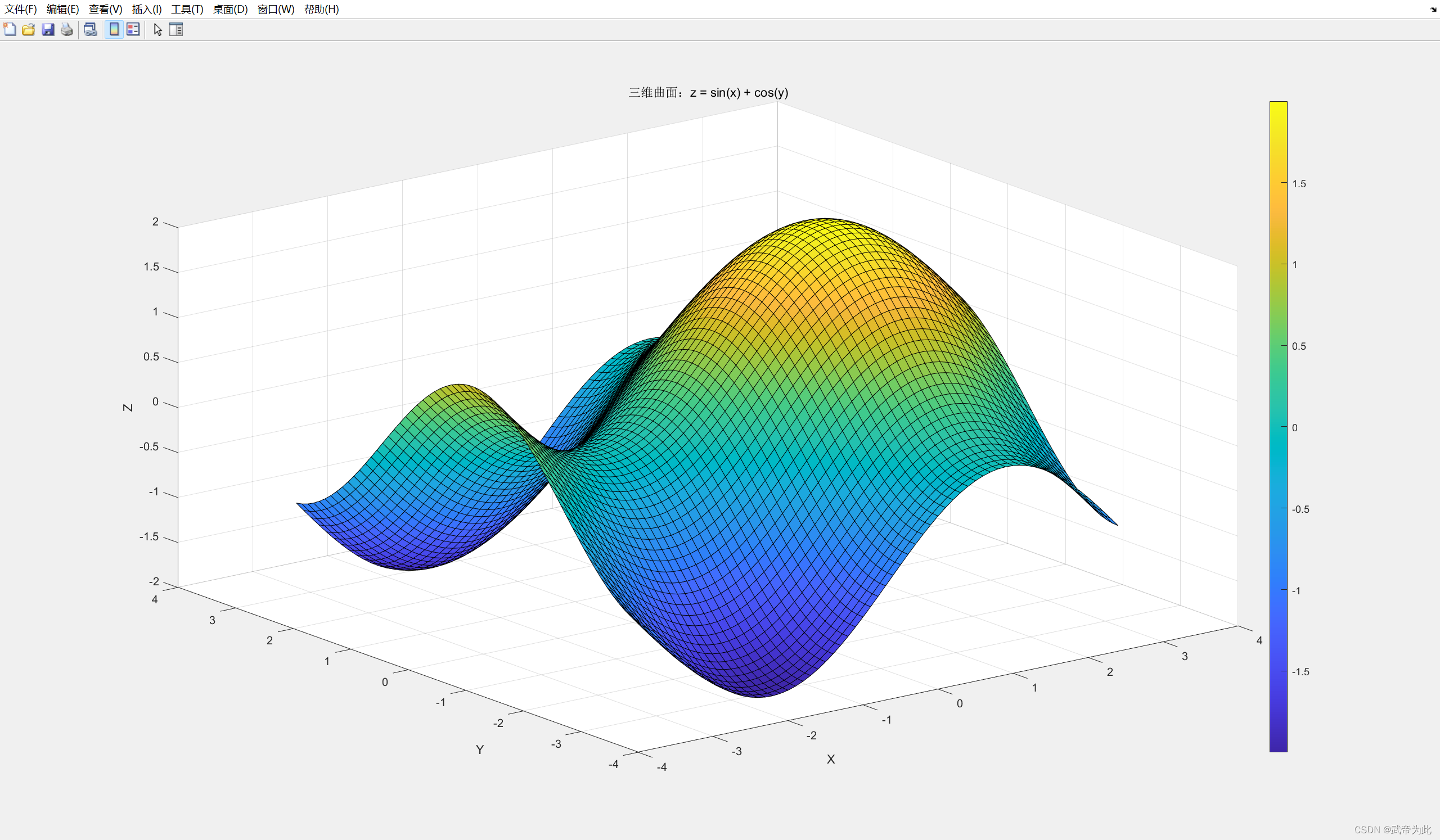
3D image rendering
We can use meshgridfunctions to generate 2D meshes, then calculate function values, and use surffunctions to plot surfaces.
Consider the following binary function:
z = f(x, y) = sin(x) + cos(y)
The following is the MATLAB code to draw a 3D surface plot:
% 定义范围和步长
x = -pi:0.1:pi;
y = -pi:0.1:pi;

% 生成二维网格
[X, Y] = meshgrid(x, y);

% 计算函数值
Z = sin(X) + cos(Y);

% 绘制三维曲面
figure;
surf(X,

 Y, Z);

% 设置坐标轴标签和标题
xlabel('X');
ylabel('Y');
zlabel('Z');
title('三维曲面:z = sin(x) + cos(y)');

% 添加颜色条
colorbar;
After running this MATLAB code, a 3D surface will be plotted showing the distribution of the function over the range z = sin(x) + cos(y).[-π, π]
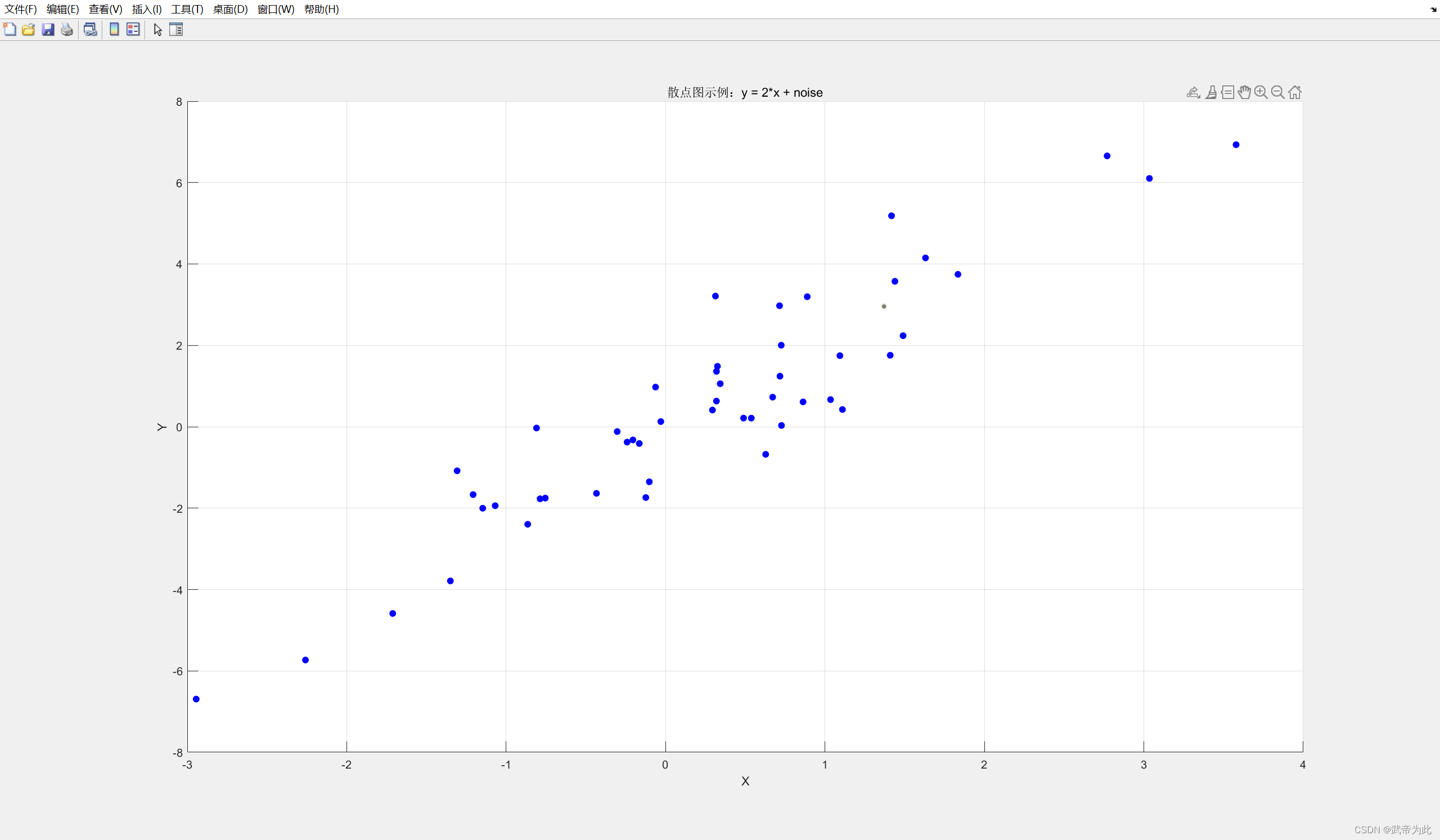
Scatter plot drawing
scatterDraws a scatterplot of a set of data points via a function.
Here is an example of MATLAB code that randomly generates data and draws a scatterplot:
% 生成随机数据
n = 50; % 数据点的数量
x = randn(n, 1); % 随机生成n个标准正态分布的x坐标
y = 2 * x + randn(n, 1); % 根据x生成y坐标,同时添加一些噪声

% 绘制散点图
figure;
scatter(x, y, 'filled', 'MarkerFaceColor', 'b');

% 设置坐标轴标签和标题
xlabel('X');
ylabel('Y');
title('散点图示例:y = 2*x + noise');

% 添加网格线
grid on;
After running this MATLAB code, a scatterplot will be drawn showing the distribution of data points on the coordinate plane.