Why screen adaptation
During the development process, we always need to consider how to adapt to various screens. But have you ever thought about why we need to adapt the screen? Why do we need so many screen adaptation solutions?
Rediscover the pixel
You must have heard of the pixel, which is the basic unit of display. What we use pxis pixels. Then there is a problem here. If we use pixels to represent the size of the UI, 10px represents 10 pixels on any screen. Isn’t that all right? Why adapt to different screens?
This is because pixels have no physical size. Simply put, a 1cm screen can have 10 pixels or 100 pixels. Generally we use ppi to express how many pixels per inch.
As shown in the figure below, if pixels are used for adaptation, when the number of pixels per unit length of a screen of the same size is different, it will cause problems of different sizes.
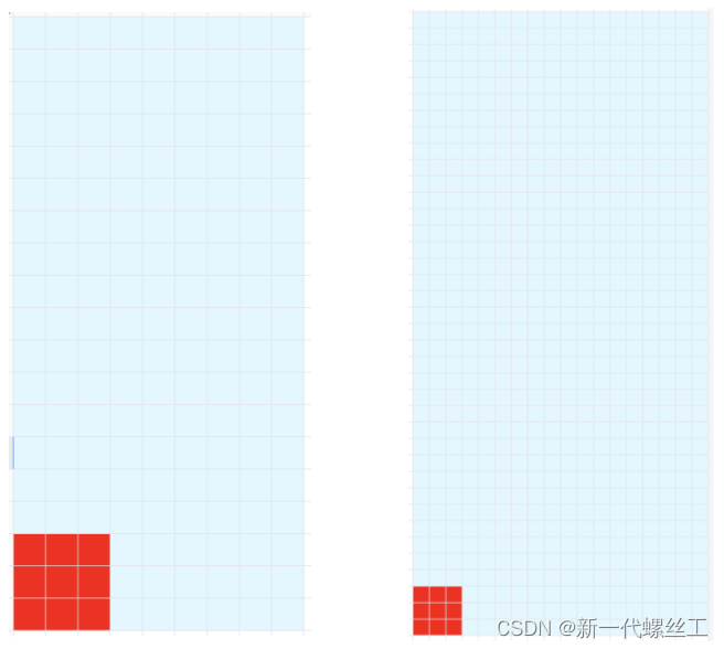
So why is the pixel not a fixed size? Because different screen requirements are different, for example, the resolution of mobile phones and notebooks both have a resolution of 1080 * 1920, but the screen sizes of mobile phones and notebooks are different. Small.
When it comes to PPI (pixels per inch), you have to mention DPI (dots per inch). As can be seen from the English name, PPI refers to pixels per inch; and DPI refers to ink dots per inch. It was first used in the printing industry, and later extended to computers, which is the concept of PPI. At present, PPI and DPI are often used together, and they can be considered as one thing. For details, please see this What is the difference between ppi vs dpi? answer from stackoverflow.
use density-independent pixels
We mentioned above that due to the different number of pixels per unit length, it is not feasible to use pixels to adapt to the screen. At this time, we will think, if the system automatically helps us adapt to the difference in the number of pixels per unit length, wouldn’t it be enough?
In Android, Google provides dp (density-independent pixel, that is, density-independent pixel, also called dip) to achieve this function; in ios, it uses pt (independent pixel). Note: These two have the same meaning, but they are called differently.
Suppose we draw a 3dp * 3dp square, in a 1PPI screen, the size of the square is 3px * 3px; and in a 2PPI screen, the size of the square becomes 6px * 6px. The effect is as shown in the figure below, we can see that after using dp, the performance on screens with different PPIs is consistent.
![[External link picture transfer failed, the source site may have an anti-theft link mechanism, it is recommended to save the picture and upload it directly (img-yBdIrCNb-1661823013817) (evernotecid://72E09CDC-C5B1-438F-9F23-70FDEA29DE69/appyinxiangcom/38484724/ENResource /p139)]](https://img-blog.csdnimg.cn/df11ec3526d945248d9ec5edcf5054eb.png)
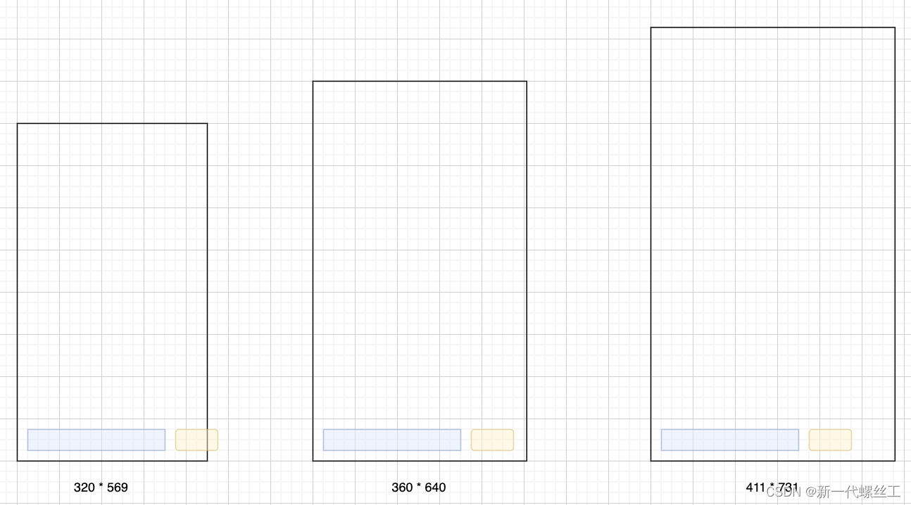
The above solution perfectly solves the PPI problem, but can it be adapted to all screens? The answer is of course no, because the size of the design draft is fixed . Generally, the design draft given by the designer is 360dp * 640dp, but the actual screen size is more than that. For example, the Android One model is
320dp * 569dp; while the Google Pixel model is 411dp * 731dp.
Suppose we need to implement a UI for sending messages (an input box and a send button). If the UI is placed according to the design draft, it is normal on a model with the same dp size as the design draft, but on a model with a different dp size Above, there is a problem with performance. As shown in the figure below, if the screen dp size is smaller than the design draft (320dp * 569dp here), the send button will not be displayed completely; if the screen dp size is larger than the design draft (411dp * 731dp here), extra space will be vacated. This is why in Android interface development, we generally need to set a maximum width and a minimum width.
Use ratio
As mentioned above, even if the UI controls are adapted to the same size, in the case of different screen sizes, there will be problems that the UI controls are not displayed completely or the display ratio is different from the design draft.
Since it is useless to adapt the UI controls to the same size, we simply adapt them according to the ratio of the UI controls to the screen size. There are two methods, one is to adapt according to the ratio of bilateral (length and width); the other is to adapt according to the ratio of unilateral (length or width).
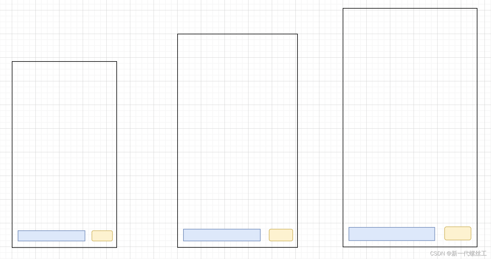
bilateral adaptation
Here is still taking the above UI for sending messages as an example. From the figure, we know that the length ratio of the input box is 13/20, and the width ratio is 1/18; the length ratio of the send button is 1/5, and the width ratio is 1/18. Through the same ratio conversion, The effect is shown in the figure below:
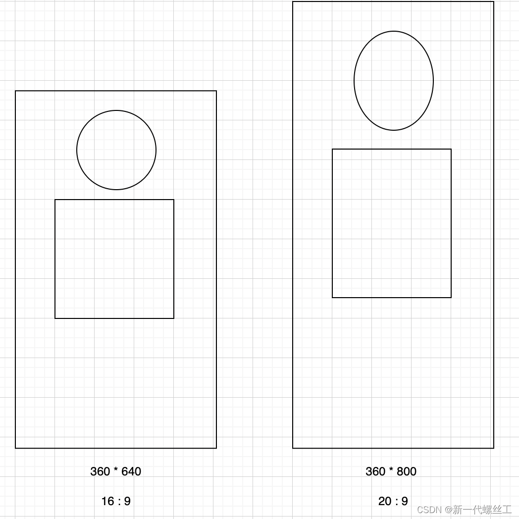
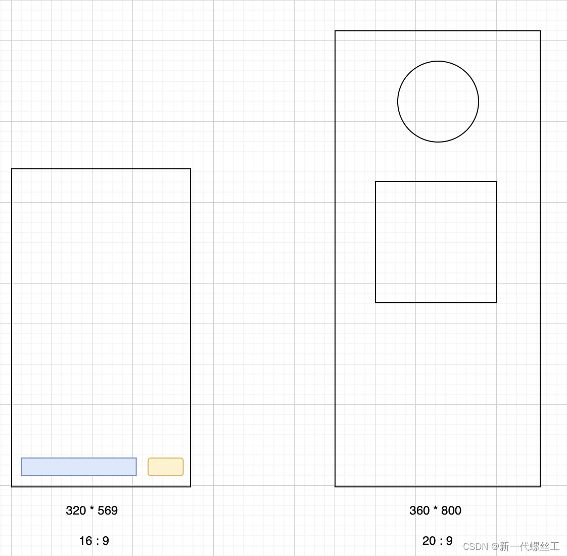
the solution according to scale seems to solve the problem. But this only works if the aspect ratio is fixed (here 16:9). If you draw squares and circles on screens with different aspect ratios, such as 16:9 screens and 20:9 screens, stretching problems will occur. The effect is as follows:
Unilateral adaptation
Since the bilateral adaptation is not possible, it should be adapted in proportion to the width, and the height of the UI is obtained by multiplying the proportion of the design draft by the width of the current UI. In this way, the width of the UI control can be guaranteed, and the aspect ratio of the UI control remains unchanged. Adapting with a high ratio is similar to a wide ratio, so I won't go into details below.
As shown in the figure above, when using unilateral adaptation, the UI control can be scaled according to the current screen width when the screen width is different; when the screen ratio is different, the current screen can be calculated according to the ratio of the design draft The height of the lower UI control.
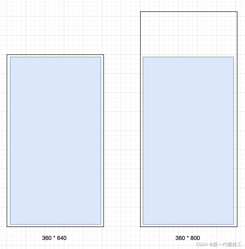
It seems that adapting to one side is a perfect solution. But if you want to display full screen, this solution will not work. As shown in the figure below, the effect of using unilateral adaptation on different screens.
If you look carefully, we will find that if you use bilateral adaptation in the above picture, there is no problem. From this, we can find that in fact, the adaptation scheme needs to be selected according to one's own needs , which is why there are so many adaptation schemes.
Summarize
The previous article introduced in detail the deficiencies of pixel, density-independent pixel, and ratio adaptation, and explained why we should consider screen adaptation and the reasons for various adaptation schemes.
It should be noted that the above only discusses the screen of the mobile phone. In fact, there are tablets, notebooks, smart watches, TVs, etc. in reality. Perfect screen adaptation is far more complicated than we imagined. At work, we don't need to think so much, we just need to choose the appropriate adaptation solution according to our own needs.