1. The code I wrote
<template>
<!-- 平均消警时长 -->
<div class="components-container" v-bind="$attrs">
<div class="components-title">平均消警时长</div>
<div class="components-content main">
<v-chart style="width: 100%; height: 100%" :option="option" autoresize />
</div>
</div>
</template>
<script lang="ts">
export default {
name: 'eyeryDayAlarmEliminationTime',
}
</script>
<script lang="ts" setup>
import { postSafetyavedisposatimeszyn } from '@/api/base'
import VChart from 'vue-echarts'
import { ref, onMounted } from 'vue'
const props = defineProps({
sonValue: {
type: String,
},
sonValue2: {
type: String,
},
})
let option = ref({
legend: { show: false },
series: [
{
name: '入住科室分布',
type: 'pie',
radius: ['40%', '60%'],
avoidLabelOverlap: true,
itemStyle: { borderColor: '#fff', borderWidth: 2 },
color: [
'#52A8FF',
'#00B389',
'#E27272',
'#FFC53D',
'#006EFE',
'#F5855F',
'#C099FC',
'#FFA940',
'#29EFC4',
'#F8AEA4',
],
label: {
// alignTo: 'labelLine', // ! 文字对齐方式
formatter: function (e) {
let {
data: { value, name, percent },
} = e;
return `{x|}{a|${name}}\n{b|${value}个}{c|${percent}}`;
},
minMargin: 5,
lineHeight: 15,
rich: {
x: { width: 10, height: 10, backgroundColor: 'inherit', borderRadius: 5 },
a: { fontSize: 14, color: 'inherit', padding: [0, 20, 0, 8] },
b: { fontSize: 12, align: 'left', color: '#666666', padding: [8, 0, 0, 18] },
c: { fontSize: 12, align: 'left', color: '#666666', padding: [8, 0, 0, 8] },
},
},
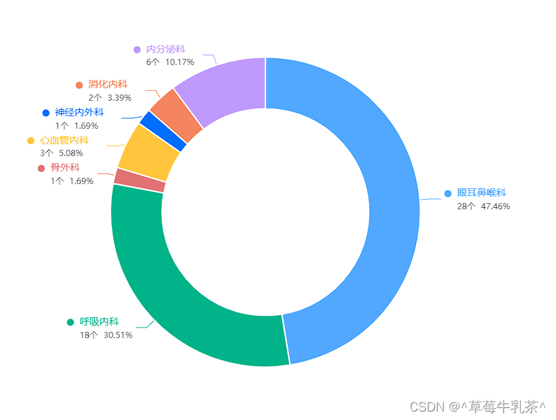
data: [
{ value: 28, name: '眼耳鼻喉科', percent: '47.46%' },
{ value: 18, name: '呼吸内科', percent: '30.51%' },
{ value: 1, name: '骨外科', percent: '1.69%' },
{ value: 3, name: '心血管内科', percent: '5.08%' },
{ value: 1, name: '神经内外科', percent: '1.69%' },
{ value: 2, name: '消化内科', percent: '3.39%' },
{ value: 6, name: '内分泌科', percent: '10.17%' },
],
},
],
});
const getData4 = () => {
postSafetyavedisposatimeszyn({
compid: '1633996112177197058',
limitnum: props.sonValue2,
// type: value.value,
type: props.sonValue
}).then((res) => {
const xData = []
const yData = []
if (res.data.length == 0) {
option.value.series[0].data = [10,20]
option.value.xAxis.data = ['10.0','20.0']
} else {
if (props.sonValue == 1) {
// 年
res.data.forEach(item => {
item.statisticsTime = new Date(item.statisticsTime).getFullYear();
yData.push(Number(item.avgDisposaDuration))
xData.push(item.statisticsTime)
})
option.value.series[0].data = yData
option.value.xAxis.data = xData
} else if (props.sonValue == 2) {
console.log('222');
//月
res.data.forEach(item => {
let [year, month, day] = item.statisticsTime.split("-");
// item.statisticsTime = new Date(item.statisticsTime).getFullYear();
yData.push(Number(item.avgDisposaDuration))
xData.push(month + '月')
})
option.value.series[0].data = yData
option.value.xAxis.data = xData
} else if (props.sonValue == 3) {
// 周
console.log('333');
res.data.forEach(item => {
let [year, month, day] = item.statisticsTime.split("-");
// item.statisticsTime = new Date(item.statisticsTime).getFullYear();
yData.push(Number(item.avgDisposaDuration))
xData.push(month + '月' + day + '日')
})
option.value.series[0].data = yData
option.value.xAxis.data = xData
}
}
})
}
onMounted(() => {
getData4()
})
defineExpose({
getData4
})
</script>
<style lang="scss" scoped>
</style>Note : The pie chart data does not have fake data yet
Renderings:
2. Add click events to different data and display bullet boxes
// 1、tempalte中添加点击事件

<v-chart style="width: 100%; height: 100%" :option="option" autoresize @click="handleChartClick" />


// 2、方法中定义点击事件

  const handleChartClick = (params) => {
    // 处理饼图点击事件的逻辑...
  };


3、点击事件中处理逻辑

const handleChartClick = (params) => {
  if (params.data) {
    const clickedData = params.data; // 获取被点击的数据

    // 根据点击的数据执行相应的操作...
    console.log('Clicked data:', clickedData);
  }
};
Notice:
v-chart usage:
vue-echartsIt is the Vue.js component of ECharts, which is used to conveniently use the ECharts chart library in Vue.js applications
1), install the vue-echarts component, and then introduce it into the .vue component
import VChart from 'vue-echarts' 2), using tags in the template
<v-chart :options="chartOptions" style="width: 100%; height: 100%;" />3), chart data display [ used like this in vue + ts, used for two-way data binding ]
const option = ref({
    tooltip: {
        trigger: 'axis',
        formatter: "日期 : <br/>{b} : {c}次",
    },
    toolbox: {
        feature: {
            saveAsImage: {}
        }
    },
    xAxis: {
        boundaryGap: false,
        // 设置日期格式显示
        data: [],
    },
    yAxis: {
        // 设置标题
        name: '次',
        type: 'value',
        // 设置单位
        axisLabel: {
            // show: false,
            formatter: '{value} 次'
        },
        splitLine: {
            show: false
        }
    },
    series: [{
        name: '平均消警时长',
        type: 'line',
        data: []
    },]
});