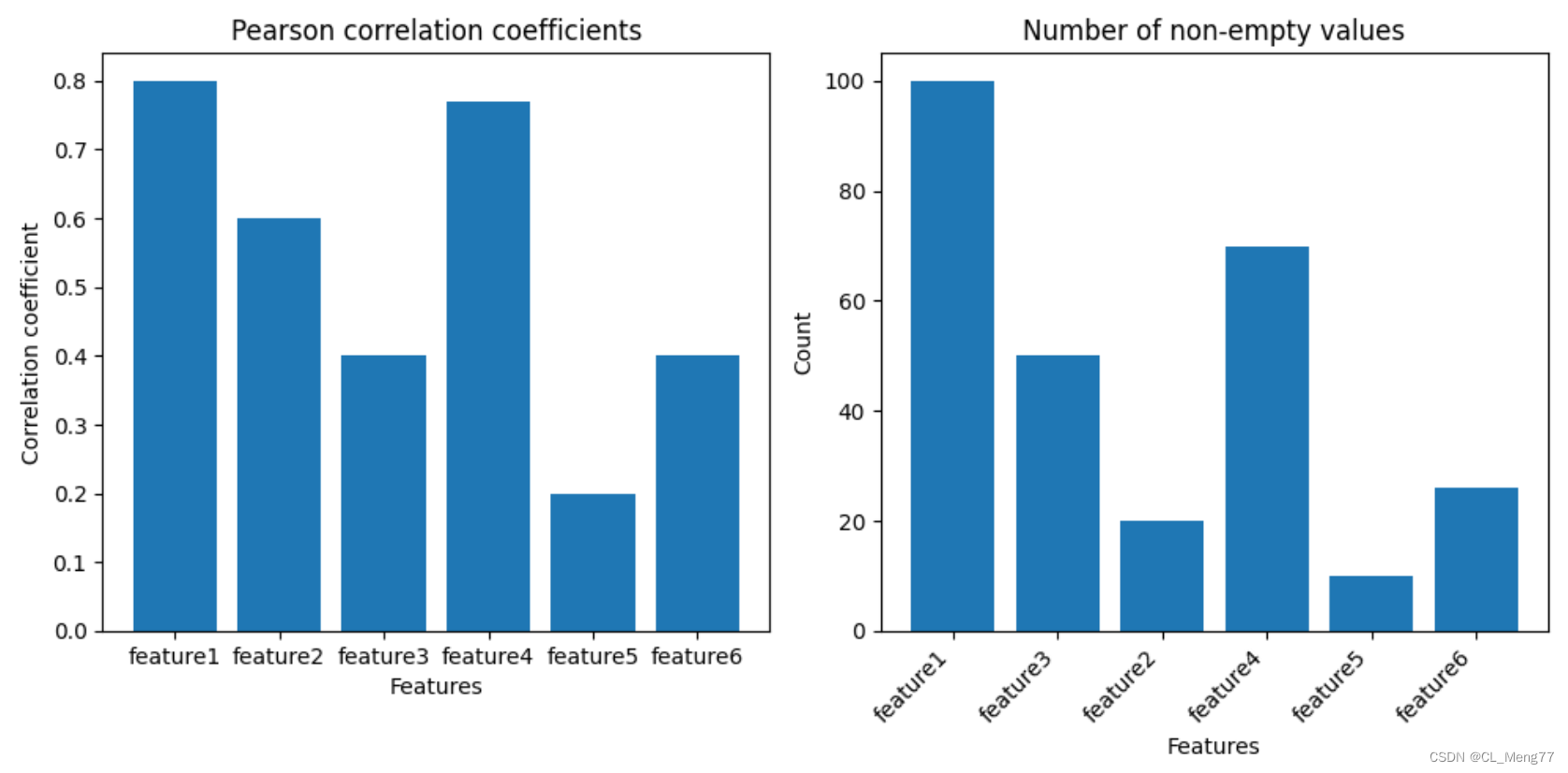
Pearson correlation analysis & plot drawing (correlation coefficient histogram, drawing a histogram of the number of non-null values)
1. Pearson correlation analysis
Pearson correlation analysis is a statistical method used to detect the strength of a linear relationship between two variables, with a result between -1 and 1. A correlation coefficient of 1 indicates a perfect positive relationship, -1 indicates a perfect negative relationship, and 0 indicates no linear relationship. Pearson correlation analysis assumes that the data come from a normal distribution and is sensitive to outliers.
2. Example of Pearson correlation analysis
# 计算pearsonr相关系数defcalculate_pearsonr(pd):
head = pd.head().columns.values
GDM = pd["目标变量"].tolist()
coefficient_of_association ={
}
significance_level ={
}
feature_cnt ={
}for feature in head:if feature !="目标变量":
ftc =0
feature_values = pd[feature].tolist()
GDM_temp, feature_temp, tag =[],[],0for v in feature_values:ifstr(v)!="nan":
ftc +=1
GDM_temp.append(GDM[tag])
feature_temp.append(v)
tag +=1
feature_cnt[feature]= ftc
iflen(feature_temp)>1:
pc = pearsonr(np.array(feature_temp), np.array(GDM_temp))ifstr(pc[0])!="nan":
ca = pc[0]if ca <-0.0001:
ca = ca*-1
coefficient_of_association[feature]= ca
significance_level[feature]= pc[1]elif ca >0.0001:
coefficient_of_association[feature]= ca
significance_level[feature]= pc[1]
dp_ca =sorted(
coefficient_of_association.items(),
key=lambda x: x[1],
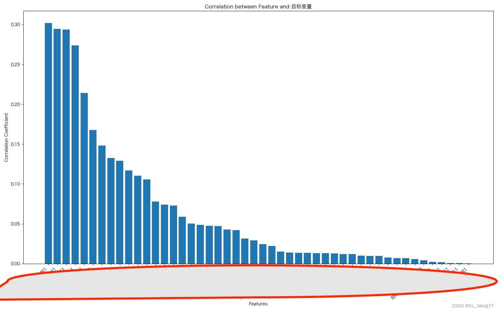
reverse=True)print("pearsonr-相关系数:",dp_ca)
dp_ca_Nempty=[(i[0], feature_cnt[i[0]])for i in dp_ca]print("非空值的数量:",dp_ca_Nempty)return dp_ca
import matplotlib.pyplot as plt
defplot1(dp_ca):# 将元组列表转换为字典
dp_ca_dict =dict(dp_ca)# 创建子图# fig, ax = plt.subplots()
fig = plt.figure(figsize=(16,10))
ax = fig.add_subplot(1,1,1)# 绘制相关性系数柱状图
ax.bar(dp_ca_dict.keys(), dp_ca_dict.values())
ax.set_title('Correlation between Feature and 目标变量')
ax.set_xlabel('Features')
ax.set_ylabel('Correlation Coefficient')# 调整布局并显示图形
plt.xticks(rotation=45,ha='right')## # 将x轴标签旋转45度,并以最后一个字符为旋转中心# 设置x轴刻度标签字体大小为8
ax.tick_params(axis='x', labelsize=10)
plt.tight_layout()
plt.savefig("./Pearson.jpeg")
plt.show()if __name__ =='__main__':file= pd.read_excel("./filename.xlsx")
dp_ca=calculate_pearsonr(file)
plot1(dp_ca)
3.plot drawing (correlation coefficient histogram, drawing a histogram of the number of non-null values)