problem instance
After the project went online, I found a problem. The effect of opening it on the web side is different from that on the mobile browser.
details as following
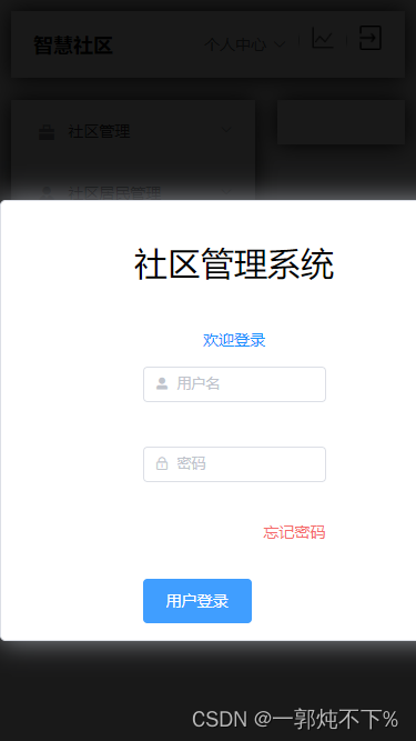
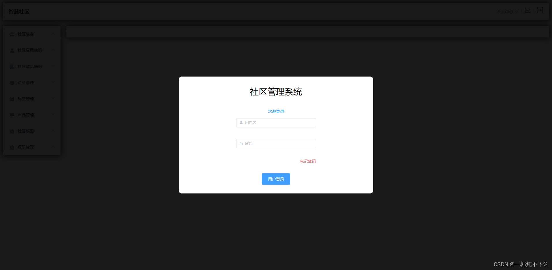
web side
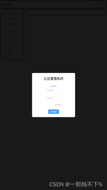
mobile browser
problem causes
The web end and the browser did not do a self-adaptation, which caused problems
Solution
Use lib-flexible to solve the self-adaptive problem.
Note that it is best to back up a copy first in the experiment to avoid bugs after problems occur. After all, everyone uses different environments and problems will occur.
step
1. Install lib-flexible in the project
npm install lib-flexible --save
2. Take vue2 as an example to comment out the meta name="viewport tag" in index.html
<!-- <meta name="viewport" content="width=device-width,initial-scale=1.0"> -->
3. Install px2rem-loader (this step has pitfalls, and an error will be reported when running, you can experiment with this)
npm install px2rem-loader --save-dev
4. Referencing lib-flexible causes the third-party Ui library to shrink (the pit in the previous step)
postcss-px2rem cannot ignore the specified file and needs to install postcss-px2rem-exclude to
uninstall postcss-px2rem first
npm uninstall postcss-px2rem
install postcss-px2rem-exclude
npm i postcss-px2rem-exclude -D
At this point, the installation has been completed and the program can be run.
If some errors will be reported, add the next code and try it out. If it doesn’t work, you need to find other solutions.
5. Configure px2rem-loader
to create a new postcss.config.js under the root path, and some will report an error after adding. My configuration also took effect, so everyone judges according to the situation.
module.exports = {


  plugins: [
    require('postcss-px2rem')({


      // rem 的单位  填设计稿的 1/10
      remUnit: 37.5,
    }),
  ],
}