This course reads data from Excel using Python and plots it into a two-dimensional image using Matplotlib. In this process, the image will be beautified through a series of operations, and finally a publication-quality image will be obtained. This course is of great value for students who need to write experimental reports, dissertations, publish articles, and make reports
knowledge points
- Use the xlrd extension package to read Excel data
- Draw 2D images with Matplotlib
- Display LaTeX style formulas
- Transparency at coordinate points
Next, we will lead you to use Python to read data from Excel and draw beautiful images through practical operations.
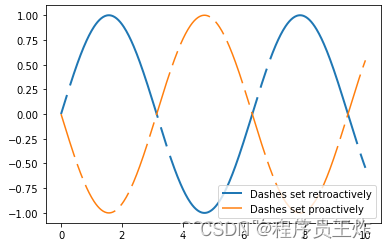
First, let's draw a very simple sine function, the code is as follows:
| 1 2 3 4 5 6 7 8 9 10 11 12 |
import numpy as np
import matplotlib.pyplot as plt
%matplotlib inline
x = np.linspace(0, 10, 500)
dashes = [10, 5, 100, 5] # 10 points on, 5 off, 100 on, 5 off
fig, ax = plt.subplots()
line1, = ax.plot(x, np.sin(x), '--', linewidth=2,
label='Dashes set retroactively')
line1.set_dashes(dashes)
line2, = ax.plot(x, -1 * np.sin(x), dashes=[30, 5, 10, 5],
label='Dashes set proactively')
ax.legend(loc='lower right')
|
Test the xlrd extension package
.xl As the name suggests, xlrd is the extension package of the Excel file extension read . This package can only read files, not write them. Writing requires the use of another package. But this package can actually read .xlsxfiles.
The process of reading data from Excel is relatively simple, first import from the xlrd package open_workbook, then open the Excel file, and sheet read out the data of each row and column in each row. Obviously, this is a cyclical process.
| 1 2 3 4 5 6 7 8 9 10 11 12 13 14 15 16 17 18 |
## 下载所需示例数据
## 1. https://labfile.oss.aliyuncs.com/courses/791/my_data.xlsx
## 2. https://labfile.oss.aliyuncs.com/courses/791/phase_detector.xlsx
## 3. https://labfile.oss.aliyuncs.com/courses/791/phase_detector2.xlsx
from xlrd import open_workbook
x_data1 = []
y_data1 = []
wb = open_workbook('phase_detector.xlsx')
for s in wb.sheets():
print('Sheet:', s.name)
for row in range(s.nrows):
print('the row is:', row)
values = []
for col in range(s.ncols):
values.append(s.cell(row, col).value)
print(values)
x_data1.append(values[0])
y_data1.append(values[1])
|
If there is no problem with the installation package, this code should be able to print out the data content in the Excel table. Explain this code:
- After opening an Excel file, first loop through the file
sheet , which is the outermost loop.
- Within each
sheet , do a second loop, row loop.
- Within each row, a column loop is performed, which is the third layer of loop.
在最内层列循环内,取出行列值,复制到新建的 values 列表内,很明显,源数据有几列,values 列表就有几个元素。我们例子中的 Excel 文件有两列,分别对应角度和 DC 值。所以在列循环结束后,我们将取得的数据保存到 x_data1 和 y_data1 这两个列表中。
绘制图像 V1
第一个版本的功能很简单,从 Excel 中读取数据,然后绘制成图像。同样先下载所需数据:
| 1 2 3 4 5 6 7 8 9 10 11 12 13 14 15 16 17 18 |
def read_xlsx(name):
wb = open_workbook(name)
x_data = []
y_data = []
for s in wb.sheets():
for row in range(s.nrows):
values = []
for col in range(s.ncols):
values.append(s.cell(row, col).value)
x_data.append(values[0])
y_data.append(values[1])
return x_data, y_data
x_data, y_data = read_xlsx('my_data.xlsx')
plt.plot(x_data, y_data, 'bo-', label=u"Phase curve", linewidth=1)
plt.title(u"TR14 phase detector")
plt.legend()
plt.xlabel(u"input-deg")
plt.ylabel(u"output-V")
|
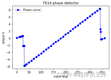
从 Excel 中读取数据的程序,上面已经解释过了。这段代码后面的函数是 Matplotlib 绘图的基本格式,此处的输入格式为:plt.plot(x 轴数据, y 轴数据, 曲线类型, 图例说明, 曲线线宽)。图片顶部的名称,由 plt.title(u"TR14 phase detector") 语句定义。最后,使用 plt.legend() 使能显示图例。
绘制图像 V2
这个图只绘制了一个表格的数据,我们一共有三个表格。但是就这个一个已经够丑了,我们先来美化一下。首先,坐标轴的问题:横轴的 0 点对应着纵轴的 8,这个明显不行。我们来移动一下坐标轴,使之 0 点重合:
| 1 2 3 4 5 6 7 8 9 10 11 12 13 |
from pylab import gca
plt.plot(x_data, y_data, 'bo-', label=u"Phase curve", linewidth=1)
plt.title(u"TR14 phase detector")
plt.legend()
ax = gca()
ax.spines['right'].set_color('none')
ax.spines['top'].set_color('none')
ax.xaxis.set_ticks_position('bottom')
ax.spines['bottom'].set_position(('data', 0))
ax.yaxis.set_ticks_position('left')
ax.spines['left'].set_position(('data', 0))
plt.xlabel(u"input-deg")
plt.ylabel(u"output-V")
|
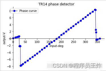
好的,移动坐标轴后,图片稍微顺眼了一点,我们也能明显的看出来,图像与横轴的交点大约在 180 度附近。
解释一下移动坐标轴的代码:我们要移动坐标轴,首先要把旧的坐标拆了。怎么拆呢?原图是上下左右四面都有边界刻度的图像,我们首先把右边界拆了不要了,使用语句 ax.spines['right'].set_color('none')。
把右边界的颜色设置为不可见,右边界就拆掉了。同理,再把上边界拆掉 ax.spines['top'].set_color('none')。
拆完之后,就只剩下我们关心的左边界和下边界了,这俩就是 x 轴和 y 轴。然后我们移动这两个轴,使他们的零点对应起来:
| 1 2 3 4 |
ax.xaxis.set_ticks_position('bottom')
ax.spines['bottom'].set_position(('data', 0))
ax.yaxis.set_ticks_position('left')
ax.spines['left'].set_position(('data', 0))
|
这样,就完成了坐标轴的移动。
绘制图像 V3
我们能不能给图像过零点加个标记呢?显示的告诉看图者,过零点在哪,就免去看完图还得猜,要么就要问作报告的人。
| 1 2 3 4 5 6 7 8 9 10 11 12 13 14 |
plt.plot(x_data, y_data, 'bo-', label=u"Phase curve", linewidth=1)
plt.annotate('zero point', xy=(180, 0), xytext=(60, 3),
arrowprops=dict(facecolor='black', shrink=0.05),)
plt.title(u"TR14 phase detector")
plt.legend()
ax = gca()
ax.spines['right'].set_color('none')
ax.spines['top'].set_color('none')
ax.xaxis.set_ticks_position('bottom')
ax.spines['bottom'].set_position(('data', 0))
ax.yaxis.set_ticks_position('left')
ax.spines['left'].set_position(('data', 0))
plt.xlabel(u"input-deg")
plt.ylabel(u"output-V")
|
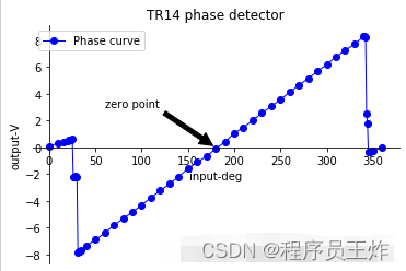
好的,加上标注的图片,显示效果更好了。标注的添加,使用 plt.annotate(标注文字, 标注的数据点, 标注文字坐标, 箭头形状) 语句。这其中,标注的数据点是我们感兴趣的,需要说明的数据,而标注文字坐标,需要我们根据效果进行调节,既不能遮挡原曲线,又要醒目。
绘制图像 V4
我们把三组数据都画在这幅图上,方便对比,此外,再加上一组理想数据进行对照。这一次我们再做些改进,把横坐标的单位用 LaTeX 引擎显示;不光标记零点,把两边的非线性区也标记出来;
| 1 2 3 4 5 6 7 8 9 10 11 12 13 14 15 16 17 18 19 20 21 22 23 24 25 26 27 28 29 30 31 32 33 34 35 |
plt.annotate('Close loop point', size=18, xy=(180, 0.1), xycoords='data',
xytext=(-100, 40), textcoords='offset points',
arrowprops=dict(arrowstyle="->", connectionstyle="arc3,rad=.2")
)
plt.annotate(' ', xy=(0, -0.1), xycoords='data',
xytext=(200, -90), textcoords='offset points',
arrowprops=dict(arrowstyle="->", connectionstyle="arc3,rad=-.2")
)
plt.annotate('Zero point in non-monotonic region', size=18, xy=(360, 0), xycoords='data',
xytext=(-290, -110), textcoords='offset points',
arrowprops=dict(arrowstyle="->", connectionstyle="arc3,rad=.2")
)
plt.plot(x_data, y_data, 'b', label=u"Faster D latch and XOR", linewidth=2)
x_data1, y_data1 = read_xlsx('phase_detector.xlsx')
plt.plot(x_data1, y_data1, 'g', label=u"Original", linewidth=2)
x_data2, y_data2 = read_xlsx('phase_detector2.xlsx')
plt.plot(x_data2, y_data2, 'r', label=u"Move the pullup resistor", linewidth=2)
x_data3 = []
y_data3 = []
for i in range(360):
x_data3.append(i)
y_data3.append((i-180)*0.052-0.092)
plt.plot(x_data3, y_data3, 'c', label=u"The Ideal Curve", linewidth=2)
plt.title(u"$2\pi$ phase detector", size=20)
plt.legend(loc=0) # 显示 label
# 移动坐标轴代码
ax = gca()
ax.spines['right'].set_color('none')
ax.spines['top'].set_color('none')
ax.xaxis.set_ticks_position('bottom')
ax.spines['bottom'].set_position(('data', 0))
ax.yaxis.set_ticks_position('left')
ax.spines['left'].set_position(('data', 0))
plt.xlabel(u"$\phi/deg$", size=20)
plt.ylabel(u"$DC/V$", size=20)
|
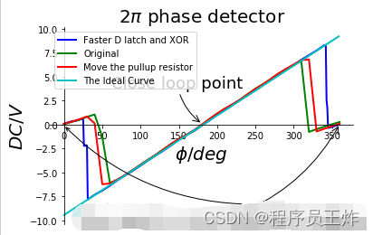
LaTeX 表示数学公式,使用 $$ 表示两个符号之间的内容是数学符号。圆周率就可以简单表示为 $\pi$,简单到哭,显示效果却很好看。同样的,$\phi$ 表示角度符号,书写和读音相近,很好记。
对于圆周率,角度公式这类数学符号,使用 LaTeX 来表示,是非常方便的。这张图比起上面的要好看得多了。但是,依然觉得还是有些丑。好像用平滑线画出来的图像,并不如用点线画出来的好看。而且点线更能反映实际的数据点。此外,我们的图像跟坐标轴重叠的地方,把坐标和数字都挡住了,看着不太美。
图中的理想曲线的数据,是根据电路原理纯计算出来的,要讲清楚需要较大篇幅,这里就不展开了,只是为了配合比较而用,这部分代码,大家知道即可:
| 1 2 3 4 |
for i in range(360):
x_data3.append(i)
y_data3.append((i-180)*0.052-0.092)
plt.plot(x_data3, y_data3, 'c', label=u"The Ideal Curve", linewidth=2)
|
绘制图像 V5
我们再就上述问题,进行优化。优化的过程包括:改变横坐标的显示,使用弧度显示;优化图像与横坐标相交的部分,透明显示;增加网络标度。
| 1 2 3 4 5 6 7 8 9 10 11 12 13 14 15 16 17 18 19 20 21 22 23 24 25 26 27 28 29 30 31 |
plt.annotate('The favorite close loop point', size=16, xy=(1, 0.1), xycoords='data',
xytext=(-180, 40), textcoords='offset points',
arrowprops=dict(arrowstyle="->", connectionstyle="arc3,rad=.2")
)
plt.annotate(' ', xy=(0.02, -0.2), xycoords='data',
xytext=(200, -90), textcoords='offset points',
arrowprops=dict(arrowstyle="->", connectionstyle="arc3,rad=-.2")
)
plt.annotate('Zero point in non-monotonic region', size=16, xy=(1.97, -0.3), xycoords='data',
xytext=(-290, -110), textcoords='offset points',
arrowprops=dict(arrowstyle="->", connectionstyle="arc3,rad=.2")
)
plt.plot(x_data, y_data, 'bo--', label=u"Faster D latch and XOR", linewidth=2)
plt.plot(x_data3, y_data3, 'c', label=u"The Ideal Curve", linewidth=2)
plt.title(u"$2\pi$ phase detector", size=20)
plt.legend(loc=0) # 显示 label
# 移动坐标轴代码
ax = gca()
ax.spines['right'].set_color('none')
ax.spines['top'].set_color('none')
ax.xaxis.set_ticks_position('bottom')
ax.spines['bottom'].set_position(('data', 0))
ax.yaxis.set_ticks_position('left')
ax.spines['left'].set_position(('data', 0))
plt.xlabel(u"$\phi/rad$", size=20) # 角度单位为 pi
plt.ylabel(u"$DC/V$", size=20)
plt.xticks([0, 0.5, 1, 1.5, 2], [r'$0$', r'$\pi/2$',
r'$\pi$', r'$1.5\pi$', r'$2\pi$'], size=16)
for label in ax.get_xticklabels() + ax.get_yticklabels():
label.set_bbox(dict(facecolor='white', edgecolor='None', alpha=0.65))
plt.grid(True)
|
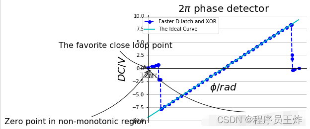
与我们最开始那张图比起来,是不是有种脱胎换骨的感觉?这其中,对图像与坐标轴相交的部分,做了透明化处理,代码为:
| 1 2 |
for label in ax.get_xticklabels() + ax.get_yticklabels():
label.set_bbox(dict(facecolor='white', edgecolor='None', alpha=0.65))
|
透明度由其中的参数 alpha=0.65 控制,如果想更透明,就把这个数改到更小,0 代表完全透明,1 代表不透明。而改变横轴坐标显示方式的代码为:
| 1 2 |
plt.xticks([0, 0.5, 1, 1.5, 2], [r'$0$', r'$\pi/2$',
r'$\pi$', r'$1.5\pi$', r'$2\pi$'], size=16)
|
这里直接手动指定 x 轴的标度。依然是使用 LaTeX 引擎来表示数学公式。
实验总结
本次实验使用 Python 的绘图包 Matplotlib 绘制了一副图像。图像的数据来源于 Excel 数据表。与使用数据表画图相比,通过程序控制绘图,得到了更加灵活和精细的控制,最终绘制除了一幅精美的图像。
到此这篇关于Python从Excel读取数据并使用Matplotlib绘制成二维图像的文章就介绍到这了。
点击拿去
50G+学习视频教程
100+Python初阶、中阶、高阶电子书籍