4.3 Button (button)
- The Button control inherits from TextView and has the properties of TextView.
- Introduction to StateListDrawable
StateListDrawable is a kind of Drawable resource, which can set different image effects according to different states, the key node <selector>, we only need to set the background property of Button to this drawable resource, and then we can easily realize different display when pressing the button. Button color or background!
| attribute name |
illustrate |
| drawable |
The referenced Drawable bitmap, we can put it at the front, which means the normal state of the component~ |
| state_focused |
Whether to get the focus |
| state_window_focused |
Whether to get the window focus |
| state_enabled |
Whether the control is available |
| state_checkable |
Whether the control can be checked |
| state_checked |
Whether the control is checked |
| state_selected |
Whether the control is selected, for the case with a scroll wheel |
| state_pressed |
Whether the control is pressed |
| state_active |
Whether the control is active |
| state_single |
When the control contains multiple child controls, determine whether to display only one child control |
| state_first |
When the control contains multiple child controls, determine whether the first child control is displayed |
| state_middle |
When the control contains multiple sub-controls, determine whether the middle sub-control is displayed |
| state_last |
When the control contains multiple child controls, determine whether the last child control is displayed |
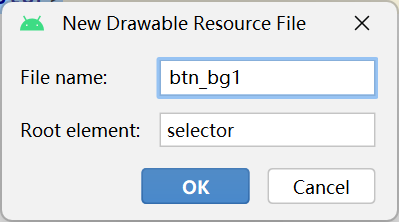
btn_bg1.xml:
<?xml version="1.0" encoding="utf-8"?>
<selector xmlns:android="http://schemas.android.com/apk/res/android">
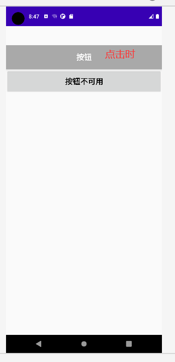
<item android:drawable="@color/dark_gray" android:state_pressed="true"/> //控件被按下时变成深灰
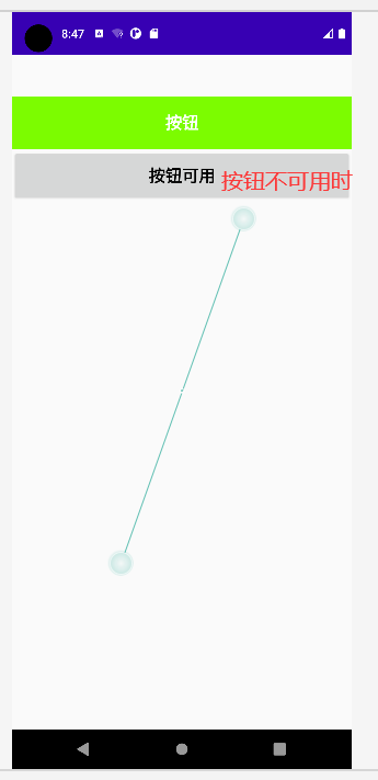
<item android:drawable="@color/lawn_green" android:state_enabled="false"/> //控件不可用时变成绿色
<item android:drawable="@color/purple_200"/> //控件平常时显示浅紫色
</selector>
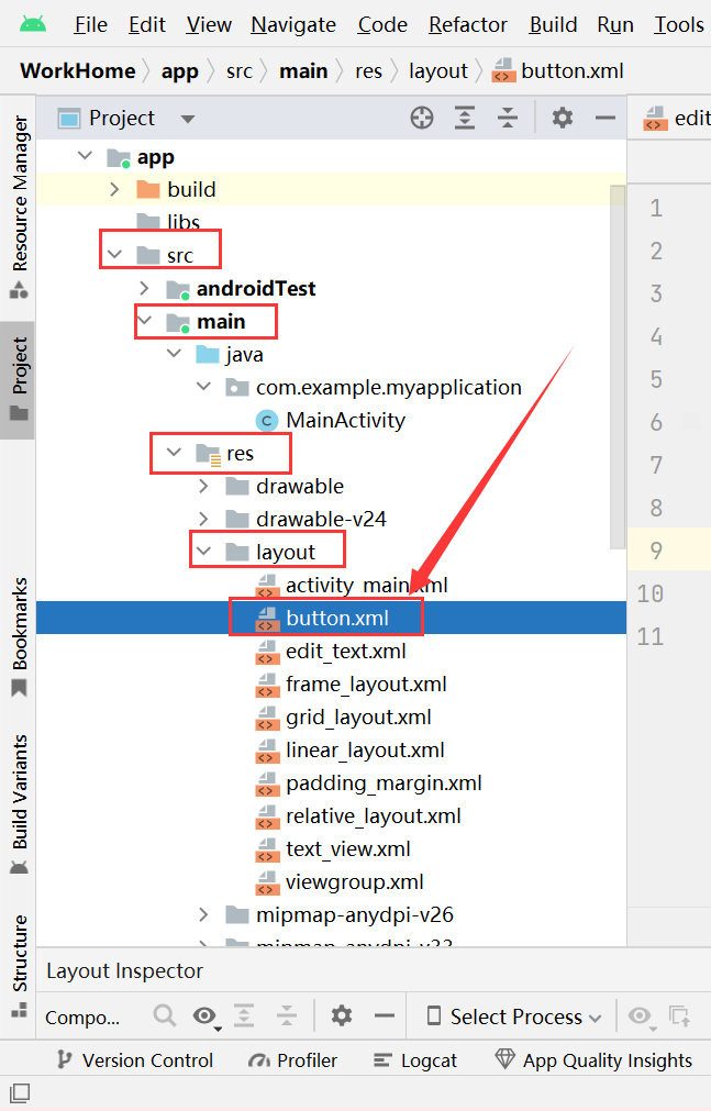
Create botton.xml in the layout folder:
<?xml version="1.0" encoding="utf-8"?>
<LinearLayout xmlns:android="http://schemas.android.com/apk/res/android"
android:layout_width="match_parent"
android:layout_height="match_parent"
android:orientation="vertical"
android:background="#eeeeee"
android:paddingTop="50dp">
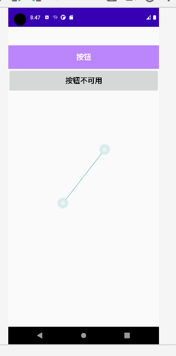
<Button
android:id="@+id/btnOne"
android:layout_width="match_parent"
android:layout_height="64dp"
android:background="@drawable/btn_bg1"
android:text="按钮"
android:textColor="@color/white"
android:textSize="20sp"
android:textStyle="bold"/>
<Button
android:id="@+id/btnTwo"
android:layout_width="match_parent"
android:layout_height="64dp"
android:text="按钮不可用"
android:textColor="@color/black"
android:textSize="20sp"
android:textStyle="bold"/>
</LinearLayout>
MainActivity.java:
package com.example.myapplication;

import androidx.appcompat.app.AppCompatActivity;
import android.os.Bundle;
import android.view.View;
import android.widget.Button;


public class MainActivity extends AppCompatActivity {

    private Button btnOne,btnTwo;
    @Override
    protected void onCreate(Bundle savedInstanceState) {
        super.onCreate(savedInstanceState);
        setContentView(R.layout.button);
        btnOne = (Button) findViewById(R.id.btnOne);
        btnTwo = (Button) findViewById(R.id.btnTwo);
        btnTwo.setOnClickListener(new View.OnClickListener(){   //按钮绑定事件
            @Override
            public void onClick(View v){
                if (btnTwo.getText().toString().equals("按钮不可用")){
                    btnOne.setEnabled(false);
                    btnTwo.setText("按钮可用");
                }else {
                    btnOne.setEnabled(true);
                    btnTwo.setText("按钮不可用");
                }
            }
        });

    }
}