guide
At the beginning of entering the data position, I wrote a series of introductory tutorials for several data science toolkits, including Numpy , Pandas , Matplotlib , Seaborn , Sklearn , etc., which also constituted my original core tool stack. Among these 5 toolkits, 2.5 are used for data plotting (Pandas can be counted as 0.5). The high proportion is related to the "indulgence" in simple and effective visualization at that time, and it can be said that I never tire of it. After more than a year, after being in constant contact with Plotly, a visualization upstart, I finally formally learned about the use, features, advantages and disadvantages of this package recently, and sorted it out a little, so as to learn from the future, this article is finally completed!
Plotly is simple, efficient and interactive, worth a try!
01 Why learn plotly
Plotly, this package name is not unintuitive, it must be a tool for drawing pictures at a glance; but at the same time, it is still not intuitive, because plotly is actually a multilingual drawing library, and when it comes to plotly A more likely reference is plotly in JavaScript. In fact, plotly is a JavaScript-based drawing library, and then introduced into Python, so in order to refer to plotly in Python more specifically, it can generally be called plotly.py.
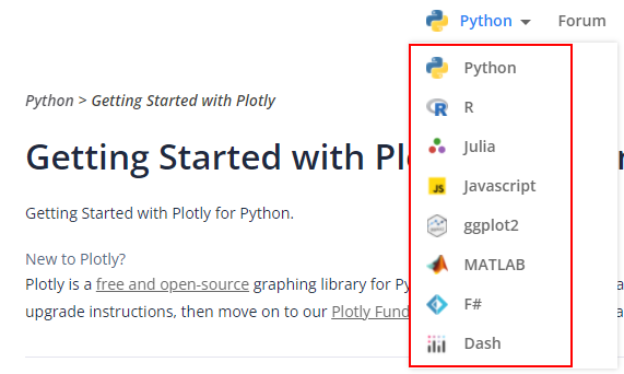
Plotly supports multi-language platforms
So, why doesn't plotly follow the practice of many third-party libraries in Python and directly name it pyplotly? After all, there are many such precedents, such as pyecharts, pymysql, pytorch, etc.
Furthermore, why spend additional learning costs to get started with plotly after mastering matplotlib and seaborn, which can almost complete all drawing requirements? In other words, what are the core advantages or irreplaceable places of plotly? In short: Interactivity! Yes, plotly's drawing supports interaction, which is not available in matplotlib and seaborn (more strictly speaking, it is not interactive by default).
Of course, there is more than one interactive drawing library, for example, I have tried pyecharts before! But for me, it's just that the drawing results of pyecharts need to open a separate webpage, which is a bit cumbersome. At the same time, plotly's drawing syntax is closer to matplotlib and seaborn, and the learning threshold is smoother. Based on the above-mentioned rich inner activities, I chose plotly, and finally decided to study systematically and try it out.
02 What can plotly do?
As a visualization library, plotly can of course be used to draw pictures, and it is a variety of rich styles of pictures. Fortunately, here is a direct reference to the introduction of plotly's official website:
The plotly Python library is an interactive, open-source plotting library that supports over 40 unique chart types covering a wide range of statistical, financial, geographic, scientific, and 3-dimensional use-cases.
A few keywords are: open source, interactive, supports more than 40 chart types, covering statistics, finance, geography, science and 3D charts.
Take a look at the chart demo directly given by the official website:
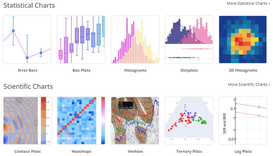
Statistical and Scientific Chart Series
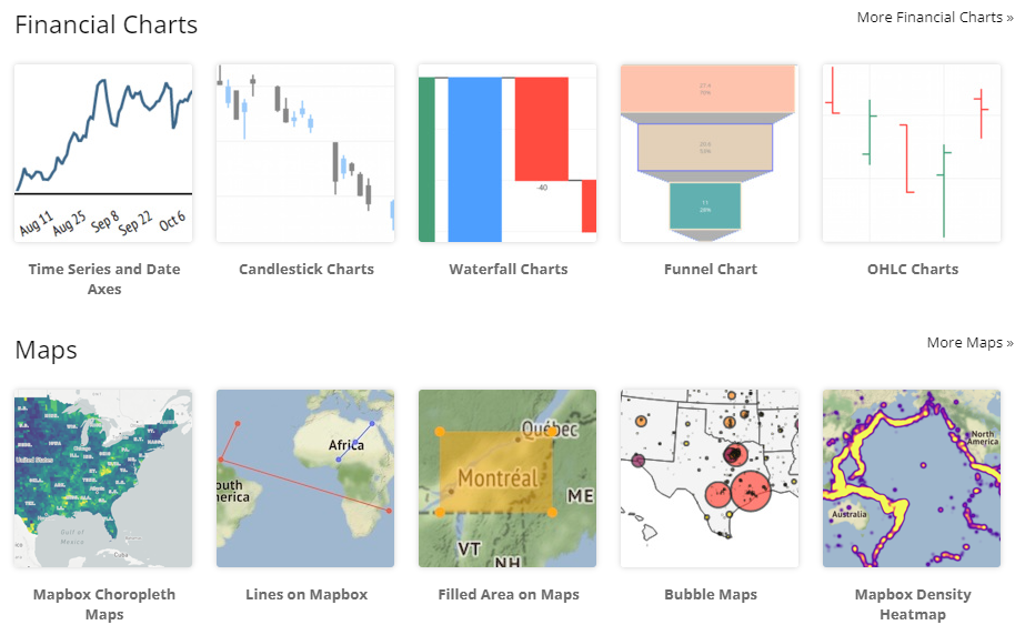
Financial and Geographical Chart Series
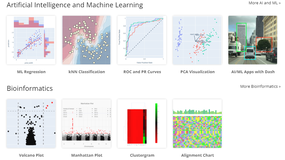
AI Science Series
More chart types can be viewed on the official website. In short, plotly has complete and powerful functions.
03 How plotly draws
Since this article is positioned as an introduction series, it must introduce how to use and get started.
First of all, the process of installing the plotly library in python is very simple, and there are few dependencies (it is found through pip show plotly that there are only 2 dependent packages). Both pip and conda can quickly complete the installation through the conventional install method.
Secondly, an overall introduction of each component module in plotly is given, in order to understand the macroscopic structure of plotly and the positioning of each module from a macro perspective. Open the plotly source code folder, you can see that it mainly contains the following subfolders, which basically correspond to several submodules in plotly:
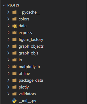
In addition to the above subfolder, plotly has several independent .py files
Specifically, the following submodules are generally involved in the application of plotly for visualization:
express: a high-level API for visualization in plotly
graph_objects: The underlying drawing interface, including all graph objects and layouts (graph_objs is a package with the same name)
io: low-level interface for displaying and reading and writing charts
colors: used to configure chart color related
data: Provides some built-in data set loading functions, such as iris, tips data set
In fact, in order to get started with plotly and get started quickly, you may only need to focus on the two submodules of plotly.express and plotly.graph_objects! Before the specific use, first introduce the difference and positioning of the two:
plotly.graph_objects is the underlying API, an object-oriented drawing style, which defines all graph objects in plotly (translated from graph_objects, isn’t it the meaning of graph objects, really simple and rude!), and provides a similar layout Set the function (layout), similar to the role of matplotlib;
plotly.express is a high-level API and a functional drawing style. The drawing process is the process of specifying each parameter of the function, which provides a more concise and convenient drawing function . If the former is similar to matplotlib, then plotly.express is properly equivalent to the role of seaborn!
Good guy, plotly has to define two sets of drawing styles. Is it really going to replace the status of matplotlib+seaborn? But for users, it may be popular - if you need to be fast and concise, use plotly.express; if you need personalized customization, use plotly.graph_objects.
Below, two simple code examples are given based on plotly
1) Use the underlying API - graph_objects
The reason why graph_objects is called the underlying API is because it exposes more drawing details and parameters, but this has both advantages and disadvantages. Generally speaking, drawing based on the graph_objects submodule is mainly divided into three steps:
Select a chart object (graph_object), and configure the data to be plotted, such as x and y data; properties of the chart, such as title, line type, etc.
Set some layouts and configure layout parameters, such as image size, title, etc.
Create a Figure object, and receive the chart object and layout object obtained in the first two steps, and then show them
for example:
import plotly.graph_objects as go  # 标准引用格式,一般简写为:go
import plotly.express as px  # 标准引用格式,一般简写为:px
tips = px.data.tips()  # plotly内置数据集:tips

# 使用graph_objects绘图流程需要三步
line = go.Scatter(x=tips['total_bill'], y=tips['tip'], mode='markers')  # ① 创建图表对象
layout = go.Layout(autosize=False, width=900, height=600, title='tips')  # ② 创建布局对象
go.Figure(data=line ,layout=layout).show()  # 创建Figure,接收图表和布局,并加以显示
2) Use advanced API - express
The reason why express is called a high-level API is because it has a more top-level abstraction, or you can get richer drawing results with less code. The more important express drawing interface seems to be naturally adapted to pd.DataFrame It exists, because the first parameter in its various drawing functions is data_frame! After setting this parameter, the x and y data only need to provide the corresponding column names. For example, for the same drawing requirements above, only one function needs to be called:
import plotly.graph_objects as go  # 标准引用格式,一般简写为:go
import plotly.express as px  # 标准引用格式,一般简写为:px
tips = px.data.tips()  # plotly内置数据集:tips

# 使用express绘图只需要调用一个函数
px.scatter(tips, x='total_bill', y='tip', width=900, height=600, title='tips').show()
Of course, the drawing results obtained by the above two methods are the same, and this picture provides common interactive functions, such as area selection (including rectangular area and custom area), zoom, move and storage and other common interactive buttons, simple demonstration as follows:
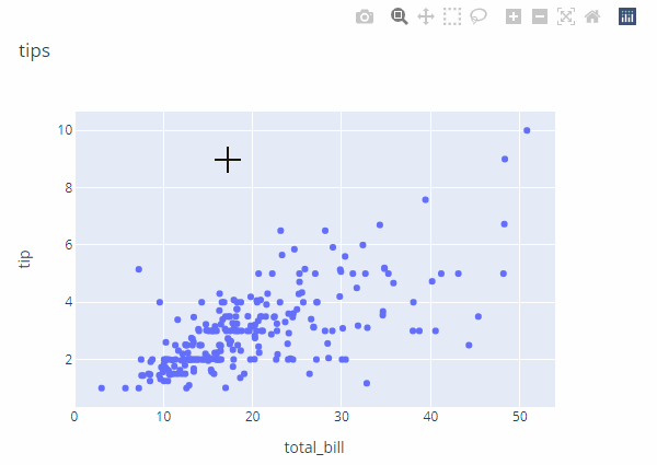
Then demonstrate a violin diagram that I prefer to show the distribution relationship between categories:

Does it have the smell of seaborn? . ?
Two other points worth adding:
1) Plotly provides an interface to convert a matplotlib drawing into a plotly drawing, which makes the mixed use of two visualization libraries smoother to a certain extent, but the specific experience needs to be tried;
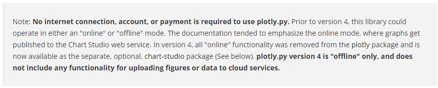
2) The early version of plotly also distinguishes between online and offline. The offline method is the above-mentioned conventional drawing method, and the online method probably needs to connect to the plotly web server. However, I think it may not be useful, so it is removed in V4.0 . For details, refer to the Note given by the plotly official website:

Related Reading:
Data Science Series: Introduction to the main modules of the sklearn library
Data Science Series: Seaborn Getting Started Detailed Tutorial
Data Science Series: Pandas Getting Started Detailed Tutorial
Data Science Series: Detailed tutorial for getting started with matplotlib
Data Science Series: Detailed tutorial for getting started with numpy