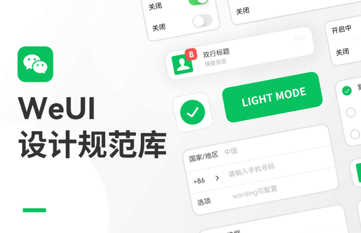
WeUI is a set of basic style libraries consistent with WeChat's native visual experience. The WeChat official design team tailors the design for WeChat web pages and WeChat applets to make user perception more unified, including button, cell, dialog, progress, toast, article, actionsheet, WeChat weui development team can directly use icons and other elements. The following WeUI design specifications and techniques in the WeUI WeChat applet component library in the resource community help designers quickly start WeUI product design.
WeChat applet component design specification
All pages of weui, including embedded webpages and plug-in applets, will have an official applet menu in the upper right corner. Developers cannot customize the content, but they can freely choose the depth of color matching to suit the design style of the weui page. In the instant design, you can directly use the two-color weui WeChat applet component library for free.
1. Light vision
When designing the WeUI WeChat Mini Program, we need to simplify the interface as much as possible. When the user clicks on the WeChat applet for the first time, the cumbersome pages will affect the user's first experience. When articles, credits, etc. appear on the page, the search should be displayed weakly. Therefore, search can gradually change from the original search box to the icon in the upper right corner. When there is a search need, it can be found without causing trouble to the user's ordinary preview.
2. Navigation bar
WeChat's official requirement for navigation is that the navigation is clear and easy to come and go. Navigation is to ensure that users browse content they are interested in within the WeChat application. Navigation needs to tell the user where they are, where you can go, and how to get back to the original page. WeChat does not provide a unified navigation bar style in Mini Programs, and developers can design the home page and secondary page interface navigation of WeChat applications according to their needs. It is recommended that the upper left corner of all secondary pages provide an operation to return to the previous page. In addition, many operating systems with full-screen gestures can also swipe to the right through the edge of the interface to return to the previous applet or WeChat page.
3. Pop-up settings
The overall operation result of the WeUI page - icon pop-up prompt The icon pop-up prompt is suitable for lightweight success prompts, which will disappear automatically after 1.5 seconds without interrupting the process and has little impact on users. It is suitable for operation prompts that do not need to be emphasized, such as success prompts. Please note that this form is not suitable for error prompts, because error prompts need to be clearly informed to users, so it is not suitable for flash pop-up prompts.
4. Button
The official documentation of the WeChat Mini Program provides the default styles of various buttons, which designers can use as a reference. As for the style, color and state of the button in the actual project, it can be customized according to the actual project. For designers who are familiar with web application design specifications, especially iOS platform software design, the web user interface WeChat mini-program design is easy to grasp, but the platform characteristics of WeChat mini-programs need to follow the official design specifications, plus the web user interface WeChat mini-program and Many imperfect functional components, functions and performance need to be further improved.
5. Color design
When matching, you need to choose the main color first, and then determine the secondary color. The color matching target can be determined according to the characteristics of the product. Secondary colors do not complement the main color. Generally, after selecting the main color, the overall tone of the WeUI WeChat applet will be determined. However, the use of secondary colors can affect the overall tone. We should try to simplify the color hierarchy as much as possible. Too many layers will also affect the user's visual effect.
6. Status bar
According to the official documentation of the WeChat applet, there is no need to design the status bar, because the status bar follows each mobile phone operating system. For example, content areas, applet capsules, and status bars do not need to be designed. Designers only need to use Android and iOS two status bar components as needed.